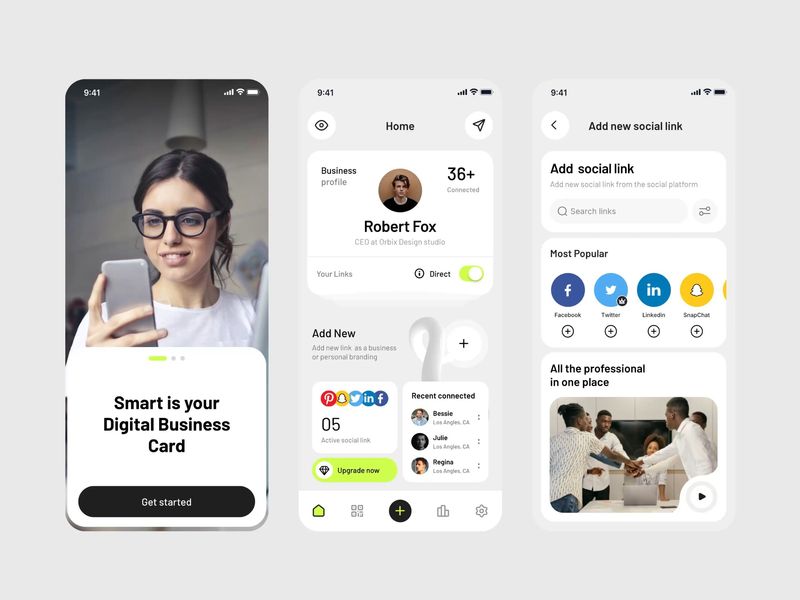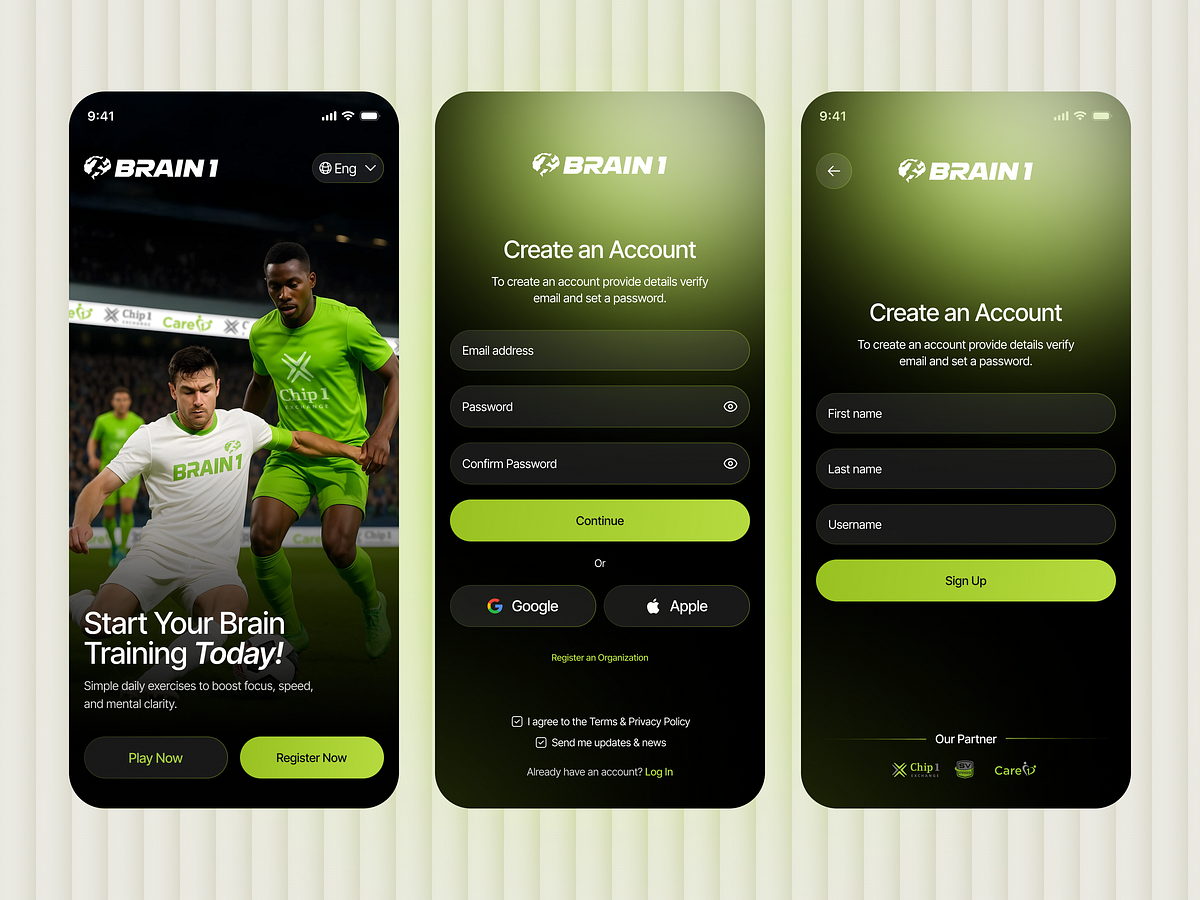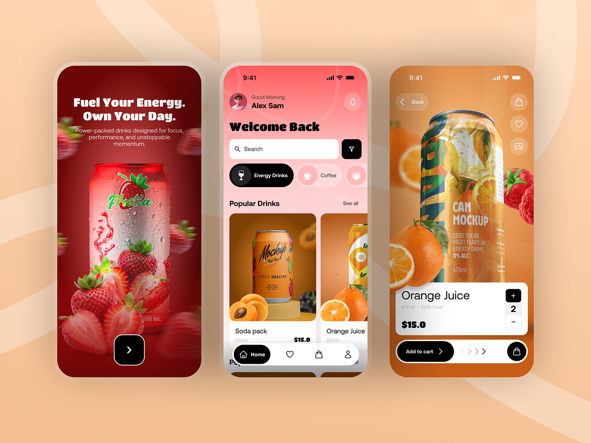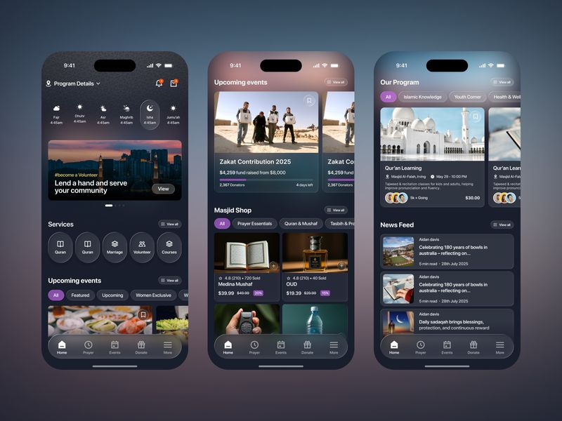
Who needs an overly complicated landing page builder? Not you.
Sponsored
We curate topical collections around design to inspire you in the design process.
This constantly-updated list featuring what find on the always-fresh Muzli inventory.
Last update: 11/20/2024
Sponsored
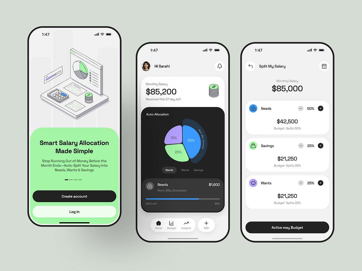
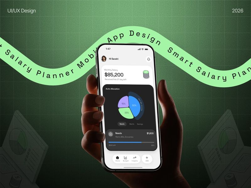
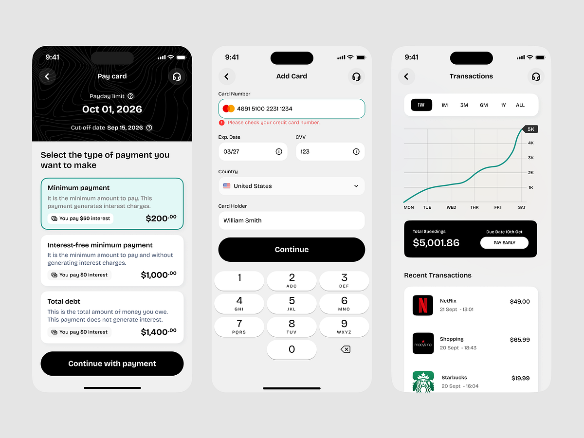
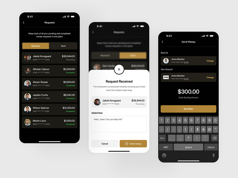
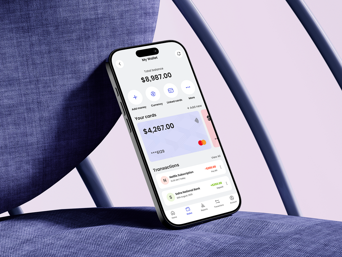
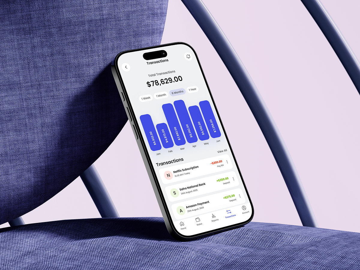
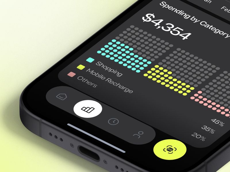
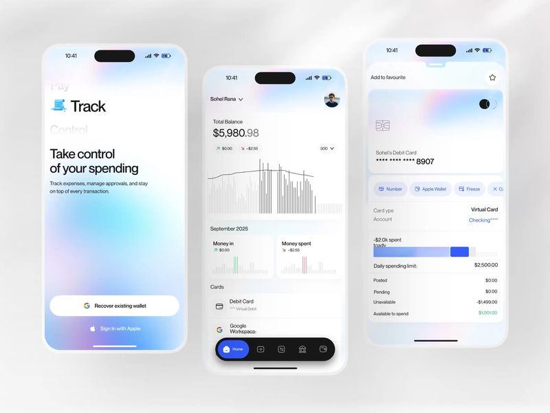
Keeping your budget balanced can help you stay on track, and also reduce your stress when it comes to your long-term financial health. Designed to bring convenience into your everyday life. Allowing its users to make payments (send, receive, and spend money with ease). Special thanks to Saepul Rohman for beautifying the visual.
The purpose of Flycard mobile application is to fulfil the dream of million people, which is to create a unique postcard here and now and send it to important addressee.
Streamlog is a sensor mobile App for Water Level Measure, content created by High Developer Agency and UI/UX Concept designed by TESLA Digital Agency/Richie Diac.
Hastalık — Health App EN People who are sick or think they are sick are diagnosing their illness online. This is a disease called Cyberhodric. But since there is all kinds of right or wrong information on the internet, I designed an application that contains health-related news and information. The application feature will be the application where the most accurate information and accurate news will be created. I used the name Illness, because these people were sick with the disease. TR Hasta olan veya hasta olduğunu düşünen kişiler hastalığını internetten teşhiş ediyorlar. Bu Siberhodrik denilen bir hastalıktır. Fakat internette doğru ya da yanlış her tür bilginin olduğu için sağlıkla ilgili haberler ve bilgilerinin oluştuğu uygulama tasarladım. Uygulama özelliği en doğru bilgilerin ve doğru haberlerin oluştuğu uygulama olucaktır. İsmi ise bu kişilerin hastalık hastası olmasından dolayı Hasta-lık adını kullandım.
Our client came to us with an idea for a fitness mobile app - and that's it. They wanted to offer premium, paid service for their customers that don't have time to hit the gym. Allowing people to exercise from the comfort of their own living room helps them to keep fit when they don't want to get tied by a gym membership or they don't have time to schedule long workouts into their busy days. After performing product workshops, we've created an easy to use but highly functional iOS and Android application using Flutter framework. Beautiful illustrations, bold styling and simple interface give everyone a positive experience. Our goal was to give every user a boost of motivation and keeping it requires the app to be accessible at all times. We achieved that by displaying everything clearly on the screen.
Hello Guys, This is the Fitness Mobile App. Hope you like it and feel free to leave comments and feedback. Thanks! :) We are available for long term or short term partnership, send your business inquiry to hello@dudeshape.com DudeShape Instagram | Behance
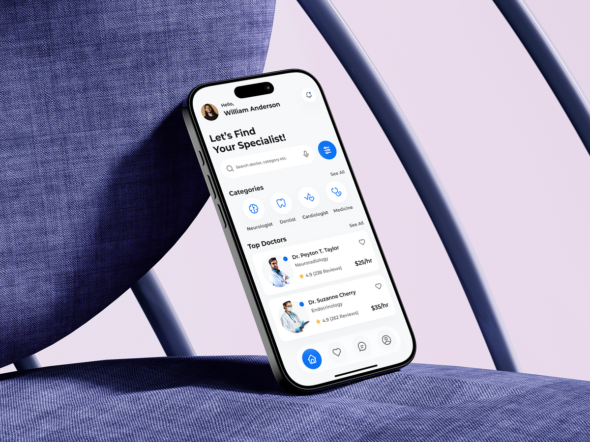
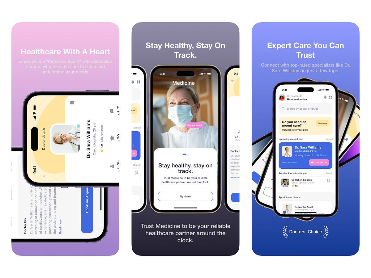
Hello, friends! Today we want to share with you this medical app design. With its help, You can easily choose a specialist doctor and make an appointment. Hope you guys like it! Have any feedback? feel free to share, your feedback will be highly appreciated. Have a project idea? We are available for new projects: abadul21@gmail.com Or Contact us: itobd2019@gmail.com Behance: https://www.behance.net/abadul21
In our routine full of diverse tasks, mobile apps have become great help. Today we share UI concept for one more called Watering Tracker, reminding users to water the plants as well as tracking the watering stats for every plant. To read a detailed case study, check Tubik Blog https://tubikstudio.com/blog/ Join in!
Stacked — Mobile App Case StudyFitness and WellnessA new, exciting way to do your WorkoutsStacked was created by bestselling fitness author Mike Matthews to help reach the fitness goals faster. It is suitable for any kind of workout routine, ranging from a simple bodyweight program to a complex strength training block.The user can set goals for exercises and body measurements, and record and review progress toward them. Also, it has a 1RM calculator to avoid losing track of personal records.Goal — Improve User Experience and Visual StyleThe main goal was to improve user expirience in application. The key points: simplify navigation, make workout screen more intuitive, improve the way to interact with routiones.Also we worked a lot on look and feel of the application and created a new visual style. We put a lot of attention to details, interactions and animations.https://medium.com/media/65d2f59c7bc752a5e8a2cc03e06b7659/hrefFirst step — Creating a new user flowWe prioritized the app features and moved the main ones to the tab bar instead of using hamburger menu. So the main features became available in one tap as well as all important information is listed on home screen.What’s new on the workout screen?Now it is collapsible and available in any place of the app. The user can navigate in app without closing the workout screen, easily see the workout overview and summary.Routines and Goals -Improve efficiency of your workoutsThere are a lot of predefined routines that can be combined into phases and assigned to specific weekdays. The user can edit and create his own routines. All settings can be easily restored to default.What are workouts without goals? User can set his goal and see which ones are achieved or what is needed to achieve them.Log. Progress. History — Monitor your actvitiesAll user’s progress is shown in Log. User can monitor his activity by two parameters: weight and reps and One rep max. All data is visualized in charts.Results — Better experience for our usersBeta testing results showed great results: 84,2 % of 597 beta testers named their experience as “Very good” and “Excellent”. As well as 89,5% of users succeed 100% in usability studies.Created with love by Netrix team ❤️We are on Dribbble, Behance, and Youtube.Stacked — Mobile App Case Study was originally published in Muzli - Design Inspiration on Medium, where people are continuing the conversation by highlighting and responding to this story.
UI/UX Redesign Concept: Starbucks Mobile App AoiroStudioJan 15, 2019 Our first redesign concept on ABDZ this year, how about from a mobile app that some use to fuel of caffeine needs. Absolute beautiful redesign of the Starbucks mobile app by Daniel Tan and Daphnie Loong. Combo Duo of two creative directors based in Kuala Lumpur, Malaysia. For starters, their visual approach is absolutely stunning. They truly give justice to how our beloved Starbucks should look. I still don't understand why we still should load our cards within the app but this redesign animation is quite solid. Definitely check out their entire project on Behance. Credits Daniel Tran on Behance Daphnie Loong on Behance UI/UX Redesign Concept >
Our client came to us with an idea for a fitness mobile app - and that's it. They wanted to offer premium, paid service for their customers that don't have time to hit the gym. Allowing people to exercise from the comfort of their own living room helps them to keep fit when they don't want to get tied by a gym membership or they don't have time to schedule long workouts into their busy days. After performing product workshops, we've created an easy to use but highly functional iOS and Android application using Flutter framework. Beautiful illustrations, bold styling and simple interface give everyone a positive experience. Our goal was to give every user a boost of motivation and keeping it requires the app to be accessible at all times. We achieved that by displaying everything clearly on the screen.
Mobile UI/UX Design: Perfect Recipes App AoiroStudio Aug 31, 2018 Happy Friday everyone! I wanted to end the week with this UI/UX case study by the folks from Tubik Studio, a kickass digital studio based in Dnipropetrovsk, Ukraine. We are showcasing one of their latest projects, the mobile UI design for a perfect recipes app. An application where you will be able to learn to cook by following recipes and also a food shopping experience. What's interesting from this particular cooking app is a concept of an integration with AmazonGo services where recipes can be generated in the relation of what you are shopping on Amazon. This could totally enhance our food shopping experience and becoming more intuitive. Let's be hopeful for the near future. More Links Studio Site Behance More on ABDZ Project Gallery mobile design UI/UX ui design tubik studio
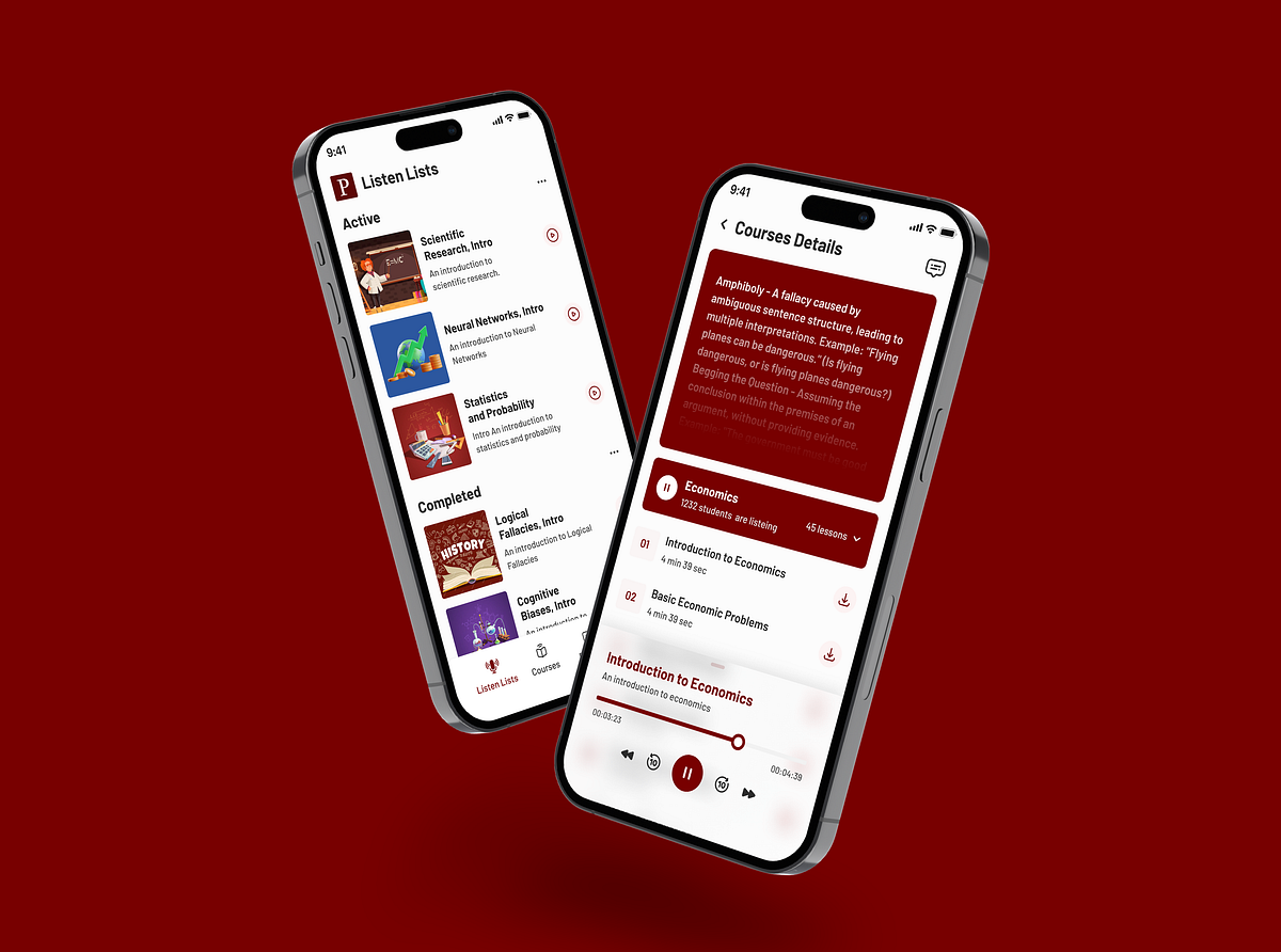
Lørn is a Norwegian podcasting platform oriented on latest technology trends. If you want to get an overview of what AR, VR, Blockchain, IoT or Fintech is, you can enroll the related class and get an info from experts It was a time to make a next step for client and transorm from set of podcasts to e-learning platform and go mobile. Our goal was to design a mobile app which combines both podcasting and study experience and the process fast and easy
UI Design for Mobile Banking iOS App (Commercial Bank) I tried to design the UI as simple as possible which make the functionality easier to it's users. I hope you like the concept. Free Download Illustrator & XD Link: https://goo.gl/Lx8iTP Thank You!
Mobile banking becomes more popular with every year and there is an explanation for this tendency. It is really comfortable to have all your financial information in one place. So, we have decided to create our vision of Wells Fargo & Company mobile app concept. In our, concept we wanted to combine notable colors and add to this user-friendly UX. We have analyzed apps of such banks as Privat24, Tinkoff and Monobank. We have found a tendency of bright and light colors. To differ, we have decided to use a dark background with bright colors for buttons. If you need to compare foreign currency courses and it is often a problem, that similar information provided in the same colors is unreadable. So, we have solved this problem by adding different colors to every different currency. You will not miss any important thing with this functionality. We decided to use Helvetica font which is popular among enterprises such as Google, Panasonic or Toyota and suit to serious apps. Cheers!
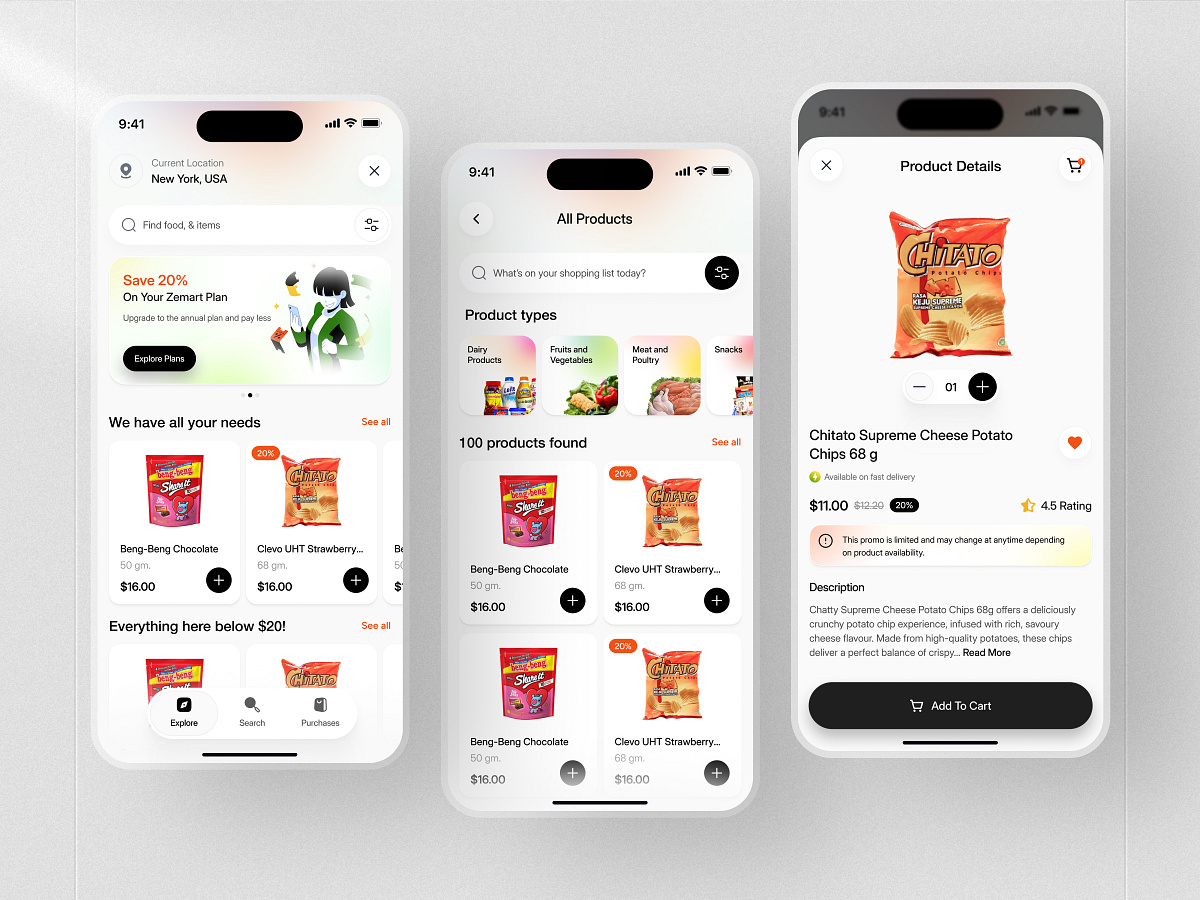
Hello! I prepared a store design with home items. Press ♥ or "L" if you like the project.
Concept of the healthcare application, which helps doctors easily track and analyze patient data. Follow us on Twitter & Facebook & Instagram You're always welcome to visit our amazing Blog
Instagram | Behance | Website For Project Enquiries - divan@greydeskstudio.com
Healthcare application concept (iOS) is a multifunctional medical app. This app collects your Test Results and synchronizes with the clinics. Thus, you can keep all the information in one place, communicate with your doctors and share the results to them on the go. Appointments and buying meds are included too.
Article mobile app design exploration . . have a gerat project? contact us hello@orely.co Follow my Instagram | Behance Have a nice day 👋
Health is wealth, no doubt, so the variety of apps helping people to keep healthy lifestyle is growing day by day. Today we would like to present designs of a recent project called Slumber: it's a mobile app with a gallery of music and meditations for relax and good sleep. Check the creative flow and UI solutions supporting the app purpose and enhancing usability. If you want to read more about real cases of UI design, check them in Tubik Blog https://tubikstudio.com/blog/ Join in!
Hello Guys :) I hope you guys are doing well.👌 Let’s check out my new Mobile UI Exploration Work. 💕 Have any feedback? Feel free to share & share your love press "L" !!! 😍 Follow Me here: Dribbble | Instagram | Twitter Thanks a lot....... :)
Today people are lazy to bring cash, now we are in an era where the money is virtual, cashless is better. So that's why I made a case study about virtual banks/money. So everyone can buy goods at the right price and no need to bother to pay. Look forward to the case study at Behance! --- Show us some love! Press "L". We're available for a new project! contact us lifustudio@gmail.com
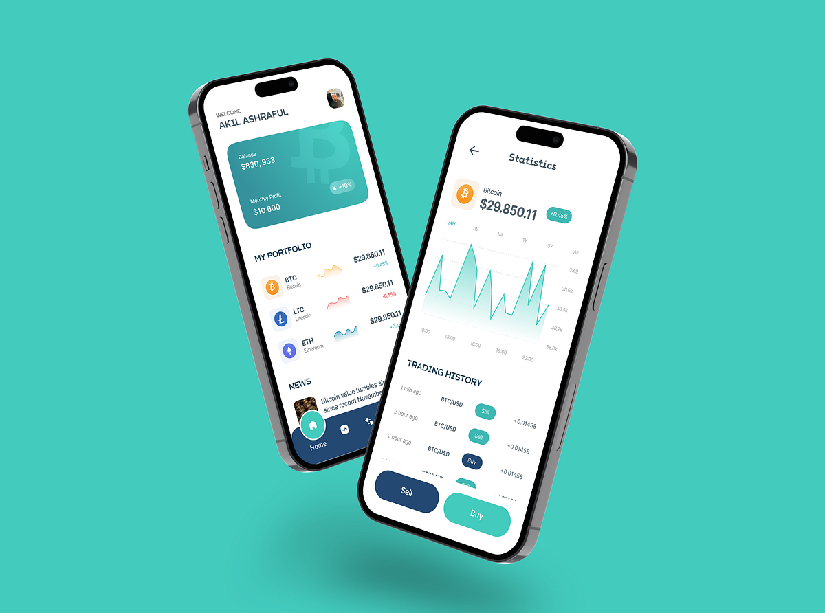
Hey 👋DeFi is another hot topic in the crypto industry. DeFi uses smart contracts to replace standard financial instruments. It allows buyers, sellers, lenders, and borrowers to interact independently of government and financial institutions.Meet MyDeFi - crypto mobile app where you can buy and exchange tokens easily. Additionally, there`s a useful activity tracker where you can have an overview of your transactions.📩 Interested in UX/UI Design for De-Fi Mobile App? Check out more on arounda.agency and contact us info@arounda.agency
Hey Dribbblers! Today I want to share my vision of Virgin mobile app redesign, second part. Hope you like it. Let me know your feedback & criticize. If you are looking for app design I’m always available for remote job! Contact me here: E-mail: eletskiy10@gmail.com Skype: alexandereletskiy Follow me on: Facebook Instagram Behance Linkedin Thanks for your time - Don't forget to click "LIKE" Have a nice day.
Hey guys 👋Meet Sowallet - a cryptocurrency mobile application where you can buy, exchange, receive and spend your cryptocurrencies. The main advantage of the application that it also allows the user to create a global card. You can connect your bank account and get access to most of the cryptocurrencies & tokens.📩 Interested in UX/UI Design for Mobile App? Check out more on arounda.agency and contact us info@arounda.agency
Lektorio is an app that makes it easy for language teachers to keep an eye on their schedule, student attendance, organize remote classes and stay in touch with the students.
Hello, guys! Here is my recent exploration design for NFT Mobile App. Hope you like it and feel free to leave your feedback! :) Don't forget to press (L) and don't forget to follow @Plainthing Studio dribbble account to get lots of awesome illustrations and animations ----------------------- Wanna collaborate with us? Shoot your business inquiry to plainthingstudio@gmail.com Plainthing.studio | Vicolo | Ui8 | Youtube | Behance
The app is for generating and running soccer tournaments. It can be used for ordinary soccer tournaments and also for those played in apps such as FIFA and PES.
Get access to thousands of freshly updated design inspiration pieces by adding Muzli to your browser.
Loved by 750K designers worldwide, Muzli is the leading go-to browser extension for creative professionals.
Designing a mobile app is a dynamic blend of creativity and usability. In today's fast-paced digital landscape, creating a mobile app that captures users' attention while delivering a seamless experience is essential for success. In this article, we'll explore the key considerations for designers when embarking on a mobile app design project.
User-Centric Design
Your mobile app's journey begins with a user-centric approach. Dive into user research, create detailed user personas, and actively seek feedback to ensure your app meets the unique needs and expectations of your target audience.
Platform Guidelines
Both iOS and Android have their design guidelines that are indispensable for creating a cohesive and native experience. Adhering to these guidelines ensures your app feels at home on the platform and makes navigation intuitive for users.
Responsive Design
Mobile devices come in all shapes and sizes. Your app must adapt seamlessly to various screen sizes and orientations. Prioritize responsive design principles to create an app that looks and functions flawlessly on devices ranging from compact smartphones to larger tablets.
Intuitive Navigation
Simplicity is key to navigation within a mobile app. Establish a clear hierarchy and use common navigation patterns, such as tab bars, navigation drawers, and gesture-based interactions. Make sure users can explore your app effortlessly and without confusion.
Typography and Readability
Typography is a crucial aspect of mobile app design. Choose legible fonts and maintain a clear hierarchy of text sizes to guide users through your app's content. Pay close attention to factors like line spacing, contrast, and color choices to ensure readability.
Visual Consistency
Consistency is the backbone of an exceptional mobile app. Maintain a unified color scheme, typography, and iconography across your app to create a visually pleasing and coherent user experience.
Icon Design
Icons serve as visual cues for actions and features within your app. Craft icons that are visually appealing, easily recognizable, and align with platform-specific design principles. Vector-based icons can help maintain a sharp appearance on various screen sizes.
Accessibility
Ensure your mobile app is accessible to all users, including those with disabilities. Implement features like scalable text, alternative text for images, and compatibility with screen readers to provide an inclusive experience for everyone.
Performance and Speed
A snappy and responsive mobile app is key to retaining users' interest. Optimize images and animations, minimize unnecessary network requests, and utilize techniques like lazy loading to enhance loading times. Slow-loading apps can lead to user frustration and abandonment.
User Testing and Iteration
User testing is invaluable. Continuously collect feedback from real users and use it to refine your design. Embrace an iterative approach to ensure your app evolves and improves, addressing usability issues as they arise.
Designing a mobile app is a dynamic journey that fuses aesthetics with functionality. Embrace user-centric design, adhere to platform-specific guidelines, and focus on essential elements like navigation, typography, and performance to create a mobile app that captivates users and excels in a competitive digital landscape. Remember, your journey doesn't conclude with the app's launch; it's an ongoing process of enhancement and refinement to provide a top-notch user experience that keeps your audience engaged and satisfied.