Design Inspiration
Motion design examples
Our most recent collection of Motion design examples.
We curate topical collections around design to inspire you in the design process.
This constantly-updated list featuring what we find on the always-fresh Muzli inventory.
Last update:
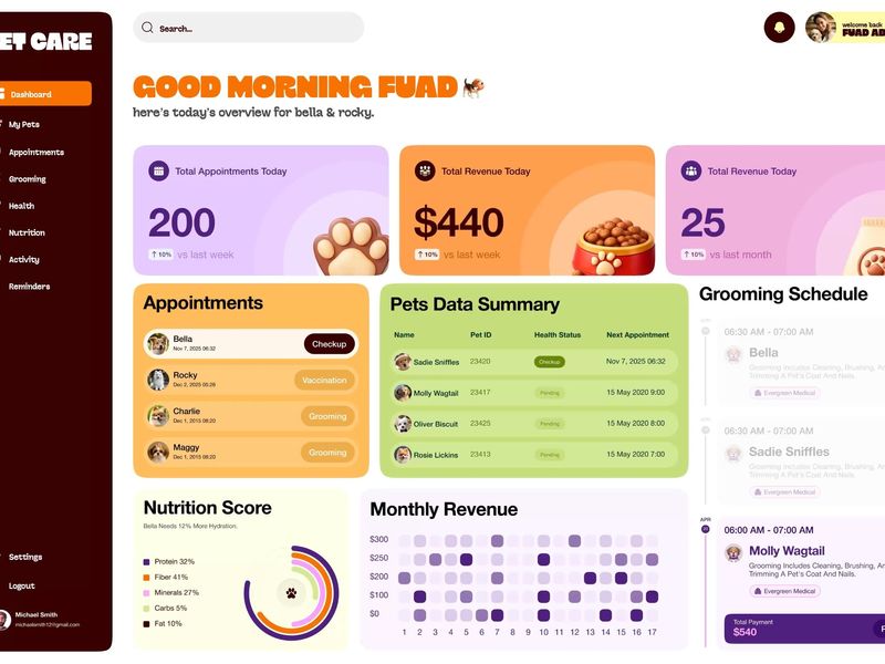
Pet Care Dashboard UI Motion Graphic Design
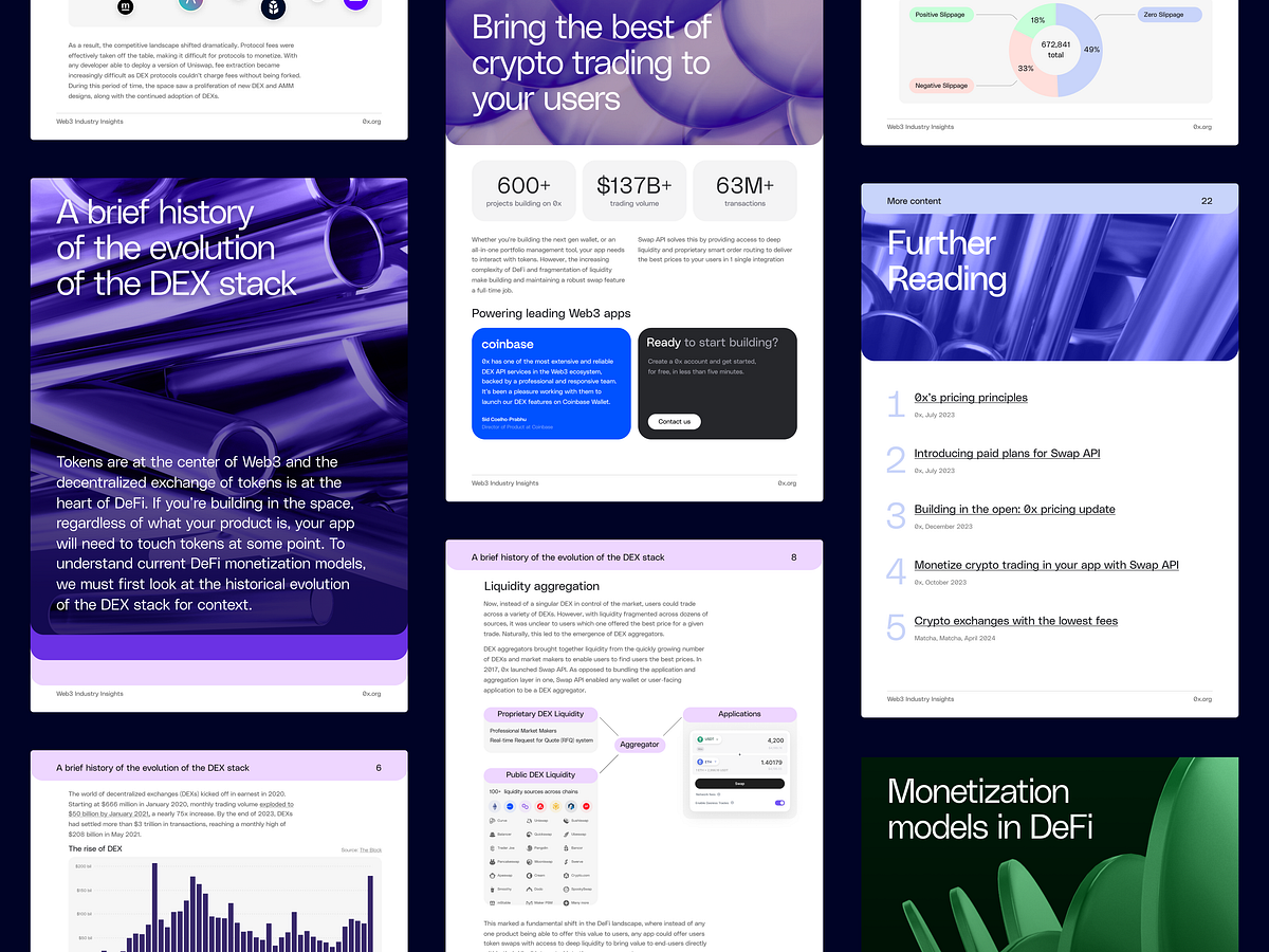
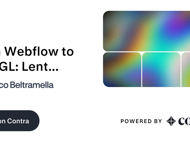
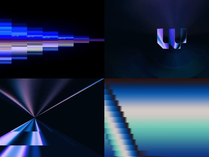
Case Study: Brand, Motion & Visual Design for Web3

Micro-Interactions & Motion Design — Lustro Showreel
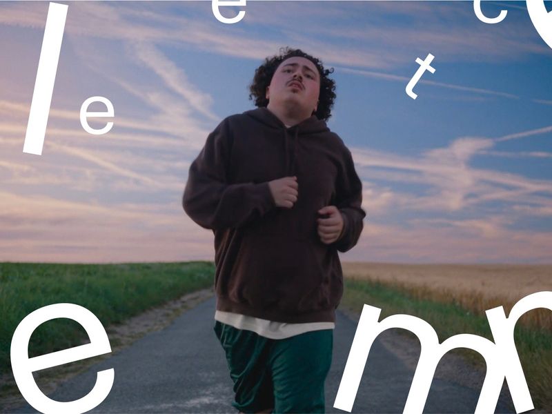
UI UX Design and Product Design Monthly Recap Motion Graphic
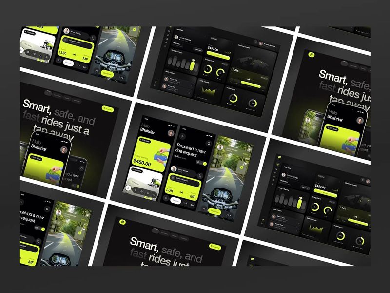
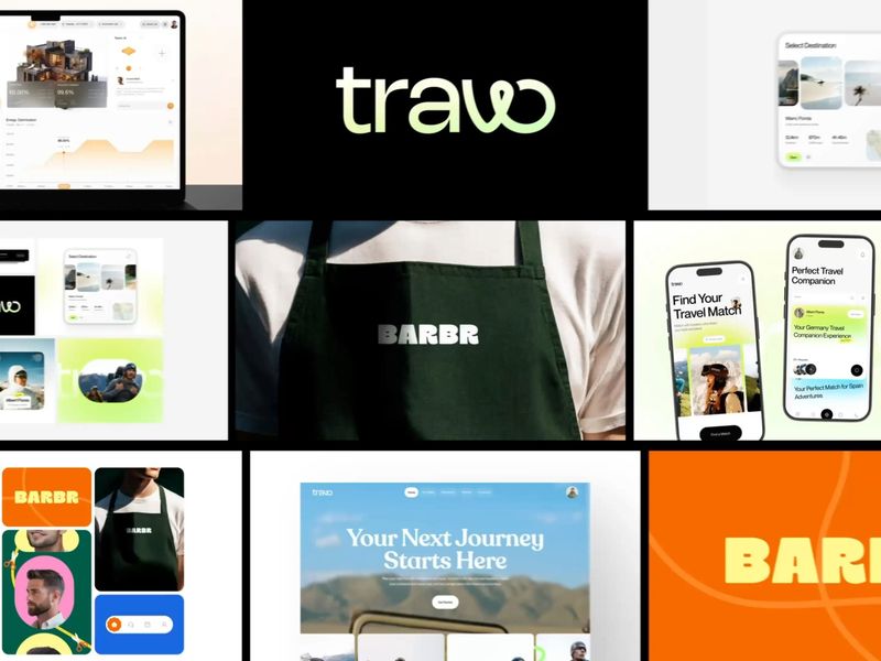
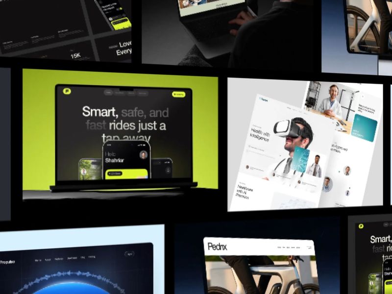
Farider - Ride Sharing Web, App & Dashboard Design in One Motion
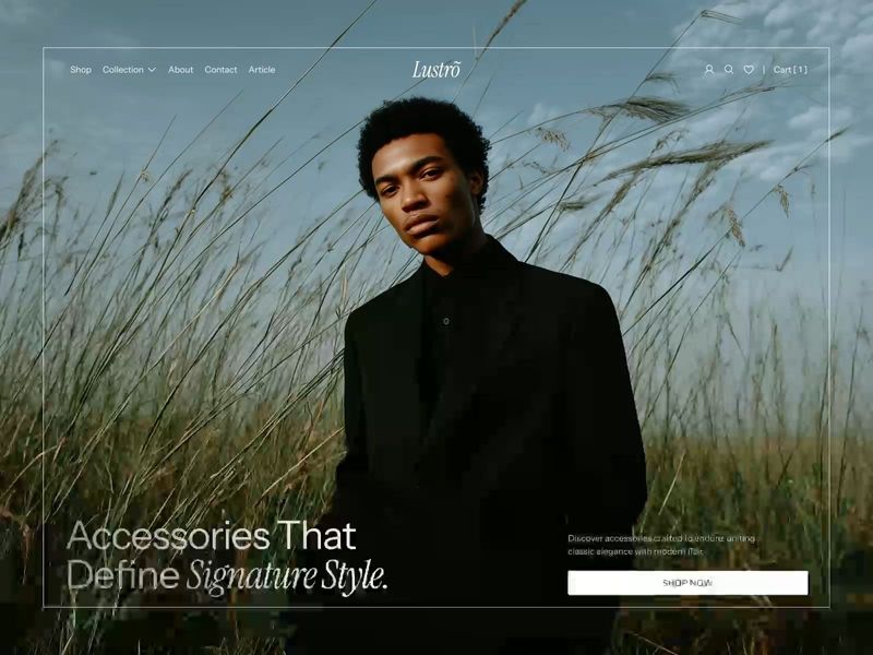
Micro-Interactions & Motion Design — Lustro Showreel
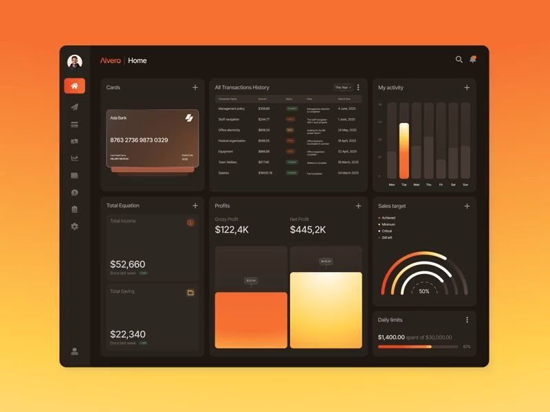
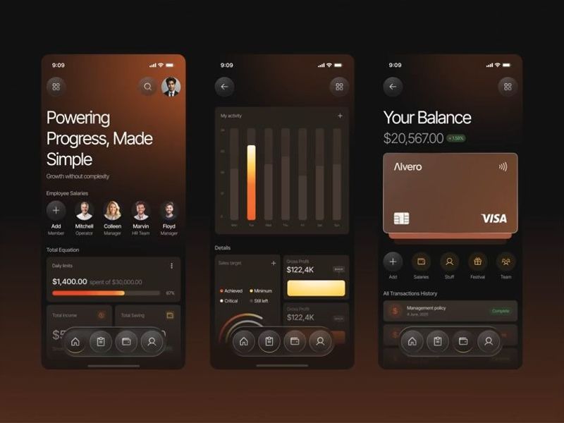
Fintech Dashboard Motion Design
SHOWREEL 2025 - Motion Design
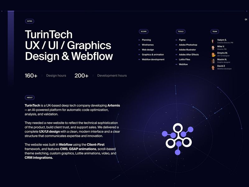
AI & ML Startup - Web Design, Motion, Graphics, Webflow
Finance Mobile App Motion Design for Fintech
Monthly Recap Motion | Branding, App, Dashboard and Web Design
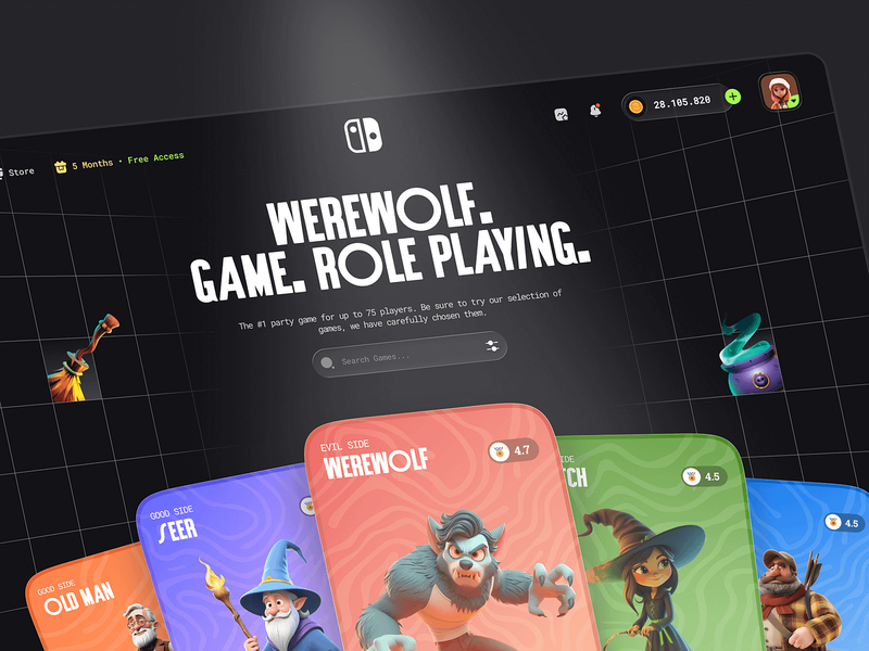
Gaming Website UI | Motion Web Design

Insporeel 2025 - The Best Motion Designs I’ve Ever Seen
Showreel Motion design
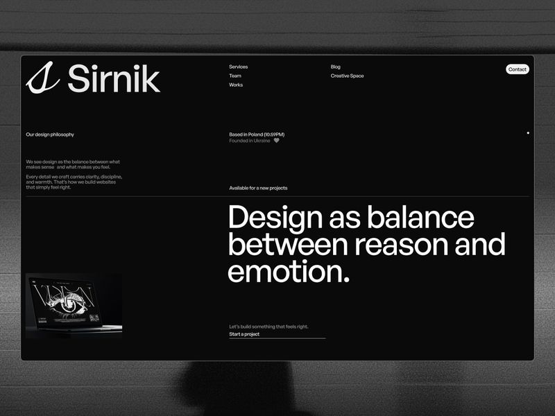
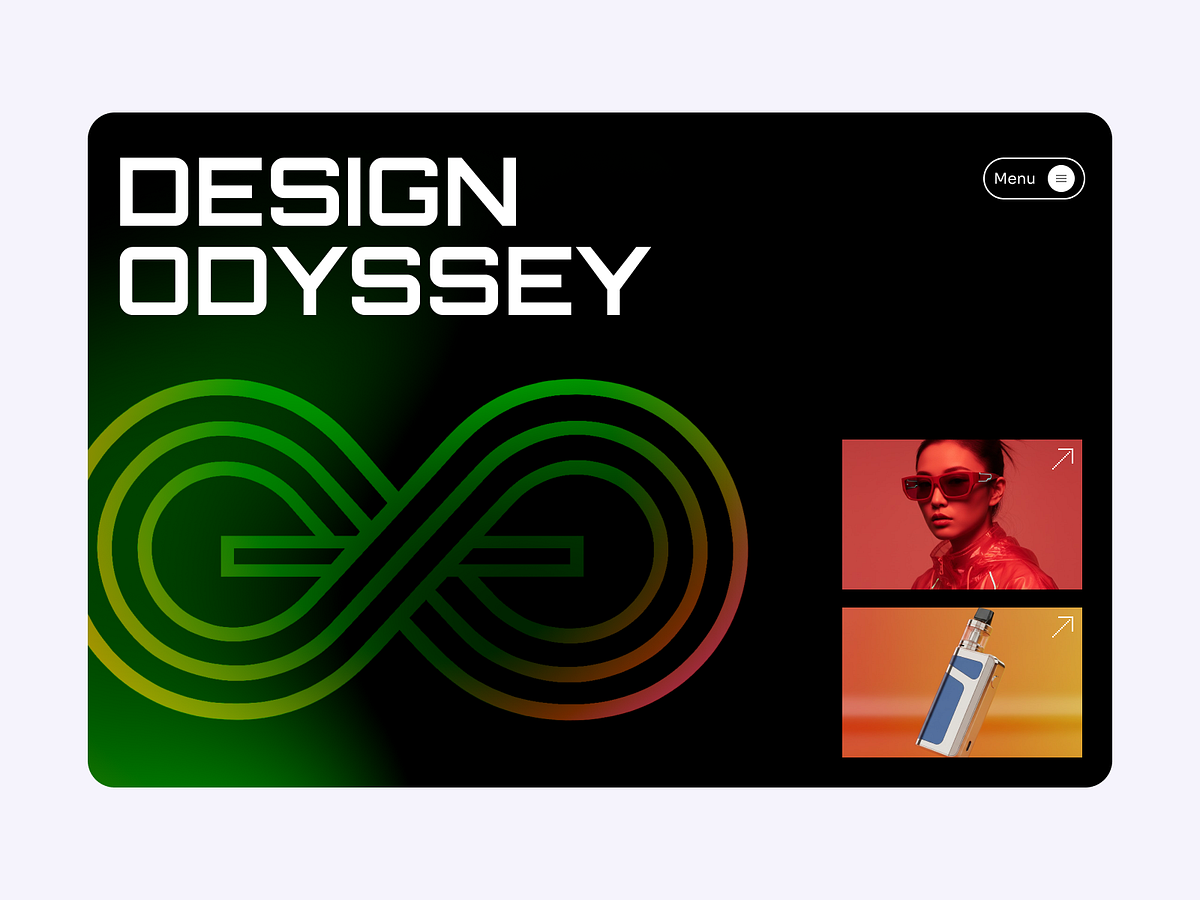
Sirnik — Design Between Reason and Emotion
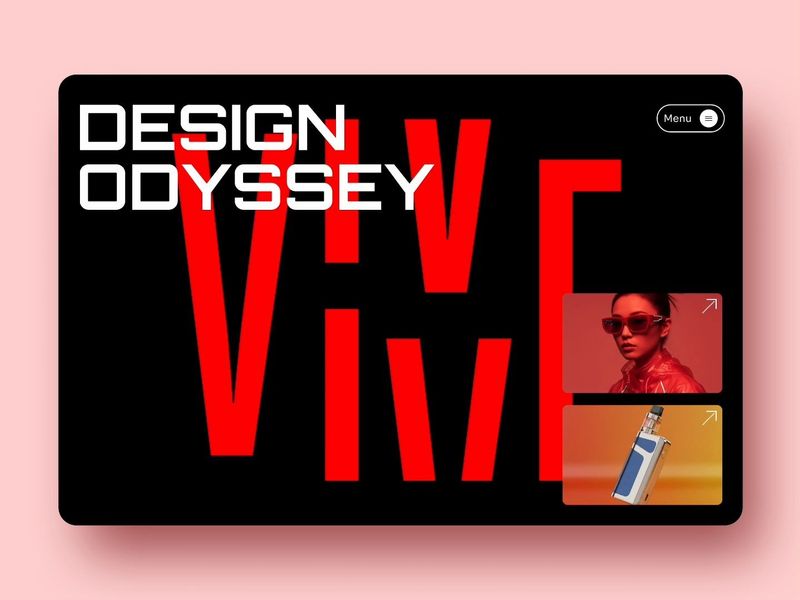
Layouts in motion
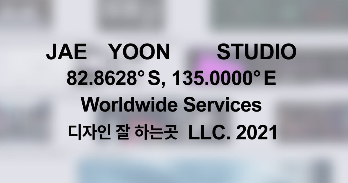
Jae Yoon Studio | Design & Motion Creative Lab
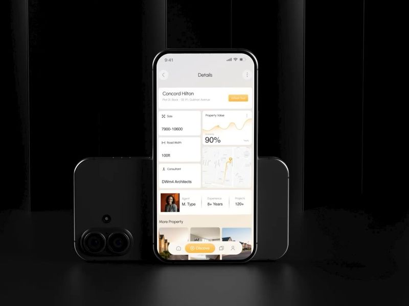
Real Estate Mobile App UI UX Design with Motion

Web3 crypto hero section 3d motion design
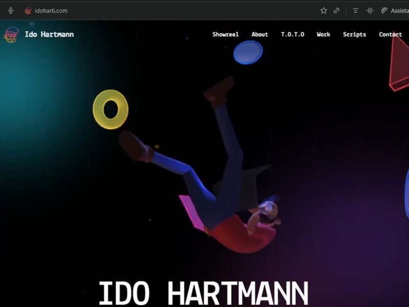
3D and Motion Design Portfolio | Ido Hartmann
Weekly Recap with Motion Design - Bento | Dashboard | Mobile app
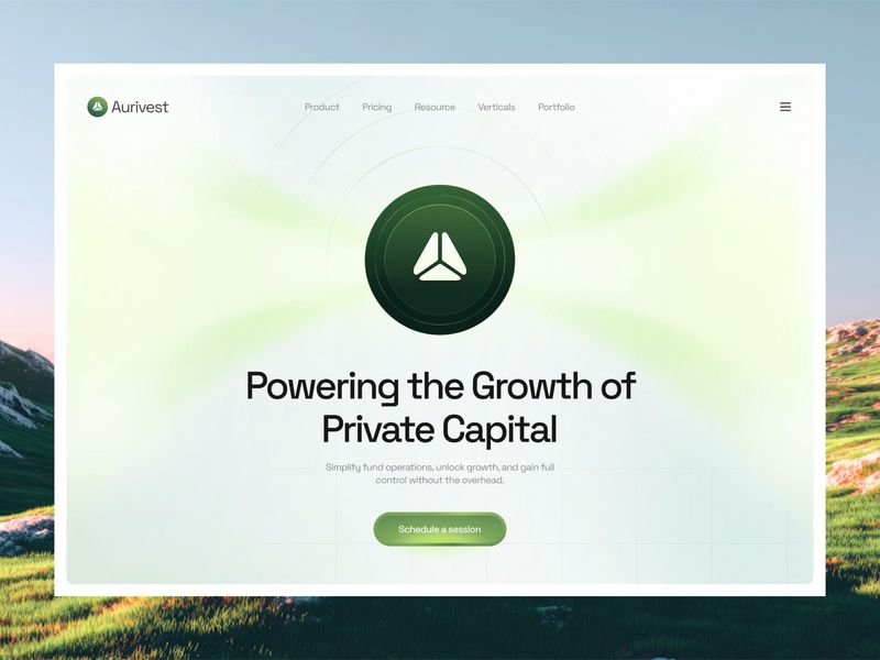
Aurivest - Fintech Investment Platform Website Motion Graphic
Website Design Weekly Recap with Motion by Taqwah
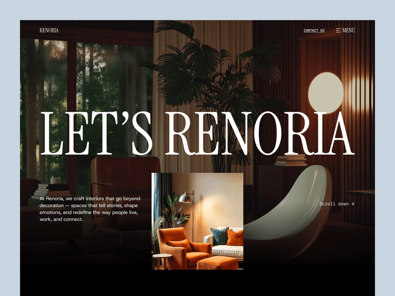
Renoria — Micro-Interactions & User Flow Motion
DESIGN Motion Definition
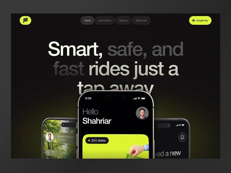
Ride Sharing Website Landing Page Design Motion Graphic
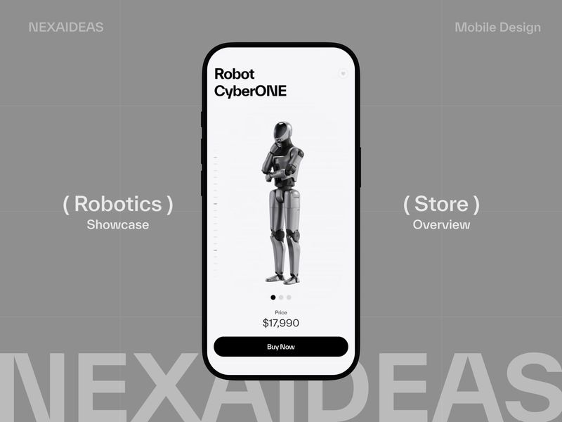
Robot Ecommerce Interface - Motion Study
Dashboard UI UX Design Recap with Motion Graphic
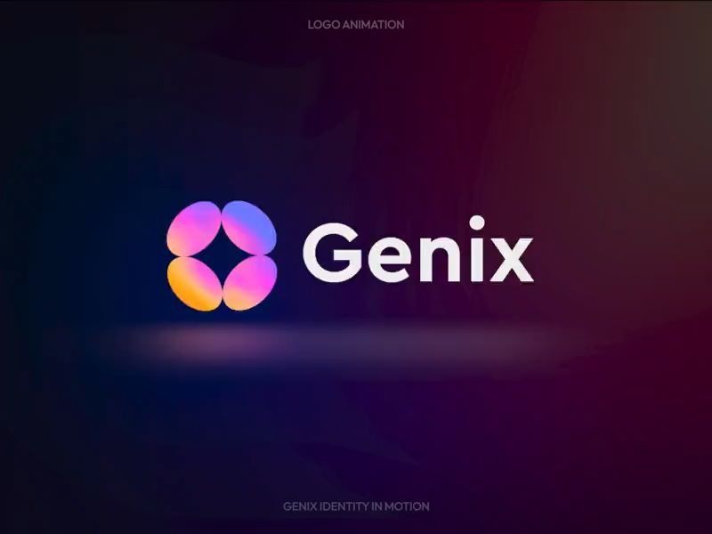
Genix Logo Motion
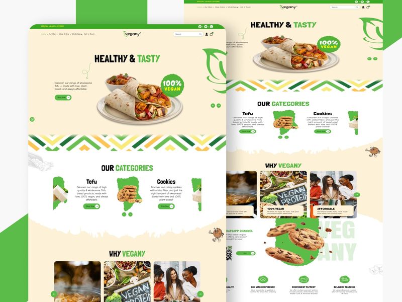
Organic Motion: A Vibrant Approach to Vegan eCommerce
Lenticular Motion Experiment
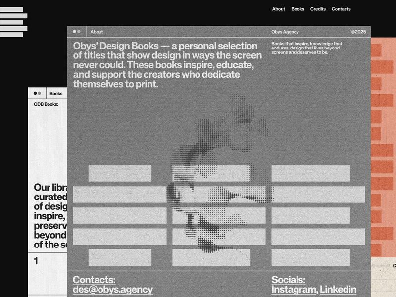
Obys' Design Books
Ashfall CCUS Motion Mockup
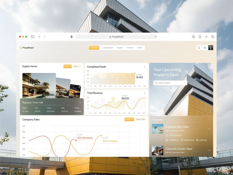
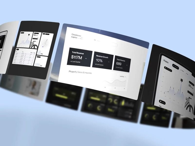
Real Estate Analytics Dashboard UI UX Motion Design

Motion Showreel 2025
Détroit - Motion
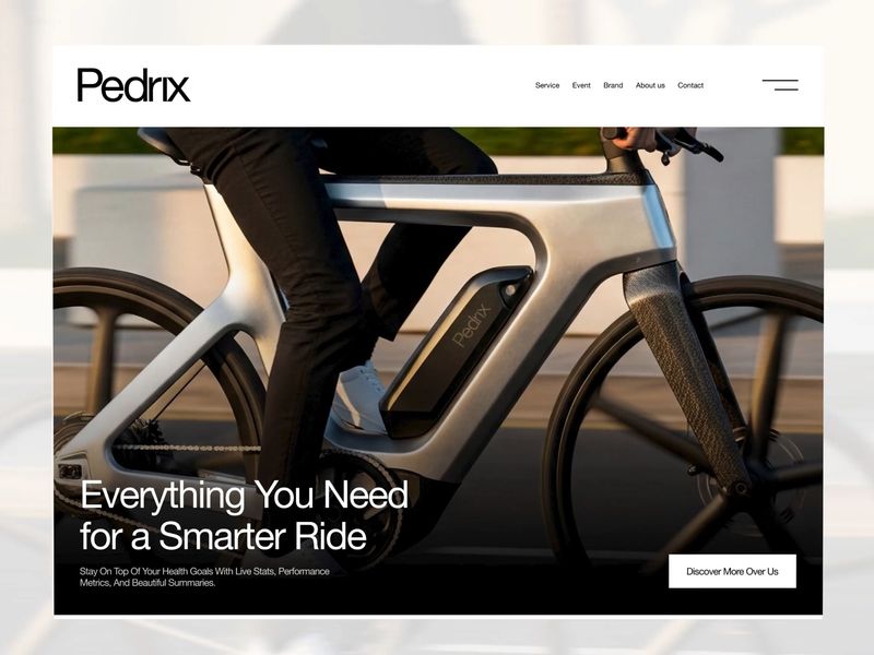
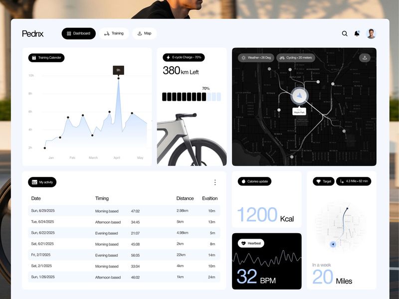
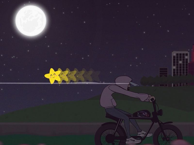
Pedrix - E Bike Website UI Motion
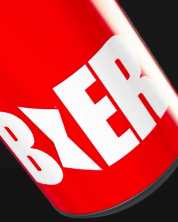
Budweiser - Beer Stomp Text Motion Graphics
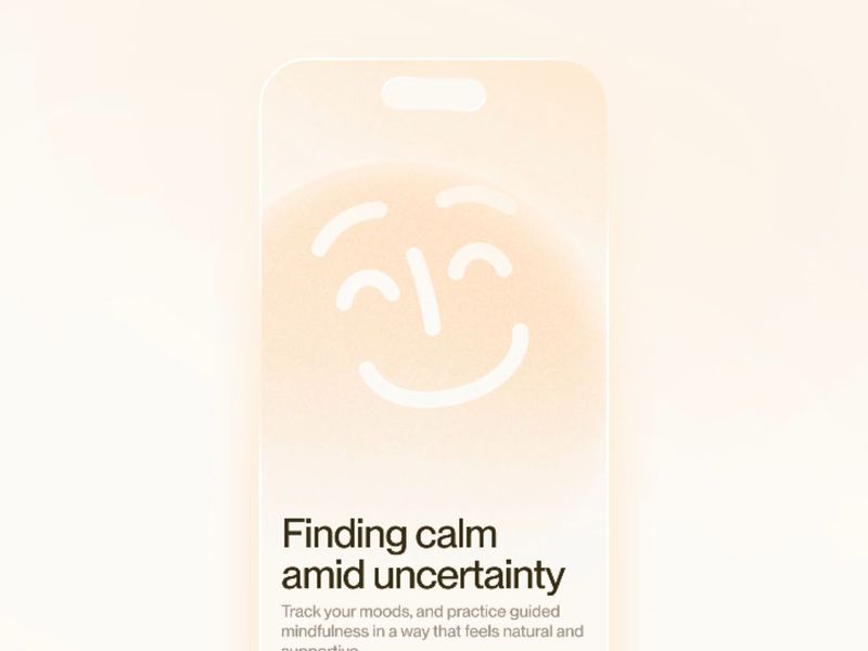
Animated Onboarding screen design for a mental health app.
Visual Identity Design Weekly Recap with Motion Graphics
Mobile App UI UX Design Highlights with Motion | Weekly Recap
Motion 05
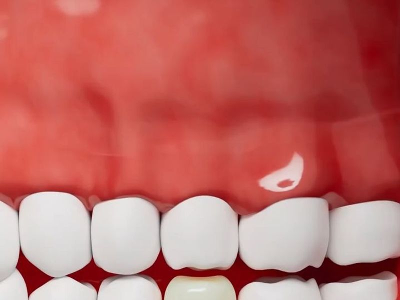
3D Motion | Implant Restoration - SMILUXE DENTAL
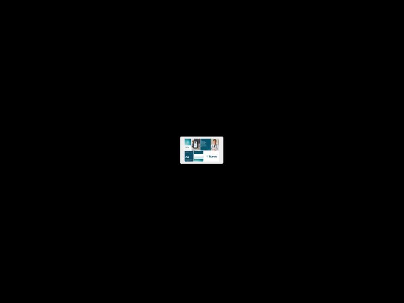
MenuXL
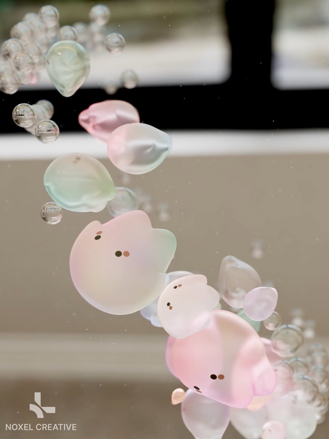
3D Motion | Iridescent dreams and tiny hauntings
Maxon One Brand Expression Film
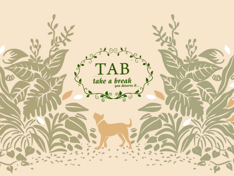
Take a Break - Web Experience | Liquidink Design

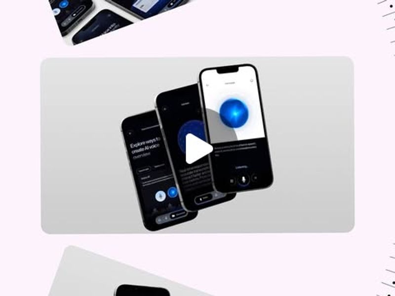
EXPLAINER MOTION | IgniteLens Dubai
Hey! Want to get a Figma file with my animated social media post designs? 🪩🐉
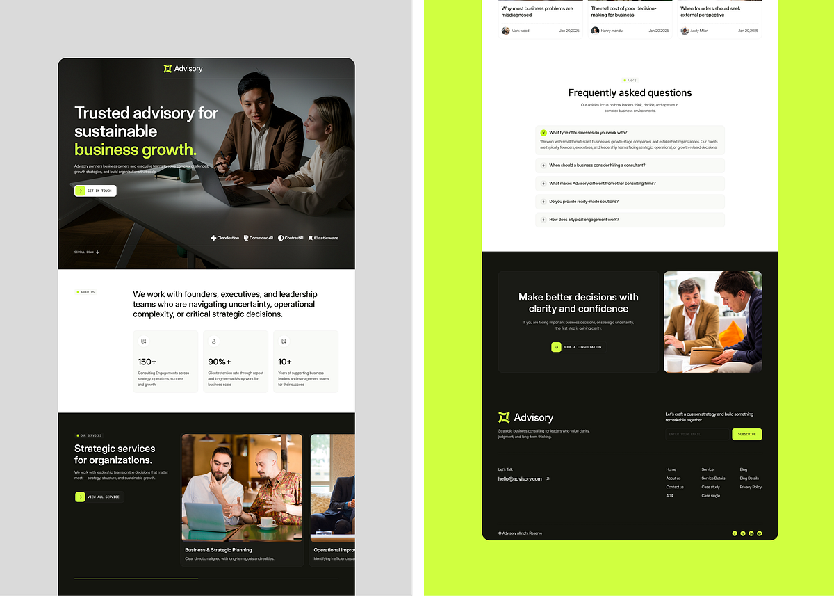
Advisory — UX Interactions & Motion Case Study
Motion Gradient Animation | Cavalry

Renoria — Micro-Interactions & User Flow Motion
![DESIGN PORTFOLIO REEL 2026 [VIDEO & WEBSITE]](https://files.muzli.cloud/b46ab510e0f6ef6fcc51abc7bcf76c6d_medium.jpeg?_cb=1770825311247)
DESIGN PORTFOLIO REEL 2026 [VIDEO & WEBSITE]
EL - Agency Hero Section Design
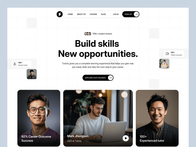
Tutorly - Online Learning & Course Platform UI Design
Taqwah's Yearly Recap 2025 | Bento, App, Dashboard, Web Design
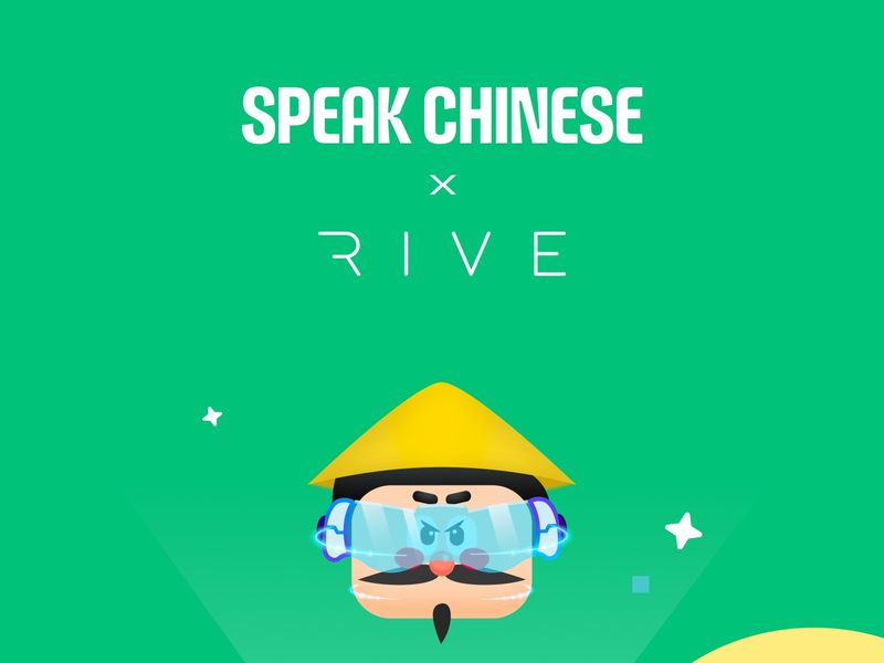
Interactive Learning Motion UI for Language App
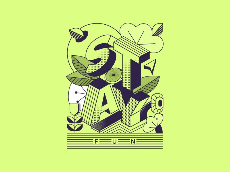
Stay fun!
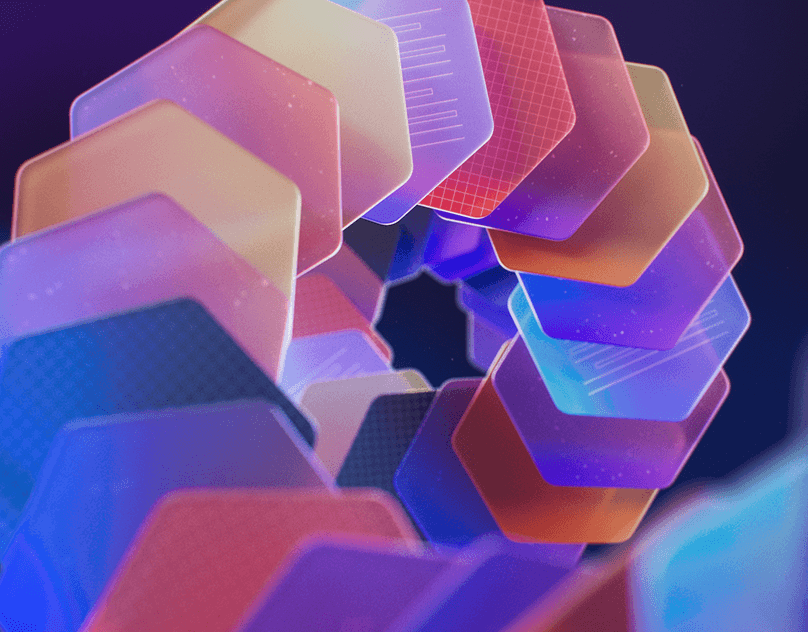
Brand Gradient Treatments
Brand Gradient Treatments
Get access to thousands of freshly updated design inspiration pieces by adding Muzli to your browser.
Loved by 800k designers worldwide, Muzli is the leading go-to browser extension for creative professionals.
How does motion design improve user interfaces and brand experiences?
Motion design serves communication, not decoration. In UI contexts, animation communicates state changes, spatial relationships, and feedback that static design cannot — a list item sliding out of view tells the user "this is gone" in a way that an instant disappearance does not. In brand contexts, motion expresses personality and character that static assets can only imply. The design discipline of motion is fundamentally about timing: the same visual transition can feel premium, playful, or mechanical depending entirely on the easing curve and duration chosen.
What are the fundamental principles of motion design applied to UI?
The classic 12 principles of animation translate directly to UI motion: squash and stretch (buttons slightly compress on press), anticipation (a drawer begins its open motion before reaching maximum velocity), follow-through (elements overshoot slightly on arrival, then settle), and secondary action (auxiliary elements respond to the primary action with slight delay). The most important UI motion principle is ease: all interface animations should use custom easing curves rather than linear movement — nothing in the physical world moves at constant velocity.
When should designers avoid adding animation to an interface?
The prefers-reduced-motion media query exists for a reason: vestibular disorders affect approximately 35% of adults over 40, and certain animation types trigger genuine physical symptoms in affected users. Beyond accessibility, animations should be skipped when they add latency to task completion (a 300ms animated page transition is a UX regression), when they don't add meaning beyond decoration, or when they create visual noise that competes with content. Test: describe what information this animation communicates. If you cannot articulate a specific informational purpose, remove it.