
5 Psychological Tricks to Use in Email Newsletter
Email marketing plays a big part in developing the brand. Whether you run an ordinary blog or hold the reins of a multinational estore, it is one of those...
The post 5 Psychological Tricks to Use in Email Newsletter appeared first on Onextrapixel.

Is the Email Newsletter Dead?

Mailchimp Email Newsletter Graphics

5 Reasons It’s Not Too Late to Start Your Email Newsletter
Have you been meaning to start a newsletter for a while? Below are 5 reasons it’s not too late – read this and craft your first edition today. Your mind can play tricks on you. You don’t want to exercise because it’s not the new year. You avoid calling that person because you don’t want...

Mailchimp | Flodesk | Klaviyo| Beehiiv | Email Newsletter Design
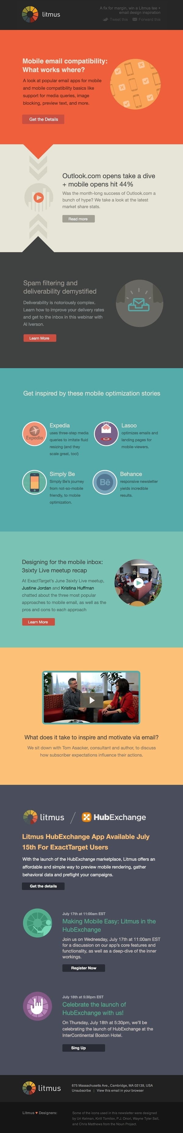
Litmus June newsletter #flat #email #minimalist #web #newsletter

Email Marketing for WordPress: Why is it Important and Which Newsletter Plugin to Use?
Ahh, email marketing. It’s the oldest way to market your product. But has it also become old-fashioned? In this age of social media marketing and chatbots, the debate has heated up on the relevance of email marketing. And yet, marketers continue to use it and swear by its benefits. So, should you include email marketing...
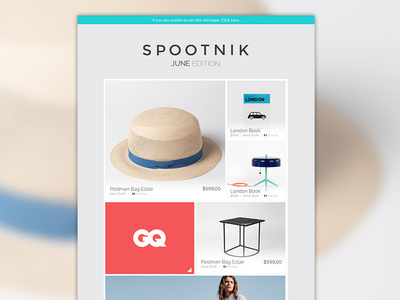
Spootnik #blocky #images #email #newsletter
Email Marketing for WordPress: Why is it Important and Which Newsletter Plugin to Use?
Ahh, email marketing. It’s the oldest way to market your product. But has it also become old-fashioned? In this age of social media marketing and chatbots, the debate has heated up on the relevance of email marketing. And yet, marketers continue to use it and swear by its benefits. So, should you include email marketing...
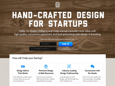
Startup Designer #resources #handcrafted #page #design #free #email #web #startups #landing #newsletter
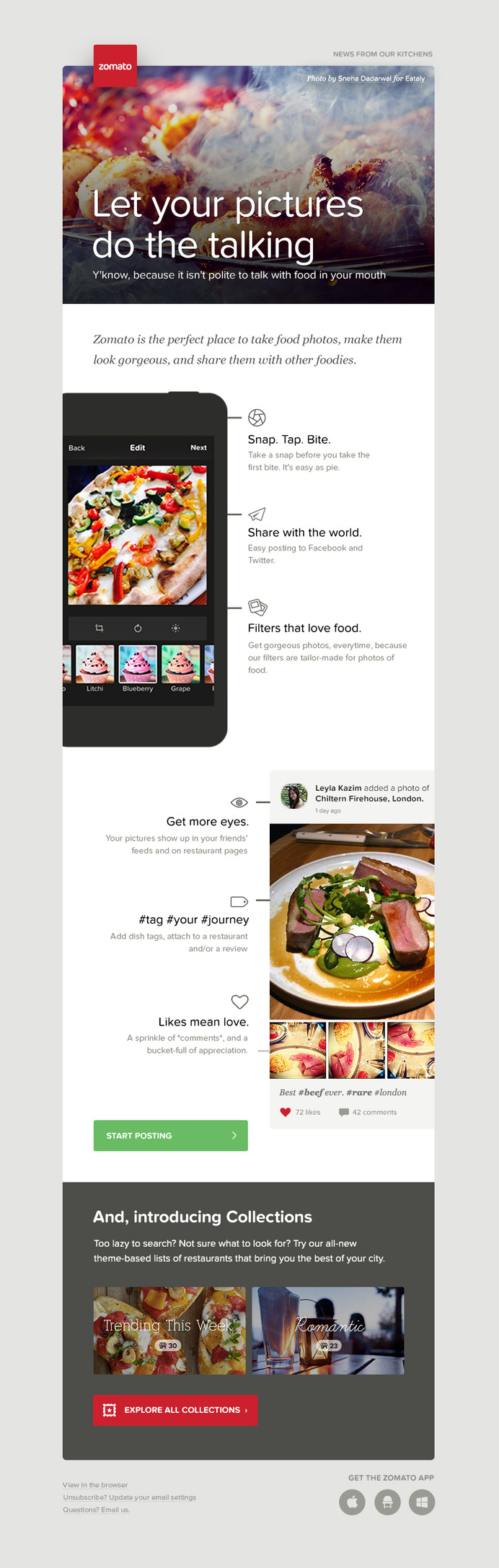
Mailer for Zomato by Juhi Chitravanshi #juhi #chitravanshi #design #clean #email #mail #mailer #web #newsletter
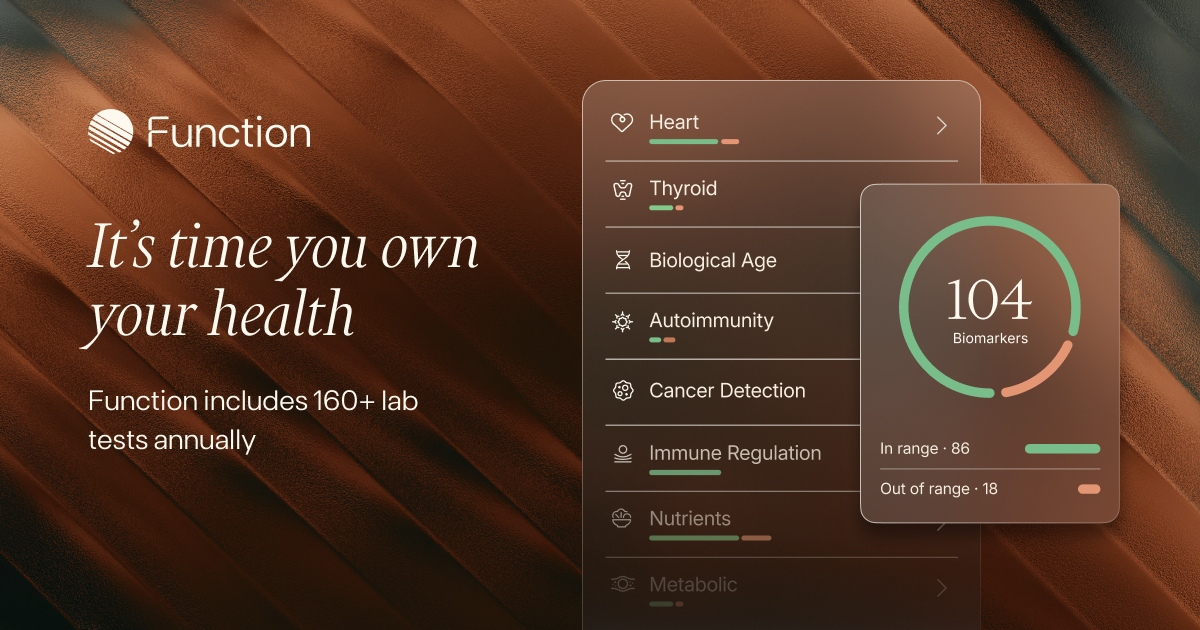
Function Health • 100 Healthy Years
Test your whole body and own your health. 100+ lab tests for the whole body including thyroid, hormones, fertility, autoimmunity, heart, kidney, liver and more. Insights from top doctors.
View full page on Landing Gallery
REKKI
Seamless order processing for suppliers and restaurants — cutting-edge tools to simplify your operations.
View full page on Landing Gallery

Scrintal
Scrintal is the most enjoyable way to shape ideas. Try the powerful canvas to go from ideas to insights.
View full page on Landing Gallery

Submagic
Submagic is an AI that crafts amazing captions with emojis for short-form content in under 2 minutes. Boost your video engagement effortlessly.
View full page on Landing Gallery

Missive · Inbox collaboration for teams that run on email
See what’s going on, know who’s doing what, and collaborate behind the scenes — without changing your workflow. Try for free!
View full page on Landing Gallery
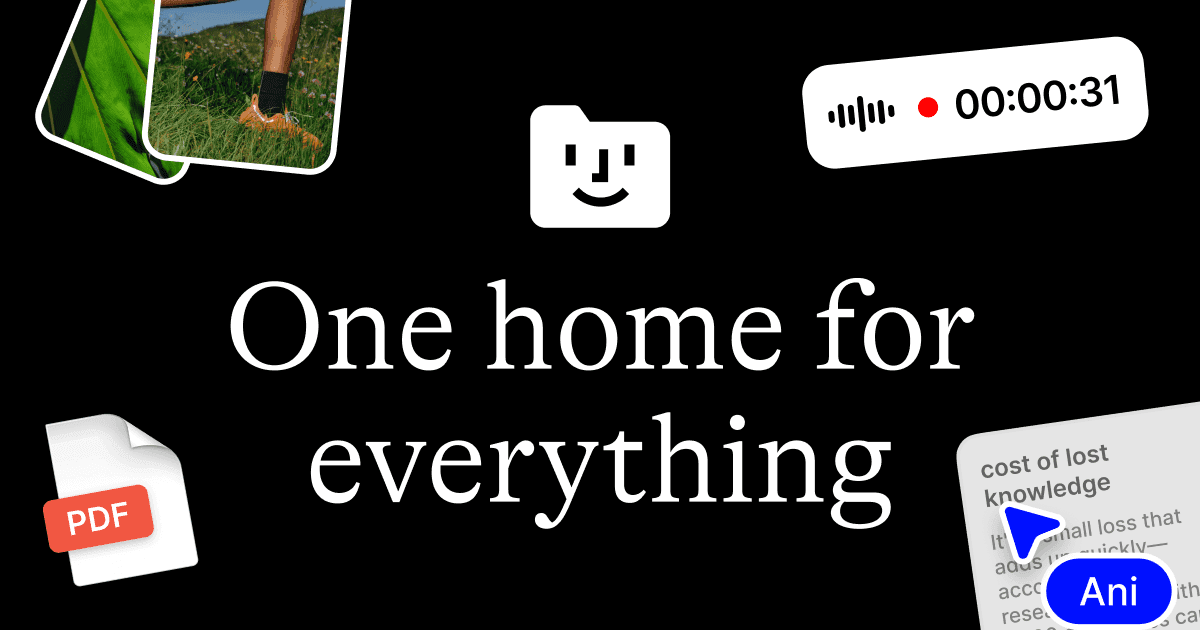
Fabric
One home for everything.
A file explorer and workspace for the internet age.
All your drives, clouds, notes, screenshots, links, and files automatically gathered into one self-organizing home.
Never forget anything again.
View full page on Landing Gallery
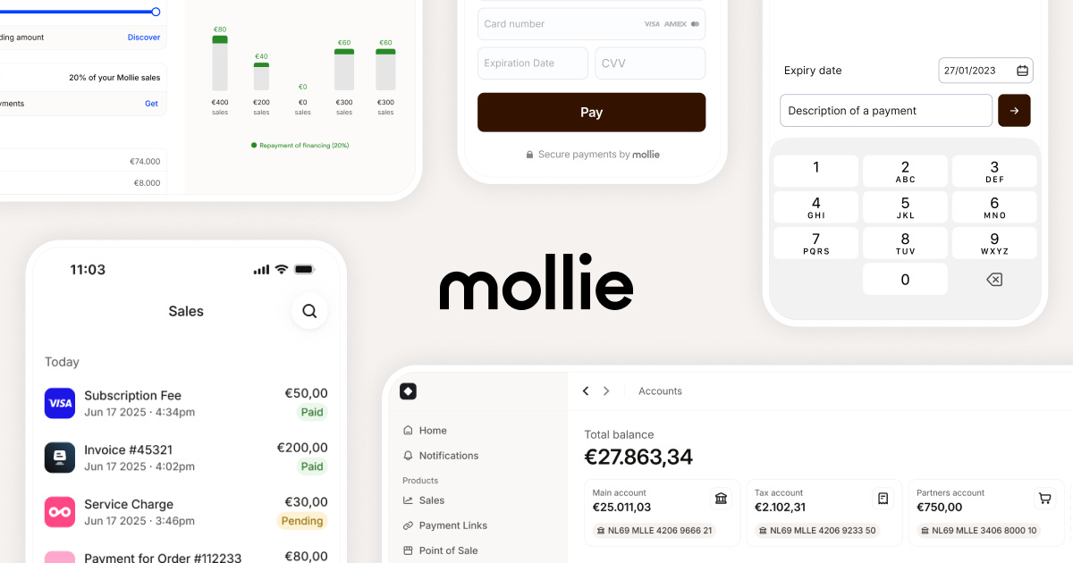
Mollie
Start growing your business with Mollie Payments, for online and in-person payments: ✓ Quick setup ✓ Honest pricing ✓ All leading payment methods. Start today »
View full page on Landing Gallery
.png)
Bridge
An entirely new payments platform, built with stablecoins, to simplify global money movement.
View full page on Landing Gallery

Bulletproof
The world‘s largest independent brand agency. We drive growth, standout and fandom for the world‘s most desirable brands.
View full page on Landing Gallery

Bee
View full page on Landing Gallery

Journey Digital
We're a global strategic design & technology agency helping leaders navigate complex digital transformation. Human-centred design meets AI-enabled solutions across Auckland and London.
View full page on Landing Gallery

Duna
Meet the modern platform that accelerates business onboarding, automates manual work and grows revenue.
View full page on Landing Gallery

Trait. Train uncommon.
Erreiche deine Laufziele mit Trait - der empathischen Lauftrainings-App, die dich inspiriert, dranzubleiben und den Spaß am Laufen zu entdecken. Unser Ansatz basiert auf kollektiven Prinzipien, Wissenschaft und individueller Anpassung, um deinen Trainingsweg zu unterstützen.
View full page on Landing Gallery
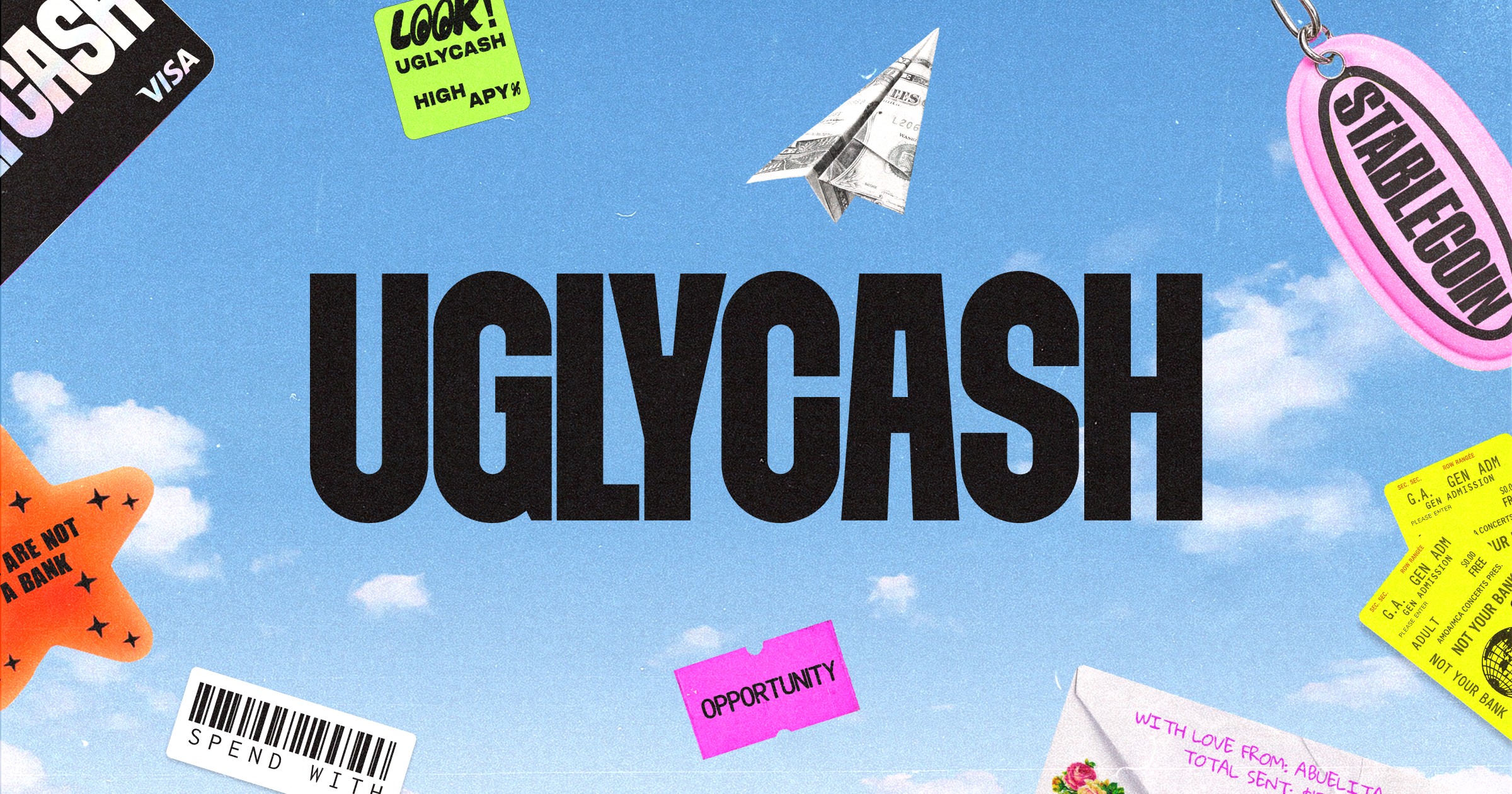
UGLYCASH
America's Stablecoin App
View full page on Landing Gallery
kit:
A curated range of high-quality, conscious formulated products built for skin & the world it’s in.
View full page on Landing Gallery

WILL SMITH
Based On A True Story - The Tour
View full page on Landing Gallery
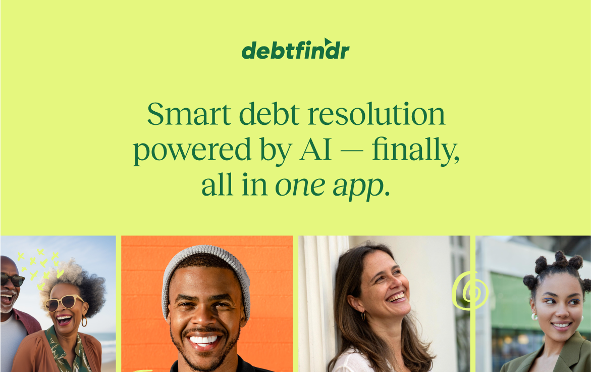
Debtfindr
Find out exactly what you owe — and let our intelligent assistant help you negotiate a better way forward.
View full page on Landing Gallery

Freewrite Valentine
In a world filled with digital distractions, Freewrite Valentine brings back the timeless art of writing from the heart.
View full page on Landing Gallery

Small Business Accounting Solutions
Uplinq Accounting offers comprehensive financial solutions for startups and SMEs. From tax planning to real-time bookkeeping, we guide you through each financial milestone. Simplify your small businesses accounting journey with Uplinq.
View full page on Landing Gallery

Scribe
Install and update your team signatures in one click. Promote your brand. Boost lead generation by up to 14%. Trusted by 500+ Marketing, Sales and IT teams worldwide. Create your signature for free.
View full page on Landing Gallery
WORK LOUDER®
Work Louder make products for people, inspired by a version of themselves sometimes forgotten - playful, versatile, and above all else, creative.
View full page on Landing Gallery

Landing
Otter matches parents who need care with trusted sitters in their community, on-demand.
View full page on Landing Gallery
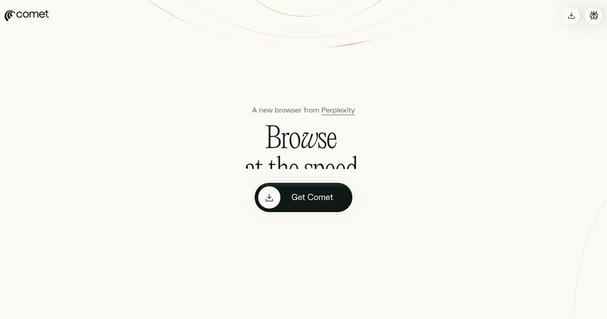
Perplexity Comet
Browse at the speed of thought.
View full page on Landing Gallery
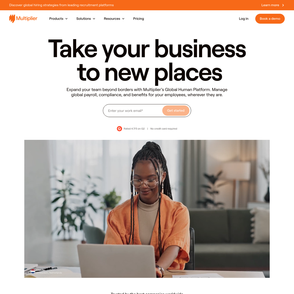
Multiplier
View full page on Landing Gallery
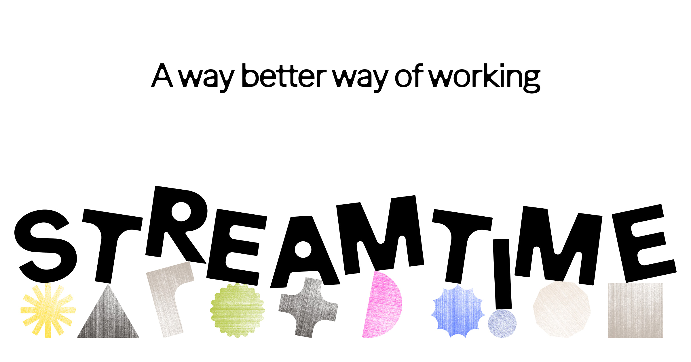
Streamtime
Project management software for creative teams, design studios and businesses. Plan jobs, track time, schedule your teams, quote and invoice and report on client and project profitability.
View full page on Landing Gallery
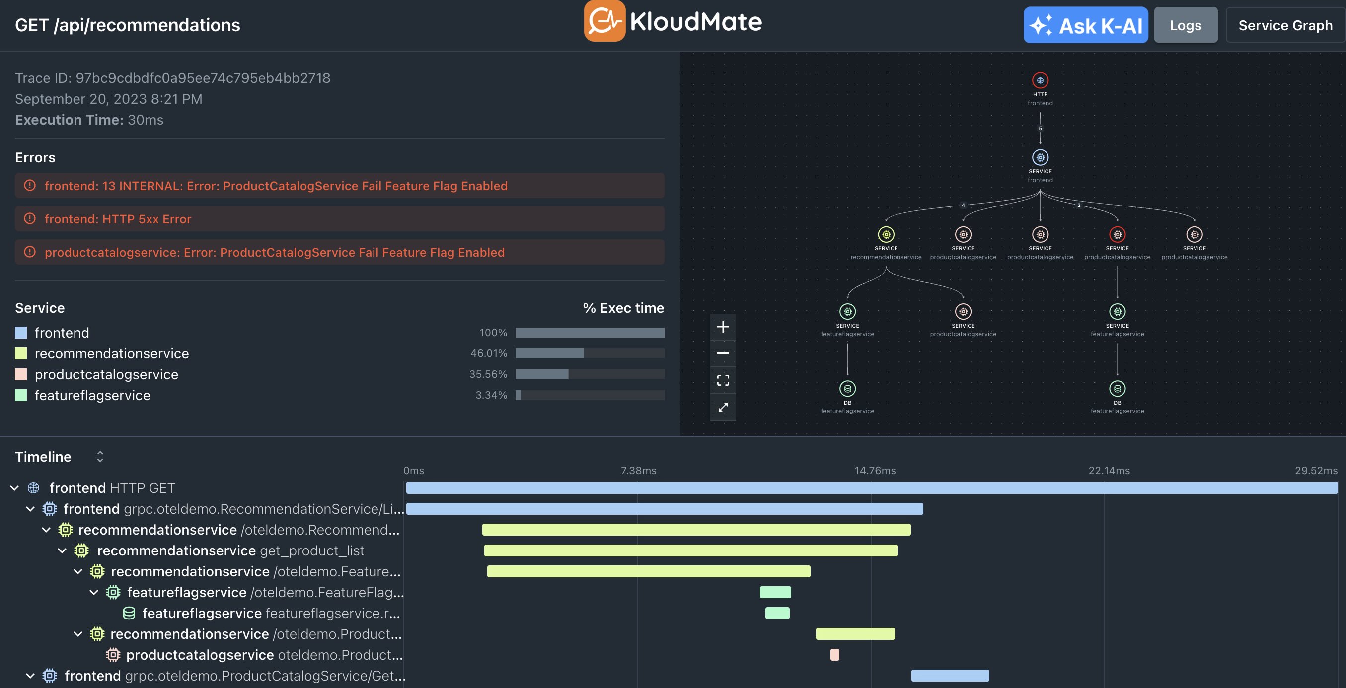
KloudMate
Application Performance Monitoring and Observability platform for microservices-based distributed applications. Create dashboards, analyze logs, trace requests, monitor errors, setup alarms and get insightful metrics. Get started for free!
View full page on Landing Gallery

Joi Planner
Minimalistic daily planner
View full page on Landing Gallery

Mesh Architects
Hello. We’re Mesh Architects. We design great places that lift your spirits. We bring together creative thinking and masses of experience to give our clients exciting ideas and frank advice. Our goal is to make buildings that are more than our clients hoped they would be.
View full page on Landing Gallery

Delphi
Delphi turns your expertise into an always-on presence, so you can grow your reach, serve your audience, and lead with clarity, without burning out.
View full page on Landing Gallery
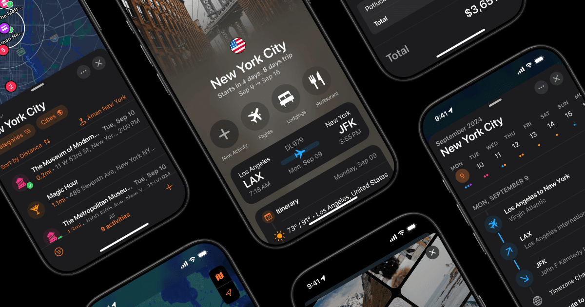
Tripsy
The Ultimate Travel Companion – Tripsy is a travel planner that helps you plan your entire trip in one place. You can share your itinerary with family and friends, get flight alerts, store documents, and make wish lists of places to visit.
View full page on Landing Gallery
Datalands
We give shape to complex ideas—transform knowledge into narratives—for brands & for people.
View full page on Landing Gallery

Mintlify
Meet the modern standard for public facing documentation. Beautiful out of the box, easy to maintain, and optimized for user engagement.
View full page on Landing Gallery

32 newsletter design ideas to get your subscribers clicking
Take a look at your email inbox right now. Chances are, there’s at least one newsletter from a company you’ve…
The post 32 newsletter design ideas to get your subscribers clicking appeared first on 99designs.

Samuel Angibaud
Samuel Angibaud is a creative specialized in Design and Photography, based in Paris, France.
View full page on Landing Gallery
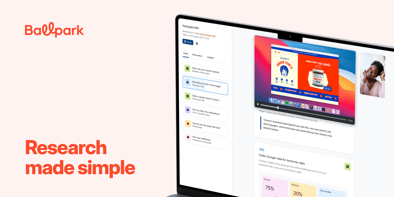
Ballpark
Ballpark is the fastest way to capture high-quality feedback on product questions, marketing copy, designs and Figma prototypes.
View full page on Landing Gallery

Paintboxed
Paintboxed is the World’s First Major Retrospective on the Quantel Paintbox Era.
View full page on Landing Gallery
For The People
For The People is a creatively independent brand agency that exists to build better brands that are as unique, compelling, soulful, textured, surprising and
engaging as the people they exist to serve.
View full page on Landing Gallery

Follow
Follow is a collective of innovative minds dedicated to enhancing your brand's presence on social media. Our team crafts intricate strategies and inventive ideas to ensure your message resonates with your audience.
View full page on Landing Gallery

CleanSpace
CleanSpace delivers precision-engineered clean, cold, and dry rooms with guaranteed costs and timelines. Our CleanFit process ensures reliability.
View full page on Landing Gallery

Deleito
Deleito propone un concepto de street food de calidad mediterránea. Abre las puertas del cielo en nuestros restaurantes, en tus eventos y también desde casa. Deleito, Santo Sabor.
View full page on Landing Gallery
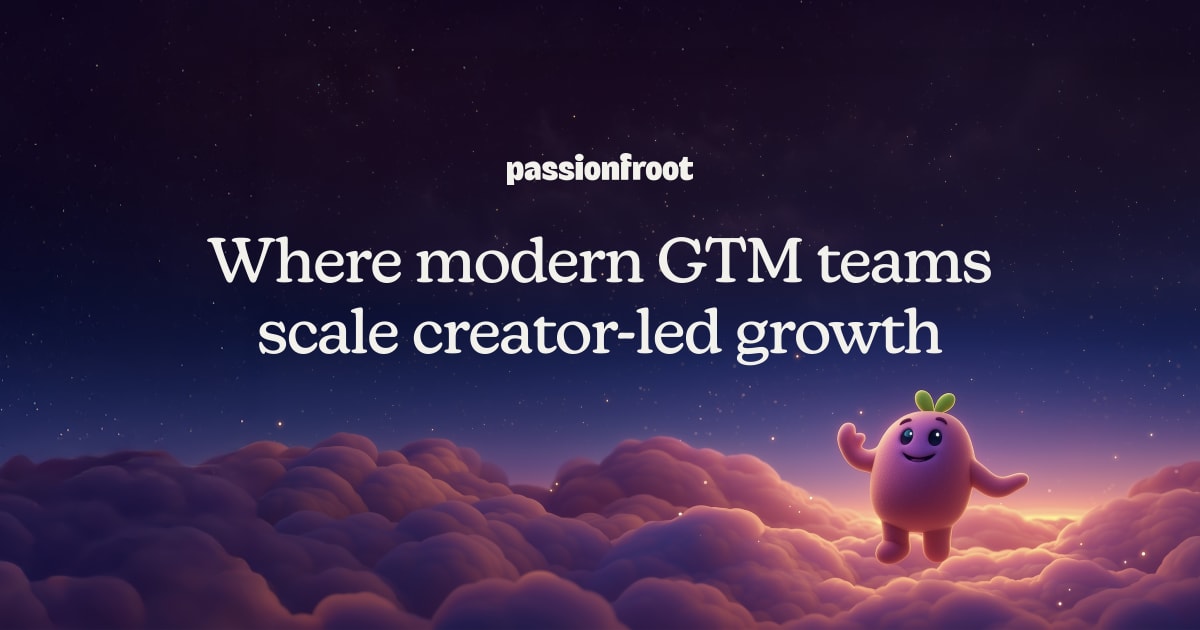
Passionfroot I Where tech brands scale influencer marketing
Meet the fastest and easiest way to do B2B creator marketing at scale. Find the right creators on all platforms, book & collaborate, pay quickly & safely - all in one place.
View full page on Landing Gallery

DIA
DIA stands as a leading management agency that represents influential talents and delivers full-service solutions for brands. Our mission is to deliver exclusive, comprehensive and innovative solutions for talents and brands within the digital media space
View full page on Landing Gallery

Glyphic
Glyphic analyzes customer interactions and provides insights into sales pipelines, helping businesses optimize revenue strategies and increase conversion rates.
View full page on Landing Gallery

Justin Bettman
Justin Bettman is a Los Angeles-based advertising and editorial photographer known for his cinematic, highly stylized imagery. His work transforms crafted environments into immersive narratives, blending surreal storytelling with bold compositions.
View full page on Landing Gallery

Wave AI Note Taker
Wave is an AI-powered note-taking app that helps you record, transcribe, and summarize meetings and conversations.
View full page on Landing Gallery

30 Free Responsive Newsletter Templates for Your Marketing Campaigns in 2025
We have a fantastic collection of easy-to-edit HTML email and newsletter templates that work across all clients and are all responsive.
The post 30 Free Responsive Email & Newsletter Templates appeared first on Speckyboy Design Magazine.

Cradle
Leverage AI to generate protein candidates and improve their properties. More breakthroughs in fewer experiments — guided by your own experimental data.
View full page on Landing Gallery

Onward: Programs and Tools to Build Inclusive Organizational Cultures
Onward offers professional consulting to high-impact partners and operates an R&D lab, using human-centered design to dismantle systems of oppression.
View full page on Landing Gallery

PlayerZero
Predictive software quality platform that deeply understands code across entire systems, predicting failures before they happen and continuously learning to strengthen software resilience.
View full page on Landing Gallery
PlayerZero