90s Look is Coming Back - Graphic Design Collection
90s Look is Coming Back - Graphic Design Collection
abduzeedoFeb 19, 2019
We have been posting a series of posts featuring graphic design and web design work that, in a way, brings back the 90s in terms of aesthetics and style. It’s hard to define that, it might vary from person to person. For me, while the 80s was all about neon, futuristic computer-generated images with chrome, unicorns running across a digital grid, and of course the RGB colors. The 90s is the complete destruction of the form. Typography is pushed to the limit of being even legible, forms are deformed and distorted. You also notice some effects like when the CMYK colors are printed with problems in the alignment, with color leaks, light leaks, textures, and dirt.
For this post, I would love to share some examples of this style. They are not from the 90s per se, however, they illustrate quite well what I just describe. Make sure to click on the link to visit the authors. Disclaimer, they are images I found on Pinterest.
90s Graphic Design Look

Artificial Intelligence for graphic design: how good are they in 2022?
Have you worried that AI would automate away graphic design jobs? Instead of worrying, let’s stay present and examine the latest results of graphic designs created by AI. The results mentioned below are from research papers published in top-tier computer science conferences or journals. (The reference is at the end.)Outline:Graphic designs created by AIHow does AI create designs (an explanation without math)Limitations of current AI modelsGraphic designs created by AIIn 2018, an artwork created by AI was sold in an auction at $432,500. By contrast, an unsung hero: an AI design system called Luban developed by Alibaba (an e-commerce giant), already delivered billions of banners/posters for customers! [watch the demo]The art created by AI (Picture adapted from NY Times)Recently, researchers proposed a new AI design system called Vinci[1]. They compared Vinci with Luban and professional human designers in the same design task: create a poster for given product images and text. Here are some examples:To evaluate the designs quantitatively, they recruited 50 designers and 50 non-designers to rate the design quality from “very good (5)” to “very poor (1)”. And here are the results:(left): average ratings from designers; (right): average ratings from non-designers. **: p The left image is the average rating from the designer judges, and the right image is from non-designer judges. In both judge groups, human designers receive only slightly higher scores than Vinci. The difference is not statistically significant, which means we can’t tell whether human designers are better than Vinci. However, both human designers and Vinci are statistically better than Luban.Researchers have also developed AI design systems to generate magazine layouts based on keywords and categories[2].Diverse design layouts generated by AIAlthough sometimes it stumbles, resulting in text occluding essential parts of the image:failure cases of AIHow does AI create designs (an explanation without math)Both models mentioned above rely on generative neural networks. For example, suppose we have a dataset of dog and non-dog images. After training, a discriminative model will predict whether a new image contains a dog. In contrast, a generative model will generate images that look like a dog.The training process is similar to how a human learns design: AI tries to reproduce the designs in the training dataset and tweak its design by minimizing the difference between generated and real designs. Researchers could also incorporate explicit rules to force the AI to consider specific design guidelines, e.g., reduce occlusion and maximize layout diversity. But AI could also possibly learn those rules implicitly after seeing some examples. For example, Vinci is trained on 2k+ posters, while the magazine layout design system is trained on ~4k magazine pages.Limitations of current AI modelsGeneralist vs. specialist: all of Vinci’s training data are about food, limiting its ability to generate high-quality designs in other areas. To be a generalist requires more training data. Luban has seen billions of posters, so it’s a generalist. Still, human designers outperform Luban when it comes to a specific theme.Font-face design: currently, it’s not supported by Vinci.Violate design guidelines (without knowing it): AI sometimes generates layout with misalignment and occlusion in the magazine layout generation experiments.Reference:Vinci: An Intelligent Graphic Design System for Generating Advertising Posters [video]Content-aware Generative Modeling of Graphic Design LayoutsArtificial Intelligence for graphic design: how good are they in 2022? was originally published in Muzli - Design Inspiration on Medium, where people are continuing the conversation by highlighting and responding to this story.
An Exploration of the 80s Retro Style in Modern Web Design
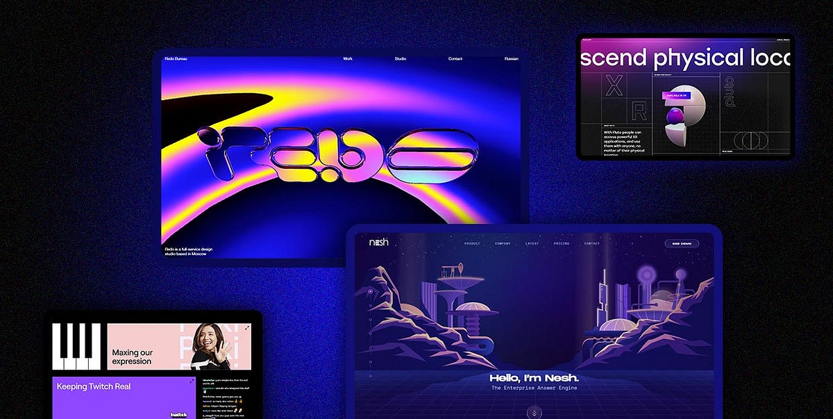
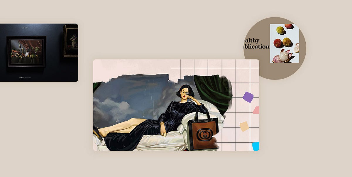
The 1980s are often remembered as an era that left an indelible mark on pop culture, music, and technology. After all, it did give us Metallica, New Order, Run DMC, Public Enemy, Madonna, and many other big names that continue to influence generations to this day. This was also the time when MTV was launched, changing the music industry forever. Meanwhile, “E.T. the Extra-Terrestrial”, “Back to the Future”, “Blade Runner”, “Ghostbusters”, and “Return of the Jedi” dominated the box office. Consumerism and materialism were on the rise. People wore oversized blazers, shoulder pads, biker jackets, and had permed hair. It was all about bold styles and loud colors to attract everyone’s attention.During the 80s, the first Nintendo GameBoy was made, VHS became all the rage, and Apple introduced the original Macintosh, bringing a graphic user interface (GUI) to the masses. The golden age of arcade video games marked the start of the 80s, with Pac-Man becoming one of the most popular arcade games from this period.One particularly important creation from the 80s era is the AutoCad software, which was released in 1982. It allowed creatives more room for experimentation, enabling them to manipulate colors, shapes, and layouts. Much like the fashion of the time, graphic designs were pretty vibrant as well. Bold fonts, loud and neon colors, geometric shapes, as well as futuristic themes were a big thing. Cyberpunk became more mainstream and so did the Neon Noir style. Designers often combined bright colors with dark backgrounds and dynamic lightning, creating mysterious and sometimes even grim scenarios.We could talk ad infinitum about the significant creations and discoveries made in the 80s, but it’s time we showed you how this distinct aesthetic looks in a modern-day scenario. We’re all witness to the explosion of the 80s aesthetic in contemporary pop culture. It seems like everywhere you turn there’s a new show or movie set in the 80s, pixel art is experiencing its own small renaissance, and you can even find hints of 80s fashion seeping through the cracks. But it goes beyond just pop culture, as we’re witnessing some major brands and businesses embracing the 80s aesthetic. And these websites prove that the retro beauty of 80s design can seamlessly blend into contemporary landscapes. The examples we will discuss include:Redo BureauTwitchNeshPluto AppThe Deliciously Dark EscapeMiu Miu — Twist: The GameMSI — The Match MakerPGS Software — Block RageZooxBlobmixerGucci Mascara HuntRedo BureauRedo Bureau is a full-service web design studio based in Moscow. Their homepage is nothing short of impressive, depicting the studio’s logo as polished letters. Their surface is smooth as if made of metal, reflecting the colors of the surrounding background. By moving their mouse around, viewers can observe the letters from several different perspectives, each colored in a unique palette. At one point, the typography reflects the ultraviolet shades only to switch to neon yellow and vibrant pink. The transitions from one hue to the next and the possibility of observing the logo from several points of view make the page appear exhilarating for the user. The fact that the homepage consists of nothing but this one section isn’t surprising — its strikingness and authenticity alone are enough to ensure a terrific introduction to the brand. Inner pages are way simpler, with black and white backgrounds contrasting the vivaciousness and complexity of the homepage.TwitchTwitch is a popular video live streaming platform. Their stunning website exemplifies the perfect blend of retro aesthetic and contemporary design trends. One of the first eye-catching elements you will come across is the brand’s logo. As you scroll, its size increases, until it takes up almost the entire page. Moreover, as the typography grows larger, the 3D trace behind the letters becomes bigger, revealing a gorgeous gradient of purple, pink, and yellow shades. This aesthetic has a pronounced 80s character that beautifully complements the mono-linear geometric typeface. The website is devised mostly using the company’s trademark colors — purple, white, and black, which makes the gradient stand out even more. Aside from the logo, the designers used the energetic gradient as a hover effect — when you place your mouse on certain sections of the site, they burst to life, surprising you and drawing your attention to a particular element. The site is also packed with scroll-triggered animations, making it all the more interesting to explore.NeshNesh is an AI-based enterprise answer engine that allows users to talk to their data. It helps companies go through documents, emails, and other data to quickly find the answers to their questions. On this website, as on some other examples from the list, the past and the future collide. The designers relied on a retro design to tell the story of modern-day technology. They illustrated a world of retro-futuristic cities with UFOs, satellites, and retro computers. A lot of these elements are animated, which only increases their appeal and highlights the collision of the old and the new on the site. The ultraviolet backdrop is the ideal canvas for the displayed content, perfectly complementing its 80s appeal. Moreover, to increase the site’s retro-futuristic vibe, Nesh used a monospace font for body text.Pluto AppThe website of the Pluto App perfectly blends the past and the future, i.e., the appealing 80s aesthetic with futuristic technologies. On this immersive one-pager, the designers have stunningly combined vibrant gradients with the mysteriousness of a black background. The gradients meld purple with blue, pink with orange, and blue with orange, creating eye-catching color combinations bursting with vivacity. Users can spot them in the call-to-action buttons, but also in the sections that contain the brand’s mottos as well as their name. The energetic design of these sections juxtaposes the peacefulness of the surrounding darkness, putting a particular emphasis on the selected elements. The designers have also dispersed simple arrow icons throughout the site — this is another unmistakable 80s characteristic because iconography and line art were widely popular during that era. The website includes terrific animations and hover effects. Speaking of the latter, on hover, some elements turn from static 2D graphics to rotating 3D objects that follow the movement of the user’s mouse. The dynamicity of the site is further enhanced by the use of horizontally scrolling sections that bear the brand’s ideology and some very succinct information about them. Furthermore, when the audience places their mouse on some parts of the site containing details about the project, the CTA buttons appear in the viewport and start to follow the cursor. When visitors bring the cursor to the edges of the section where the pointer appeared in the first place, the CTA button tilts to one side and attractively evaporates from view.The Deliciously Dark EscapeThe Deliciously Dark Escape is a pixelated, arcade-inspired game that invites you to help the Trolli worms. Your mission is to lead them through five levels until they eventually get eaten. Don’t worry, it’s what the worms want, as they inform you at the very beginning. As you and your worm embark on an exciting journey, you go through a series of action-packed adventures. You start by collecting data chips and then travel through a mine and some underground tunnels. The third level has you breaking through firewalls and the fourth urges you to escape the big glitch. Your final mission is to unlock the cages and set your other worm friends free so they can get eaten by the final boss. The site has an intense cyberpunk feel, with a lot of glitching visuals and neon-lit landscapes. Its design evokes the spirit of retro arcade graphics. The Deliciously Dark Escape represents a florid blend of stunning, colorful visuals, exciting background music, and an imaginative storyline that you will enjoy from start to finish.Miu Miu — Twist: The GameTo celebrate the launch of their Twist fragrance, Miu Miu devised a pixel art game that invites you to become the first woman on the miun (i.e. moon). Large pixels and 2D graphics were widely popular back in the ’80, and implementing them into this site gives it a characteristic and distinct visual vibe. The fun starts from the loading screen that depicts a person twisting their hips on the miun, with a cat laying at their feet. The retro feel of the site is further enhanced by the powerful, angled magenta typography displayed at the center of the screen, welcoming you to the game. Once you start playing, you’re in control of a female character that begins her adventure on the bustling streets of a modern city. Using only your mouse, you need to make your heroine jump on the moving bottles of Twist perfume. The bottles align vertically, bringing you closer to the miun with each new jump. As you make your way to space, upbeat music encourages you to keep going. You go through various layers of the Earth’s atmosphere until you finally reach your destination. The miun isn’t a lonely place — two friends and your cat await you there. To celebrate reaching the goal, your friends and you engage in a dance while the cat cheerfully twists its tail.MSI — The Match MakerTo celebrate their 35th anniversary, MSI, a popular gaming and eSports brand, launched The Matchmaker — an online co-op game platform. MSI invites you to create your profile on the site, match with a gamer that has a similar profile as yours, and then test your gaming skills through a series of mini games. For instance, you need to match pairs, draw a perfect circle, select only yellow elements, and more. The design of the website is bursting with neon colors, turning your screen into an arresting, vivid landscape. Like some other examples on the list, this platform has an arcade-game character as well. That’s especially evident in the design of the geometric, neon call-to-action buttons. The bright colors of the elements look particularly striking against the dark background that combines several dark shades of purple. What’s interesting about the backdrop is its oscillating character — you seem to be placed in some sort of a 3D box with moving sides, creating a more exciting environment to play in.PGS Software — Block RageBlock Rage is a multiplayer game devised by the PGS Software studio. The game puts you into a room adorned with elements from the 80s, such as a poster of Goku from Dragonball, the Ecto-1 car from Ghostbusters, the image of the Delorean from Back to The Future, the Dirty Dancing tape, and several floppy disks placed on the desk. The cursor is designed as a pixelated hand that instructs you to move to the right. As you move horizontally, you discover an old-school computer with a DOS-style interface. Arcade-like music starts to play in the background as you’re invited to enter your nickname and select a character you’d like to be in charge of. Using a QR code, your phone turns into a gamepad. You can either train with a robot or compete against players from the entire world. The game invites you to move descending blocks of various shapes and rotate them so that, when they fall, they form lines. You need to be mindful not to clutter the playing field as that would terminate the game. The concept of Block Rage resembles the idea behind Tetris — which was developed in 1984 — delivering another blast from the past to all website visitors.ZooxZoox is a vehicle company that’s made an electric and completely autonomous car. The influence of the 80s becomes apparent from the loading screen, where the illustration of the car appears colored in the retro-futuristic glow of the 80s. Its colors change from various shades of ultraviolet to neon blue gradients, and the same color scheme is applied to the site. The homepage is peppered with 3D models of the car that evoke strong Neon Noir vibes. They appear mysterious, extraordinary, glowing in the encompassing darkness. These 3D car illustrations beautifully complement the immersive fullscreen videos. The pages on the site end with a stunning footer colored in various gradient color schemes. The color combinations change every few seconds, which enhances the site’s dynamicity and makes it appear all the more exciting.BlobmixerBlobmixer is an interactive 3D playground where you can create a custom animated blob. The site lets you choose the colors and personalize the blob’s surface, size, distortion levels, name, and more. And while you can use flat colors for the blob, you can also experiment with a gradient map and merge the colors you like best. By default, the animated bob is covered in a rainbow gradient, oozing the beauty of the 80s. The striking colors make the plain bob appear fabulous and flamboyant, shining against a plain background. To fully immerse yourself into this interesting experience, you can also explore the site in VR.Gucci Mascara HuntGucci Mascara Hunt is a 3D game designed to celebrate and mark the launch of Gucci’s mascara l’Obscur. The gradient background in gorgeous, soft shades of violet sets a dreamy tone to the site. Pastels were popular during the 80s, as were the louder colors that contrasted the tranquility of the gentler hues. On this website, the subtlety of the pastel backdrop juxtaposes the vibrancy of the typography used to present the name of the game i.e., the product. A gradient composed of magenta, orange, and yellow shades fills up the retro typeface, instantly capturing your attention. Animated 3D illustrations of the mascara flow from the bottom of the page to the top, inviting you to press the “Play” button and discover all the site has to offer. The game itself puts you in command of a bowling ball and your goal is to collect (i.e. hit) as many mascaras as possible in 60 seconds. The quest isn’t as easy as it sounds, since you need to overcome some conveniently placed obstacles along the way. The color palette in the “bowling alley” is gentle and easy on the eyes, once again, celebrating the beauty of the pastels and giving the site an eye-appealing, feathery look.Closing WordsThe 80s were undoubtedly an exciting era that, thanks to its multifaceted character and timeless beauty, never goes out of fashion. The technological advancements made over the last several decades allow creatives to experiment with the elements typical of the 80s, manipulate them in imaginative ways, and implement them into contemporary environments.If you are considering creating an 80s-inspired website, think of how a retro aesthetic could best suit your project. Perhaps a pixelated 2D game could help you engagingly share your ideas and mission. Or, maybe a carefully crafted combination of gradients, neons, and glitching effects would allow you to create mysterious yet irresistibly beautiful designs that would instantly capture the viewer’s attention and lure them into your world. Whichever way you go, you’ll be able to use the possibilities modern technology offers to amplify and highlight the allure of the 80s designs that inspired you and create original and visually captivating projects.Originally published at https://qodeinteractive.com.An Exploration of the 80s Retro Style in Modern Web Design was originally published in Muzli - Design Inspiration on Medium, where people are continuing the conversation by highlighting and responding to this story.
Amazing Examples of Vintage Style Web Design
When we describe something as vintage, we think of a recognizable aesthetic that withstands the test of time. Vintage cars, clothes, furniture, and other items are designed in a distinct way that makes us think back on the “good old days”.The nostalgic quality typical of vintage designs is something most of us are drawn to. The past seems simpler and more comforting than the unpredictability of modern-day life, and in this lies the strong appeal of all things vintage.Whether you’re holding a vintage piece of clothing in your hand or browsing a vintage-inspired website, everything that stylistically imitates past eras looks special and authentic. Vintage designs draw upon trends that were popular several decades or centuries ago, and they never go out of style.Elements from the past are noticeable in all design categories, including web design. Whenever designers look for vintage inspiration, they rely on a variety of styles. In this article, we will walk you through arguably the most significant periods from the past that have left an indelible mark on modern designs and went on to become designer-favorites. By learning more about them, you will understand how to best create a vintage piece of work that looks fresh and modern at the same time. Nothing says vintage better than the following styles:BaroqueVictorianaGothic StyleArt DecoArt NouveauBauhausPop ArtAtomic AgeVintage ‘70sGrunge DesignBaroqueThe Baroque style blossomed in Europe from the early 17th until the mid 18th century. It owed much of its popularity to the support of the Roman Catholic Church, which was heavily shaken by the Protestant Reformation. Unlike protestants, who strongly opposed the use of religious imagery, the Catholic Church saw it as a way of guiding, persuading, and inspiring believers. And so, the new artistic movement became a part of the counter-reformation process. The visual arts of the time emphasized religious themes and their goal was to evoke a strong emotional response from people. The paintings were intricate and awe-inspiring, conveying a lot of tension and drama.The painters of the era used predominantly warm colors in their work and played with the chiaroscuro technique. The striking contrast between light and dark helped enhance the dramatic atmosphere of a painting and draw people’s attention to its most significant elements.The baroque style is marked by the use of complex and excessive ornaments, movement, tension, and decorative flora, including scrolling foliage and flower garlands.One of the best examples that illustrates the use of baroque in modern web design is the website for the Gucci Marmont collection. The first thing you notice is the Caravaggio-esque preloading screen and the dramatic use of chiaroscuro on it. The handbags are showcased as parts of complex, richly-colored, still life paintings that look as if they’re hanging on a gallery wall. When you place the mouse pointer on them, the chiaroscuro effect becomes even more prominent. While you scroll through the gallery, the gradient background effect appears, enhancing the dramatic vibe of the whole site. The golden fonts used for the project contrast the darkness that surrounds them and perfectly match the brand’s world-renowned identity.VictorianaVictoriana is a design style inspired by the period of Queen Victoria’s reign over England from 1837 until 1901. Those were the years of significant technological advancements when the effects of the Industrial Revolution were in full swing.The widespread industrialization affected the lives of the poor for the worse. They lived in terrible conditions and worked for the better part of every day. On the other side of the spectrum, there was the newly rich class that gained a lot of power on the workers’ backs. This new aristocracy was eager to flaunt its wealth, hence the popularity of excessively ornate elements in architecture, on furniture, and even on clothes. Wood graining and woodwork were heavily popular, too, and were used to decorate indoor walls and ceilings.The Victorian style is known for the use of rich, dark colors, especially deep shades of red, green, and black.The striking visual identity of this era, with its extravagant embellishments, sophisticated colors, and grained, varnished woodwork leaves no one indifferent. A website that beautifully demonstrates how you can incorporate the Victorian style elements into contemporary projects is The Ol’ Box. Its user interface is minimal. However, the combination of a monochromatic design, the illustrations that resemble the intaglio printmaking method, and elegant colors make this site look like a modern-day Victorian work of art.GothicThe Gothic style was popular during the mid to late Medieval period. One of its most important and recognizable elements is the pointed arch that supports heavy, vaulted ceilings. Towers were also heavily popular and so were stained glass windows with intricate trefoil designs, especially on churches.Gothic designs are among the more traditional and formal-looking examples of vintage style. As such, they ooze authority and regalness with a touch of darkness on the side.The modern-day Gothic style is characterized by medieval and ecclesial influences, particularly typography-wise. The colors in use are dark and rich, such as black, ruby, and dark purple.To see the power of typefaces in action and understand how much they can elevate projects, check out Jesper Landberg’s website where the gothic-like typography stands out more than any other element. The site is minimalistic but interesting to explore thanks to the use of RGB hovers. Once you place your cursor on any of the featured images, an overlay appears, resembling the light passing through stained glass.One of Qode Interactive’s designers also took inspiration from the picturesque Gothic era. The Galatia theme reflects the perfect symbiosis of gothic aesthetics and contemporary design trends. The use of the Gothic font a.k.a. Blackletter and interesting imagery choices make the theme look regal and sophisticated. It isn’t dark to the core but still has a strong gothic feel to it. Galatia is a great example that shows you how to incorporate gothic styles into your work without overdoing it.Art DecoArt Deco reached its peak in the mid-1920s and early 1930s. It represented an amalgam of different artistic styles and fine craftsmanship, while the materials in use were expensive and of high-quality. Its main characteristics are opulence and luxury.Art Deco borrowed elements of pre-modern art from around the world. It brought together the Japanese and Chinese exotic and minimalistic approach to art, the bold geometric forms of Cubism, and the use of golden, bright colors and floral motifs typical of the Louis Seize style. Thanks to its widespread use in architecture and all decorative forms of art, it went on to become one of the first international styles. Some of the best-known buildings in New York, such as The Empire State Building and Radio City Music Hall were built in the Art Deco fashion. This style has also influenced the poster design of the 70s and left an indelible mark on illustrations and the visual culture of recent years.Qode Interactive’s Laurent theme is an example that illustrates the perfect balance between the use of elegant fonts and intricate ornaments in design. Laurent showcases the atmosphere of an exuberant Art Deco-inspired restaurant, where dark images, geometrical patterns, golden elements, and rich colors ooze with the grandeur of this style.Art NouveauArt Nouveau, also known as the Modern Style, rose to prominence between 1890 and 1910. It developed as an attempt to create an entirely new style that had nothing in common with any of the previous artistic eras (unlike its predecessors from the early 19th century that copied other styles). Art Nouveau is known for the heavy use of long, undulating lines inspired by the forms seen in nature. This style emphasized the importance of contours over colors. The usual Art Nouveau hues were muted shades of brown, yellow, olive green, sage green, and blue.Graphic arts became particularly popular during the Modern Style era. That was largely due to the development of chromolithography, i.e. the printing of colored images. Posters were made en masse and used as a means of promoting art, be it on street walls or in art magazines. The leitmotif of the Art Nouveau style is a woman (often surrounded by flowers) as a personification of glamour, modernity, and beauty.The Senteurs d’Ailleurs website demonstrates the subtle use of Art Nouveau elements in a modern setting. It is adorned with delicate, ornate illustrations in black-and-white and stylized, elegant typography. The whole project is enlivened thanks to the alluring animation effects that enhance the beauty of the site.Bauhaus“Form follows function” is one of the fundamental principles of the Bauhaus — one of the most influential styles in the world. This idea means that the shape of a building or an object should always relate to its function. And the aesthetic appeal is no longer considered as relevant as it was before.Bauhaus was popular from 1919 to 1933. One of the biggest goals of the artists of the time was to bring together art and the functionality of everyday life. Bauhaus designs focus on geometric elements and balanced compositions, which is why we see little ornamentation on paintings, in architecture, and interior design.The minimalist Bauhaus style was a counter-movement to Art Deco and Art Nouveau. It marked the shift from emotional expressionism to objectivism and rationalism. One of its core ideas was that architecture should unite all forms of fine art. Both architecture and design were all about functionality, which was further enhanced through the use of “truth to materials”, i.e. materials that were not modified in any way nor hidden.Two websites that embody the ideas of Bauhaus are Future London Academy and Readymag Stories — Bauhaus Vkhutemas. The former comes with contrasting black and yellow colors, resembling a minimalistic Bauhaus poster. Modest animation effects highlight the form of the design, while the bold usage of big font sizes and simple geometrical shapes showcase the author’s modern approach to the Bauhaus principles.Exploring Readymag’s history of two schools — Bauhaus and Vkhutemas (the Russian Bauhaus) — feels like going through a fanzine. You have the opportunity to enjoy an interactive Bauhaus web experience characterized by the minimal use of colors, huge sans-serif fonts, large textual blocks, striking complementary imagery, and seamless transitions from one section to the next.Pop ArtPop Art emerged in the late 1950s, but it reached its peak in the ’60s and ’70s. When we talk about this style, the first thing that comes to everyone’s mind are probably Andy Warhol’s “Campbell’s Soup Cans” or some other work from his oeuvre, since he was one of the most prominent artists of the Pop Art era.Pop Art was unlike any other style because it incorporated elements from popular culture (such as comic books, newspapers, road signs, and even soup cans) into art. One of its main goals was to point out how pointless the elitist culture is. To achieve that, artists mostly relied on satire, parody, and irony. Bright colors were immensely popular, especially red, blue, and yellow.During this time, the art of collage blossomed. Creatives used imagery from newspapers and movie stills in their projects to ridicule current events and the banality of mass culture.Besides Warhol, one of the most significant artists of the era was Richard Hamilton. His collage “Just what is it that makes today’s homes so different, so appealing?” was made in 1956 and is one of the first iconic works of Pop Art. Hamilton believed art needs to address the rise of consumerism and the role of technologies in everyday lives, which shows in his projects.The website for Gucci’s Spring / Summer ’18 collection resembles Hamilton’s collage in style. Peculiar, amusing illustrations, wild colors, and combinations of seemingly unmatchable elements all reflect the spirit of Pop Art. The user interface is subdued, which puts the featured collages into the spotlight and allows them to capture the visitor’s undivided attention.Atomic AgeIn terms of design, the Atomic Age refers to the period from 1940 to 1963. Back in those days, people were terrified of the potential of nuclear warfare because of the ongoing Cold War. But at the same time, constant technological progress and human achievements fascinated them. They were particularly intrigued by space explorations (the Space Age started in 1957 with the launch of the Sputnik satellite and it’s still going). Architecture, design, fine arts, and even fashion at the time reflected the conflicting emotions caused by the unstoppable technological advancements.Designs from this era are instantly recognizable because they rely on atomic motifs and elements typical of the Space Age, such as stars and galaxies. Abstract shapes and forms from nature (such as cells and amoeba), were also widely used in designs.Hypergiant’s website showcases the use of Atomic Age designs in a modern setting. The bright yellow and blue hues make you feel optimistic from the get-go. The combination of textured photography and monospaced fonts makes you feel as if you’re exploring a document from the Space Age era. The choice of these design elements comes as no surprise because Hypergiant is a tech company focused on space and defense. The style of some of the sections on the site resembles that of the political documents published during the Cold War.Vintage ‘70sThe psychedelic elements typical of the 1960s remained immensely popular during the ’70s, especially in terms of typefaces. Thanks to the use of thick lines, outlines, and font swashes, typography looked particularly appealing and interesting. Aside from playing with curvy fonts, creatives expanded their horizons and started to experiment with other artistic forms, including fashion, music, and art. They used bright, bold colors, simple shapes, and lots of floral and paisley patterns.The ’70s gave us several trends that are popular to this day. But one thing that this decade is known for is impressive poster design. The artists of the time adorned their posters with colorful, attractive photography. And by adding vivid colors and groovy typography into the mix, they created timeless pieces of poster art.Creative developer Rob Smittenaar perfectly demonstrates how the 70s aesthetic can be successfully used in web design on the website he created for fans of Quentin Tarantino’s film “Once Upon a Time in… Hollywood”. The site resembles magazines typical of the ’60s and ’70s. Its retro vibe, the modest interface elements, the color palette that matches that of the movie, and the rich and bold typography make browsing this site feel like a nostalgic adventure.GrungeThe term “grunge” was coined to label a specific music genre influenced by punk, rock, and heavy metal. The grunge design that was popular in the ’90s mirrors the rawness of the mentioned music styles and adds the real-life urban and industrial imagery into the mix. Graffiti and gritty textures were the main characteristics of this style. Because of their unpolished look, grunge designs aren’t for everyone. They can become overwhelming for the average user who perhaps isn’t accustomed to their ruggedness. But when aimed at the right audience, the elements of grunge design can make projects look more memorable and eye-catching.The Punk Is Not Dead website features prominent characteristics of grunge design introduced in a refreshing way. The concoction of vivid pink and bright yellow hues, flat and simple icons, and strikingly designed elements delivers a serious artistic punch to the visitor. The background music and attention-grabbing animations illustrate the freedom that lies at the core of the grunge style.Final ThoughtsTo describe something as vintage, it needs to carry the spirit of another era and mirror its visual style. And while there is a variety of different artistic eras to explore, our roundup features some of the most popular and widely used vintage styles in all design categories. From baroque and Victoriana to grunge and everything in between, these eras have all greatly influenced the art world and they continue to intrigue and inspire creatives of all ages.But before you implement their characteristics into your own projects, make sure to understand them well first. That will help you decide on a style that best matches the purpose of your site and the aesthetic of your brand. And as examples on our list illustrate, just because something is vintage doesn’t mean you can’t make it look modern at the same time. The use of compelling animation effects and cool interactions will give your website a contemporary appeal, while all the vintage elements will enrich it with a timeless vibe.Originally published at https://qodeinteractive.com.Amazing Examples of Vintage Style Web Design was originally published in Muzli - Design Inspiration on Medium, where people are continuing the conversation by highlighting and responding to this story.
Disrupting The Rules: The Boldest Graphic Design Trends in 2020
Illustration by Julia Hanke for Fireart StudioOur today is limited with so many rules, especially due to the recent Coronavirus lockdown we have been forced to experience. The soul is thirsty for more dynamics, brightness, and beauty. To reinforce the inner engine of creativity, we sometimes need a pinch of inspiration from other creative geeks who are still working hard to produce new original styles and fresh aesthetics for the modern digital world.To empower designers, illustrators, and other cool creative professionals, we have collected the most prominent graphic design trends that are breaking the rules in 2020. Moving away from the traditional and closer to innovative, we’re welcoming you to the garden with the blossoming digital trends.The Beauty in BrutalismDesign by Eugene Paryhin for Fireart StudioThe new decade unlocks myriads of incompatible combinations and immersive designs, united into one stylistic family — brutalism. Mark Alan Andre, a famous architectural designer said it once about brutalism in architecture, but it perfectly describes the essence of the concept in digital design too:“I’m drawn to brutalism because of its simplicity and honesty to its materials. It’s a very “pure” form of architecture when it’s done well.”This style is about brutal honesty without excessive decorations. It is characterized by deliberate plainness, crudity, or violence of the imagery. It is almost screaming about breaking the traditional rules.Brutalism doesn’t align with a classical understanding of composition or color aesthetics in graphic design. It adds more sharp edges, unexpected views, dynamics, and bold colors. This style intentionally attempts to look raw, haphazard, or unadorned. It can satisfy the aesthetic tastes of the most outrageous, brave, and ambitious graphic design gourmets. Below, you can enjoy a few brutalist designs, which we have found to be particularly beautiful.Design by OkalphaDesign by Giga TamarashviliCyberpunk Renaissance“Science fiction is reality ahead of schedule.” — Syd Mead, Blade Runner concept designerAnimation by META on BehanceWe can describe cyberpunk with nearly the same words since it’s a sci-fi sub-genre. It’s not easy to give a precise definition of cyberpunk.This concept rooted in the new wave science fiction movement of the 1960s and 1970s and spanned film, fashion, and design industries. It is both a style in digital design and a massive culture. Cyberpunk features advanced science and technology in the future urban world. When you think of cyberpunk, you usually envision incredibly high skyscrapers, shimmering neon lights, futuristic color palette, and dystopian backdrops.This style has become slightly kitsch in the digital design on the edge of millennials, but in 2020, it has gained a second life. Take your sunglasses and enjoy the dazzling and breathtaking blast from the past in the cyberpunk design examples provided below.Illustration by Yulliia Dobrokhod for Fireart StudioDesign by Romain TrystramUltra-Thin Geometry“The line is a rich metaphor for the artist. It denotes not only boundary, edge or contour, but is an agent for location, energy, and growth. It is literally movement and change — life itself.” - Lance EsplundDesign by Eugene Paryhin for Fireart StudioIn the attempts to create new futuristic aesthetics, designers combine ultra-thin geometry with flowing liquid curves. This incredible mix of styles attracts many companies that incorporate these breezing aesthetics into their branding styles and visual materials. Below, you can see a few samples of the ultra-thin geometry implemented in ultra-beautiful designs, breathing with elegance and minimalism.When we think of a form, the first thing we see is a line, defining the overall silhouette. The shape and nature of the object live in the line. It is the primary element of every image. This year, we can see the art of line in a very extraordinary form — ultra-thin geometry. It has already gained widespread acceptance in the electronic, industrial, and computer industries. However, in 2020, this style is gaining momentum in graphic design too.Design by Demih KodarlakDesign by Ian DouglasLoud Bold Typography“Be bold, proclaim it everywhere: They only live who dare.”- VoltaireIn recent years, bold typography has become a big trend. Saying “big,” we mean that it is literally gigantic. Just look at this huge typography below!Design by Andy Selimov for Fireart StudioIf used in the right place and the right quantity, bold typography has the potential to uncover the brand’s soul, character, and mood. There are a few designers and entrepreneurs who are ready to apply this outrageous font style to brand identity. But, a sensei of typography who knows how to combine bold letters, colors, and digital design in a visual perfection, can bring a lot of popularity to a brand and admiration among a target audience.Design via Sagmeister & WalshAbsolute Monochrome“Color provokes a psychic vibration. Color hides a power still unknown but real, which acts on every part of the human body.” — Wassily KandinskyMono-mania obeys the hearts of many designers, brands, and customers worldwide. The monochromatic color palette has become widely adopted in the digital world. Today, we can see it in website design, mobile app design, branding, and other areas of design. It refers to the use of varying tones of a single color. It is versatile, timeless, refreshing, and easy to style.Even though a monochromatic coloring operates around different hues of the same color, it looks much more exciting and unusual than plenty of other more “colorful” designs. Of course, the designer should be a real master to choose a tone combination that doesn’t look boring and, on the contrary, it evokes a lot of interest and visual satisfaction.The particular value of monochrome is hidden in the ability to focus the viewer’s attention on the key elements in the content. It doesn’t distract with unnecessary details or switching colors. Monochrome brings the person’s high concentration on a promoted product or service.Design by Rokas AleliunasIllustration by Dani RayneMind-Blowing Art CollagesCollage by Jorge TorresThe art collage has become very popular in digital design during the last few years. It is an extraordinary visualization technique that implies an assemblage of different forms, materials, and sources, creating a new whole. It usually includes newspaper or magazine clippings, ribbons, bits of colored or hand-made papers, and photographs glued or photoshopped together on the canvas.In collages, designers mix the worlds, the universes, and different angles of views on the same topics. They often try to create interesting visual effects tricking the eye and mind. The collage is one cohesive image constituted by several realities. Would you like to see what we really mean? Welcome to a few mind-blowing worlds introduced in these art collages.Animated Collage by AndrianaCollage by Anna YashinaNot Saying Goodbye“If I had asked the public what they wanted, they would have said a faster horse.”- Henry Ford, Founder of Ford Motor CompanyAnimation by Aslan AlmukhambetovThe functionality is the horse. One of the designer’s primary tasks is to endow this horse with a silver horn and airy wings. Besides the functionality, we also need a visually stunning design that inspires and lets our imagination fly high. Hopefully, these graphic design examples will help you give a fresh update to your art and empower you to do new creative experiments. Let’s move this world forward to innovation and unconventional beauty!Disrupting The Rules: The Boldest Graphic Design Trends in 2020 was originally published in Muzli - Design Inspiration on Medium, where people are continuing the conversation by highlighting and responding to this story.
Branding in the Design Process. Part 1
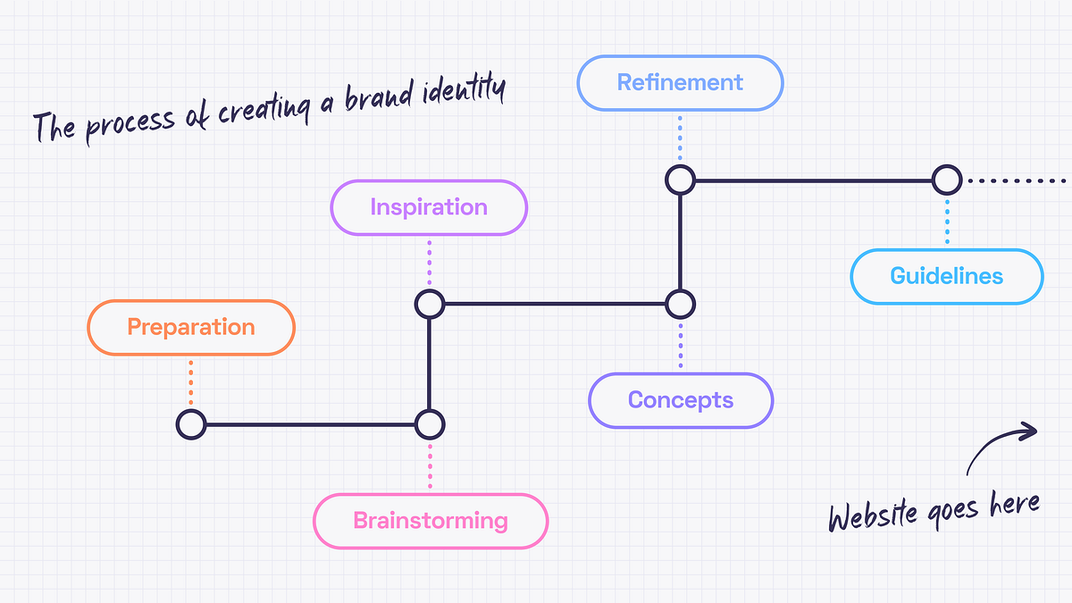
Cover design by https://dribbble.com/mariablazeIn this article, we’ll cover the beginning of creating the experience — the brand identity.It may seem that there is only a good designer’s taste and a couple of weeks behind the pixels that we call a design. The truth is that since every project needs a personal approach the designer needs to get to know the business and dedicate some time to find the right inspirations.The start pointEvery design work begins from understanding the project objectives and client’s business. I inspect briefs filled out by a client, study all the materials I got, stalking the competitors, talk to the client and google. Oh, I google a lot. There is no such term as “too much data“.The aim is to collect as much relevant information as possible because preparation is a very important part of every project. It is crucial to have an understanding of what needs to be done before I diving into creating concepts.BrainstormingNo creative work can be done without brainstorming, right? I like this kind of activity because it’s a great opportunity to come together as a team and spend some time thinking, imagining, making notes and doodling. As a team, we start by discussing the data we have. It is important to make sure that everyone is on the same page. Then I define the directions of the future style and create some kind of a mind map for ideas that differ too much (if needed). There is always a room for some abstract creative thoughts, though. Let ideas flow!But since it is a part of a process everything should be documented. The best ideas have the honor to go to the summary document with the most relevant and interesting ones that should be discovered later.Getting inspiredDesign is like driving a car. You need fuel (ideas) to start the engine (create a design) and get to the destination (business goals). No fuel means no movement. And by fuel, I mean inspiration — i.e. mood board and references.So, a few directions to develop are defined. Now what? Let’s begin from the mood board. Originally a mood board is a physical piece where papercuts, fabrics, paints and photographs come together. It is very exciting but I prefer using Miro and Pinterest because collaboration and flexibility are significant for me. Thanks to a mood board, the brand’s values can be pictured and communicated without words. This must be the guidance for the design choices that will help in visualizing the emotions I want to evoke.Consistency is fundamental for a good mood board. Separate mood boards should be created for different directions. Color palettes, patterns, font combinations, photos and illustrations are the basis. It’s fine to mix them up, edit, be creative but you need to keep in mind the main idea.Here are some really nice example of mood boards ⬇️Design by Marion EijkenaarDesign by copperheartcreativeMood boards are cool and inspiring but nothing helps as much as references. While mood board expresses the… well, mood 🙂 references show the way of how to do something. How does it work? I may like the font from some book cover, colors from a retro movie poster and illustrations from a science magazine. Then I bring it all together, experiment, refine and get something completely new. That’s how I use references.Generating conceptsWhen mood boards and references are done, I can start working out concepts. It’s better to have a few to choose from. I strive for complex concepts that evoke emotions, not just colors and font pairings so finding the right theme for the whole brand identity can take some time.The ideal concept should include:Big ideaLogoColor paletteFont pairingStyle of illustrations or photosHere is the example ⬇️Design by jacknifedesignPolishing THAT special ideaWhen concepts are ready, I can show them to the client. It’s worth remembering that the concept is not a ready-made identity. It only represents the idea and key elements. Sure thing, it could be polished after the feedback session, but this is the essence of collaboration. I refine the concept until it becomes the actual identity.Brand guidelinesAnd what happens when the logo, colors and the overall style are accepted? The brand guidelines are created. Or the brand manual. Or visual identity guide. Names may differ, but all of them mean the same –the client gets a handbook to help them use the branding without asking anyone for help.The guidelines include:Information about the logo (the idea behind it, how to use it properly, and what is not allowed to do)TypographyColorsImagery styleKey graphic elementsExamples of usageThese guidelines are made for people who will be responsible for creating different kinds of content or merch — marketing team, in-house designers or other design studios. This handbook can be updated later when the website design is ready because there may be some cool examples of usage I may want to include in the manual.And speaking of websites… I also have an article where I describe the website design process.Branding in the Design Process. Part 1 was originally published in Muzli - Design Inspiration on Medium, where people are continuing the conversation by highlighting and responding to this story.
Steal Like an Archive: Mining Design History for Fresh Ideas
Good designers create. Great designers curate. But the best designers? They remix. The secret isn’t waiting for a lightning bolt of originality—it’s building a deep visual library and learning to reinterpret its contents in ways that feel both fresh and grounded.
This isn’t about copying. It’s about understanding the underlying principles of past movements and recombining them with contemporary context. Here’s how to research, archive, and ethically remix design history.
Why History Matters Now
Every design problem you face has been solved before—maybe not in exactly the same context, but the visual language likely exists somewhere in history. The Swiss Grid, developed in the 1940s and 50s, still underpins some of the most effective layouts today . The psychedelic posters of 1960s San Francisco continue to influence album art and festival branding. The Bauhaus, now a century old, remains the foundation of modern design education .
Understanding these movements gives you a vocabulary. More importantly, it gives you permission to stop trying to invent something from nothing.
The Digital Archive: Your Starting Point
Before you can remix, you need raw material. Fortunately, the internet has made design history more accessible than ever.
Museum-Grade Collections:
The Metropolitan Museum of Art’s Heilbrunn Timeline offers a chronological, geographical exploration of art history, illustrated by the Met’s collection . It’s an unparalleled resource for understanding visual culture in context.
Cooper Hewitt Smithsonian Design Museum provides access to a vast collection through the Smithsonian Institution Research Information System .
The Getty Research Institute holds primary materials for modern movements including Bauhaus, Russian Constructivism, Dada, and Surrealism .
Design-Specific Archives:
AIGA Design Archives contains over 20,000 selections dating back to 1924, documenting all disciplines of communication design . You can browse by color, year, format, or keyword.
The Chicago Design Archive provides a permanent online record of excellent design created by local professionals from the late 19th century to the present .
Graphis Archives presents award-winning work from 1944 to the present, including books, magazines, and annual reports .
Specialized Collections:
Center for the Study of Political Graphics houses over 90,000 protest graphics from the 19th century to the present—the largest collection of post-WWII posters in the United States .
The Chinese Type Archive compiles and catalogs resources related to Chinese typography to make them open and accessible .
Archives of American Art (Smithsonian) holds over 20 million items documenting the visual arts in America .
Physical Collections: Seeing the Real Thing
Digital archives are convenient, but nothing replaces handling original artifacts. The texture of a letterpress print, the scale of a vintage poster, the yellowing of newsprint—these qualities inform authentic work.
Major Collections:
The Design Library (New York and London) holds over seven million designs, from fabrics and wallpapers to original paintings, dating from the 1750s to the present .
Denver Art Museum’s AIGA Design Archives contains approximately 12,000 physical artifacts from 1980-2010, representing the largest holding of contemporary American communication design in the world .
The Design Museum of Barcelona holds historic dies, typographies, and printing plates from the 18th to 20th centuries .
University Collections Open to Researchers:
Yale University’s Arts of the Book Collection includes examples of binding, typography, illustration, calligraphy, and book design .
Cranbrook Academy of Art Library maintains an extensive collection on graphic design history, theory, and professional practice .
Stanford’s Special Collections holds important modern and mid-20th century graphic design books, periodicals, and ephemera .
Three Movements Worth Mining
Bauhaus (1919-1933)
Core principles: Geometric forms, primary colors, asymmetrical balance, integration of fine arts and crafts.Why it endures: The Bauhaus wasn’t just a style—it was a philosophy about design’s role in society. Its focus on function and simplicity continues to resonate because it prioritizes communication over decoration .How to remix: Take the Bauhaus commitment to geometric abstraction but apply it to contemporary subjects. Use the grid structure but break it in unexpected places. Combine Bauhaus forms with textures and materials the original movement never had access to.
Swiss/International Typographic Style (1940s-60s)
Core principles: Grid systems, sans-serif typography (Akzidenz-Grotesk, Helvetica, Univers), asymmetrical layouts, objective photography, clarity above all .Why it endures: These principles aren’t about a look—they’re about effective communication. A well-executed grid creates hierarchy and flow that guides the reader’s eye naturally.How to remix: The Red Dot award-winning book “KASPER FLORIO – Atypical Swiss” demonstrates this perfectly—it uses only two fonts (Darker Grotesque and Xanh Mono) but creates dynamic interest through thoughtful placement, flaps, and slanted pages . The grid is respected, then thoughtfully subverted.
Psychedelic (1966-1972)
Core principles: High-contrast, saturated colors; undulating, distorted typography; kaleidoscopic patterns; visual complexity that rewards extended viewing .Why it endures: Where Swiss design aims for immediate clarity, psychedelic design invites exploration. Its connection to music and counterculture gives it emotional resonance that purely functional design lacks.How to remix: Contemporary designers like Paris-based Uchronia are doing exactly this—using “hallucinogenic swirls of orange, purple, acid yellow and searing pink” to create immersive environments that prioritize joy and emotional impact . The key is taking psychedelic’s emotional intensity and applying it with contemporary restraint.
The Remix Framework: From Reference to Original
Step 1: Deconstruct, Don’t Just AdmireWhen you find a piece that resonates, analyze it systematically:
What’s the underlying grid or structure?
What’s the color relationship? (Complementary? Monochromatic? High contrast?)
What’s the typographic hierarchy?
What’s the cultural context that made this work resonate then?
Step 2: Extract Principles, Not AestheticsThe goal isn’t to make something that looks like a 1960s psychedelic poster. It’s to understand why those posters worked—the relationship between visual complexity and engagement, the emotional impact of saturated color—and apply those principles to a contemporary problem.
Step 3: Combine Across MovementsThis is where the magic happens. What happens when you apply Swiss grid discipline to psychedelic color palettes? Or Bauhaus geometric forms to Victorian ornamentation? The tension between systems creates something genuinely new.
Step 4: Add Your ContextFinally, ground the work in today. Use contemporary subject matter, current technology, and your unique perspective. The historical references become depth, not costume.
The Line Between Inspiration and Plagiarism
How do you know when you’ve crossed from inspired to infringing? Recent research on similarity evaluation in graphic design offers clues. The key isn’t whether individual elements look similar—it’s whether the main visual features and their relationships have been copied .
The safe zone:
Using the same grid structure with different content
Adapting a color palette to a new context
Applying historical principles to contemporary problems
The danger zone:
Tracing or directly copying distinctive shapes
Recreating the exact composition with swapped content
Using recognizable, culturally significant imagery without transformation
Building Your Personal Archive
Create your own system for collecting and organizing inspiration:
Digital tools:
Pinterest or Are.na for visual bookmarking
Notion or Evernote with tags for movements, designers, and principles
A folder system on your hard drive organized by concept, not just designer name
Physical practice:
Keep a sketchbook for recording observations from archives
Print and pin inspiring work where you’ll see it daily
Collect found ephemera—old magazines, packaging, tickets
The Goal: Work That Feels Inevitable
The best design doesn’t scream “look how original I am.” It feels quietly right—as if it couldn’t have been any other way. That quality comes from deep familiarity with what came before. When you’ve absorbed enough history, you stop guessing and start knowing.
The Bauhaus masters studied centuries of craft before they broke the rules. The Swiss designers understood ornament before they rejected it. The psychedelic poster artists knew commercial art before they dissolved it into color.
Build your archive. Study it deeply. Then trust that what emerges will be yours alone.
The post Steal Like an Archive: Mining Design History for Fresh Ideas appeared first on Designer Daily: graphic and web design blog.
National Geographic Redesign
Fear And Loathing In Oslo
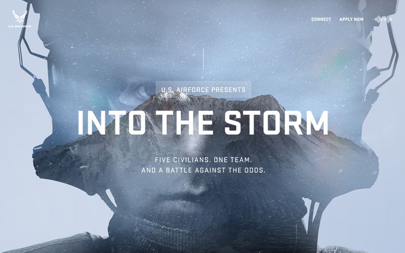
U.S Air Force - Into The Storm
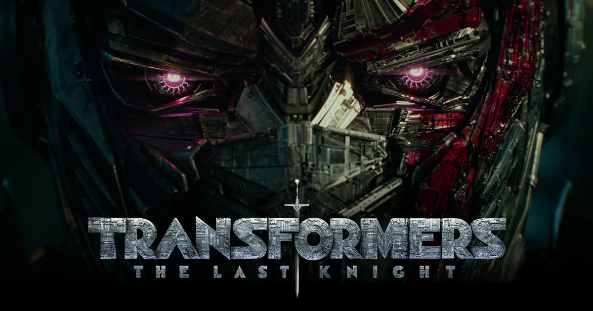
Transformers: The Last Knight | Trailer & Movie Site | June 21, 2017
graphicporn
The Chip Kidd School of Graphic Design
Photo by S O C I A L . C U T on UnsplashWe are told never to judge a book by its cover, but I often do. I’m a bit of a stickler for a good book cover. I love graphic design, and aesthetics in general, so when I see a cover that seems to have been put together in a Word doc in ten minutes for a few dollars or on Fiverr by a fourteen-year-old kid on a mobile phone app, using a terrible font and spacing, I can usually tell.“There are three responses to a piece of design — yes, no, and WOW! …”- Milton GlaserBook covers take, personally at least, the vital second spot in priorities when creating a product I can be proud of. If a book cover design doesn’t pique my interest at once, I won’t even bother to click on the ‘Look Inside’ feature on Amazon, even though a book has a thousand four or five-star reviews. It has simply failed in its task. I believe this is the same case for any other reader, too, who, like me, values good art. They could be serious readers of romance who voraciously get through ten books a week. The casual seven-books-a-year type. It doesn’t matter. There are no prejudices here.The graphic designer Chip Kidd is one of the most famous graphic designers in the world. The bespectacled New York-based art director started designing covers for the publishing house Knopf in the mid-1980s. A comic book geek and lover of popular culture, he has had a massive influence on the way book cover design had developed over the last thirty years. Not only does he believe the image is important as an artist in conveying the message of a book’s plot or theme, but he also thinks the typography plays an important role in defining hidden messages within the book’s structure. His most famous and iconic cover design is probably Jurassic Park by Michael Crichton, published in 1990.It is clean.It is clear.It is miraculous.It lets the reader know exactly what the book is about. My own personal favourite, however, is the trade paperback edition of Garth Risk Hallberg’s City on Fire. The fiery neon red fluorescent font epitomizes the era in which the novel is set, 1977 New York City, a time of the infamous Blackout and The Son of Sam murders. This, is not, nonetheless, a reflection of the book itself: at over 900 pages I failed to get even halfway through. Too wordy and self-conscious for my liking. One critic from the New York Post called it a ‘steaming pile of literary dung’.Has somebody farted?So, yes, nothing but perfection should be acceptable for a book cover if you want it to be considered professional-looking.One of the first methods to see this is to look how the cover is presented as a thumbnail image — a thumbnail image is a way readers can gauge your book cover when it is up against all the others on the Amazon landing page (or any other platform, for that matter). It is small. Thumbnail almost in size. Hence the term ‘thumbnail’. If it doesn’t look visually attractive on a small scale it most definitely won’t up close and personal. If that is the case, you need to change it. And fast. It must also be in high resolution. No faded or foggy-looking images that don’t come alive from the computer screen.Chip Kidd, Courtesy of WikiCommonsAfter you’ve done that, you can then compare it to other book covers in the same genre. Does it stand out from the crowd while at the same time beating them in the aesthetic stakes? If so, you’re definitely cooking with gas.But I hear the reader saying: ‘But shouldn’t I first do this before I commission a professional graphic designer to carry out the work?’ Of course. The method I propose only works if the cover has already been completed. If you are starting out, you should compare and contrast other book covers competing with yours on Amazon or any other online platform.A book cover should clearly represent the genre of the story. If your book is a crime fiction piece, it should give a sense of foreboding, using dark hues, menacing images. Many of the crime fiction/thriller novels I see on Amazon and other platforms show a man or woman, usually shadowed or darkened, with their back facing toward the reader and most commonly walking or running away from someone or something. This has been a popular motif in the genre for many years but has now become more fashionable than ever.Mark Dawson, an acclaimed indie author and popular writer in the crime fiction genre (and an author I highly recommend you read) does this with his John Milton series of books.“Never fall in love with an idea. They’re whores. If the one you’re with isn’t doing the job, there’s always, always, always another.”- Chip KiddCold, ominous scenes — very often rural in nature, are used frequently by the Scandinavian crime fiction writers for their book covers, Jo Nesbø and the late Henning Mankell being two good examples.It is very important that whatever genre you write in, you set the tone of the story by giving your readers some idea from the very off, and that you get the reader to ask themselves questions about the book. This comes, obviously, from the visual message of the cover. That way, in theory at least, you are not cheating them — they know exactly what they are going to get. Readers often purchase a book (though not exclusively) at a whim, at least the casual types, so the ‘initial hook’ must start with the artwork and visual presentation which can then lead them to turn to the back and the blurb, which is the ‘second hook’.Photo by Filios Sazeides on UnsplashOne mistake many authors make — and one I have made countless times myself — is by using bad quality images for my book covers. There is nothing worse than a blurry image. Because many self-published authors lack money, they see it as a necessity to download bad quality stock images that are for free or cost a few bucks at the very most. This is a huge mistake. Readers aren’t idiots. When you are competing with the big publishing houses which can afford to pay the likes of the aforesaid Chip Kidd and the amazing Rodrigo Corral to do their cover art, you know you have to be on the top of your game in the stylistic department even to stand a slight chance of attracting readers’ eyeballs. This is especially the case when your novel is in the same genre of books commissioned by these cover designers. It’s death by the electric chair even before your book has a chance to sell if you make lazy mistakes and don’t invest in good quality images.Where’s the bucket? Somebody’s on fireIf, on the other hand, you are designing your own images, either via taking photos or by being much more creative and picking up pencils, pens, coloured markers and a pair of scissors (those Andy Warhols amongst us), then you realize the final image must be of the highest quality.Do not skip on this step.“Graphic design will save the world right after rock and roll does.”- David CarsonI love fonts and typography. Whenever I read a newspaper, pick up a book at a bookstore or stare at a poster in the men’s toilet in a funky club or billboard on the street, I analyse the font — is that serif, sans-serif or slab serif? This is the kind of question I ask myself all the time now, especially since I have been hiring a new book cover designer for my work, Meghan Allbright, who has educated me in font theory since our cooperation began. We have had some interesting typographical discussions on whether the sans-serif font is better for crime fiction or not.A great book cover will be half the battle in winning the hearts and minds of potential readers. Too many big publishers, smaller independent gigs and indie authors working alone make a hash of it at the first hurdle. A mediocre cover won’t be the ‘make or break’ factor as to whether your book will be a success, but a really bad one will, I’m sure. I have had too many designers in my career who have been technically sound but not artists.Vision is key here.That is why I always have an idea of how I want my book covers to look before I liaise with the artist. Before we start on a project, I give the designer rough drawing samples, other book covers in the genre I like, pictures and photos from the internet as well as a synopsis of the plot. These things can help them build a better picture of the overall mood I envisage.One last point I feel I must add which I find important is that you don’t have to spend a fortune on covers for them to be effective. I hear of indie authors paying professional designers a few thousand dollars for a cover I believe I could have done myself in an hour. There are many good and up-and-coming graphic designers around just starting out, needing to build up their artistic portfolios. I do believe such freelancers have a lot to offer, particularly those who are also artistically inclined. Meghan Allbright studied fine art at university before she went on to do graphic design, so she possesses both the aesthetic skills as well as the technical requirements needed for such projects.Think about who you are hiring before you offer them a contract.It is important throughout everything that you are satisfied with the end product — if you are not, and this happens often — you must ask the designer to change certain things to your liking. I have never had a contract with a graphic designer stating ‘this and this needs to be done’. I usually know what I want and tell them straight away. I offer them a set fee for the work and may give them a little extra if I keep asking for changes beyond what we agreed upon in our ‘spoken agreement’.The Chip Kidd School of Graphic Design was originally published in Muzli - Design Inspiration on Medium, where people are continuing the conversation by highlighting and responding to this story.

BBC-Earth , Life Story Ep05 - Courtship - Puffer Fish (From Netflix)
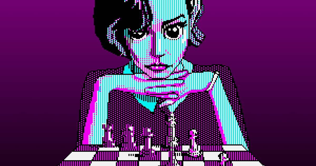
The Kilobyte’s Gambit
Negative vs. Positive: How To Use Space To Create Seamless Design Compositions?
Take a moment to stop and look at any piece of design or art. Design is about balance — whether good or bad, there’s a ratio of positive space to negative space that influences, supports, and delineates how the design is perceived.Positive Space: The focus, or areas in a piece of art or design that are the direct subjects. It tends to be more active, dynamic, and motivating. For example, think of a still life painting of a bowl of fruit, or the trees in a landscape.Negative Space: The background, or areas around the direct subjects. For example, “negative space is the area between a cup and its handle, and the space between the petals of a flower.” (Source: ThoughtCo.com)The ratio of positive to negative space can greatly influence how appealing audiences find a design to be. “The majority of people don’t like it when designs are too crowded,” states SitePoint.com. “Giving your subject and other objects plenty of negative space gives them much more definition.”But negative space isn’t only just what it sounds like. Though its moniker makes it seem as though it’s simply a lack of something, it’s actually a big part of the yin-yang that makes up the balance of design. In Foundations of Art and Design, author Alan Pipes notes that certain cultures and schools of art have “long manipulated the negative white space in their compositions to enrich our viewing experience,” techniques which have been emulated and explored by artists such as Vincent van Gogh, Aubrey Beardsley, and Barbara Hepworth.Wheatfield with Crows by Vincent Van GoghSpace, both positive and negative, ties your design together. The intelligent usage of space draws the eye away from focus on negative or positive, and instead uses both to tell a harmonious, coherent, complete — seamless — story.Black Swan | DesignModoNegative vs. Positive SpaceNow that we’ve put some labels on both positive and negative space and understand the basics of what they are and what they do, let’s talk about why they’re both important.Much like the yin-yang analogy referred to earlier, you can’t really have one without the other; or, at the very least, and you can’t have good, understandable design without both aspects in play.Imagine a piece of graphic design in which the designer intentionally tried to leave out any hint of negative space. The entire piece is overcrowded, none of the text is legible, and the overall effect doesn’t exactly encourage the audience to even try to make sense of it all.Image: LingsCars.comA lack of good use of positive space, too, would have a similarly deleterious effect. What is the point of the piece? Without effective use of positive space, your design is more or less just a blank slate.People may get confused about the difference between the terms “negative space” and “white space,” but essentially they signify the same thing.“White space” is in common usage because of its prevalence in the print-based world, where literally white space gives a cushion to text, rendering it more readable, and a frame to visual elements such as photographs, setting them apart from other elements in design. This is less common in digital design, where “white space” in a website tends to be a lot of other things other than white.Image: SimplaNegative space may very well be white, but it also may be dark, colored, patterned, variegated, a gradient, or even a background image. It all depends on what is called for to present a harmonious design. The shades and colors are really secondary considerations.Gestalt PrinciplesIn order to achieve good design, designers often use the five Gestalt principles:1. Proximity2. Continuity3. Closure4. Similarity5. Figure/GroundThese are basic laws that define our perception, and each of these principles work to create unity. Gestalt principles, when combined with space, lays a solid foundation for design.Here is how Gestalt principles and space come together to design a balanced and well-perceived compositions in design:PROXIMITY:The relationship between negative and positive is influenced by the proximity of the elements to each other. Proximity refers to the principle of grouping; when we see objects close to each other, we tend to relate them to each other and classify them in a group, even if they are radically different. The amount of negative space between objects can define the shape of the group. Increasing or decreasing the amount of white space can change how we perceive the graphic design as a whole; this is especially important when it comes to the legibility of text.CLOSURE:The principle of closure, uses the spaces or gaps in between positive spaces to create the illusion of an existing image. Closure is like giving clues to your viewer, allowing them to fill in the gaps themselves to get the message. Our eyes tend to do that automatically, which can be helpful — but also can hinder the effectiveness of a design, if closure isn’t addressed and elements are too vague.Also, sometimes, it can go really, really wrong.Arlington Pediatric Center LogoFIGURE-GROUND RELATIONSHIP:The last principle is directly related to positive and negative space, where “figure” is the focus, or positive, and “ground” is the surroundings, or negative.Why is this relationship important to the composition as a whole?Our eye is automatically, intuitively drawn to positive shapes. But considering the effect that negative shapes have will render the composition more effective as a whole.Negative space happens organically, usually. Once we begin a composition or a piece of design, the first marks we make draw the focus and take on “positive space” attributes. This has the effect of organizing the space left over into shapes of its own. But as we continue to fill in the page, the focus may switch to the other, and the smaller areas, formerly positive, may become negative. In short, the figure must be smaller than the ground, or focus is lost.Challenges of Using Space in DesignUsing space in graphic design seems like it’s pretty straightforward. It would be hard not to use space. But there’s a difference between filling up your blank template and operating by principle.Two of the biggest challenges to using space in a comprehensive manner are balance and message:BALANCEUse too much negative space, and it overwhelms and distracts from your positive space. Use too little, and the same thing happens — your focus isn’t clear, your audience is distracted, and your design is ineffective.Some may view white space as wasted space, which could have been filled up with message-bearing information and graphics. But filling things up too much can stress us out; bombarding your viewer with information won’t allow them to process enough to retain what they’ve seen.What happens in those cases is that the message gets muddled and eventually lost, and the audience loses interest in the absence of direction.So the key is finding a healthy balance between the two. Of course, there isn’t really a rule of thumb here; what constitutes a healthy balance for one piece of design isn’t going to work for another. There are too many variables at play.MESSAGEGraphic designers know that it isn’t just about the semantics; it’s also about the message you want to communicate to the audience. Negative and positive space can either enhance or detract from that message.Do you want to communicate soothing, calming influences to your viewer, with a clear direction toward the focus? Opt for more negative space. “Designers sometimes use extreme amounts of white space as a way to bring focus to a certain part of the design,” notes DesignModo. Don’t go too overboard, though, as it can make the actual focus of your design seem distant, even unimportant, and can limit the amount of actionable information that you provide within the design.Is your aim to set your viewer on edge, capture their attention and motivate them to action? Opt for less negative space. Even then, however, don’t stray too far from legibility. “Even if the effect you are going for is one of chaos, space matters,” says DesignModo. Taking away too much negative space can drastically impact the legibility and efficiency of your design.Middle Ground — Working With Ambiguous SpaceSometimes, however, the delineation between the positive and negative can seem to be blurred. In the Foundations of Art and Design, Alan Pipes says, “The human mind likes the positive shapes to be distinct from the negative ground.” We get confused “when shapes overlap or are cropped. Understanding is lost or uncertainty heightened, especially if there are many layers of positivity and negativity.” This results in ambiguous or misleading space.It can be simply illustrated by zebras. Are zebras white with black stripes, or are they black with white stripes? Leaving aside the genetics-based answer that science has actually provided, the question presents an interesting experiment in using negative and positive space in design.Image: Unsplash/ Ricardo Gomez AngelMisleading or ambiguous space is employed in the creation of optical illusions, leading the audience to see one shape the first time they view the piece, and perhaps another the second time, depending on what part they focus on.Image: The GuardianThis type of design can be rewarding for the viewer, allowing them a sense of inclusion because they’ve figured the hidden message out. That, in turn, can solidify the memorability of your design, since the audience has invested in it, connected with it.While this can be an effective design decision, especially from a marketing standpoint, it can also actually inhibit the message and tone of your design, unless ambiguity or duality is what you’re aiming for. It can be difficult to make both positive and negative spaces layered and complex, but meaningful at the same time.However, careful and skillful use of misleading or ambiguous space can result in further engagement from the audience. As in the case of Pablo Picasso, his use of ambiguous space was, instead of intended to stimulate an immediate response, an invitation to the viewer to take time and invest in the painting, analyzing the relationships of the shapes.Again, message, tone, and focus must all be considered before employing too much misleading space in your design. If it distracts from your message, it may not be the wisest choice to make. The point is to create a composition that is seamless, not one that is disjointed, in which the elements and spaces are pointing the audience in opposing directions.Unified CompositionThe term “composition” basically means “putting together.” It refers to the bringing together of your design elements and their distribution into your layout. Good composition is a matter of the appropriate organization or arrangement of design elements, including both positive and negative space, according to the principles of good design, such as balance, flow, contrast, and emphasis.Basically, excellent composition elevates “good” design to “great.”What you don’t want in your composition is the feeling of elements being disjointed, as though they truly don’t belong together in your piece. This does happen — with poor composition, the elements, no matter how carefully chosen they may have been, are left to wander around your template or canvas with nothing to really link them together. They are individual words rather than a sentence that forms a part of a story.Space and other elements can be used to “arrange or organize the visual components in a way that is pleasing,” “help give structure to the layout […] and the way the subject is presented,” “encourage or lead the viewer’s eye to wander […], taking in everything and ultimately coming back to rest on the focal point.” (Source: ThoughtCo.com)This is important in any design, but especially in graphic design that is intended to market something to the audience, or to motivate the viewer to action. Whether it’s a logo, an ad for a new store, or a website, the last thing a designer wants is a disjointed composition, because disjointed equals ineffective.“Seamless” is a good goal to aim for.Experimenting with SpaceSpace gives a designer a lot of leeway to play with concepts, allowing them to functionally embed two designs into one. Experimentation is definitely called for.Negative space can be either directly or indirectly effective in a composition, depending on how the eye is drawn to it.DIRECTLY:Image: Michael Gericke Center for Architecture LogoIn this example, the image of the key is part and parcel of the image of the cityscape, and vice versa. The key is the positive space, the cityscape the negative. This works on multiple levels because the eye is drawn first to one element, then to the other, and then puts them together: the key to the city.This one is along similar lines, too.Image: LogoDesign.NetA logo for a company in the housing industry, it includes the image of a house, but there’s a white space key silhouette in the middle of it, letting the viewer know that the company will get results for their clients.INDIRECTLY:It doesn’t always have to be that clear, of course.Image: LogoDesign.NetThis logo looks, at first glance, just like two penguins, but the white space in between them also creates a gentle heart shape, so vague that you might not even be certain it was intentional.Using Space to Create a Seamless CompositionIt isn’t always easy to know when you’ve hit the right balance. Design — whether it be graphic design, art, logo, or anything else — is all about perception.· That doesn’t mean that there aren’t any tips on using space well, though.· Keep in mind the gestalt principles mentioned previously here. Operating by good design principles gives you the best chance of success.· Learn from others. Taking time to observe the use of space can do a lot to teach you what works and what doesn’t.· Consider both message and focus. It isn’t just about what your piece is about, but how it makes the viewer feel, that ends up influencing what the take-home is.· Use ambiguous space judiciously.· Go with your gut. Adjust, adjust, and adjust. Play with the ratios of negative and positive, and if you don’t like something, analyze why, and then change itLet’s take a look at how others have used space in their compositions.Examples — Negative Space and Positive Space In ActionHere are a few examples of effective design that uses negative and positive space to balance the composition and promote a seamless effect.The Formula 1 LogoThe previous Formula 1 logo used negative space quite equally balanced with positive to give definition to each element involved. The F is curved and delineated by the 1; the red is cut into triangular ribbons by the negative space of the black, giving it a feeling of movement and dynamic action. The piece as a whole is composed to give the impression of a racing flag, which is an appropriate tone for a racing establishment.Image: ItsNiceThatArtist Shigeo Fukuda is well known for trippy, optical illusionist poster designs. This is a classic example of a use of positive and negative space that is balanced, fascinating, and ultimately a bit unsettling, reminding designers of why considering tone is just as important as considering focus.Image: LogoPondThis logo concept is intriguing because of how little variation it needs in order to promote both its message and tone. The negative space is used within the logo of the pen nib, which otherwise would be a straightforward element; however, with just the slight alteration to the left, it aligns the element with the company name, Pendulum, and elevates the design to “effective.”Image: Chupa ChupsThis Chupa Chups ad makes use of negative space that is already existent, or at least implied, in a slice of cored pineapple. Again, the negative space is the background, rather than just plain white space, keeping the entire ad together as a harmonious whole.Image: Hard Rock CasinoThis poster for Hard Rock Cafe and Casino also hits the nail right on the head: using negative space, it clearly lets the viewer know the dual message it wants to promote, namely both music and food.Putting It All TogetherSome types of design lend themselves more easily to a heavier concentration on negative space, but basically what it boils down to is this: negative space and positive space are vital to design, and space is everywhere. Effective use can make or break your design, intelligent use can elevate your design from good to great, and balanced use can give you a coherent, harmonious, seamless end product.So when you start to outline your next project, remember to stop and look at it from a different perspective. What does the space between add to your message? What tone do the balance and composition strike? What are you telling your audience by your use of space?Overall, strive for balance between the two. Your white space is not just a matter of what got “left over” in the design; it’s another opportunity, another canvas, another chance. Don’t forget — using negative space can be a positive thing.Negative vs. Positive: How To Use Space To Create Seamless Design Compositions? was originally published in Muzli - Design Inspiration on Medium, where people are continuing the conversation by highlighting and responding to this story.

Masks Work. Really. We’ll Show You How
![[Invalid Project]](https://a5.behance.net/f100e9917e4fb0b63a3b9afb41579d7da85f48c9/img/search/homepage-seo-image.webp)
[Invalid Project]

Artworks for GWENT © Card Game
A new artwork for the upcoming card game GWENT by our good old friends CD Projekt RED. We've been happy to work with amazing artists.
For more details please follow the links:
https://www.playgwent.com/en
https://www.facebook.com/PlayGwent/
https://www.youtube.com/c/playgwent/videos
© 2016 CD PROJEKT S.A. ALL RIGHTS RESERVED

Women‘s Foundation 25th Anniversary Campaign

New Split-View Trash Sculptures by Bordalo II Combine Wood and Colorful Plastics Into Gigantic Animals

Discover Ray-Ban® Stories Features

Bats and the origin of outbreaks
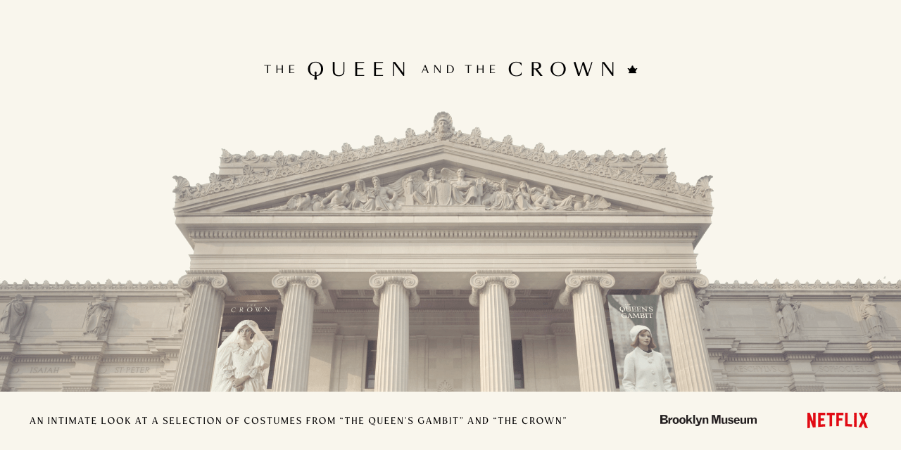
The Queen and The Crown

TAO TAJIMA | Filmmaker
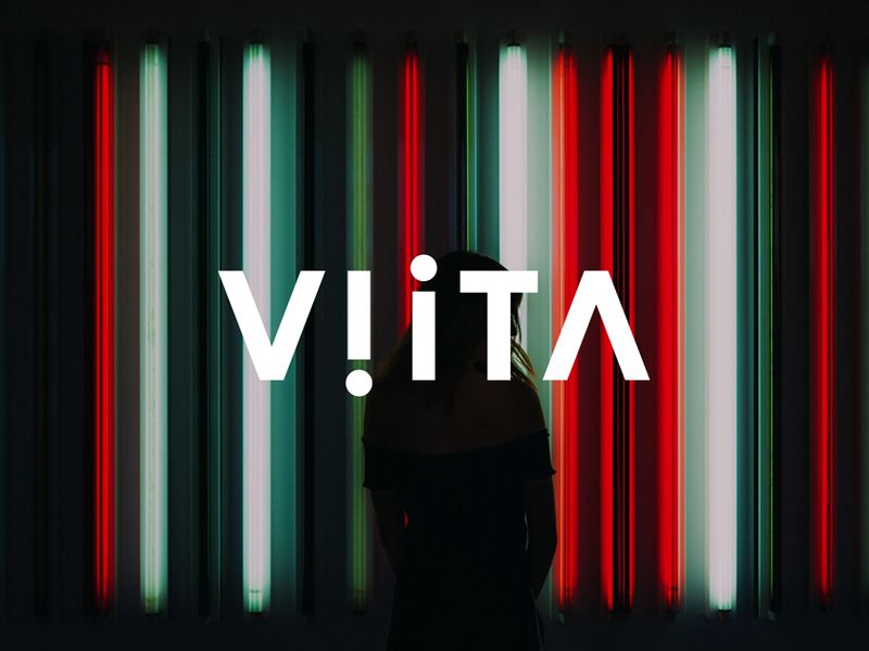
VIITA Watches
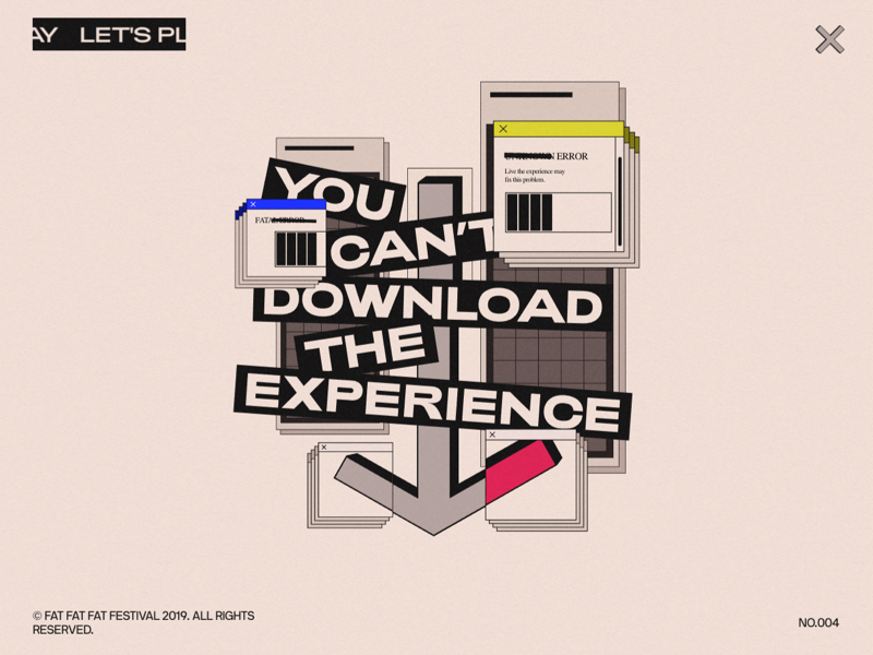
FAT FAT FAT Festival
MARNON
The Jessica Simulation: Love and loss in the age of A.I.
Spidey Vs Venom, Tropical Waves, Russia 2077 and more… Weekly inspiration roundup!

Pitchfork Music Festival

Jigsaw

Icelandic Volcano

Otherworldly Paintings Trap Skeletons in Perpetually Bizarre and Eerie Situations
In his ongoing Fragments series, San Antonio-based artist Jason Limon (previously) uses muted jewel and earth tones to paint uncanny scenarios for his recurring skeleton figure. The bony subject finds itself in a variety of bizarre situations, whether bursting from a tube of paint, orchestrating a puppet show with a pair of ornate paper hands, or nervously awaiting an encroaching fire. Often set against backdrops filled with multi-colored dabs of paint, his small pieces are imbued with a sense of creative problem-solving as he traps figures in scenes with boxes of pencils, scuffed erasers, and other craft supplies. More
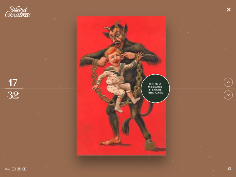
Weird Christmas ~ Create your card!
Sing | Trailer & Movie Site

Weekly Design Inspiration #213

Discarded Objects are Beautified with Colorful Coral-Like Growths by Stephanie Kilgast
Metaсonf
Fergie
Superlist

The New York Times – #ThisIs18
OK Go - Obsession

Fashion Illustration series
kasiq street fashion illustration series
Exo Ape - Digital Design Studio
Expansive Black and White Patterns Mixed With Chrome Color Spectrums in Murals by Felipe Pantone

Margot Lévêque Studio
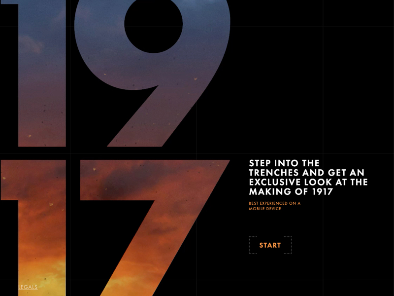
1917 | 360 Trench Experience | In Theaters Now
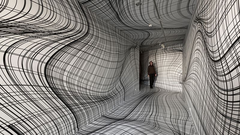
Vertigo-Inducing Room Illusions by Peter Kogler

Flatland II: A New Series of Dramatically Skewed Photographic Landscapes by Aydin Büyüktas

Nuanced Portraits of Women Merged With Abstract Environments by Sofia Bonati
Self-taught artist Sofia Bonati captures nuanced expressions and personalities of a variety of female characters while also integrating them into abstracted environments and patterns. Her illustrations most often feature solo subjects melded with thunderclouds, dizzying mazes, and floral patterns. Bonita renders the women’s features in graphite and she uses gesso, paint, and markers to add colorful accents and build their surroundings. The strong, distinctive expressions on each woman’s face suggests that the characters are in control of their environments, rather than being subsumed by them. More
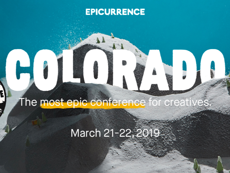
Epicurrence – Breckenridge, Colorado

Expressive Text Loops, Folds, and Ties Itself in Knots in New Murals by Pref
British graffiti artist Pref (previously) transforms words and sayings into visual interpretations of their meanings or messages—forming the word “undo” into a knot, or layering the phrase “all over the place” on top of itself to take up as much surface area as possible. With added shading and perspective the words appear as if they are 3D, like his piece “It Is,” which forms a a narrow grey cube when the letters are stacked. More

Judge a book by its cover?

A Forgotten Pinhole Camera Made from a Beer Can Captures the Longest Exposure Photograph Ever
Eight years one month. That’s how long a beer can pinhole camera spent capturing this solargraph at the University of Hertfordshire’s Bayfordbury Observatory. Featuring 2,953 light trails of the sun’s movement, the image is thought to be the longest exposure photograph in existence, surpassing Michael Wesely’s record of four years eight months.
Then an MFA student at the university, Regina Valkenborgh set up the camera in 2012 and subsequently forgot about it. More
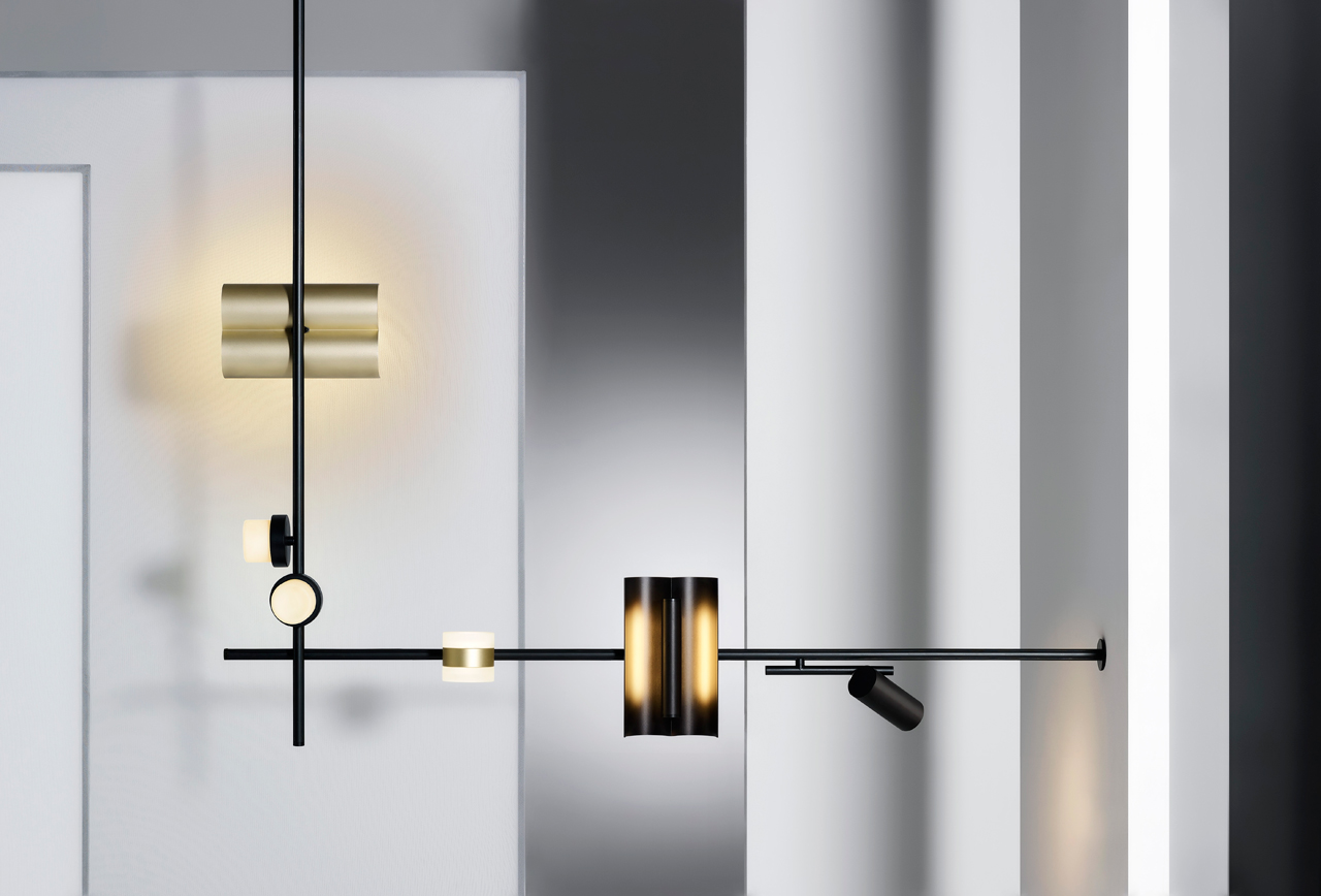
Studio Truly Truly Designs Mix & Match Lighting System for Rakumba

Meticulously Painted Portraits by Miho Hirano Fuse Introspective Women with Plants and Animals
Solitary female figures command the canvas in oil paintings by artist Miho Hirano. The Japanese artist creates detailed portraits of her human protagonists, who avoid direct eye contact with the viewer, staring off into the distance as fish and butterflies swarm and flower blossoms and vines seem to grow from the figures’ hair. In a statement on Gallery Sumire’s website, the artist describes the mission of her work as “to express the changing situation of life’s ugliness and maturity.”
Hirano draws inspiration from her upbringing, noting that her mother cared for plants and animals, and those motifs have continued in her work even though she does not currently reside in a nature-filled place. More

Textiles and Board Games Inspire Large-Scale Murals that Span Sidewalks, Streets, and Staircases
Baltimore-based artists Jessie Unterhalter and Katey Truhn, known as Jessie and Katey, started creating murals because of the sheer accessibility of public art. The pair have always created work with a big visual impact, but as their designs grew they began to consider the possibility of working on the ground in addition to large-scale walls. Their site-specific floor works combine inspirations from both textiles and board games to create interactive walkways that encourage play and exploration. More
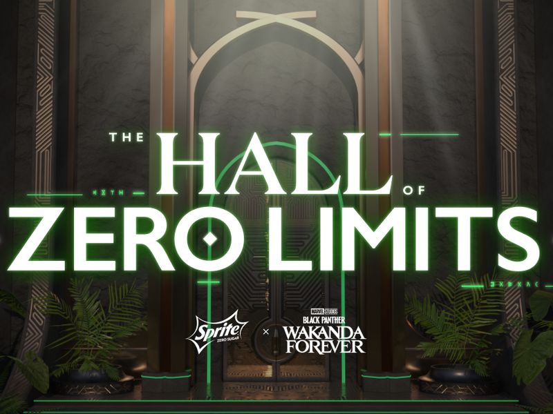
Hall of Zero Limits
KYOTO-OKAZAKI MEIJI SAKABA
KYOTO-OKAZAKI MEIJI SAKABA