Design Inspiration
Pricing & plans page design inspiration
Curated collection of pricing and plans page designs. Find inspiration for your own subscription and service pricing tables.
We curate topical collections around design to inspire you in the design process.
This constantly-updated list featuring what we find on the always-fresh Muzli inventory.
Last update:
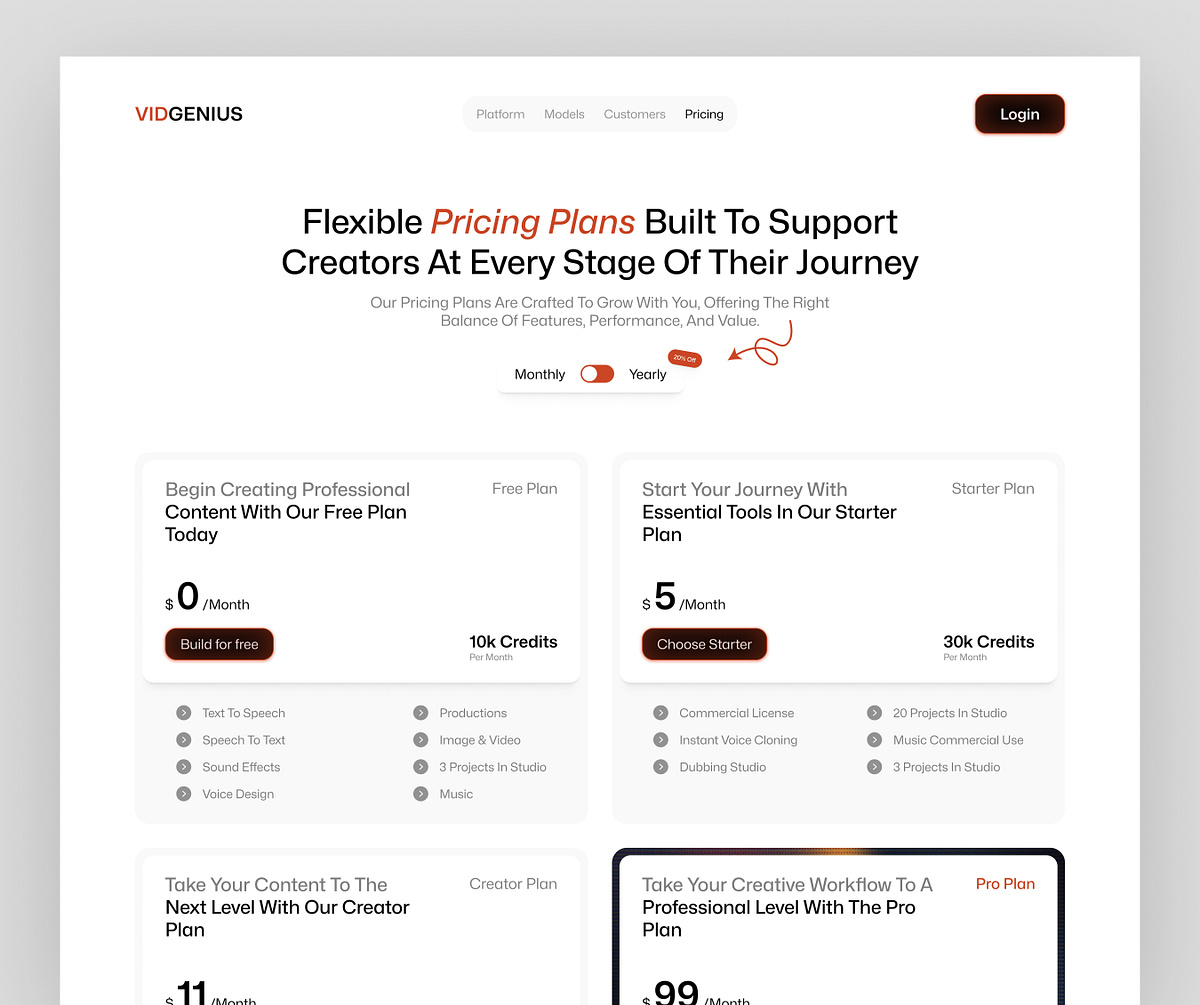
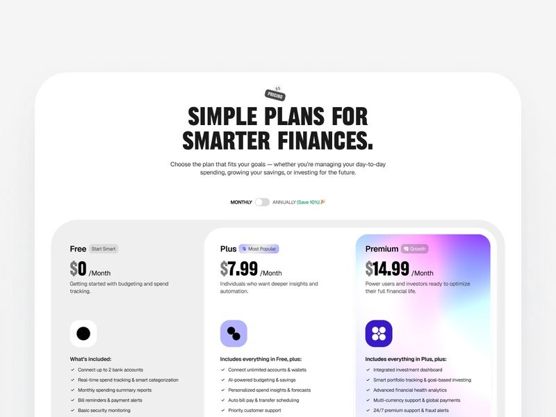
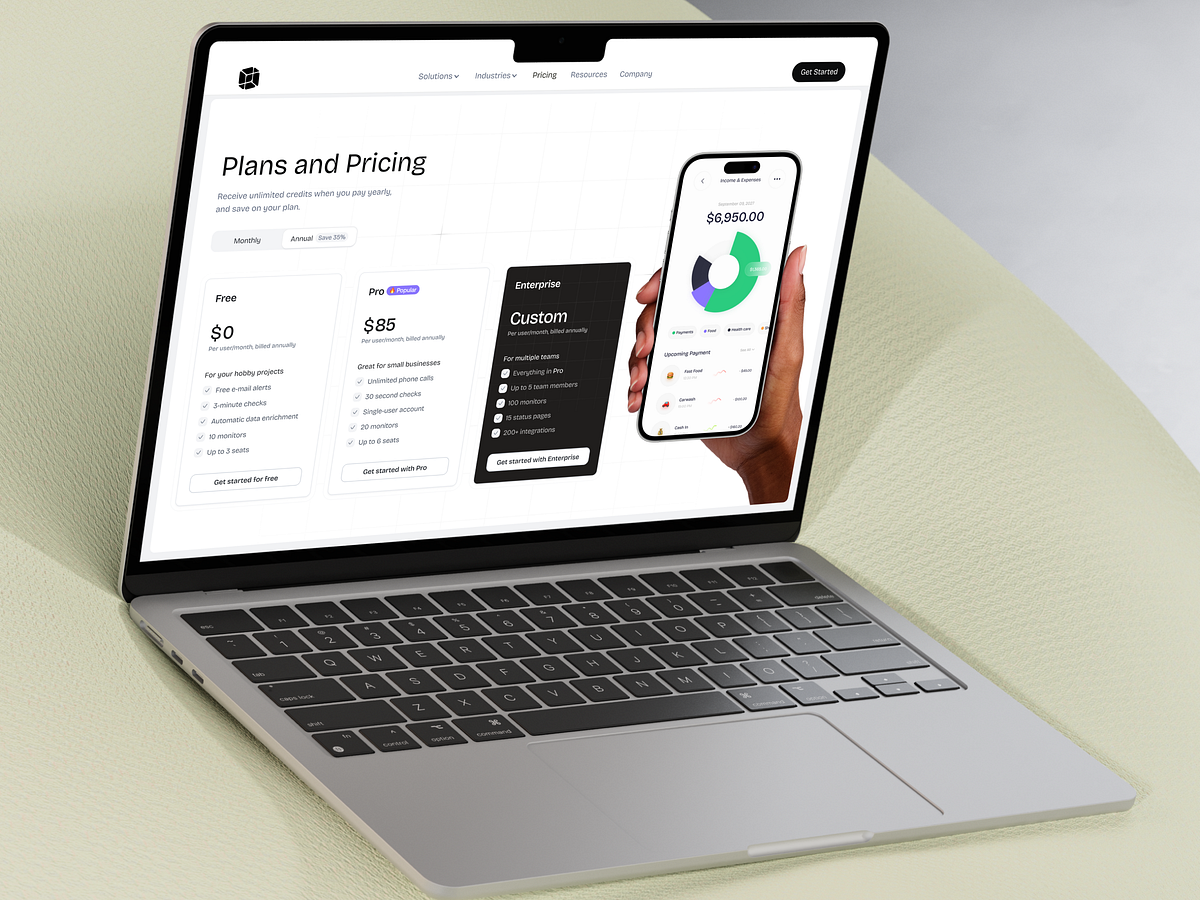
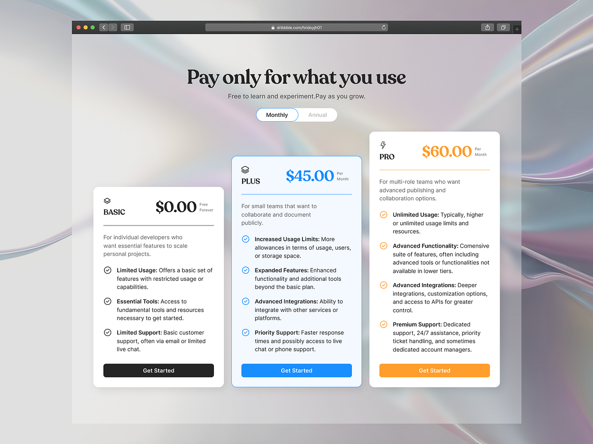
15+ Shadcn Pricing Sections, Blocks, Templates & Components
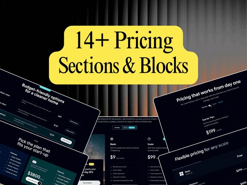
15 Shadcn Pricing Sections & Blocks
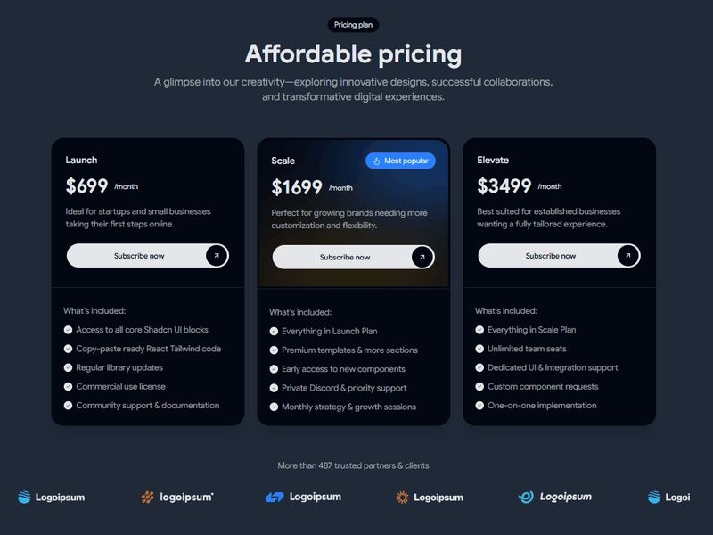
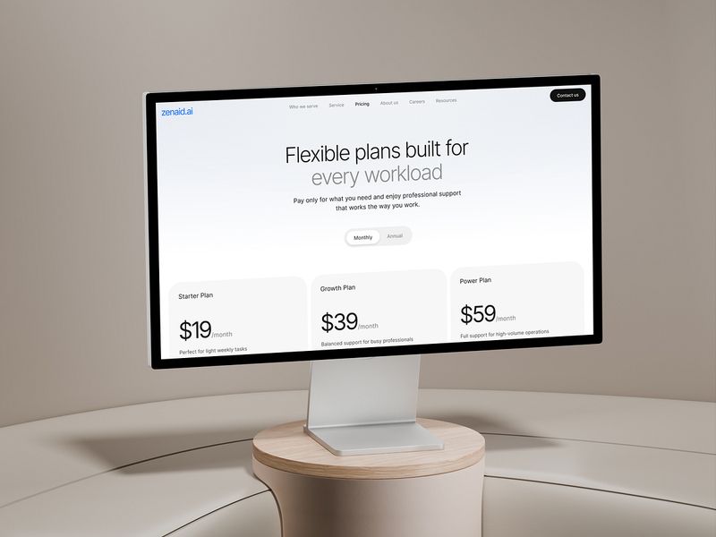
SaaS - Pricing Page
SaaS Pricing Web Design
Pricing page
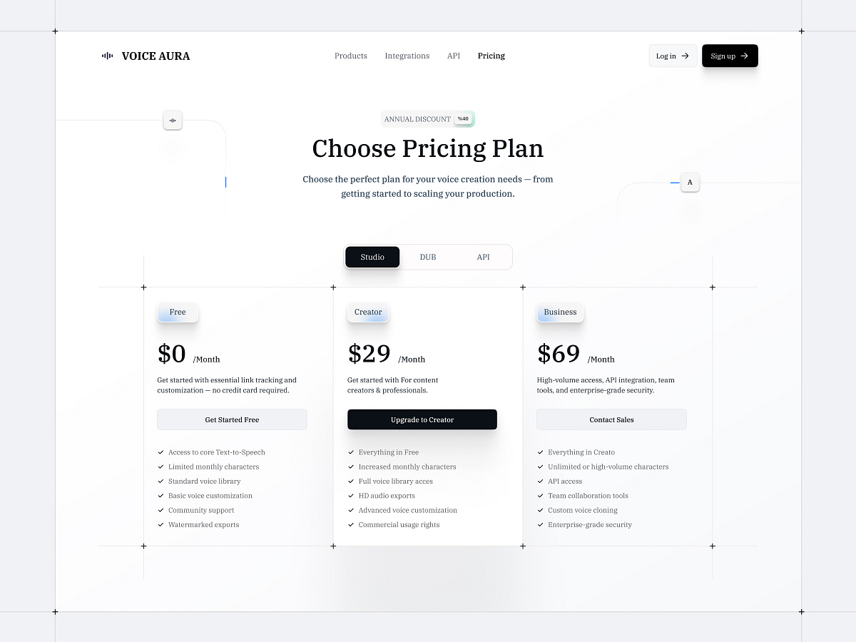
Pricing Card UI – Light & Dark Mode
SaaS - Pricing Page
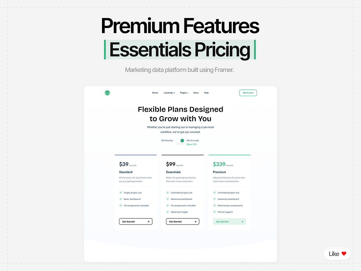
Modern SaaS Pricing & Landing Page Design | Framer Build

Pricing Page Design — Helping Users Choose Without Confusion
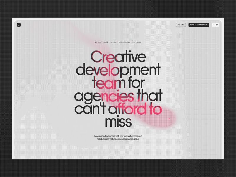
Creative web development team for agencies | incredibles
SaaS Pricing Section UI Design One-Time Payment Model
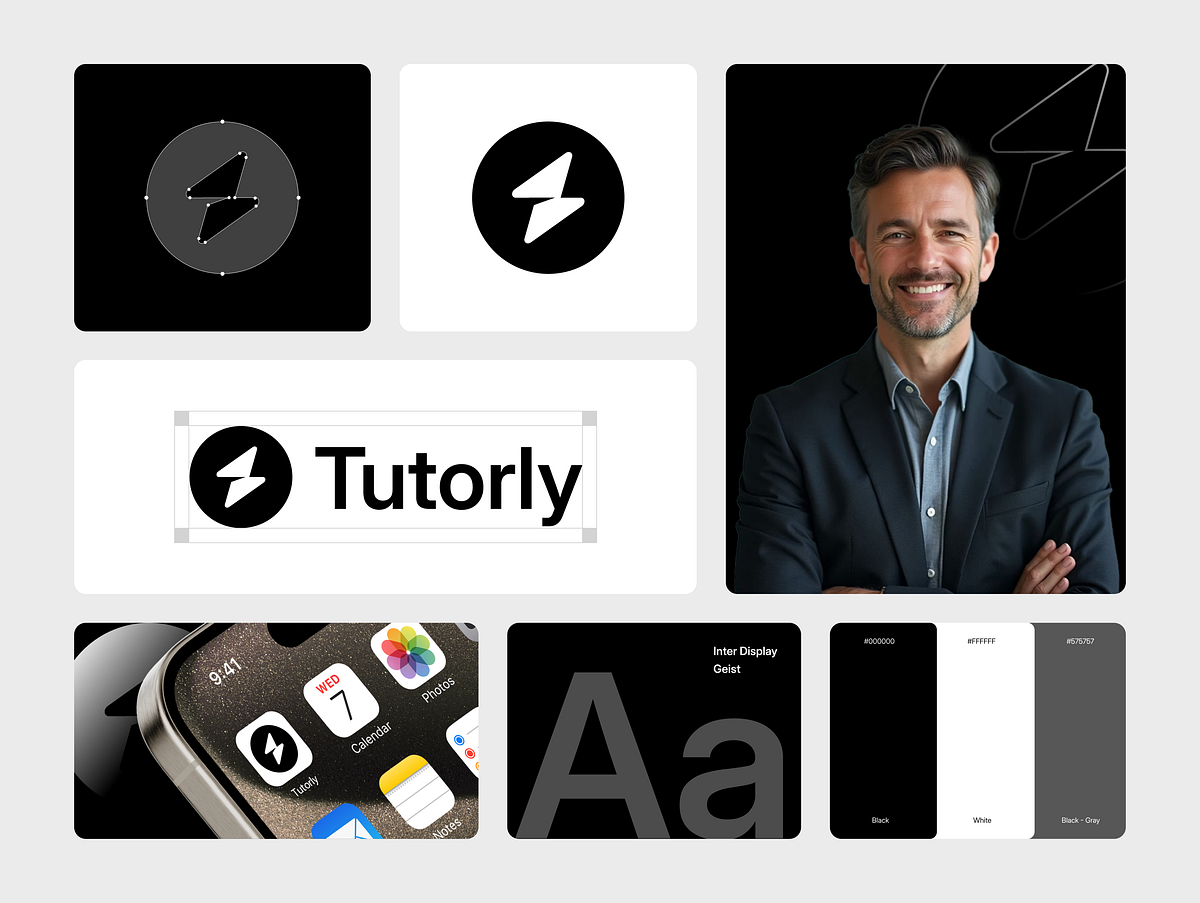
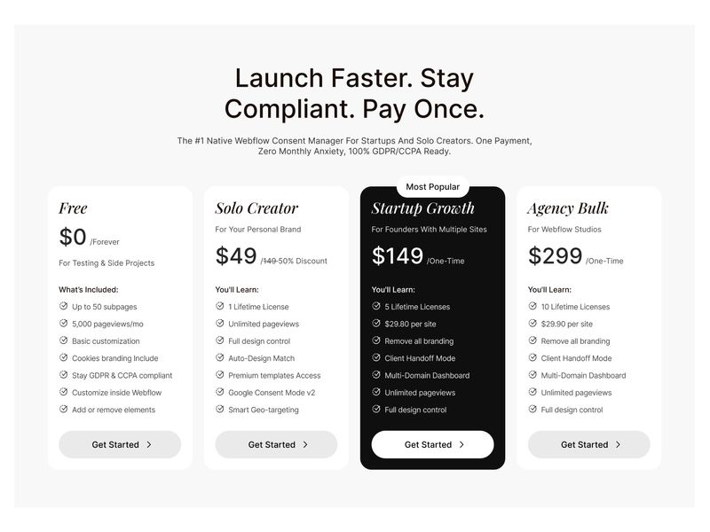
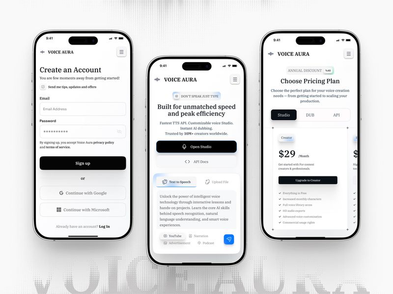
High-Converting Pricing & Sales Pages — Tutorly 💸
SaaS Pricing Page & Mobile App Dashboard 💳

High-Converting Pricing & Sales Pages — Tutorly 💸

Visual direction For Smart Travel Assistant Jourkit
AI Website - Mobile
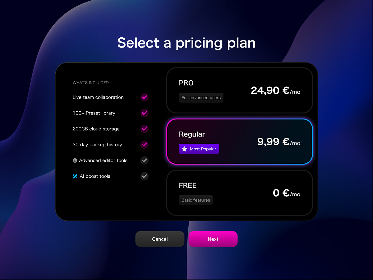
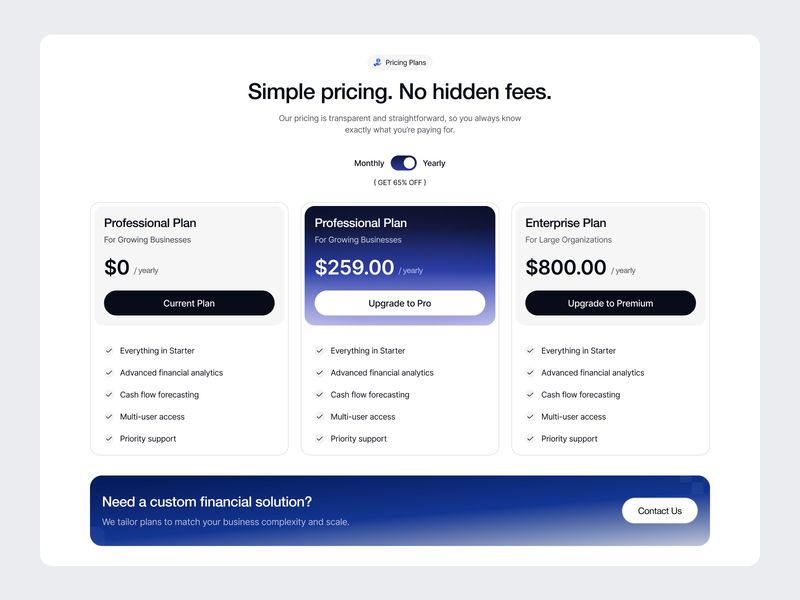
Pricing plans
Pricing Card - Mobile
Pricing page - Virtual assistant website
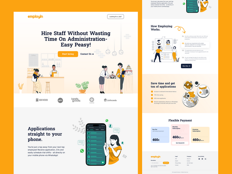
Hiring Platform Landing Page — SaaS Recruitment Website UI
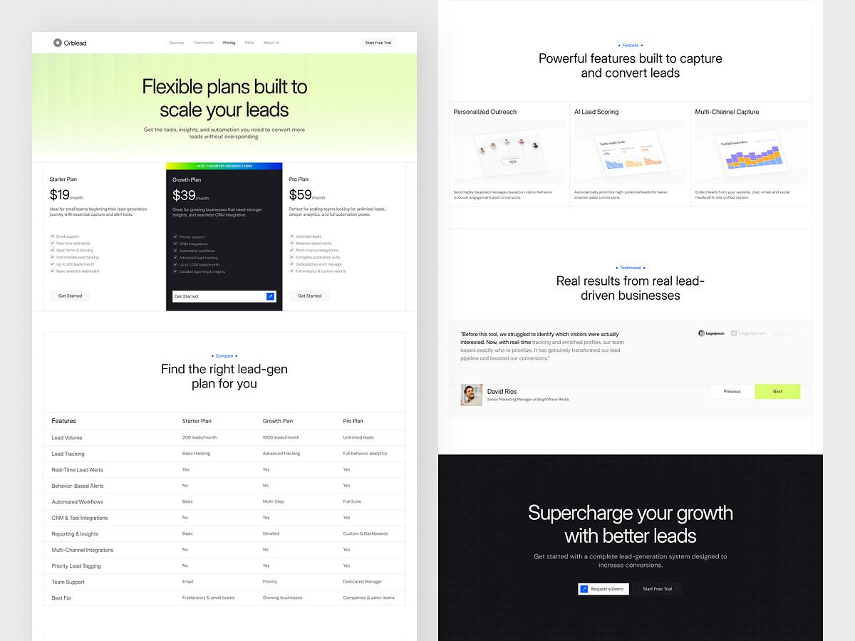
Pricing Page - Lead-Generation Website
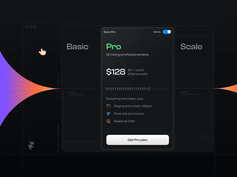
Compact pricing card exploration with @Framer. How is it?
SaaS Website Pricing Section
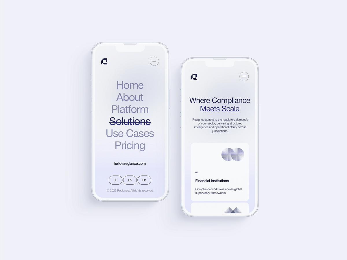
Regulatory Intelligence Mobile Web

Catch Dashboard Web App

Pricing Screen
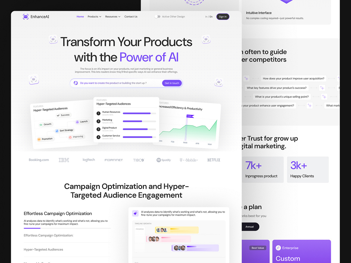
EnhanceAI – AI-Powered SaaS Landing Page for Smarter Marketing
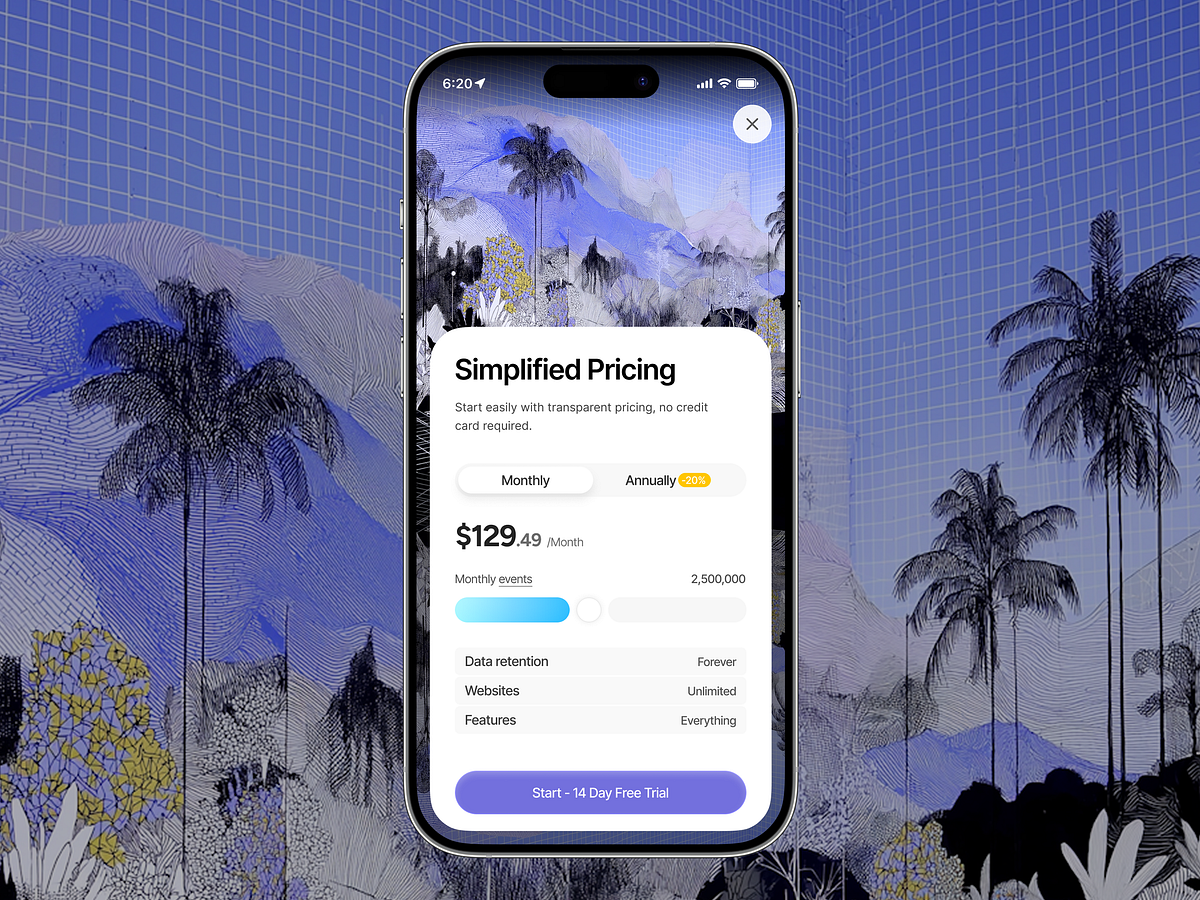
Simplified Pricing UI — Mobile SaaS Experience
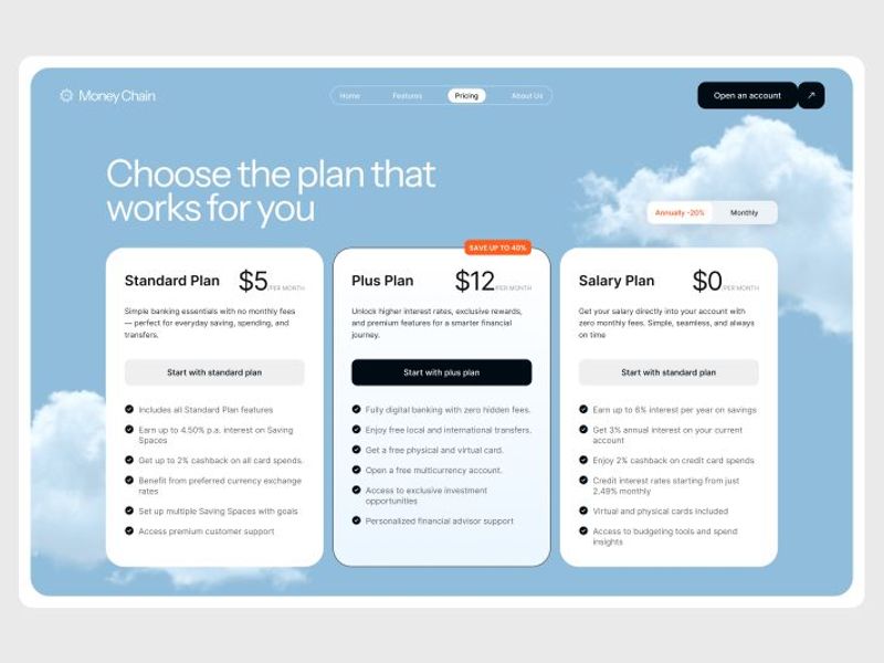
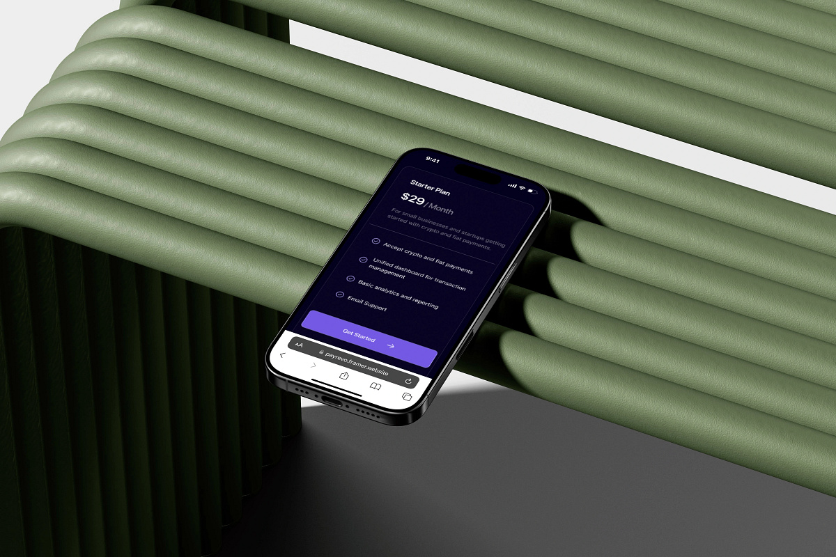
Modern Fintech Pricing Website Design
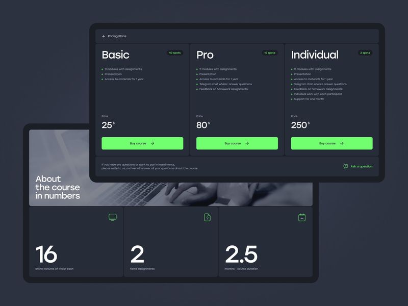
Pricing Screen
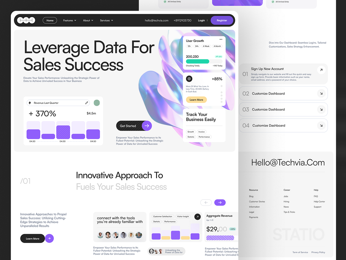
Techvia - Landing Page for SaaS & Analytics
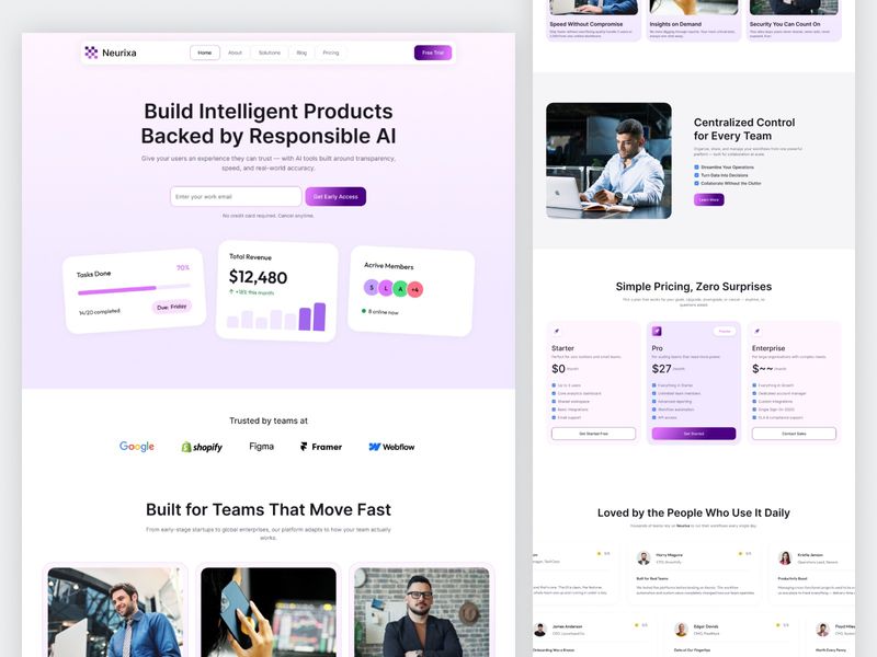
AI SaaS Website Landing Page UI Design
Simple & Scalable Pricing
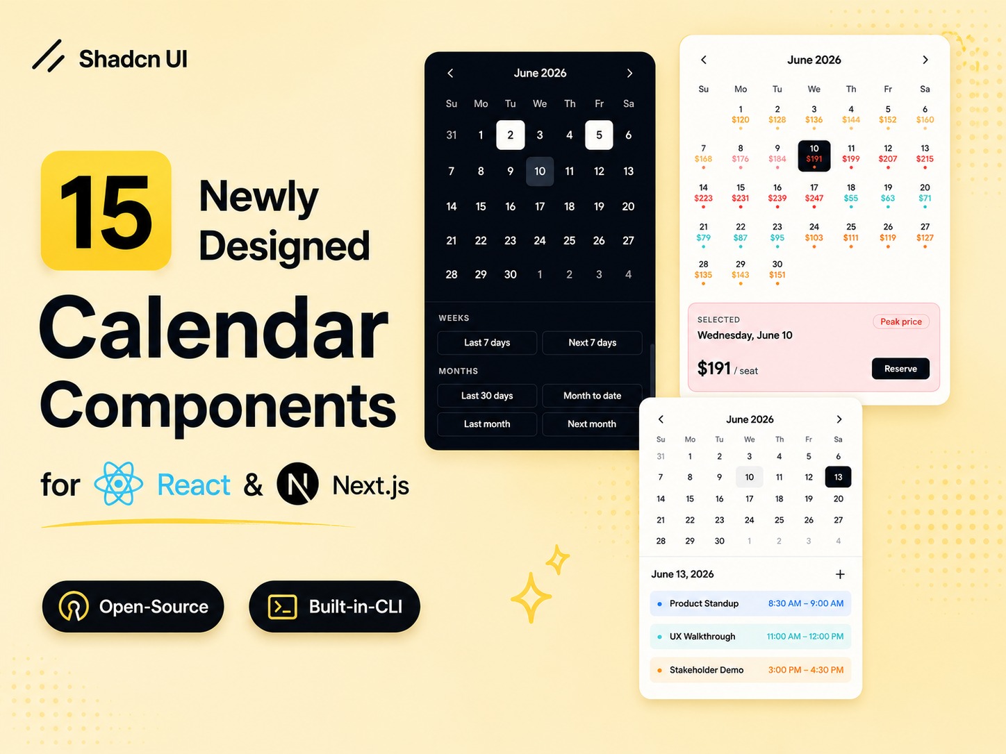
Newly Designed Shadcn Calendar Components for Booking UI
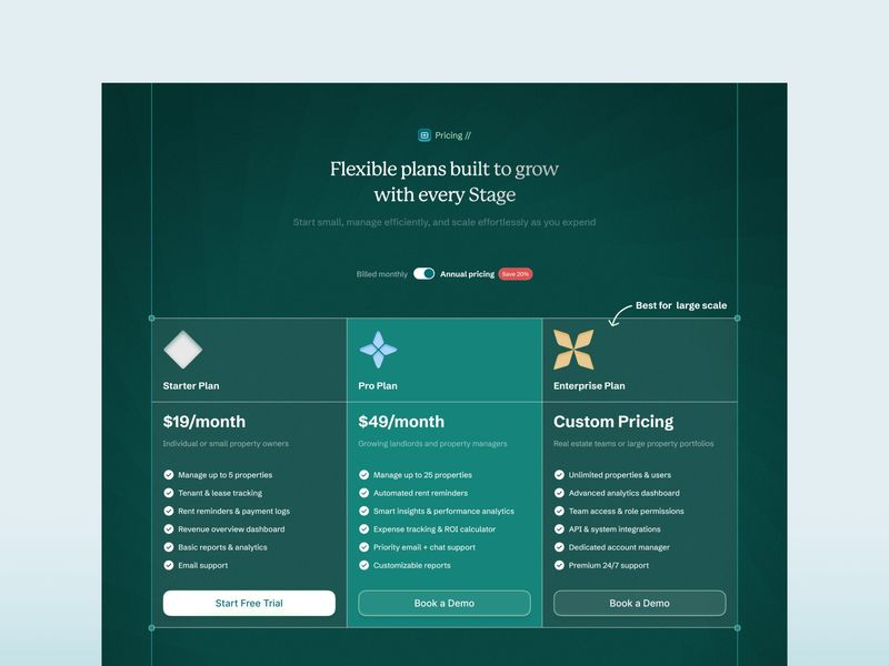
Pricing Section Design
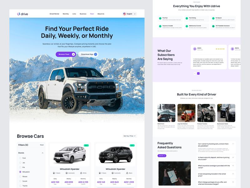
Car Rental Website UI Design — Udrive Fleet Page

Ary's Plans for 2026 - January Design Challenge

Pricing plan emojis
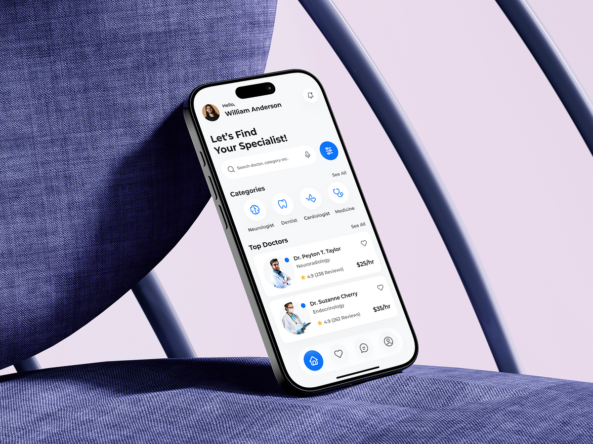
Healthtech Telemedicine Mobile App - Home Screen Design
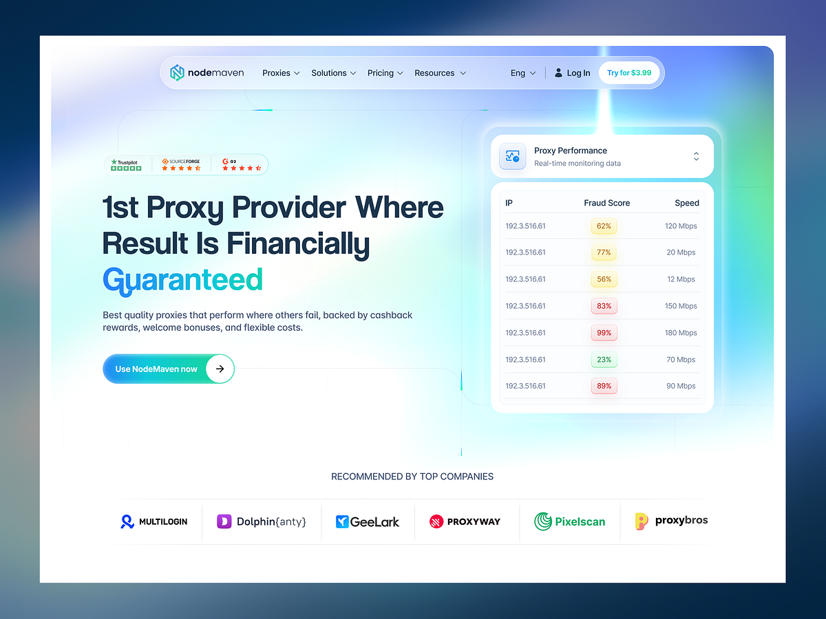
NodeMaven - Proxy Service Providing Platform
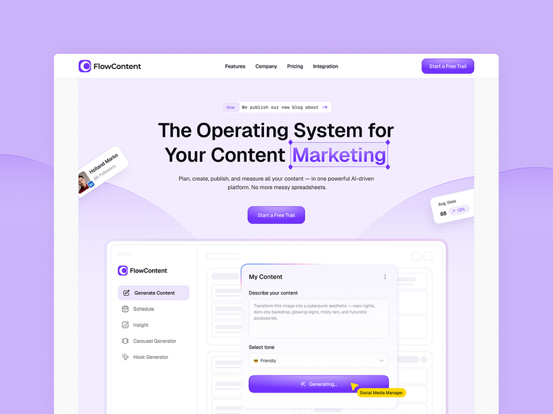
FlowContent SaaS Template: Full Design System & Landing Page Kit
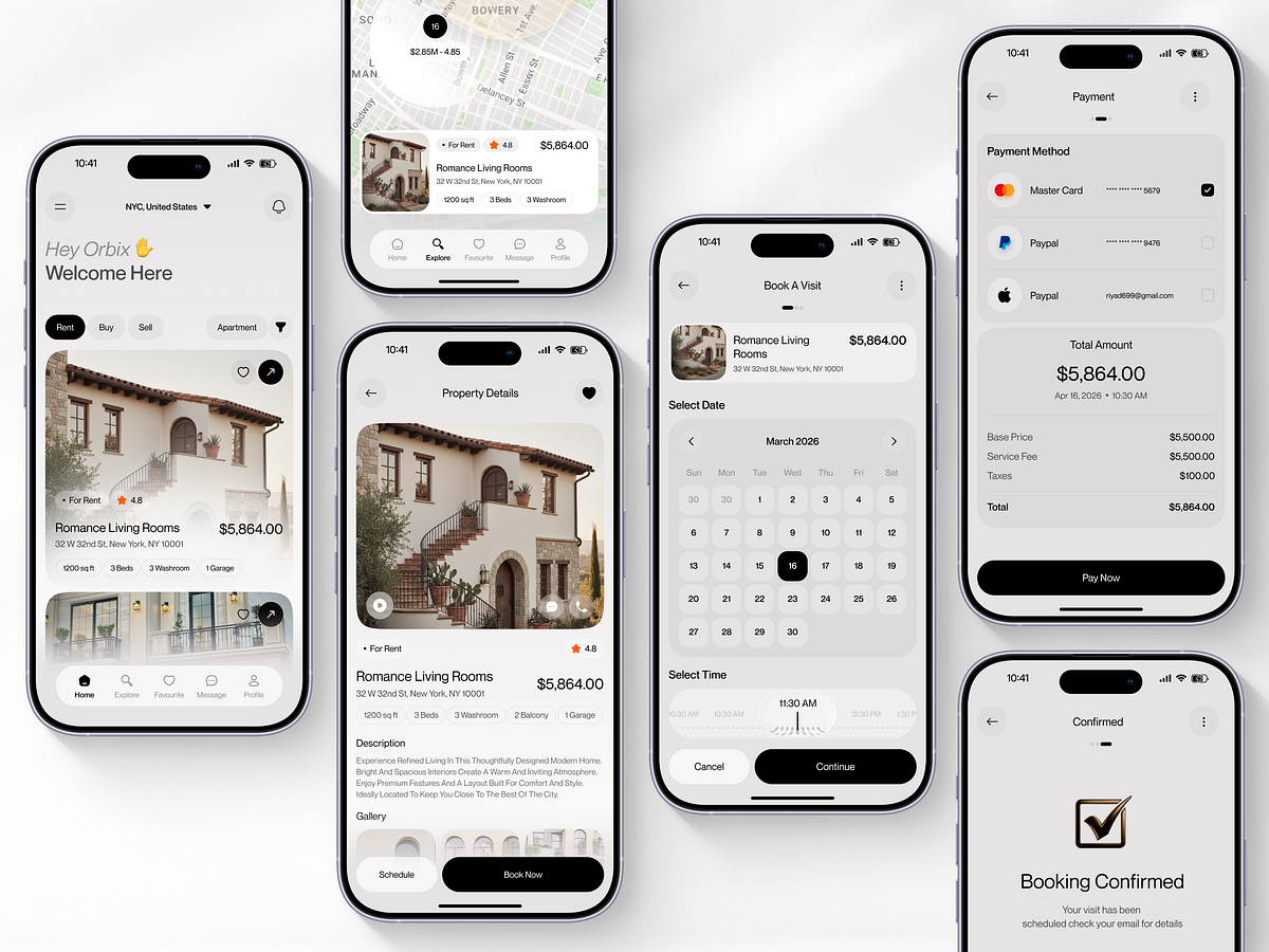
Aurex Living — Real Estate Mobile App Design
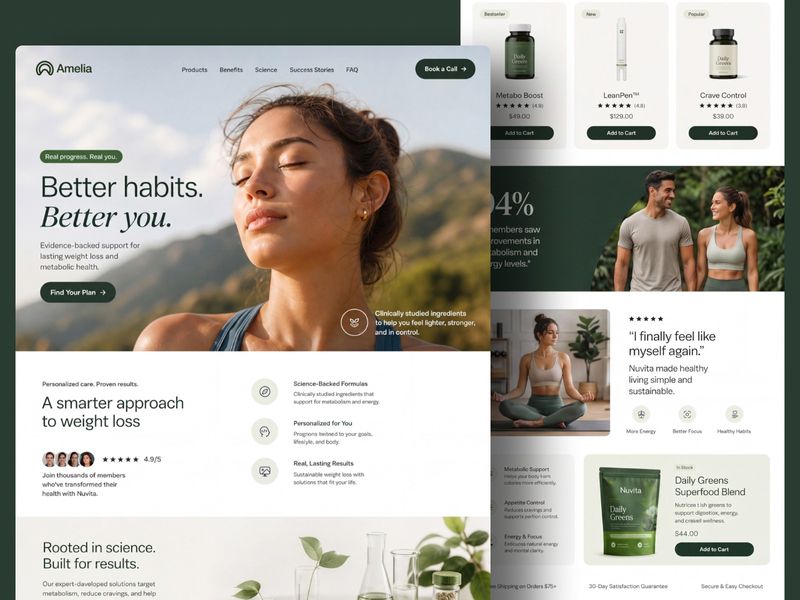
Wellness & Lifestyle Training and ecommerce Experience

Remodix — Home Renovation & Remodeling Template
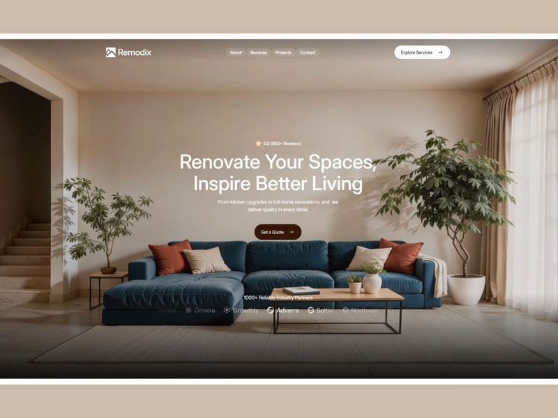
Remodix — Home Renovation & Remodeling Template

Paysafe · Financial Framer Template
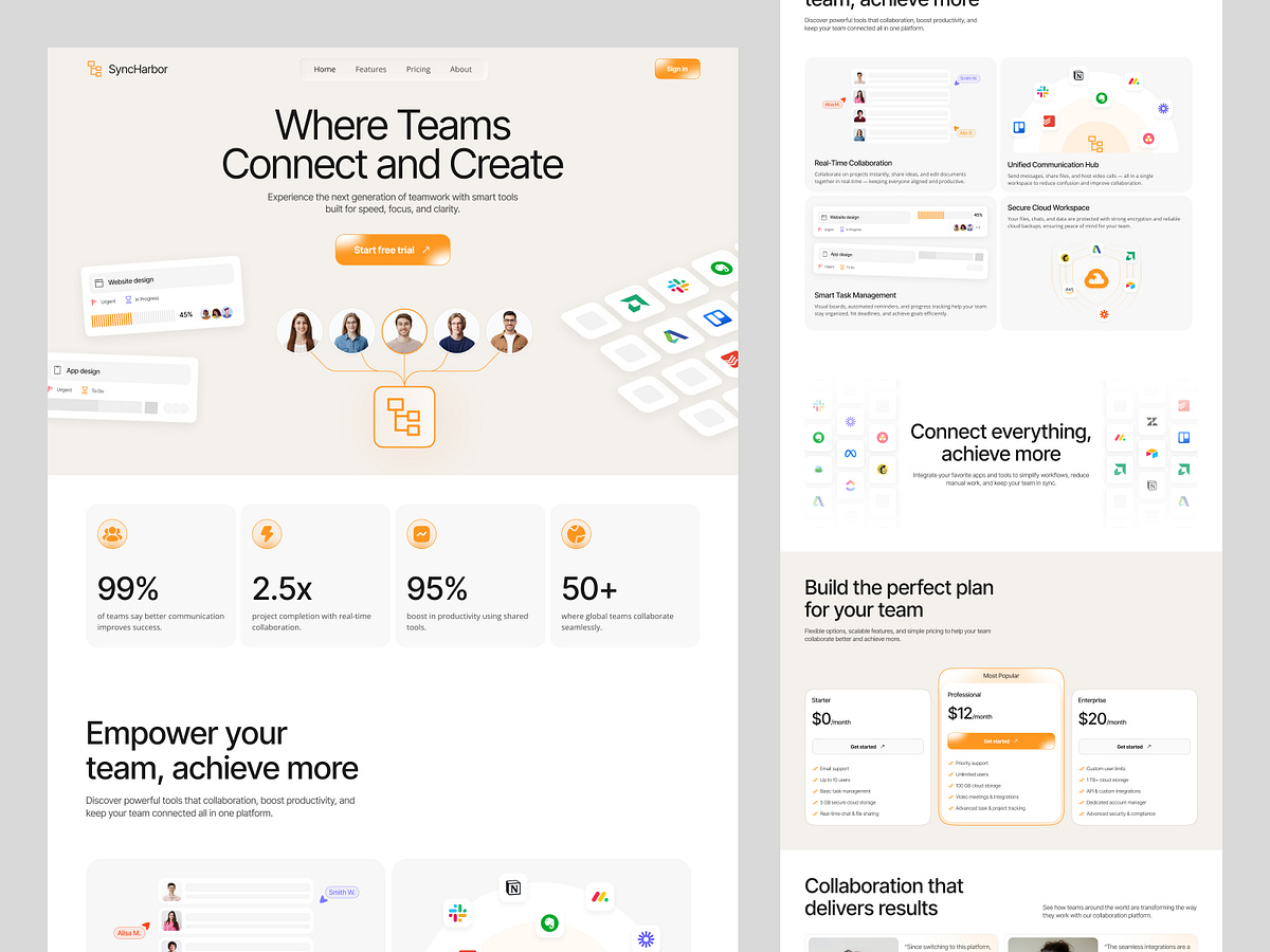
Team Collaboration website design

Sobry

Scalora – AI Marketing Automation SaaS Website |Framer & Webflow

Scalora SaaS Template – Fully Responsive AI Marketing Website
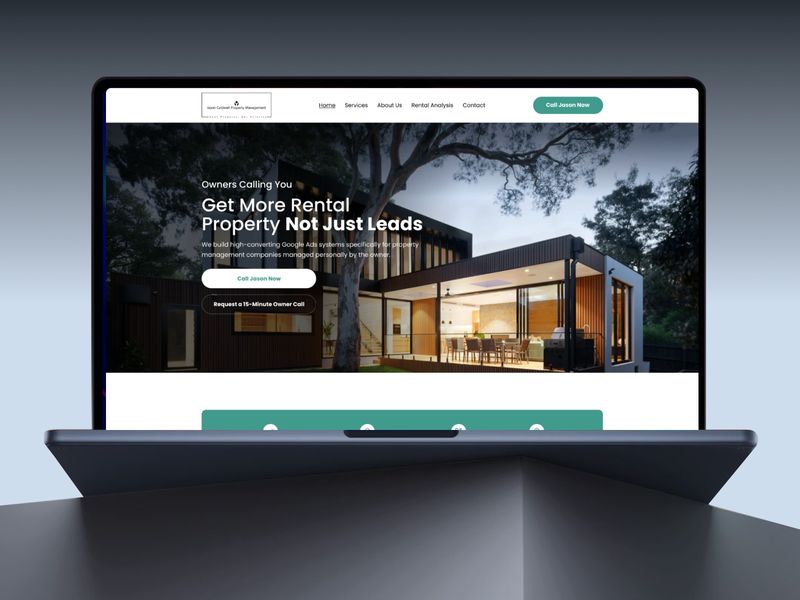
Jason Caldwell — Performance Marketing UI Design
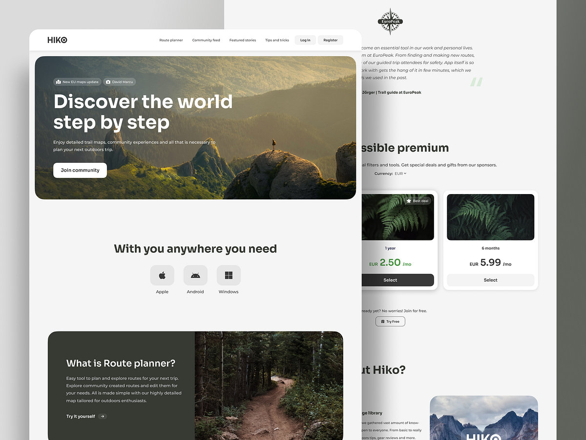
HIKO - Landing page
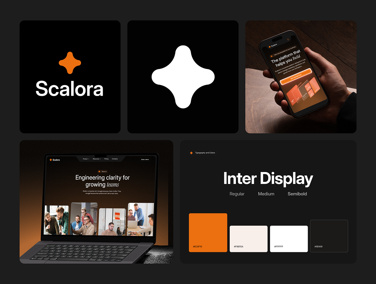
Scalora – AI Marketing SaaS Template Project Overview
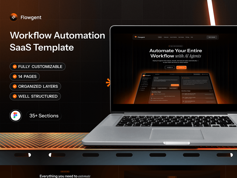
Flowgent - Workflow Automation SaaS Template

SaaS Pricing Section
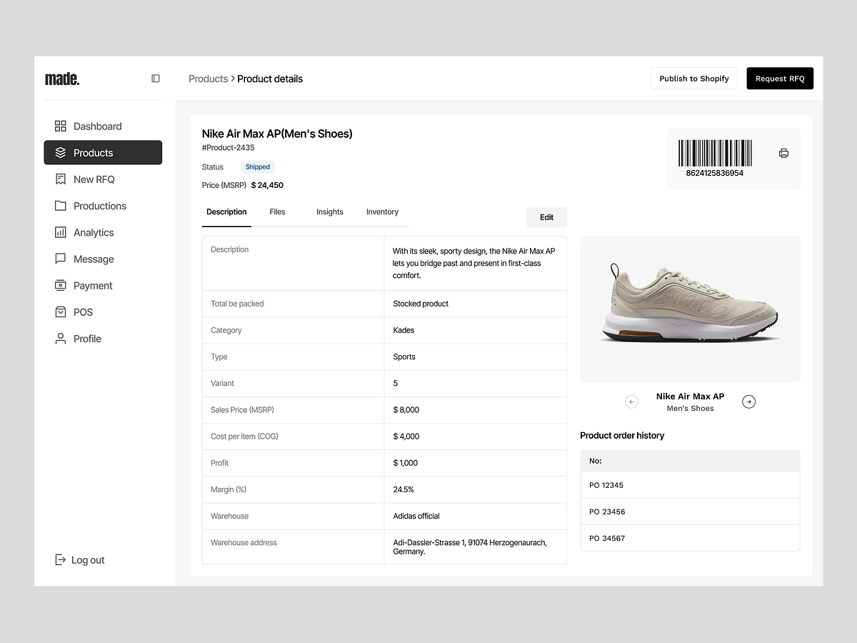
Made – Product Details Dashboard
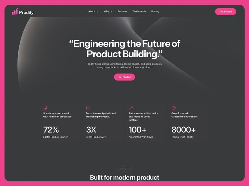
Prodify
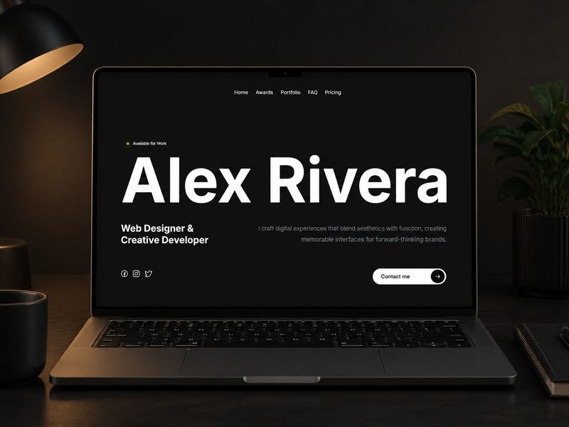
Alex Rivera - FREE Framer webdesigner portfolio template
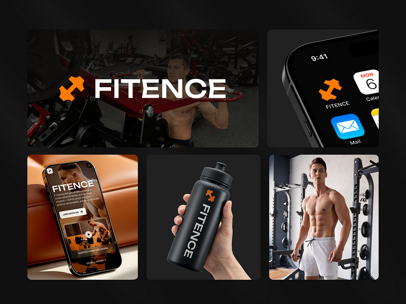
Fitence Full Project Overview — Fitness Website Template
Fitence Full Project Overview — Fitness Website Template
Get access to thousands of freshly updated design inspiration pieces by adding Muzli to your browser.
Loved by 800k designers worldwide, Muzli is the leading go-to browser extension for creative professionals.
How do you design a pricing page that converts browsers into buyers?
Pricing pages are where much of the revenue decision happens in software and subscription businesses. The design goal is reducing decision friction — helping visitors quickly understand which plan is right for them and feel confident enough to commit. The most reliably effective pricing page design is less about visual creativity and more about information architecture: the right features in the right comparison format, anchored by a clearly recommended option.
What is the most effective pricing table layout structure?
Three to four horizontal plan columns outperform longer vertical lists for plan comparison. A recommended tier (typically the middle or second-highest option) should receive visual distinction: elevated card with primary brand color header and a "Most Popular" label. Feature comparison rows should group capabilities meaningfully — lead with the 5–7 most decision-relevant features, then collapse the full list behind a toggle. Show annual pricing by default when the annual discount is meaningful (20%+).
What trust signals belong on a pricing page?
Pricing pages need to address the primary anxiety: will I regret this commitment? Social proof specific to plan tiers works better than generic testimonials — quotes from companies similar to the prospect's size at their respective plan level. Free trial or money-back guarantee messaging directly adjacent to the CTA removes the last risk barrier. FAQ sections that address cancellation, billing cycles, and seat management questions close the most common objections before they require a sales conversation.