Product Page Design: Handy UX Tips and Practices
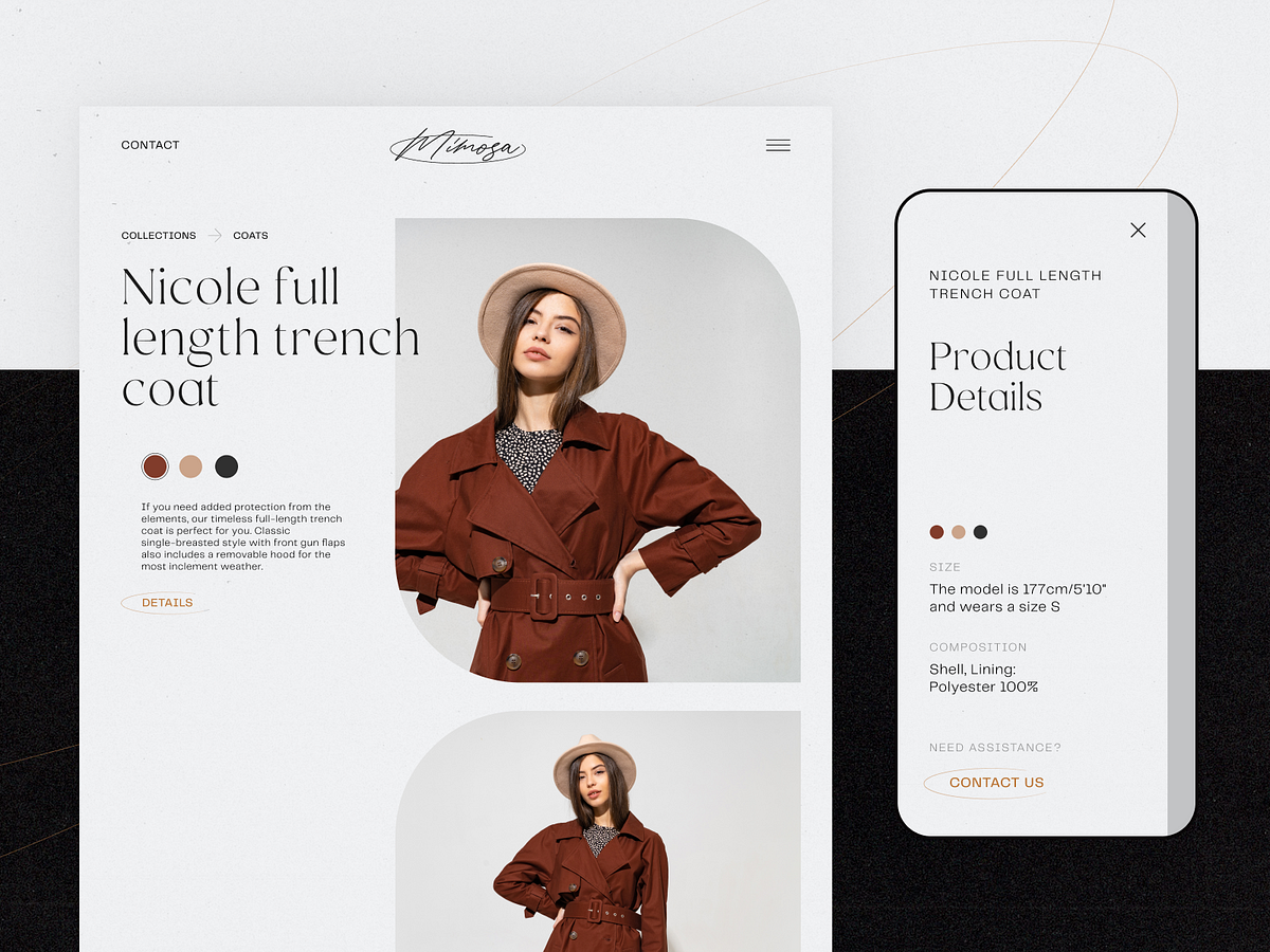
In e-commerce, the measurement of success is not the number of website visitors or clicks. It’s the number of finalized purchases. From that perspective, a product page is crucial as it is usually the spot where most decision-making on “to buy or not to buy” happens. So, designing or improving an e-commerce website or application, UX designers have to think it over and test it up to the slightest detail. That’s what our today’s article is about: let’s discuss what a product page is and how to design it effectively. Packed with plenty of examples from both known e-commerce websites and creative design concepts for niche or specific business goals.Product page design for the BlockStock websiteWhat Is Product PageThe product page is a page of an e-commerce website that provides a customer with all the needed information about the particular item, allows them to check various options if they exist, and enables a customer to quickly proceed with the purchase process if they decide upon buying the item.Unlike a real point-of-sale, an e-commerce website doesn’t provide physical contact with an item or assistance from shop staff. Product page becomes the major source of attraction, impression, information, and persuasion. That’s why its design, navigability, and usability play a crucial role in growing sales.As we mentioned in our guide to the basic web pages, a badly-designed product page may waste all the effort (usually massive and complex) taken to bring the buyer to the website and to this particular product. So, besides the attractive product presentation, focus on functionality, clarity, readability, and intuitive navigation.Product page concept for a gardening e-commerce websiteTypical Elements of Product PageBasically, a product page:shows the image of the productgives all the needed information about the productallows users to check different color/model options (if any)enables visitors to see the reviews, comments, and ratings from earlier buyersallows for adding the product to the cart or wish listshows other relevant options.Additionally, the product page may include such options as a comparison of different items, especially popular on websites selling different devices and appliances.https://medium.com/media/fbf4df9762877774580cc9ad6f038ee5/hrefBased on that, here’s a checklist of basic elements of the product page layout:name/title of the itemphotopriceitem availabilityadd to cart/add to bag/add to basket/buy buttonadd to favorites/save to wishlist buttondescriptionsocial proof: rating, reviews, the number of previous buyers, the number of people looking at the item now, etc.choice of colorchoice of modelchoice of the number of items to buysize guide or calculator (for clothes and footwear)extended details (materials, technical specifications, dimensions, weight, special features, etc.)The list above doesn’t mean that all the points are obligatory for any product page. The choice will depend on analyzing multiple factors, understanding the target audience, and careful prioritization to see which points to include and which may be eliminated from the list for this particular type of goods or kind of customer.Product page first-screen view on Walmart websiteDesign Practices for Product PagesVisual DemonstrationE-commerce platforms are the best place to prove the saying that the picture is worth a thousand words. Not able to contact the item physically, visitors will count on the visuals of the product to make their first impression about the goods. What’s more, images are noticed and decoded faster than words; they will be the first element attracting the visitor’s attention. They present the part of the content which is both informative and emotionally appealing.That’s why many e-commerce platforms:use a set of images to present one item from different points and anglesapply zoom functionality to enable a visitor to look at some parts of the photo closer, see the textures and small detailscombine the photos of the item with photos of it on a model or in the proper environment to give a better understanding of its looks and sizesProduct page first-screen view on Marks and Spencer: a combination of several photos shows the item separately and on the modelThe approaches to photo content can be different and depend on both general brand strategy and particular campaign or collection style. However, what unites them all is:originality: special shootings are organized to make custom photos that correspond to the style defined in a brand book or specific campaign guidelineshigh-quality: no doubt, the quality of photos directly influences the impression about the particular item and the brand in generaloptimization for the web: being quality, photos shouldn’t be too big as it can dramatically influence the loading time, which in turn has a great impact on SEO; also, pages loading slowly are the solid reason for high bounce rate — unless the website offers something absolutely unique and super exclusive, people will just go away instead of waiting.https://medium.com/media/0dbae34320e0fdf1557cb3c1f0a819e6/hrefExcept for images, other media, more complex or interactive, can also be used. Among them, you can now find:product videos, detailed video reviews, and instructions360-degree view of the itemaugmented reality technologies helping people to observe the item in their own environment or try it on virtuallyhttps://medium.com/media/41455d1226847ea12130dc5b5bb0e2c0/hrefhttps://medium.com/media/14946784cfbd8eaf5288cdf71010c4cc/hrefGardening Shop WebsiteObviously, these types of media are often more complicated, time-consuming, and expensive in production than photos. So, the decision on their worthwhileness is usually based on the type and price of the offered item. For example, to sell a 5-dollar T-shirt, photos may be enough, but for buying a massively more expensive fridge, smartphone, computer, or even a car, customers need more convincing in the decision-making way. And in this case, expenses on the more complex but more impressive, persuasive, and informative visuals and media could be a worthy investment.https://medium.com/media/4574e116775a0032a6295c5ec63d54c4/hrefhttps://medium.com/media/6d36ec146e7ead43e4b5ab45ce1817d4/hrefInformative but Simple DescriptionThe saying that people don’t read anymore has nothing in common with the product page: when customers are deciding upon spending their money, they do read what they need to know about the product they are going to buy. Still, it’s not the reason to overload the description, as the attention span is quite limited. The description text should be concise, factual, simple, and talking in the language of the audience. It should answer the basic questions: what the product is, what it looks like, what it does, and how it does it. And better to do it from the first lines, which have the highest chances of being read, instead of filling them with standard marketing hooks shoppers are already sick and tired of.Another rule of thumb here is connected to the previous point: show, don’t tell. Well, better to say, tell, but also show! Don’t just describe in detail how the bag looks inside — show the photo. Don’t just tell how beautifully this neckerchief matches that jacket — show the photo. Don’t just mention the size of a toy — show the child playing with it. Combine the power of words with proper images to make the experience much more effective.Product page first-screen view on Uniqlo: the page features a concise and informative description of the item and puts the details on materials and care in another tab, both in the pre-scroll area of the page. Another good thing is a clear definition of the model's size on the photo, allowing the customers to instantly understand the proportionshttps://medium.com/media/fb1c390085eaaae2df3836596da418b8/hrefSuper Obvious Call to ActionCalls to action (CTA) should be instantly noticeable. In e-commerce interfaces, CTA elements are the core factor of effective interaction with the product; they play a crucial role in usability and navigability and, therefore, in getting profits. When all the path of interaction and transitions is built clearly for users, but the CTA element is not obvious, misplaced, or designed badly, the risk gets higher that users will get confused and need to make additional effort trying to achieve their goals — which is annoying. Therefore, the risk of poor conversion rates and bad user experience grows.ASOS product page first screen: the CTA button differs from everything else on the page due to color contrast and is instantly noticed in the light airy layout.Focus on the ItemNo doubt, thinking about the layout and content of the product page, both stakeholders and designers feel the urge to fill it with everything possible, and even more, to make the page super informative. However, be careful as this strategy may do a dirty trick: in that flood of information, the focus gets blurred, and visitors can get too distracted to make a decision. How to find the balance?On the one hand, it’s recommended not to overload the page with a great deal of information that will overwhelm customers and distract their attention from the major goal — to make the purchase. On the other hand, visitors aren’t ready to jump from one page to another to get different information about the item they are interested in. Therefore, the designer has to take the time for thorough research on the issue, prioritize carefully, and find the balance of data that needs to be provided on the product page.Is there a golden rule for all e-commerce websites? No way, as different customers and markets have different needs, and the type of the product also influences the choice of core and secondary information to show. The analysis of the target audience and user testing can give clues on what information is required for the specific categories of items or services.https://medium.com/media/26962819154291eb06645ebc01b7f1da/hrefThe more pricey, uncommon, or innovative the product, the more information the customers usually want to get about it. And even for common stuff, there may be tons of questions and hesitations. Sure, all the needed information should be accessible from the product page, and the challenge for UX designers here is to find a way to organize it properly. Technical details, materials, weight and size, size chart or calculator for clothing and footwear, functionality for comparing the item with a similar one, and so on, and so forth — any of those details can play the premier violin in a story of a particular item.Use the principle of the inverted pyramid and uncover information gradually, from the most important and demanded shown first to more and more specific details unveiled further.Instead of creating intrigue, be open, direct, and clean in content presentation.Try to put all core information in highly readable form on the above-the-fold part of the page.And test, test, test again, analyze the time on the page, heatmaps and clicks, ask and analyze to know what buyers really need and what makes shopping convenient for them.The product page on Amazon is based on the principle of the inverted pyramid: this above-the-fold view shows the core information and functionality buyers want and need to know about this type of product first of all. Engaging social proof is marked by the label of #1 New Release and showing what other products are often bought together with this one.The second screen uncovers more about the actions of other customers interested in this theme: two sections, visually attractive due to the focus on product images, uncover other items customers view or bought.And only after that, scrolling further, can users find the extended information, editorial reviews, etc., based on text without visuals.Intuitive NavigationEvery button, link, and card design can change the conversion rate significantly. It’s vital to always remember: in the intense competition we observe in e-commerce now, buyers aren’t ready to wait or waste their time on unnecessary operations or efforts to understand where’s what they need. What they do demand from e-commerce is an experience that is faster, easier, and more convenient compared to going to the actual store. If this website doesn’t give it to them, they will look for it somewhere else.So, adding to obvious CTA, make sure that users can effortlessly do common steps, for example:find search fielduse breadcrumbs helping to quickly understand the current position in the website hierarchy and probably take a step or two back instead of just going awaybe totally sure which elements on the page are clickablesee if the item is already in the cartsee the number of items in the shopping cart or bag (usually, in the website header)use the power of visual dividers and common directional cues to perceive the information fasterfind the contact information and navigation links in the website footerProduct page first-screen view on Target: multiple photos of the item, both clean and integrated into the environment, clear and instantly noticeable controls for choice of color, the obvious search field in the header, breadcrumbs creating the secondary navigation level, social proof in the form of ratings and questions, and clear call-to-action element.ConsistencyConsistency means that the product communicates with the user in the same or similar way, whatever point or channel of communication. In terms of user experience, it means that similar elements look and function similarly, this way reducing the cognitive load and making interactions more smooth and more intuitive.In an e-commerce interface, it touches both:Internal consistency is about different parts of your interface or brand that look and behave as one clear system. For example, when you make all the CTA buttons on different pages or screens of your product colored and designed the same way, visitors can learn fast and will be able to quickly distinguish them at any step of their user journey.External consistency is about parts of your interface that look and behave as typical patterns for most products of this kind. That’s, for example, when you use a shopping cart even on the website selling non-tangible products or underline the text links to give users a hint that they are clickable.Sephora product page first-screen view: expected navigation in the website header, easily recognizable for e-commerce shoppers, super obvious call-to-action button, arrows used as the clearest directional cues for most users around the web, focus on the item presented in different visuals and highlights important and influencing decision-making for the target audience.Power of Known PatternsAdding to the previous point, UX designers would better never underestimate the power of habit. In UI for e-commerce, especially in the red-ocean spheres, the primary goal is not to shock and awe. Basically, UX designers become a friend or at least supportive shop assistant who greets visitor, guides them around the store, takes them right to the items they want, and make the checkout as fast and simple as possible. To make that all possible, designers should base their decisions on how actual customers behave.There are many articles and videos calling creative people to hear their hearts, trust their guts and think out of the box. However, design is not just pure creativity striving to show all the power of original solutions. First of all, it’s a way to solve the problem and make users happier. So, it’s vital to look at the interface from the user’s perspective and find a way to make interactions that will provide a smooth and easy way to purchase.The power of habit plays a big role in products of this kind. Choosing layouts, menus, or icons, which stand too far from the ones users are generally accustomed to, often brings confusion and frustration. For a simple example, the usage of any other image instead of a magnifying glass to mark the search field can result in a bad user experience as buyers know that visual symbol and will look for it. If you are ready for such experiments, take time to test them well and ensure that customers are ready for them, too.H&M product page design is based on a minimalist approach: the first-screen view is designed around prominent images, model choice options, elegant and readable basics (product title, color name, and price), a heart icon as a well-recognized visual trigger of adding the item to favorites and a noticeable CTA button. Even the size options are hidden in the dropdown menu to put the number of controls to a minimum and focus all the attention on the visuals. Sure, it means additional clicks and scrolling; however, the approach may be reasonable and effective if the customers are used to this flow and appreciate this particular style, consistently reflecting the brand image in general.In the article on home page design strategies, we mentioned: the website is made not for creative contests or galleries of fame but for real users. The positive impact of habit in terms of user experience can be stronger than the wish for revolution. No doubt, the dose of uniqueness is needed, but not so much to knock down the user. In e-commerce UI design, often aimed at quite a diverse target audience, too much of a revolution might scare and provoke hesitations: do I really need to buy this thing, a user may think, if it’s so hard to get it? Study the interaction patterns and typical products for that particular target audience to make their habits their power. And don’t forget to check that all the icons on the screen don’t have a double meaning; support them with text labels where needed. Strive for the balance between innovation and traditions.Narrowing the focus, we may also talk about the power of habit for a particular e-commerce website. You could have read numerous reviews of the “poor UX design” of this or that e-commerce giant, breathing fire and brimstone into old-fashioned solutions or complex navigation. However, thinking deeper, it’s easy to understand that they activate the power of habit as a major approach of respect to their buyers, as plenty of their customers have been with them for many years. It’s not because they don’t know how to change; it’s because, at some stages of business development, the cost of change may be too high. It doesn’t mean that the changes are never made; they are just not as revolutionary and made in small steps.Product page above-the-fold view on Etsy marketplaceScannability and SkimmabilityIt’s already well-known that coming to a website or app, users don’t usually read and observe all the content on the page or screen. Instead, they start with quick scanning to understand if it contains something they need or want. Knowing the eye-tracking models, Gestalt principles, and laws of visual hierarchy, designers and information architects can put the core data and interactive elements into the zones of high and natural visibility. Other factors making product pages scannable are readable typography and enough white space.There are numerous things that have an impact on decision-making, and harmony is one of them. Eye-tensing color combinations, unreadable or not combining fonts, aggressive background, intrusive pop-ups or animations, annoying sounds, or pages loading for ages — any point of that stuff can spoil the experience quickly, distract users and move them away, sometimes even without a clear explanation what they didn’t like. Details matter; think over them and organize them well.First-screen view of the product page on George: due to the light airy layout, the page looks clean and simple, but at the same time, it’s highly informative even at the stage of fast scanning.https://medium.com/media/534253dc2ee6fbeba0c2ab38afc082f7/hrefFewer ClicksIf going from page to page or jumping from screen to screen is not a part of the journey into the sales funnel, save every user’s click possible. Too many operations are tiring and annoying, which is a kind of negative emotion. And emotions have a huge impact on user experience and make retaining users much harder. Minimize the number of clicks on the way of choosing and buying whenever it’s possible — this way, you respect the user’s time better than the politest words of thanks. For example, avoid dropdowns for a small number of choices in basic options such as color or model choice.Product page first-screen view on Sportsdirect website: no information is hidden in dropdown menus, so it’s super easy to scan the availability of models and sizes, the CTA is seen immediately, the number of items is changed easily by typing or manipulating plus/minus controls, arrows show how to see more images, and breadcrumbs help to jump back to choosing other items easily.Exotic Fruit e-commerce app uses a tab for adding the needed number of products with a simple tapThe OldNavy product page integrates the section of offered combinations with other items from the website, and it is not just an image to get buyers inspired: on hover, the shopper gets the list of links to items with basic information, which enables them to easily get engaged in further shopping and makes the relevant product accessible quickly.Social ProofSocial proof is an impactful factor in the decision-making process in both the physical and digital worlds. It is a psychological and social phenomenon of people copying the actions of others to undertake behavior in a certain situation. This term was introduced by Robert Cialdini in his 1984 book Influence; the concept is also called informational social influence.In e-commerce, the experience of the previous buyers influences the behavior of the next ones greatly; that’s why ratings, comments, and reviews are needed, especially on mass-market platforms. They help customers feel united with a group of similar buyers, which is easy to feel in the actual store among other shoppers but even more needed in the online shopping experience when you are shopping alone in front of a computer or mobile screen. What’s more, reviews can answer the questions the customer has, and this way support the positive decision about buying — or prevent from buying the wrong item and getting a negative experience.Here’s the product page on OldNavy: the first screen view, among all other details, includes the social proof showing the rating of the item with the number of people that marked it. Scrolling down, buyers are getting even more engaged: except for relevant products to combine this item with for the perfect outfit, the page uncovers the relevant items other customers looked at and liked and further customers’ photos and details on reviews.InteractivityWith more and more buyers online, brands and retailers can analyze more data about their behavior, needs, and wishes and integrate new approaches on that basis. Interactivity that imitates seeing the item from different angles and manipulating it, trying on the clothing or footwear, testing the make-up options on your face, virtually placing the piece of furniture or decor into your room — all that and diversity of other innovations are becoming more and more accessible and affordable due to the creativity, customer experience care, and new technologies. And sure, they help customers to make a decision.Another vital aspect of interactivity in e-commerce now is personalization and customization, when people can customize their purchase instead of just choosing it from the catalog. Choosing a custom combination of flowers for a bouquet, customizing the burger or pizza with favorite ingredients, collecting a personal outfit or family look instead of just buying ready-made ones — able to add their own personality to the offer, many shoppers feel ready to buy.Tasty Burger app allowing for creating custom burgers to buyMobile AdaptationNeedless to say, how many daily things people do with their smartphones nowadays, and shopping is getting to one of the top options. Besides, mobile adaptation is among the core web vitals of search engine optimization. If you want an e-commerce website to be googled successfully and let the visitors have a seamless shopping experience from any device, make the product page mobile-friendly and reconsider the layout to make the interface convenient and navigable for mobile devices. Some e-commerce platforms go even further and also invest in creating their native applications for iOS and Android, but for many small businesses, it may appear not affordable or even not reasonable. Anyway, the product page, as well as the rest of the website pages, should be responsive and mobile-friendly, no matter if the native app exists or not.Minimalistic product page for a fashion brand e-commerce website focused on photos, easy choice of color, and responsive to be used on any device.404 ErrorWith product pages intensively used and often updated, there are different cases of running into an error. People can accidentally mistype a letter in the URL, or the page they saved before may not already exist as the product is already out of stock. Make sure not to let customers come across an empty error page and go away. Connect them to other pages, offer relevant options or categories, and do everything to take advantage of the error page involving a customer checking something else.Bottom LineSure, the decision on the design practices to choose for a particular e-commerce project is a matter of thorough thinking, and the solutions on what to use and what to leave will be based on many subjective factors, from the type of product and market segment to the company budget, employers’ skills, individual tastes and specific needs of the target audience. The approach to mass-market e-commerce differs from the approach to a narrow niche. The approach to various generations of customers will be different.Yet, all the practices mentioned above won’t work properly if the major condition of the commercial world is not followed, which is: the product should be good above everything else. All the other steps, investments, and practices make sense if the website sells quality goods and makes a website or app its channel of sales, not the place of lies and tricks. Anyway, if the products you offer are good and the customer is already on the website, let the product page show the item in its best light and help the shopper to feel it like home, convenient, clear, and friendly.Useful ArticlesHere’s a bunch of articles to dive deeper into the theme of usability and user experience design.UX Design: Types of Interactive Content Amplifying Engagement5 Basic Types of Images for Web ContentUX Design for E-Commerce: Principles and StrategiesUser Experience Design: 7 Vital User AbilitiesMotion in UX Design: 6 Effective Types of Web AnimationTypes of Contrast in User Interface Design5 Pillars of Effective Landing Page DesignHow to Make Web Interface ScannableThe Anatomy of a Web Page: Basic ElementsError Screens and Messages: UX Design PracticesWeb Design: 16 Basic Types of Web PagesOriginally written by Marina Yalanska for Tubik BlogWelcome to check designs and art by Tubik via:WebsiteDribbbleBehanceTubik ArtsProduct Page Design: Handy UX Tips and Practices was originally published in Muzli - Design Inspiration on Medium, where people are continuing the conversation by highlighting and responding to this story.
26 Examples of Effective eCommerce Website Design
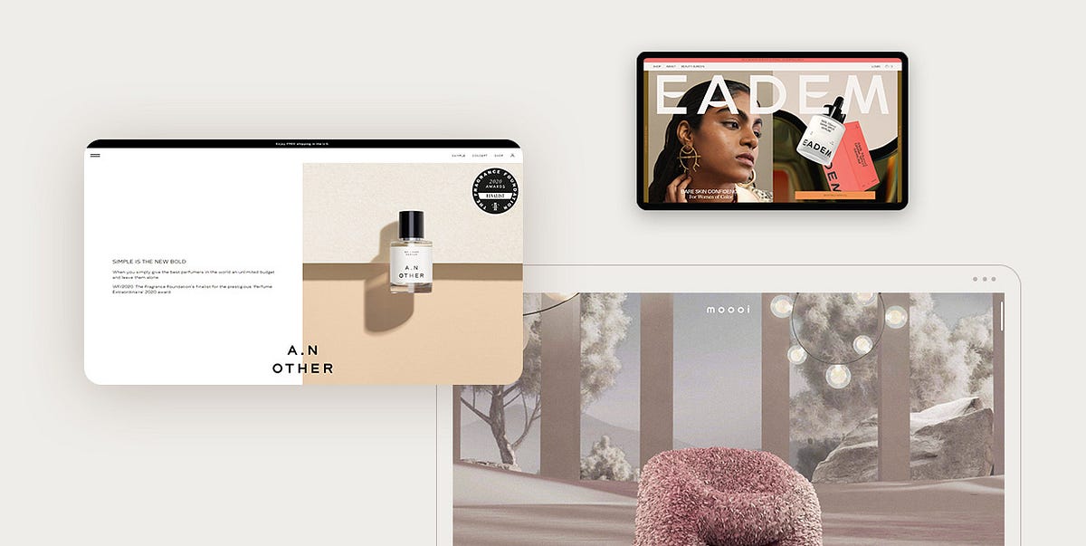
The success of an eCommerce business largely depends on its website. Excellent functionality, fast-loading times, clear terms of use, and a quick and simple shopping experience are just some of the most important qualities an eCommerce website needs to have. But to solidify themselves as eCommerce juggernauts and stand out on the competitive retail market, brands also need to be mindful of the way their website looks.Businesses that have successfully adapted to digital platforms and managed to converge excellent performance with beautiful design are the ones that thrive. While it may seem that an eCommerce website doesn’t leave too much room for expressing creativity, the reality is completely different. An online shop can be just as compelling and exciting as any other type of website. In fact, the design of an eCommerce site should be well-thought-out and carefully devised as it can be a thing that will ultimately make or break a business. This is especially true if brands are only just starting out and people are not familiar with their services. An imaginative online presentation can help them tell their story in an engaging way and incite people to press the “Purchase” button.To show you how immersive and impressive eCommerce websites can be, we have created a collection of some of the most striking examples from the web that prove that an online shop can be both functional and imaginative at the same time. The brands that have successfully combined performance with beauty and created memorable online shops as well as stunning presentations of their businesses include:EademMoooi — Beauty BloomsA.N OtherArmadillo — The Ellipse CollectionOrris SoapsAposeSeedlip DrinksDims.Maison d’EttoThomas ThanNutrafruit — Queen GarnetLafaurieProvider StoreTotêmeKarts Stone PaperAntiBite Toothpaste BitsSasai JewelryEveryday NeedsMatthew Fisher — Art ObjectsSandland SleepSuperfluidSalus BodyŌmbia StudioMociunMaurèleEademEadem is a skincare line created by and for women of color. Their website is picturesque, vibrant, demonstrating the beauty of its target audience and showcasing the power of Eadem’s products. The content is placed both vertically and horizontally, making it more exciting to explore. The particularly fun element on the homepage is the animated image carousel. It contains photos of women who used Eadem’s products as well as their reviews. This is a bit unusual but undoubtedly striking review showcase, guaranteed to capture users’ attention. The animated carousel is used elsewhere on the site, e.g., on the products page, making that layout appear packed with energy. Images are bursting with colors, and the large typography used on top of them enhances the site’s contemporary appeal. The shop itself is rich with images and copy that celebrate Eadem’s products and the positive effects they have on users. In the background, several pastel colors are combined, matching the palette of the imagery. The company opted for a horizontally-scrolling, strikingly orange bar to share that their packaging is recyclable, ensuring this important piece of information doesn’t go unnoticed.Moooi — Beauty BloomsMoooi is a Dutch furniture, interior, and lightning brand. They are known for their often stunningly designed websites, including the company’s official site as well as the online presentation of their A Life Extraordinary project. Beauty Blooms is an imaginative presentation that celebrates the launch of Moooi’s Hortensia Armchair. The site is a true audio-visual feast that starts off with a solar eclipse. As the dreamy music plays in the background, you find yourself among the stars, while the cinematic caption announces the name of the project. On scroll, a powdery pink hortensia petal falls from the skies towards the ground, leading you straight to the animated presentation of the Hortensia Armchair. The chair starts to move towards you, and you soon find yourself engulfed in pink petals. As you continue to scroll, you come across more of Moooi’s products, including the Ripples Carpet, the Hubble Bubble, the Mimic Moth Wallcovering, and the Room Spray Calli Papayan. All items are introduced through animated, fullscreen moviesque presentations that end in the pink moon rising above the tranquil midnight sea. When the movie ends, you reach the product slider. On click, you can explore each product individually, learn about its design, dimensions, etc. Product single pages are nothing less impressive, containing gorgeous visual stimuli that irresistibly invites you to make a purchase. The Beauty Blooms project is in development and more products will be added to the presentation, so this site is definitely the one we should all keep an eye on.A.N OtherA.N Other is a Miami-based perfume brand. The look of their website matches the design of their perfume bottles — it is simple and sophisticated. Overall, there aren’t that many colors on the site. Most of the content is in black and white, with occasional spritzes of peach-y and yellow-ish tones. The image — text ratio is perfect, presenting the A.N. Other perfumes in a refined and subtle way. The page that introduces you to the perfumers contains a more vivid color scheme, but still, the shades are quite tame so as not to disrupt the site’s ubiquitous serenity. There are no extravagant animation effects either. In fact, hover effects are the most prominent on the site, in particular on the shop page and product single layouts. When you place the cursor on product images, information about the particular product appears in the viewport. That way, you can immediately decide if it’s to your taste.Armadillo — The Ellipse CollectionArmadillo is a company that makes luxury rugs. In collaboration with House of Grey, an interior design studio, they created the Ellipse Collection. The website devised to present the collection starts off with ethereal fullscreen videos, depicting a young woman gracefully walking through the forest. Visitors are encouraged to begin the virtual journey that takes them through more video showcases. The first product they come across is called Etoile. As the woman reaches a sandy terrain, two transparent, outlined circles appear on the screen. On hover, smaller parts of the fullscreen graphics appear within the circle. When users click on one of the circles, the video continues, and the information about the collection and the link to the shop appear on the screen. The other circle reveals the brand’s philosophy. The filmic introduction to the collection is a surefire way of capturing the viewer’s attention and drawing them into Armadillo’s pastel world of luxury products. As one product presentation is finished, visitors can skip to the other and walk through the entire Ellipse collection. The “Shop Collection” button is displayed at the top of every product presentation, allowing users to start shopping instantly in case they’d rather skip the cinematic introduction to the selected items. On inner pages, the designers added a mega menu to illustrate the content of some website sections. Mega menus are an excellent way of introducing viewers to the site’s content and encouraging them to explore it. Product single pages contain images with a zoom-in hover effect, which is a great way of letting users view items up close without even clicking on them.Orris SoapsOrris is a French brand of artisanal botanical soaps. Large, gorgeously edited images of soaps make you almost smell the products and feel their robust texture between your hands. Aside from engaging photography, the site also includes background videos that take users on a quick trip through nature, highlighting Orris’ drive to connect the production of artisanal products with nature. The layout on the site is predominantly divided in two, with images on one side and the story about the brand on the other. This is a clever design solution that lets users discover details about Orris in a visually interesting way. The shop page is minimal, including only product images as well as their name and the price. But when you place the cursor on any photograph, another image replaces the default one, showing the selected product in a different setting. This makes the page more dynamic while simultaneously enhancing the appeal of Orris’ products.AposeApose is a French brand of watches. Their website looks sophisticated, with the content placed on a black background. The layout is interestingly designed — there is one horizontal bar placed at the top of the screen and the other, vertical sticky bar on the left-hand side. Both contain useful links that facilitate website navigation for the user. The menu is hidden by default, but when you do open it, it takes up the entire surface of the screen. Not only does the menu contain links to other website pages but it also features an image carousel, letting users explore the Apose collection of watches within the menu. The first slide on the homepage includes a fullscreen background video presentation of a watch, showcasing the product in all its glory and inciting viewers to continue scrolling. The copy is concise and informative, beautifully complementing the displayed imagery. Scroll-triggered animation effects are particularly engaging. In one of the sections on the homepage, the animation brings the components of an Apose watch into the viewport one by one, letting users see what the watches are made of. Moreover, the hover effect on the “Collections” page zooms in on pictured items, inciting you to click on the image and purchase the product. Aside from looking elegant, the website also contains some fun elements, such as the icon of a call bell that, on click, introduces viewers to the people behind the brand.Seedlip DrinksSeedlip Drinks is a brand that makes distilled non-alcoholic spirits. They are all about using natural ingredients in their drinks, so the loading animation in the form of a plant growing from soil comes as no surprise. The background is in white and beige, while the typography is colored only in dark green, matching the site’s naturalesque aesthetic. The packaging of Seedlip products contains illustrations of some animals, including a rabbit, a squirrel, and a fox, amplifying the brand’s connection to nature and the power of the natural ingredients used to make the drinks. The photos are stunningly displayed as fullscreen presentations as well as parts of image sliders, showcasing what Seedlip has in store in a fun and engrossing way. The beauty of the imagery is especially effective on the products page, with bottles displayed on wooden surfaces and against pastel backgrounds. The natural color palette is very pleasing to the eye, making the shopping experience more enjoyable for users.Dims.Dims. was founded in 2018 with the goal of providing contemporary furniture pieces at “the fairest possible prices”. The first thing that caught our eye was the menu. It looks unobtrusive, with small typography, and it stays tame until you hover over it. Once you place the cursor on sections that include subcategories, a dropdown menu appears with links written using large fonts. This is perhaps a bit of an unexpected design solution, but it’s also an effective one as it helps direct your attention toward the site’s categories. The background on the site is white, but when the dropdown menu slides onto the screen, the backdrop becomes light grey. As the menu disappears from view, the background goes back to white. The change is barely noticeable but it’s there, and it’s a testament to Dims.’ attention to detail. The first image on the homepage is huge, containing three items, each marked with an outlined circle. On hover, the circles become brown, and on click, they take you to the product single pages where you can discover more info about the selected items. Typography is in a warm shade of brown, matching the color of wood, which is one of the most popular materials for furniture. The font choices are also interesting, with a soft, serif typeface used in the menu and body text and a contrasting futuristic monospace font in product names and descriptions. The shop page features images in a predominantly zigzag formation — one photo is on the left with the accompanying text on the right, followed by an image on the right and the text on the left, and so on. Such content organization is interesting to the viewer’s eye, and even though there are no animation effects applied to the graphics, the zigzag arrangement adds to the site’s dynamicity, making it visually exciting to explore.Maison d’EttoMaison d’Etto is a luxury brand of artisanal fragrances. Their website is artfully designed, with the company’s products at the forefront. The imagery depicts contemporary-art-inspired perfume bottles often bathed in the warm sunlight, oozing comfort and tranquility. You feel completely serene as you immerse yourself in the large photographs, image sliders, and accompanying product descriptions. The color palette consists of earthy tones, with the dominant being a deep olive-green shade displayed on a beige background. Every Maison d’Etto fragrance has a unique story, but to reveal it, you need to click on the “The Story” button. The poetic text will then appear on the screen. The same goes for “Shipping & Returns” details — the information shows up on the screen only after you press the designated button. By hiding some details from immediate view, the designers had a lot more room to present the perfumes in an alluring way. This is also a great way of increasing user engagement on the site — photos are there to spark your interest but you must perform an additional action to learn more about the product itself. Useful links are displayed in the header and footer, so you can access all of the site’s sections in one click. And of course, by pressing the omnipresent “Add to Cart” button, you can easily get one step closer to owning Maison d’Etto’s luxurious perfumes.Thomas ThanThomas Than is an Italian brand of hand-made bags. The website starts off with an image slider that stretches across the entire screen. The photos depict people in the nude sitting or squatting on some kind of rock under the clear blue sky, with bags placed next to them or on them. The images are slightly provocative, but very artistic, void of superfluous detailing, allowing the bags to be the true stars of each picture. In some sections, the screen is divided in two, with photos appearing on both sides, which helps make the page exciting to browse. In other areas, the scroll-triggered action causes the images to overlap — one of them is in full-width and the other appears after several scrolls, covering up one half of the larger picture. On inner pages, products are presented in lots of visually interesting ways. For instance, on both “Women” and “Men” layouts, you’ll see a large, fixed photo of a bag. As you scroll, several smaller images appear next to it, revealing all the colors that specific bag is available in. The fonts used throughout the site are unobtrusive, which helps keep you focused on the depicted bags at all times.Nutrafruit — Queen GarnetQueen Garnet is a plum species and a superfood (Nutrafruit is an Australian company that owns the global license to the fruit and sells products made of the plum). Even if you’ve never heard of it, this website will not only help you learn more about the plum but also incite you to order some of the products that contain this superfood. The site’s design is regal, complementing the fruit’s name. The deep purple color on the layouts matches that of the plum and highlights the site’s grandeur. Moreover, the featured product images appear even more elegant because of the surrounding deep purple backdrop. Some products have purple packaging, but the designers used various shades of the hue throughout the website, so the colors don’t appear monotonous and dull. In fact, the different shades of purple on the website match the plethora of colors seen within the fruit itself. When you hover over product photos on the shop page, a deep purple circle surrounds the selected item while the image slightly tilts to the right, keeping your attention on the chosen product only. The refined typefaces complement the site’s aesthetic, further amplifying the fruit’s royal status. The facts about Queen Garnet and the answers to some of the most asked questions are displayed as a carousel on the homepage, presenting viewers with information in an appealing fashion.LafaurieLafaurie is a French menswear brand that’s been around since 1991. Their website looks refined and modern. Beautiful product images are paired with a great font combination of a serif and a sans-serif typeface, creating a striking presentation of Lafaurie’s collections. The homepage includes a particularly attractive image slider, but the photos don’t change automatically. Instead, you need to click on the lines displayed below the pictures, which helps increase your engagement. Moreover, when you place the mouse on the photographs featured in the slider, the name of the product, as well as its price, appear. On the homepage, there is also a section that contains product categories written in an elegant typeface. On hover, featured product images appear in the background, inciting you to further explore each category. And while you can explore the products using lots of different criteria, we were especially impressed by the practical features on the shop page. For instance, on each photo, there is a handy color palette that shows what colors the selected item is available in. You can simply click on the color you like, which then opens the page with more details and product images in the preferred color.Provider StoreProvider Store is an Australian brand that makes Japanese homeware. The website opens with a fullscreen image of some Japanese products used for cooking. There are also two strategically placed buttons that redirect users either to the kitchenware shop or the one containing Provider Store products. The color palette on the site is soft, with lots of pastel shades, making the content particularly enjoyable to explore. There are no wild animation effects. However, when visitors hover over product images, they can see what each item looks like in action (e.g., if there is an image of a basket, another photo appears on hover, showing the basket filled with flowers). Aside from images, the site also includes cute illustrations, including sushi and a bowl of ramen, fully immersing the viewers in an enjoyable Japanese experience.TotêmeTotême is a Stockholm-based fashion label. They are known for their minimal, uniform-inspired style, and the site’s design mirrors that aesthetic. The layous are full of straight black lines and geometrical shapes. Rectangles, in particular, are the dominant shape on the site. In fact, the entire content is placed in rectangles, starting from menu sections to product images. Pages are divided into two or more parts, creating sharp divisions between the displayed content. Everything screams precision — a word that perfectly describes Totême’s items. Needless to say, the site contains all the functionalities you’d expect from an online shop, including the possibility of creating an account and wishlist and exploring items either via keyword or by going through the available menu categories.Karts Stone PaperKarst Stone Paper is a brand that makes notebooks, planners, and journals from sustainable, recycled stone. The loading screen consists of an outlined, illustrated notebook. When the content loads, the illustration turns into a levitating, rotating, 3D notebook with the “Shop Now” button placed below. The shop page is clean and simple, with product categories on the left and product images on the right. The entire website looks modern and elegant, and is rich with imagery. It contains many practical elements that help you find the ideal notebook with ease, such as the possibility of selecting a soft or hard cover and the cover color. Moreover, you can choose the page layout and get a notebook with stripes, dots, squares, or have it entirely blank. The site also includes many illustrations, some of which appear after you complete an action — e.g., once you choose the page layout and the cover type, a seemingly hand-drawn line encircles the selected element, mirroring the act of writing on a physical notebook.AntiAnti is a waste transformation business that builds new lamps using discarded umbrellas. The design of their website is in complete sync with what they do. On most sections, the cursor behaves as a source of light, mirroring the purpose of a lamp. You can first see this in the opening section on the homepage where an image slider is placed. The screen is split in two, with a picture of an Anti’s product on the left and the accompanying copy on the right. Images are bright and in full color until you hover over them. As soon as you place the mouse onto their surface, the light switches off. The cursor becomes the only element that illuminates the depicted objects. When you move it around, the images distort, as if they were made of water. Further down the page, the layout is still divided in two. There are product images with a few of their components marked with pulsating white dots and some seemingly random text in black on the other side of the screen. When you place the cursor on the dots, the accompanying text that explains what the marked element is becomes white. Alternatively, you can also hover over the text and the white dot that corresponds to the text stops pulsating and becomes larger than the other ones. These are all engaging and exciting ways of bringing the audience closer to a brand’s philosophy as well as their products. The shop page is no less appealing to the eye. The darkness of the background clashes with the brightness of the displayed images, making the depicted products look particularly elegant and attention-grabbing.Bite Toothpaste BitsBite Toothpaste Bits is a company that makes zero-waste toothpaste tablets, vegan and plastic-free dental flosses, and bamboo toothbrushes. Their website is filled with soft and vivid colors and gorgeous imagery that makes you want to press the “Add to Cart” button immediately. While it may seem that the pages are packed with action and there’s a lot going on, the content is beautifully organized and presented in a way that makes it easy to digest. The homepage provides a terrific introduction to the brand, with imagery, video embeds, and testimonial carousels bringing you closer to Bite Toothpaste’s philosophy. The pages are also rich with copy that amplifies the brand’s focus on making environmentally-friendly products. Stop-motion animated elements are particularly eye-catching. You may not expect to see this sort of effect on a website for dental hygiene products, but this only goes to show how open-minded and creative both the company and the team that made the site are. And plus, seeing an animated presentation of how to use the bite toothpaste bits answers a lot of questions new users may have. Animation effects used on the site help make the brand presentation more engaging and the content more amusing for the user, especially the scroll-triggered effects. On scroll, images may appear or disappear from view. The shop page is pretty tame compared to the rest of the site. The emphasis is on the large, clean product images. There are, however, some quirky animated elements, such as the special offer information displayed in an attention-grabbing, color-changing spiky circle. And when a product is kid friendly, you’ll see an undulating, colorful “great for kids” sign on the photo. Typographic choices are equally fun. Aside from some classic serif and sans serif typefaces and the monospace font in the menu, there are also some outlined letters and numbers with a 3D effect (e.g. on the “Reviews” page), adding a touch of playfulness to the site.Sasai JewelrySasai is a brand of handcrafted jewelry from New York City. Their logo instantly catches your eye once the site loads. The letters are large, black, bold, and connected with one another. The layout is divided into multiple sections with thin, straight lines, separating displayed images from one another. The latest collection is presented via an animated image showcase. Further down the homepage, you’ll see the name of their jewelry collections called “Echo”. The letters are contorted and on scroll, they become bigger. If you were to scroll backwards, they’d decrease in size again. Price details are vertically displayed in the space between two images. The portion of the homepage that introduces you to the “Proxy” collection also includes an interesting typographic solution. The name of the collection is placed on top of a fullscreen image. On scroll, the letters run away from each other, with each letter going toward one image corner. The letter “O” is the only one that stays in the middle, spinning as you scroll. The way the images on the site are edited and how the texts are displayed evokes strong magazine vibes. That is especially evident on the “Editorial” page that contains photos from all the fashion shoots where Sasai jewelry was used. The shop page includes a myriad of product images that on hover depict how the selected product looks on a person, which helps you picture it on yourself more easily. The design of the “About” page is also very striking thanks to its pronounced brutalist vibe. Aesthetically, inner pages mostly differ from one another, which makes exploring this website all the more compelling.Everyday NeedsEveryday Needs is a New Zealand company that makes simple homeware most people use in their everyday lives. As we’ve seen on a lot of websites featured on this list, fullscreen photographs on an eCommerce website help draw the visitor’s eye to a product. This website is no exception as it starts off with an idyllic image that stretches across the entire screen, showcasing how some Everyday Needs’ pieces blend with nature and bucolic landscapes. As you continue to explore the content of the homepage, in some sections the color of the background changes from white to a darker, pastel shade of green. The content displayed within that section also loses its color in favor of the darker green. This change makes the site appear more dynamic, which is especially useful since there are no wild animation effects on the site. The products page has a completely white background, but the items are placed against pastel green backdrops. The contrast between the clean white and slightly more intense greens puts products at the forefront. The menu is hidden, but when you click on its button, you’re in for a real treat. The fullscreen menu contains all product categories, allowing you to easily find the item you are looking for. But that’s not all. On hover, each category reveals an accompanying transparent image behind the menu links, giving users a glimpse of what the Everyday Needs products are like. Featured photos also help make the myriad of categories appear less overwhelming and the entire menu more eye-appealing.Matthew Fisher — Art ObjectsArt Objects is Matthew Fisher’s series of furnishings made from handcrafted materials. You can explore the website dedicated to the collection in two modes — dark and light. Depending on the skin you chose, typography will be colored in black or white, contrasting the color of the background. The fullscreen menu is hidden from immediate view. It contains not just the links to all pages, but also accompanying images that illustrate the content of every page. Pictures on the site are gorgeously animated, with their surface becoming billowy for a moment and the displayed product slightly enlarging on hover. And when you move the mouse over photos displayed in the image slider (you can see it on the homepage), the cursor turns into a miniature version of the picture you’re hovering over. Product inner pages contain information about the selected product with the details displayed on either side of the item, which isn’t something you often see on eCommerce websites. That way, the product stays at the center of the screen, right where it’s most likely to catch your eye. The fonts on the site complement the displayed imagery, creating a sophisticated showcase of Fisher’s items.Sandland SleepSandland is a company that makes holistic sleep-aids. Since their mission is to help users fall asleep, it’s no surprise their website is filled with illustrations of sheep. But these are no ordinary sheep — their bodies seem elongated, possibly insinuating that people will sleep for a long time if they take the Sandland pills. The colors on the site are mostly pastel, in predominantly soft purple, pink, blue, and yellow shades. There is also a beautiful gradient in the top section of the homepage. It looks dreamy, soothing, giving viewers a taste of the calmness they can experience with these products. In sections where Sandland pills are presented, a text saying “fall asleep” and “asleeeep” appears in the background. The text is animated to mimic a calm breathing rhythm , with the letters slowly rising and falling, like a person’s stomach or chest do when they breathe.SuperfluidVibrant, modern, packed with action — these are all the adjectives that perfectly describe Superfluid’s website. This cosmetic brand has created an astounding presentation of their products. Every layout is bursting with vivaciousness and vibrant colors which can be seen on images, in the background, and on typography. The brand encourages its audience to always improve and never change, and the look and the feel of the website fully embody that motto. The incessant movement of the majority of the site’s elements is a testament to the company’s determination to continuously evolve and become better at what they do. The pages are filled with colorful images and background videos that introduce viewers to different faces of beauty and Superfluid’s products. Hover effects are especially engaging and handy on the shop page — behind each item, a picture of a model wearing the product appears along with the animated logo of the brand. Even though the layouts are packed with graphics, website navigation is easy and intuitive, with all important links included in the sticky menu.Salus BodySalus Body is an Australian line of spa products made of natural plant extracts and 100% pure essential oils. Their website is quite geometrical, with layouts divided into multiple rectangles using smooth, thin lines. Each section contains either useful links, copy, the brand’s logo, or engaging imagery. Some rectangles also include product categories. When you click on them, you will be redirected to a shop that contains only the items from the selected category. By splitting the pages into a myriad of smaller areas and adding different types of content to each of them, the designers have created a gripping introduction to the world of Salus Body. Animation effects augment the site’s appeal, especially the sections where a larger image stays fixed while a string of smaller rectangles move on scroll one after the other.Ōmbia StudioŌmbia is a ceramic sculpture and design studio based in Los Angeles. As the site loads, a horizontal straight line divides the screen in two. Then several small black-and-white images of hands shaping clay show up on the page. They act as some sort of harbinger, announcing what the site is about. They disappear from view several seconds later as the horizontal line breaks into several more lines and expands. It reveals a larger product image at the center and the name of the brand vertically placed on either side of the screen. Vertical and horizontal lines are a constant on the entire website, with products and copy placed within geometrical sections. Even though the lines separate the content, they also create the connection between all of the site’s elements, forming a visually cohesive unit. The black-and-white aesthetic shrouds the products in a veil of mystery, inciting users to click on the photo and discover more about the depicted product. The shop page also includes images in color, mostly in blue, white, and occasionally orange shades that don’t contrast the surrounding dark grey background too much. They do, however, help draw the viewer’s attention to the showcased products. Items are organized in several rows, with each row featuring no more than three product pictures. That way, the layout remains uncluttered and easy on the viewer’s eyes. Photographs do come in various sizes, which makes them look particularly interesting when several of them are placed next to each other.MociunMociun makes fine jewelry and curated home goods. Their latest collection is called Fine Foods and it contains jewelry pieces inspired by iconic New York City food, including waffles, sunny side up eggs, pancakes, etc. The collection is presented in a deli setting as part of the everyday breakfast menu. This fullscreen image is the first thing your eyes land on when the content loads, making you wonder whether you visited the right jewelry shop or somehow ended up on a deli website. The entire site is packed with images and videos of the pieces from all of Mociun’s collections, showcasing the brand’s creativity and their unique offer. There is a lot of content to explore, but everything’s well organized, so you won’t have trouble finding what you’re most interested in.MaurèleMaurèle makes customizable and sustainable stationery. The first thing users see on the website is the dreamy video that takes them through scenic landscapes and calm environments, encouraging them to find the time to read, write, and think. They also added a beautiful quote by Anaïs Nin that says — We write to taste life twice, which is a terrific incentive to website visitors to write down their thoughts and ideas on Maurèle’s paper. Aside from purchasing default types of notecards and letter paper, users can also customize them to their own taste by selecting a specific template and typeface or by entering their monogram. Product presentations are simple, pure, and refined, allowing the displayed products to fully shine and grab the viewer’s undivided attention.Closing WordsCreating a successful eCommerce website means you need to be mindful of a lot of factors. Users must be able to explore your products with ease, find what they’re interested in fast, and all the while they need to enjoy browsing your online store. You need to make them stay on your site and not look for a specific product elsewhere. That may sound hard to achieve, but the websites we included in this roundup prove that it can be done.These brands demonstrate that, with a little bit of imagination and an open mind, you can build an astounding eCommerce website. And as you can see, nothing is off-limits. You can combine vertical with horizontal navigation in one layout, use stop-motion animation to present your products, add fullscreen photos and videos to increase user engagement, use grid lines, create effective popups, and even add background music for a fully immersive experience. These are just some of the things you can do with your eCommerce website. The important thing is you realize that excellent performance and functionality don’t necessarily mean plain design, and these examples are a true testament to that.Originally published at https://qodeinteractive.com.26 Examples of Effective eCommerce Website Design was originally published in Muzli - Design Inspiration on Medium, where people are continuing the conversation by highlighting and responding to this story.
8 Best Examples of Ecommerce Product Video
8 Best Examples of eCommerce Product VideoCreated by Explain NinjaWhy product videos eCommerce should be used to attract users and convert them into loyal customers? How to create it and where to place it? And how do you make videos increase your conversion rate and your site’s visibility on search engines? Get some answers here, but first, let’s understand what eCommerce videos are.Benefits of Video Marketing for Your eCommerce BrandVideo is the most expensive, but also the most effective tool for engaging visitors. Video content is actively used by Amazon, Zappos, Asos, and other e-commerce giants. According to one study, visitors who view videos have an 87% higher conversion rate than those who do not.In practice, this means that the user leaves the website if there is no video on it. Today, visitors to online stores expect not only to be told about the product but also to be shown how it works, etc. Not finding a video review, they leave to look for it on YouTube or Vimeo. Or google it somewhere else.So, product videos in particular are proven to capture your eCommerce customers’ attention and deliver more useful data than any other medium available. That’s because consumers end up staying longer on websites with videos.What is an eCommerce Product Video?An eCommerce video is a video that displays your brand product, shows it in action, and highlights its key features and benefits. Ecommerce video marketing is the best way for consumers to learn more about your brand, products, or services and their benefits, especially if they are not available to view these products in a store or showroom.What is video marketing? This term refers to any kind of video that is used for marketing purposes, i.e. to promote a certain service or product. The brand name, the benefits of your product, the vision — all this is successfully distributed and popularized with the help of explainer videos.How to Implement Product Videos in Your Ecommerce Marketing?To implement your video marketing for eCommerce strategy, get prepared first and stick to a list of tips for a start. Ensure effective video marketing for eCommerce by following at least these 5 tips:1. Context is kingThe contextual ‘how’ or ‘why’ we communicate via our brand and what form that experience takes have become as important as the actual video content being delivered. To produce an effect, context is everything. Context is king. So, do not forget to think it over before you deliver the video and place it.2. Show and tellYour video should contain a clear story that tells your audience what’s what. Of course, visuals go first but do not forget about the meanings. Apply visual storytelling to amaze your viewers.3. Share your storyOr you may let your customers tell it for you. If you produce stories that go viral, your users will spread the information over and over, thus working on you as your brand advocates.4. CustomizeCustomization and personalization are important in order to cater to your target audience with the most up-to-date information 24/7 all year round. Inject some personality but don’t foster FOMO (fear of missing out).5. Include a clear CTAA clear and convincing call to action is a must, so people know how (and where) to buy. Sometimes marketers may forget about the importance of picking the right CTA button or motto for their product videos in eCommerce.11 Best Examples of Ecommerce Product Video MarketingHere you will find the list of the most incredible eCommerce product videos created by the Explain Ninja team for your inspiration. Enjoy it!1. ZalandoeCommerce product video for Zalando:Zalando Lounge2. Duds Onboarding AnimationDuds Onboarding Animation3. ShopsShops4. ShoppingShopping animation5. PsiphonAslan Almukhambetov for Fireart Studio6. Flying cafeCreated by Fireart Studio7. IndemandlyIndemandly explainer video8. Bolt Food — Picked UpOnly shape layers and parenting usedReasons why your business needs an eCommerce Product Video MarketingYou may find about five solid reasons to use video marketing in your business and succeed in no time. Here they are:1. Video improves SEOVideo marketing is the present and future of the online marketing space, making it absolutely essential for every company to make the most of video. Social platforms like Facebook or Instagram love videos.When you upload videos to these platforms, viewers become more engaged and spend more time on the site. This builds trust with visitors and signals to search engines that your site has quality content.Google loves video. If you add engaging and informative videos to your site, they can appear on the first page of the search engine giant. According to statistics, if you embed a video on your site, you are 53% more likely to appear on the first line of Google search results, all other things being equal.2. Mobile apps striveEvery day people are becoming more dependent on smartphones and tablets. A US study by Deloitte found that all Americans check their smartphones 8 billion times a day. As more people check their mobile devices to watch animated videos dozens of times a day, video marketing opportunities are growing.According to Wyzowl, 90% of users watch videos on mobile devices. This means that visitors are more likely to view your brand’s videos and ads on their smartphones. Mobile devices and video go back to back.3. Video boosts conversions & salesThis is one of the main reasons for using video in a content marketing strategy. Videos can turn your visitors into loyal customers.According to a report by Vidyard, 70% of businesses say that video content is more effective than any other form of content for engagement, driving conversions, and sales.4. Videos have a higher ROIThis is another important reason for using video in your marketing strategy. Over 83% of companies say that video delivers a high ROI.There was a time when video production was an expensive and time-consuming creative process, but thanks to the availability of online video creation tools, and professional studios, a lot of bright and spectacular amateur products got their chance to skyrocket.5. Videos form loyaltyVideo is the best way to engage your audience and spark emotions. When we talk about industry experts, YouTubers can be the most powerful social media figure to promote a brand. Make a deal with popular YouTube stars to effectively promote your brand in the digital space.Trust is the basis for the growth and increase in the income of your business. For a brand, building trust is a goal in itself. The whole concept of digital marketing is based on building trust and long-term relationships with potential customers.As a business owner, stop focusing only on sales and let your audience come to your brand by offering useful and interesting information.ConclusionUnderstanding eCommerce marketing video brings success to your marketing. When visitors view a product on an online store card, they are one step away from ordering and paying. It has been proven that users who watch a video about a product buy much more often than those who have not. Therefore, it is essential not only to shoot a good eCommerce video, but also to optimize it. With video, a potential customer can get acquainted with the product and compare it with other products without leaving your online store. Mind that!Originally published at https://explain.ninja.8 Best Examples of Ecommerce Product Video was originally published in Muzli - Design Inspiration on Medium, where people are continuing the conversation by highlighting and responding to this story.
How 3D Product Models Can Improve Ecommerce UX Without Hurting Usability
3D product experiences are showing up on more product pages every year. Interactive viewers, configurable objects, AR placement tools — the range keeps expanding. And on the surface, richer product visualisation sounds like a straightforward win. More detail, better understanding, higher confidence.But here's the thing: a more complex experience is not automatically a better one.3D adds interaction cost. It adds cognitive load. It adds weight to the page. Done right, it answers real user questions that flat photography can't. Done wrong, it introduces friction that pushes users toward the exit, not the checkout.The question worth asking as a product designer isn't "should we add 3D?" It's "what problem does 3D solve for this user, and does our implementation actually solve it?"Why Designers Are Adding 3D to Product ExperiencesThe case for interactive product visualisation is strongest in categories where form, material, and spatial fit are decision drivers. Furniture, footwear, consumer electronics, jewellery, equipment — products where "what does this look like from the side" and "how big is this really" are genuine questions before purchase.Static imagery forces users to mentally extrapolate. A well-executed 3D viewer lets them rotate, inspect, and zoom. The interaction replaces imagination with direct observation, which reduces uncertainty — and uncertainty is one of the primary friction points in high-consideration ecommerce.When 3D is doing its job, users spend less time wondering and more time deciding.What Good 3D UX Actually Helps Users DoInspect detail fasterA single interaction — a slight rotation or a zoom gesture — can surface a construction detail, a texture, or a port placement that three supplementary photos couldn't communicate. For products where specific details are part of the purchase decision (hardware features, fabric weave, joint construction), interactive inspection is genuinely more efficient than a photo gallery.Understand form and scaleThis is where flat product imagery consistently fails. Width and height in centimetres are abstract. Seeing a product rotate in three-dimensional space, especially at accurate scale in an AR context, gives users a spatial reference that a number on a spec sheet can't provide.Explore options without page navigationConfigurable 3D viewers — where users can change finish, colour, or component variants and see the result update in real time — compress what would otherwise be multiple product pages into a single coherent experience. That's fewer page loads, less navigational overhead, and a tighter feedback loop between "what if I tried the walnut finish?" and seeing it.Benchmark the Pattern Before You Design ItBefore designing an interactive product experience, spend time with existing ones. Not for visual inspiration — for behavioural analysis.How does the viewer initialise? What happens on slow connections? Where are the controls placed, and are they discoverable without a tooltip? How does the interaction behave on a mid-range Android phone? What does the model look like at low zoom versus close inspection?When designers start benchmarking interactive product experiences, curated references such as best 3d model Websites can help them compare realism, loading behaviour, and interaction patterns across real implementations. Benchmarking real examples tells you things that specs and case studies don't — like which interaction paradigms users have already learned, and which require re-teaching every time.Maserati's MC20 configurator, for instance, layers 3D exploration, micro-interactions, and deep-dive features in a way that earns its complexity. The scale of the product justifies the depth of the experience. Not every product page gets to operate at that level — and most shouldn't try.Where 3D Starts to Hurt UsabilitySlow loading and poor mobile behaviourThis is the most common failure mode. A 3D asset that performs beautifully in Chrome on a powerful laptop may load in a way that pushes LCP into a range that triggers abandonment on a mid-range mobile device.The majority of ecommerce traffic is mobile. If the 3D viewer wasn't tested on real mid-range phones, with real network throttling, on real device memory constraints, the interaction may be actively hurting the experience for the most common user.Asset weight is a design decision. A 50MB model is a UX decision, not just a technical one.Hidden controls and unclear affordancesIf users don't know the object is interactive, they won't interact with it. A 3D product viewer with no visible affordance — no rotation hint, no drag cursor, no introductory animation — often functions as an unusually heavy static image.And once users do interact, if the controls are unpredictable (drag axes that don't feel natural, zoom that jumps rather than scales, no reset button), the frustration compounds fast. Interactive complexity without predictable interaction behaviour is a usability problem, not a feature.Too much novelty, not enough utilityNot every product needs a 3D viewer. A candle, a notebook, a t-shirt — these are products where a well-photographed flat gallery and a good zoom feature probably serve users better than an interactive model. The added interaction cost (loading time, learning the controls, interpreting the model) isn't justified when the product can be understood clearly from photography.3D earns its place when it answers a question that photography can't. If it's there because it looks impressive, it's decoration — and decoration at the cost of page speed is a poor trade.What Product Teams Need From the Asset WorkflowEven when 3D is clearly the right call, the asset question is non-trivial. Generic 3D files from stock libraries are often built for rendering, not for web deployment — high polygon counts, heavy textures, formats that don't play nicely with Three.js or model-viewer implementations.What a product page needs is fundamentally different from what a CGI pipeline produces. Web-ready assets need to be lightweight, built to spec for the viewer implementation, exported in the right format (GLB, USDZ, or both for cross-device AR), and tested for performance on target devices.If a team needs custom, web-ready assets instead of off-the-shelf files, a 3d product modeling company may support the workflow with models built around product, UX, and channel requirements. The alternative — adapting existing high-fidelity models for web use — is technically possible but often resource-intensive, and the optimisation shortcuts taken under time pressure tend to show up in performance metrics later.A Better Pattern for 3D in Product DesignStart with the user questionWhat does this user need to understand before they can confidently purchase? If the answer is "the exact colour of this finish under living room lighting" — 3D may not help. If the answer is "how this chair's proportions relate to the desk I already own" — AR placement is directly relevant.Define the question before choosing the tool.Keep interactions obviousThe initial state of the viewer should communicate that the object is interactive. An auto-rotate that stops when the user grabs it, a drag hint, a rotation arrow — something that signals "you can move this." Controls should feel familiar to existing paradigms (drag to rotate, pinch to zoom, double-click to reset).Progressive disclosure works well here. Default behaviour should be immediately useful. Advanced controls (angle locks, cross-section views, technical specs overlaid) can be discoverable but don't need to dominate the interface.Design for speed firstTarget 5MB or under for web-deployed models. Use GLB format for modern browsers. Lazy-load the viewer until user interaction. Test on real devices at 3G equivalent. If the viewer hurts Largest Contentful Paint, it's introducing friction before the interaction even starts.Let static content and 3D work togetherThe 3D viewer shouldn't replace the product image gallery — it should complement it. A user scanning quickly is better served by a sharp static image. A user who's already interested and wants to inspect further is the target for the interactive viewer. Design the visual hierarchy so both users can accomplish what they came to do.3D Should Behave Like Product Design, Not DecorationThe same principles that govern any UI decision apply to 3D product experiences. Does this element serve the user's task? Does it do so efficiently? Does it maintain usability across devices and contexts?The difference with 3D is that the failure modes are heavier — both in page weight and in friction. An unnecessary button takes up 40 pixels. An unnecessary 3D viewer adds seconds of loading time, confuses users who can't figure out how to interact with it, and potentially degrades the entire page experience for users on lower-powered devices.When 3D is justified, built well, and integrated into the product page with the same discipline as every other design decision, it genuinely extends what a product page can communicate. When it's added because immersive feels modern, it usually just adds cost — for the team that built it, and for the user trying to get past it.The best 3D product experiences don't announce themselves. They just make the right answer easier to find.……💡 Stay inspired every day with Muzli!Follow us for a daily stream of design, creativity, and innovation.Linkedin | Instagram | TwitterHow 3D Product Models Can Improve Ecommerce UX Without Hurting Usability was originally published in Muzli - Design Inspiration on Medium, where people are continuing the conversation by highlighting and responding to this story.
Web Usability Practices: Breadcrumbs as a Part of User Experience
Whatever beautiful and elegant a website is, whatever useful content, services, or products it offers, all the benefits may easily be ruined by only one factor: poor navigation. In this article, we continue the theme of web usability, this time to discuss breadcrumbs as an element of web navigation. Let’s learn what this term means and explore the types of breadcrumbs and best UX practices to make them work effectively.What Are BreadcrumbsBreadcrumbs are navigation elements used mostly in web design and supporting users in a journey around the website. Due to breadcrumbs, users get aware of where they are on the website and can get used to the website structure easier, which means that breadcrumbs present a tool for better wayfinding. Yet, breadcrumbs don’t replace the primary navigation menu; they present the secondary level of navigation and increase website usability in case it has lots of pages.Breadcrumbs on the product page on AmazonWhy such a funny name is used for this interactive element? If you think it resembles something from a fairytale rather than from design terminology, you are right. The term echoes Grimm Brothers’ tale about Hansel and Gretel: in it, the characters used breadcrumbs to mark the way home and not get lost. On the web, it works the same way: breadcrumbs visualize the path or the users’ journey from the perspective of the website hierarchy. That’s why they are also called a breadcrumb trail.Types of BreadcrumbsAs for classification, there are three basic types of breadcrumbs:Location-based: they show the visitors where they are according to a website hierarchy, usually applied to websites with complex navigation schemes consisting of multiple levels.Image sourceAttribute-based: they show the visitors the trail of attributes of the page they are on.Image sourcePath-based: these show the visitors the trail of steps they took to arrive on the page they are on. This type is often referred to as less effective compared to previous ones and is not recommended to apply.Why Use BreadcrumbsAmong the benefits of breadcrumbs as a navigation element, we would mention the following.increased findability: the more complex is the website architecture, the more content it has, the better organized it should be to be found quickly. Breadcrumbs give users another touchpoint to the content and help to understand the structure of the website easierfewer clicks needed: with breadcrumbs, website visitors can jump from one level of the hierarchy to any previous step with no effort and no need to take all the way back, which means it takes fewer clicks and transitions to reach the page they wanteffective use of screen space: crafted well, breadcrumbs take a narrow horizontal line with plain-looking text elements that don’t need much space, so users get navigated but designers have no need to overload the pageno misinterpretation: breadcrumbs present the element which is hardly ever misunderstood by users: the behavior pattern for them has solidified through years and people rarely mistake this element for anything elselower bounce rate: breadcrumbs are great support for first-time visitors or people that have no everyday experience of dealing with complex websites, so the more confident they feel the slimmer are the chances of them bouncing the page. What’s more, it’s an effective way of engagement for the users directed to a particular landing page: seeing it as a part of the bigger structure shown via breadcrumbs, users can get interested in jumping to other pages and seeing more.The minimalist product page by tubik for an e-commerce website uses breadcrumbs to follow the typical mental model users expect and help them with quick navigation.Design Practices for BreadcrumbsHere’s a bunch of UX design tips and practices that can help to master breadcrumbs as a supportive and handy element of web navigation. Bear in mind that none of these practices is a cure-all to apply for any website: the examples below show you how different products approach this navigation element to cover their priorities.Don’t use breadcrumbs as the primary navigationThe key rule of thumb for breadcrumbs is using them as an addition to major navigation. They shouldn’t be seen and used as a replacement for global navigation, usually found in the website header or menu. Instead, they support and amplify primary navigation.Place breadcrumbs above the H1 headingThe most common place where users expect to find breadcrumbs and where they work effectively as a part of the general layout is above the H1 heading. It may be the name of the category, the product, the article’s title, etc. Sure, not all the pages have visually defined H1 heading; in this case, designers find the most appropriate place, typically in the top part of the layout.For instance, on the George website, the product page features the classic approach to the breadcrumbs: they are placed right above the H1 heading, with a slight line used as a visual divider between them. However, on the category page, which doesn’t have an obvious H1 title, the breadcrumbs just keep at the same position at the layout, below the top navigation, and visual dividers help to clearly separate the trail from other navigation elements and filters.Consider starting a breadcrumb trail with a link to the home pageNoticeable and easy-to-reach link to the home page that allows the user to jump to the website’s main page from any point of the journey is still an essential part of web navigation. Although more and more users are getting used to the pattern when the logo featured in the website header is clickable and helps to jump to the home page, there are still many those for whom this flow is not obvious. As the breadcrumbs let users quickly define the website hierarchy and their current position in it, it’s logical to start the trail from the main page of the website.However, if there is a text link to the home page in the primary navigation, for instance, in the header, you don’t need to double it in the breadcrumbs.As well, in the case of a polyhierarchical website, you may want to concentrate users’ attention on a particular level or category instead of sending them to the home page. For example, Uniqlo starts the trail from the name of the major category user is browsing at the moment, letting the logo in the top left corner do the job of moving visitors to the home page.Make the current location look non-clickable (or don’t show it)There are two different approaches to the last item of the breadcrumb trail: you may show the name of the current page or finish it with the previous step, which means that the current page’s name isn’t shown at all. Whatever your choice, ensure all the elements cover a particular goal and help users. If you suppose that adding the current location to the breadcrumbs is necessary to support usability, make it clear that it’s not clickable and thus looks different from the interactive elements. For the mobile experience, it’s better not to show the current location at all, as the screen space is very limited.On the contrary, for all the other elements of the breadcrumb trail, make it obvious that they look clickable and are clickable.Example of a breadcrumb trail on the Walmart websiteClearly separate the elementsOne of the most popular separating symbols for the elements of the breadcrumb trails is the symbol “greater than” (>), which typically defines hierarchy and features the movement from the parent category to the child category. Other frequently used symbols are slash (/), right-angle quotation mark (»), and arrow to the right (→). So, designers do have what to choose from, don’t they? Some also separate breadcrumbs with the color putting them into the colored tabs that imitate the line of elements, each colored in a different shade.Mind readability and white spaceAs well as for any text element, the primary goal of breadcrumbs is to make the information packed in written form perceived and absorbed easily and in no time. So, take care of making them highly readable rather than decorative. And make sure there is enough space between the elements so that it is easy to read them, visually separate the pieces of text, and click.A clear and unobtrusive breadcrumb trail on the Google Support websiteShow the website hierarchy instead of the interaction historyUnlike the fairytale characters who used breadcrumbs to mark all their way, web designers would do much more effectively turning to show users the clear hierarchy of the pages instead of all the way they got through to reach this page. Such an approach will always look more logical and, furthermore, will clarify the clear and simple path back for the visitor who could get lost otherwise. What’s more, in this case, breadcrumbs don’t work at all for users who landed on a particular page and didn’t take any steps yet.As Jacob Nielsen mentioned in his article, “a history trail can also be confusing: users often wander in circles or go to the wrong site sections. Having each point in a confusing progression at the top of the current page doesn’t offer much help.”Don’t clutter the page with too many elementsWhat if the breadcrumb trail gets too long? Sure, it won’t be good to overload the page, especially at the secondary navigation level. In the case of the too long breadcrumb trail, some of them in the middle can be hidden behind the ellipsis. But never hide the first and the last element so as not to break the logic.In his article about breadcrumbs, Alex Zlatkus recommends not to let breadcrumbs take more than half of the page and think about such a shortening with an ellipsis inside when the trails get more than 5 items.Image sourceSure, the final decision is up to the designers of the particular project. It should be based on usability testing, as there can be different creative design solutions that allow for organizing longer breadcrumb trails effectively.Don’t emphasize breadcrumbs visually in the webpage layoutIf you feel the urge to find a super bright and catchy solution for the breadcrumbs, consider refocusing that on the other object of the web page layout. Breadcrumbs are not the primer violin in this show; that’s not the goal behind them, so keep them stylish but moderate. No need for bright accents, bigger sizes, and impressive fonts — breadcrumbs should just provide the secondary level of wayfinding, not scream into users’ faces distracting them from more important things that solve users’ problems.For example, the OldNavy website uses super minimalist and non-distractive breadcrumbs placed in the top left corner right below the header with primary navigation, this way sticking to a common left-to-right reading and scanning pattern. That makes breadcrumbs almost unnoticed when you don’t need them but easily found when needed.Don’t use multiple lines of breadcrumbs on mobileThe most precious asset of any mobile app screen is space. So, optimizing your website for mobile, take special care about that aspect: if the breadcrumbs trail is just copied from the website to mobile, it may take several lines, which snips off the big part of the limited screen space. So, by that, you get into the higher risk that some critical elements, for example, the name of the product on the product page or the introductory text, won’t be seen at once just due to the lack of space.Don’t apply breadcrumbs to the websites with a flat or simple hierarchyAs well as with internal website search, breadcrumbs are needed and helpful in cases when the website has multiple pages and a complex hierarchy consisting of multiple layers. Breadcrumbs are common — and expected by users — in big e-commerce websites and platforms, media and news websites, blogs, and magazines covering a wide range of topics, etc. If that’s not your case and your website has a simple hierarchy, primary navigation will be enough to let the users effectively interact with it.Example of a breadcrumb trail on the California State University websiteBreadcrumbs present the perfect example of how much details matter in user experience design for the web. Being far from primary and critical functionality but approached thoughtfully and crafted well, this interaction element can contribute much to making interactions easier and user-centered. Nevertheless, think twice and test twice before deciding upon them, as there may be more effective secondary navigation options to solve a particular task for a certain project.Useful ArticlesHere’s a bunch of articles to dive deeper into the theme of web usability and user experience design.Motion in UX Design: 6 Effective Types of Web AnimationTypes of Contrast in User Interface DesignThe Anatomy of a Web Page: 14 Basic ElementsUX Design: How to Make Web Interface ScannableUX Design: Types of Interactive Content Amplifying Engagement5 Pillars of Effective Landing Page DesignWeb Design: 16 Basic Types of Web Pages5 Basic Types of Images for Web ContentError Screens and Messages: UX Design PracticesFrom Zero to Hero: Look at Hero Images in Web DesignOriginally written by Marina Yalanska for Tubik BlogWelcome to check designs and art by Tubik via:WebsiteDribbbleBehanceTubik ArtsWeb Usability Practices: Breadcrumbs as a Part of User Experience was originally published in Muzli - Design Inspiration on Medium, where people are continuing the conversation by highlighting and responding to this story.
Re-Thinking Amazon’s Product Pages on the Web
What is the first thing that comes to your mind when you think of e-commerce? We all can safely guess that for most of you it’s Amazon that flashes though or the image of the richest man in the world.Photo by Morning Brew on UnsplashHi, Today I wish to share with you all my perspective on a very simple yet important aspect of any e-commerce site and take on it from a designer’s perspective on what must be changed/improved.Whenever, we get online to buy products, we head over to the online commerce site, click on the search and enter the thing we want. Then from the list of search results, we choose one item that is favourable to us and here we stop for a moment to go through it. And it’s here where all the magic happens. On the product pages.I’m from India. Amazon India and Flipkart (National e-commerce site) are two of the most famous online stores anyone in this country with 1.3 billion people will look forward to when making a purchase. However, there is a very strict contrast on how both the platforms approch the user. Now before I dig in into my views, I want you to take a look at the following two links in seperate browser tabs.MI Superbass Headphones — Product Page on Amazon IndiaMI Superbass Headphones — Product Page on FlipkartBoth the pages show the same product. But Flipkart clearly stands out in providing a better user experience. Please don’t get confused between experience and interface. I’m not talking about the color, font or layout, but the overall arrangement of information for the user to easily navigate and be attracted towards the product. Persnally to me and many others, we are more likely to buy the product from Flipkart. Here is the quick comparision image:Direct Comparision of Flipkart and Amazon’s Product PagesIf you are new to the field of UX, it might be a bit difficult to notice the experience pain points. Let me help you through. Before we dig deeper, I want to let know exactly why I am doing this anyway. And here is the outline of how we can approach the solution.OutlineWhy is this important?User Research FindingsHow well both the companies understood the userWireframing based on observationsFinal Mockup for a better UXSo, let’s dive in…Why is this important?Product pages by any means are easily the places where user spends the maximum amount of time and effort on an online store. Product Pages are the only part of the website that convert visitors into potential customers. Understanding the importance is thus very crucial in how we approach users on this page. For better inderstanding of how important the product pages are, visit this link where Racheal Jacobs of Big Commerce describes the examples and shows the best practises.Effective Ecommerce Product Page ExamplesUser Research is one of important and essential part of User Experience Design process. We can have poorly built webpages when proper user research is not done. Amazon is an international site. However, when they are focusing on people of India, they need to understand how different are they compared to others and thus how well we can polish the page for them.User Research FindingsI conducted some secondary research on this topic on what are most important things an average Indian looks upto when making an online purchase. For those who are not familiar with the term secondary research, it is the research in which you refer to the study conducted by other people in the same area.Secondary Research is essentially the collation or synthesis of already existing research data. Doing secondary research before any project is essential to gain valuable insights.To know more click here.For this exersice I limited myself to secondary research as it was becoming increasingly difficult to go out and do a primary research during COVID-19. However, I also interviewed some of my friends and family members on the experience they expect when they land on product pages and some other important questions.Here are some of the valuable insights I found from the study:Indian people prefer to see Price, Ratings & Offers immediately on the product page.There needs to be a simple way to check in the first place if the order will be deliverable to their location.The ratings should be clear and easy to see soon when a product is clicked upon.Should have the ability to add a product to favourites.Color selection must be visually easy to click upon and understand.When the page is scrolled down, the product’s image should be fixed on the left.These are small but some of the very valuable conclusions users made and getting them right seperates the good UX from the bad.How well both the companies understood the userA Bad Experience 👎Flipkart has almost all the needs discussed above, addressed. Just even without scrolling down we can clearly see the important aspects of the experience are present clearly in front of the user. However, what Flipkart doesn’t do well is the color choice. From a distance the color selection element looks same for all the colors.On the other hand, Amazon fails to address most of the user needs showing that a significant amount of User Research has not been done by the company in the Indian markets. The most annoying thing the users said about purchasing on Amazon is the checkout process. Although it is not the concern for us now, we still need to understand this. If a product is not deliverable to a person’s location, he/she won’t know that until the final checkout stage of the process on Amazon. The product’s color selction is also poor. However, people say Amazon has a lot of products compared to Flipkart and that’s keeping them glued to it.Both of them has their own ups and downs. But here, we are redesigning the Amazon’s product page.Wireframing based on observationsI took all the aspects into account and started off by making many wireframes with trail and error method. I also wanted the Amazon’s top nav bar to be clutter free and still fit in all the options it provides now.Here is what I came up with:This simple wireframe shows how I planned on keeping things simple and clutter free on the page. The menu button beside profile photo will contact all the controls hidden and still easy to access. The top nav bar has only a few important elements. The bar below the search contains essential Amazon services and product categories.I also wanted to remove the burger menu you see on the original Amazon website that consists of categories. It feels outdated. I though of incorporating it directly into search.You can download the Wireframe UI Kit I used here:Adobe Hand-drawn Wireframes UI Kit.Final Mockup for a better UXAnd here we are in the final stage. There is a lot of process between Wireframes stage and this one. However, since we are only focusing on single page, there is not a lot to describe. The critical part is where we must implement changes that we thought of while still keeping the Amazon’s Style guide.Here is my final product page mockup:Observe how different it is compared to the original site. The Wireframe actually helped a lot for the skeleton of the page.Key Changes that people will love:Simple and Clutter free Navigation and Search fields.Visually appealing product categories on top.The main page focuses on the product.Easy to Bookmark and add the product as gift with simple buttons on top of product image.The quantity of product can be easily increased with “+” button rather than the drop down in original site which is pretty outdated.The product color selection is easy and simple.The line dividing the product images and details gives a clear view.All the details like price, description, specs, return policy are clearly mentioned in a visually attractive manner.To the far right, user can easily check the delivery availability to his location by entering the area PIN Code.Finally, Amazon can atake advantage over other platforms by adding it’s Alexa into the picture which can help users know more about the product, seller and can checkout with voice.And so yeah, that’s it for now on how user research and can help make some of the most important pages in the site very valuable and turn visitors into customers.What are your comments? You too might have some sights you think are poor with UX. Try remaking them by conducting good user research and you will be astonished to see the results.Hope you liked the article 🥰 !!!Re-Thinking Amazon’s Product Pages on the Web was originally published in Muzli - Design Inspiration on Medium, where people are continuing the conversation by highlighting and responding to this story.
Case Study: Pass-On. Designing Landing Page for Delivery Application
Another design case study from tubik agency is up, and this time it supports the idea of landing page importance in building a solid brand for a mobile application. Check the design process on the landing page for Pass-On, the application that helps people connect and organize deliveries conveniently across Saudi Arabia.ProjectLanding page promoting the mobile application supporting convenient deliveries in Saudi Arabia.ProcessA well-designed landing page is a tool of great importance for building up the mobile app branding and amplifying its online presence. It plays a crucial role if the case is mobile-only and the app doesn’t correlate with a website. In general, it is a web page designed to focus on a specific, relatively narrow goal and a quick way of accomplishing a particular action. So, for a mobile app like the Pass-On application, the goal is app installation, and the landing page concisely covers its benefits and functions. In addition, creating a landing page based on geographic, gender, psychographic, demographic, and behavioral targeting is an effective way to reach potential app users and give them a quick presentation of the application, which will tell much more than just screenshots on the AppStore or PlayMarket and will make the brand communication more emotional and informative.To uncover more about the essence of the app, Pass-On is a digital platform (native Android and iOS app) that aims to provide easy, economic, and fast courier service. It is positioned as a community marketplace that connects travelers with available boot space to the sender with a parcel to be delivered. The client wanted the web design to be vibrant and classy, simple, and trustworthy.Let us give you a glance at the design solution for the landing page design for Pass-On, clean, bold, and scannable in the best traditions of design for web marketing. One more point to mention is that it had to be adapted for two languages, English and Arabic, as the application is used in Saudi Arabia.The main design features that determine the general design concept for the Pass-On landing page are the following:color palette based on bold contrast of clean basic colors — white, black, and red, echoing the main colors in the application; no gradients, no multicolored combinationsbackground colors separating web page sections to make content more organized and clearreadable typography with prominent catchy taglinescustom illustrations and motion graphicsmobile screens demonstrating the application’s user interface and functionalityinstantly noticeable call-to-action elementsintuitive navigation based on well-established mental models of web interactionsOne of the catchy features of the landing page is the animated map used as a hero image that visually connects the visitor to the core idea of the service. Scrolling down, users see the section uncovering three primary benefits in a sort of animated interactive slider based on corresponding mockups demonstrating the particular screens of the application, enhanced with minor graphics giving visual hints to the text explanations.https://medium.com/media/dbecb3f0a4ff423847750d09eab93709/hrefAnother section also lets the visitor dive deeper into the benefits in a set of short, concise headlines. When the headline is clicked or hovered, the more detailed description is open, and theme photos also change to give it visual and emotional support. Due to such an approach, the page looks airy and uncluttered, although it contains a lot of information.https://medium.com/media/13a2a11c042081a0a9bbe9fa9fc51de3/hrefThe landing page uses a diverse set of consistent illustrations. They support text information with visual hints and metaphors and make text content look neat, organized, and systematized. What’s more, the graphics add their two cents to make the whole landing page concept look more emotional and integral.To make the landing page attractive and functional on any device users come from, the mobile version was also well-thought-out and designed with attention to detail.One more big challenge of this project was to think over the Arabic version of the landing page, as this language uses a different text direction in writing, the general perception of both copy and graphic content had to be inverted, and the text itself looks absolutely different. It means that in fact, the page needed not just localization, but a sort of new design and layout to make the text content and images work properly in totally different conditions. Take a look at the result.New design case studies from our team are coming soon. Stay tuned!More Design Case StudiesHere’s a set of more case studies sharing the design solutions and approaches for some of the design projects done by the Tubik team.Nonconventional Show. Website Design for PodcastuMake. Branding and Website for 3D Design ToolBEGG. Brand Packaging and Web Design for Food Product EcommerceCrezco. Brand Identity and UI/UX Design for Fintech ServiceFarmSense. Identity and Web Design for Agricultural TechnologyReal Bitcoin. Creating Website IllustrationsCarricare. Identity and UX Design for Safe Delivery ServiceOOP. Brand Identity Design for Online Flea MarketOtozen. Mobile App Design for Safe DrivingBennett. Identity and Website Design for Tea BrandOriginally written for Tubik BlogWelcome to talk to us and check designs by Tubik via:WebsiteDribbbleBehanceTubik ArtsCase Study: Pass-On. Designing Landing Page for Delivery Application was originally published in Muzli - Design Inspiration on Medium, where people are continuing the conversation by highlighting and responding to this story.

UX Details: Visual Dividers in User Interfaces
The thoughtful design of content performance in web and mobile user interfaces means much for amplifying the utility and usability of the product. Our today’s article is devoted to visual dividers, the minor but meaningful layout elements that help to organize content on the screen and separate its parts clearly. Let’s check how visual dividers work and what types of them are popular.What Is Visual DividerA visual divider is a layout element that helps to separate pieces of content into clear groups, sections, options, or parts. This way, it helps a designer organize the page according to the typical patterns of visual perception and makes the layout clearer and more digestible for users.Together with other elements on the page, dividers play a great role in setting up a solid visual hierarchy. For example, with them, users can easier define the relations of content, like if the pieces of content are the same, similar, or related; if any of them is subordinate to the others, etc.Dividers are also important for usability: in many cases, they create visual containers that look clickable or tappable, which is particularly crucial for mobile interfaces.Types of Visual DividersTalking about dividers, we can analyze them in two aspects: their appearance and their functions. Starting with the visual part, there are five basic and broadly used methods of dividing content in user interfaces:linescolornegative spaceshadows/volumeimages.LinesLines have belonged to the top methods of separating the pieces of content since time immemorial, both in print production and in digital interfaces. They are recognized easily in this role, so users won’t need to think twice.On the other hand, this type seems to be super simple and far from original. So, quite often, designers strive to find other ways of content separation. What’s more, it is recommended to use lines only if the content cannot be effectively divided in another way. Too many lines can overload the screen with visual noise and create unnecessary visual tension.The mobile version of the Nonconventional Show website uses lines to divide different sections in the menu.The product page for a website devoted to zero-waste living uses horizontal lines as visual dividers to clearly organize different information about the item.The webpage of the scientific platform uses horizontal lines to separate different content blocks and make their structure easily scanned.https://medium.com/media/fbf4df9762877774580cc9ad6f038ee5/hrefNegative SpaceNegative space (aka white space) means empty space on the screen around and often inside the elements. Yet, empty doesn’t mean passive or wasted: as well as any other element of the screen, it works, supporting a positive user experience. Negative space is one of the most popular kinds of visual dividers, especially in interfaces built on the idea of minimalism and simplicity. Spiced with the knowledge of Gestal principles of visual perception, for example, proximity and similarity principles, negative space turns into an effective and elegant visual divider that also lets the interface breathe and avoid clutter.Education app design demonstrates the elegant approach to units arrangement via well-balanced negative spaceThe travel planner app separates the items in the list without any additional visual elements, just with white space.Color ContrastAnother effective type of visual divider is color contrast. Color choice and combinations in UI design have great psychological potential: they are able to strengthen the message and content of the website, creating the appropriate mood.Contrast is one of the key factors influencing scannability and visual hierarchy of the page or screen. With all that, color contrast can effectively separate different options, items, or interactive zones, which means working as a visual divider. That is the reason why split screens have been so trendy in recent years. And that may explain the popular approach of organizing landing pages and single-page websites along the content blocks presented on contrasting color background.The Nonconventional Show website design employs bold color contrast to arrange the content more engagingly and dynamically.The landing page concept for Momatu divides content with different color backgrounds.Even in pastel pages like this one, the power of color contrast is clear: it helps to divide the page on the hero section with the CTA and the active section of the menu. Also, pay attention to the vertical lines used as visual dividers for menu items: together with slightly seen images, here they also work as directional cues and help to avoid the illusion of completeness on the page.https://medium.com/media/d3ee2e6cef1af4861412e9813cf89fd1/hrefShadows and VolumeShadows and volume, which are usually reached with the effect of visual elevation of a part of the content, may also work effectively as dividers. They create a feeling of depth and separate the page into several layers that often look natural and harmonic to a human eye. On the other hand, it looks less obvious and noticeable than lines, so this approach may be helpful in achieving balance and legibility of the particular items without too much visual noise or distraction.https://medium.com/media/67e2fd26f28a8eab94958bf95cf58235/hrefThe catalog screen presenting the items in stock uses drop shadows this way, giving the layout more depth and clearly separating the cards from each other.Images and VideoImages of all kinds present one more effective visual divider. In this role, they are especially popular in the interfaces with lots of text content, for example, blogs, online media, and text-based landing pages. Photos, illustrations, 3D graphics, as well as animated images, and even videos help to balance the text content, increase scannability and readability levels, effectively divide the visual blocks, as well as add fun and emotional appeal.https://medium.com/media/8b8ecf3612fc1b9a047dd6400e2c1b79/hrefhttps://medium.com/media/918120e4bf1a0168af7241a4ed6ffed5/hrefFunctional TypesThe functional types of visual dividers depend on the hierarchy levels they work at.Full bleed dividersFull bleed dividers are the ones that separate the sections and span the whole length of the screen layout.Astrology website uses full-bleed dividers to separate blocks of contentThe gallery app uses horizontal lines as dividers in the catalog of artists.The Perfect Recipe app uses full-bleed dividers to separate the recipes.The finance app uses slight, barely seen full-bleed dividers to separate the items in the list of expenses.The cinema app uses the full-bleed dividers on the check-out screen.Inset dividersInset dividers separate the items of related content, anchored by elements that align with the app bar title or adjust to the specific kind of text content on the page.https://medium.com/media/973a369c06a673acf1574b896b7258ea/hrefhttps://medium.com/media/6468b4562a03492a7c7bccab8fd0195d/hrefDividers with subheadersIn some cases, you can pair dividers with subheaders to identify a block of grouped content. In this case, the divider should be placed above the subheader to make the subheader’s connection to content more obvious.Middle dividersThese are usually dividers placed somewhere in the middle of a layout, for example, to separate related content, such as prices on a receipt.The product page for the ecommerce website selling herbs features the middle divider to clearly separate the check-out interactive zone from the text content describing the product.Points to ConsiderChoosing the type of visual divider for the layout you design, you’d rather consider two essential factors.Subtlety: dividers shouldn’t yell for users’ attention and shouldn’t distract users from the content itself. The goal behind the divider is to support and make the layout clean, not to catch attention. So, make them noticeable but not annoying.Moderate Frequency: as was mentioned above, too many visual dividers, especially if they present the additional element of the layout like lines do, can create visual noise and make the user interface tiring for users. So, thinking over the type, think twice, or seven times more. Prefer negative space to lines where it’s possible; don’t overplay with colors; strive for harmony and consistency.As the examples above show, designers tend to find an effective combination of visual dividers that would effectively organize the content on the webpage or mobile screen.Useful ArticlesHere’s the set of articles on more aspects and best practices of user experience design.Types of Interactive Content Amplifying EngagementMotion in UX Design: 6 Effective Types of Web AnimationHow to Use Animation in Mobile Apps5 Basic Types of Images for Web ContentTypes of Contrast in User Interface Design5 Pillars of Effective Landing Page DesignError Screens and Messages: UX Design PracticesBasic Types of Buttons in User InterfacesThe Anatomy of a Web Page: Basic ElementsOriginally written by Marina Yalanska for Tubik BlogWelcome to check designs and art by Tubik via:WebsiteDribbbleBehanceTubik ArtsUX Details: Visual Dividers in User Interfaces was originally published in Muzli - Design Inspiration on Medium, where people are continuing the conversation by highlighting and responding to this story.
Weekly Designers Update #418
via Muzli design inspirationLooking for more daily inspiration?Download Muzli extension — your go-to source for design inspiration!Web design inspirationBeautiful websites that made-in-webflow.Framer: Site of the Month Award.Lusion — Realise Your Creative Ideas.IPhone 15 Pro And IPhone 15 Pro Max — Apple.Off-Grid.Project Parallax ✢ This Is Parallax.Design ResourcesSaspy — SaaS Website TemplateA dynamic, modern, and colorful template designed for SaaS companies, as well as startups and tech-focused businesses. Present your software services, sell subscriptions online, share insights through a blog, and showcase job opportunities..Dieter — E-Commerce TemplateDieter is a very simple e-commerce template that has been made for Framer. Experience e-commerce simplicity at its best..Rylinx Device Mockups08 premade device mockup scenes.Animoji avatarsFree set of 116 ready-made 3D Animoji-style avatars with a variety of digital characters.Product SpotlightProtoPieHigh-Fidelity Prototyping for Mobile, Desktop, Web & IoT.Procreate DreamsProcreate Dreams is an all-new animation app packed with powerful tools that anyone can use. Create engaging hand-drawn animations, motion graphics and enhance them with photos, videos and sound..Builder Velocity: it’s about time.Tailwind CSS Color GeneratorUI Examples & WCAG Contrast Ratios.Design inspirationHealth Monitoring App by AwsmdKoko — Bakery Cake And Shop Landing Page Website by Adhiari SubektiFinancilux Website by Halo UI/UXITYPE PRO — Ecommerce Website by AwsmdAR Devices Website by Orix CreativeCover design and mural INKEBRANTABLE — SFDK by Jota LopezPaint Tube Mockup Set by Richardki HallsjORIGIN OF DARKNESS // BLUMOO x Collective Arts Brewing by posters.blumooThe Moon’s Celebration by Bracom Agency, R-Duy Tran by minh doubleWeekly Designers Update #418 was originally published in Muzli - Design Inspiration on Medium, where people are continuing the conversation by highlighting and responding to this story.
Get Impressed by Agile Project Management Tool Design Concepts
Stay Agile with Fireart!To stay agile, you need to move quickly and easily and think smart. It seems to be quite a helpful quality, especially in business. Thinking fast and responding swiftly to a variety of changing tasks in a highly competitive environment is exactly what the doctor ordered for our turbulent times, otherwise, you simply won’t survive: competitors will devour you.There are fewer and fewer industries in the world where these competitors do not exist. Moreover, the speed of growth makes it practically impossible to just bring the product to the market and be happy. It is increasingly difficult to survive without the ability to adapt to change quickly, which gives the so-called agile methodology. And without agile management tools, accordingly.Apart from the tools & techniques we already know, newer concepts emerge on the market to ensure great competition to industry tycoons like Atlassian Jira or other well-known project management software manufacturers.Top 6 Awesome Agile Task Management Dashboard DesignsHere are some agile management tools we may come across in the nearest future that will guarantee a great UX and high effectiveness of the agile team cooperation and results for the business:1) Agile Task Management Dashboard2) Project Management System3) Agile Project Management Tool Landing Page4) Project Management Landing Page5) Agile Project Management Tool Dashboard6) Project Management DashboardWhy agile methodology?If you go into technical details, then Agile is a methodology that improves your management, and the more effective tools you use in your everyday struggle the better you and your team’s results are. The top-notch will be sure to:Focus on the team on the needs and goals of the clients.Simplify organizational structure and processes.They offer work in short cycles.Actively use feedback.There is an increase in the powers of employees.They are based on a humanistic approach.They are not a must, but rather a way of thinking and living.There’s nothing supernatural, right? Let’s go through more tool concepts and see why the above is important in order to be fast and flexible, and how Agile achieves these goals.ConclusionNeedless to say why the most successful business is the one that satisfies the needs of its client better than competitors. And the tools you use here also add to your overall entrepreneurship success. It is more interesting to understand what agile tools help achieve this and regularly look through the innovative products to stay tuned in. Feel free to discover more alternative tools and pm project tool design concepts on Dribbble to choose from and probably pick an ideal environment for your agile communication and work.Update:Originally published at https://fireart.studio on February 9, 2022.Get Impressed by Agile Project Management Tool Design Concepts was originally published in Muzli - Design Inspiration on Medium, where people are continuing the conversation by highlighting and responding to this story.
10 Elegant and Handy User Interface Design Projects
Time to review another fresh collection of UI design concepts crafted by the tubik team. This time it gathers an eye-pleasing set of functional mobile and web layouts and impressive design ideas created to cover a variety of goals from business and e-commerce to education, innovations, and communication. Below you will find a bunch of inspiring interface designs created in different styles and following different design approaches. Still, all of them are united with one objective to help the user to reach their goal and solve their problems, as well as help businesses effectively communicate and sell to those who need their product or service. Enjoy and get inspired!Poster Store Ecommerce AppThis UI/UX design project is inspired by the widespread human desire to surround ourselves with the beauty of art. That is the design for the e-commerce mobile application for the poster store where customers can find their perfect poster and even try it on their own interior, this way adding the element of personalization to the customer experience. The color palette uses a dark background on most screens, which works effectively for the image-driven interface. Also, the landing page was designed to promote it and amplify its online presence, keeping the consistency of style with the product and using impressive web animation effects.https://medium.com/media/de4ad4f24f695a363fb7833c65b3723a/hrefhttps://medium.com/media/9b48f18045e0f82530f30af441bb12f3/hrefhttps://medium.com/media/79390f3015da11fdddd8256d213bfd69/hrefBartending School WebsiteSip some elegance and style with this web design project: that’s the website for the bartending school and courses for those who strive for knowledge and practice in the sphere. Stylish layout playing with typographic hierarchy, contrast, and negative space, well-arranged theme photo and video content, smooth motion, custom graphics, and cool trendy mask shapes of glasses together make the pages not only informative but also eye-pleasing and emotional.https://medium.com/media/b88d0150d87d6d082e49b52262486be9/hrefhttps://medium.com/media/91083743f388458e7b2fbfa59b62f63a/hrefhttps://medium.com/media/44503db23d0e706c6878ceab05afedfd/hrefCrypto ApplicationThis UI/UX design concept and interactions are made for a functional and stylish crypto application helping users to dive into the diversity of the crypto world and manage all their data effectively.https://medium.com/media/5581f216e57b0417c0740237155a8645/hrefhttps://medium.com/media/5010d3e1900030eff1a04e5ae1e83715/hrefhttps://medium.com/media/4031b455a37d51b5c698542bd3b4afa8/hrefhttps://medium.com/media/5bb07596dec1a6e2537c2f9c6ec38ca9/hrefAR Based Social Network AppHere are some UI/UX and interaction design solutions for the vibrant and engaging mobile application concept of the AR-based social network. This user interface design concept combines well-recognized mental models for communication in social networks with innovative elements and approaches that consider new technologies involved in this process. In addition, the landing page was designed to strengthen the online presence and recognizability of the mobile app brand.https://medium.com/media/798370d93c9bbaf013c4a2a9c599a8a2/hrefhttps://medium.com/media/925b11b313a98dab803b761986886f14/hrefhttps://medium.com/media/93d5670fccea4b51c8b13dad585b2478/hrefhttps://medium.com/media/bf96e213198e9fcdf346d92c3c9acb84/hrefhttps://medium.com/media/56735e37c9d6fad15cc1e378c8def6e8/hrefhttps://medium.com/media/77911c528d36feeff71327d2500617b0/hrefhttps://medium.com/media/bb6a76f660869586830c29d078de4a68/hrefMasterclasses Platform“An investment in knowledge pays the best interest,” Benjamin Franklin once said, and that’s the reason why many people never stop their education and strive to get more knowledge all the time. This UI/UX design project is aimed right at that type of audience: it is a stylish, handy, and functional educational platform where users can join a variety of masterclasses and workshops. Take a glance at the user experience, interface, and interactions for the mobile application, as well as the web design for the platform.https://medium.com/media/49bc2744446c3ff0704d1d2958e6ccb3/hrefhttps://medium.com/media/d9a96a64ed640b7391f96cae806110e2/hrefFashion Marketplace WebsiteThis sophisticated web design concept was created for a marketplace presenting an ecommerce hub for a variety of modern Ukrainian brands to be promoted and sold. The approach combines bold and daring presentations to highlight the creators and the exclusive stuff they sell, with intuitive e-commerce functionality to make the purchase process fast, convenient, and clear.The project features the following cool brands:Gunia Project website instagramMakhno Studio website instagram workshop ART OF HOMEALL THE KHMARAS Dido Ceramic Art ToysEtnodim website instagramKatimo websiteGorn Ceramics website instagramAndrij Bokotei websitehttps://medium.com/media/145eb54b45359d84b57c5b84a32f8fb4/hrefhttps://medium.com/media/f6f90734cc86a661e433716ac5db83a9/hrefhttps://medium.com/media/bc42e848d13e67f73aa2ec6f741f709d/hrefhttps://medium.com/media/9872162aeabcbba538f898dc81e9c74e/hrefWater Brand WebsiteCatch the refreshing vibes with our air, neat, and exquisite design for the atmospheric ecommerce website of a niche water brand. Well-arranged content, impressive videos and photos, a limited color palette creating an atmosphere and literal feeling of freshness, custom graphics, solid visual hierarchy, and smooth motion design make the website captivating and informative for visitors.https://medium.com/media/56738719eef418f9cf60fafad4c74aa2/hrefhttps://medium.com/media/e14904a891d2fa225f73059eadefa6e0/hrefhttps://medium.com/media/c03618536dc60c7595a2a5a134eda7ab/hrefSports and Fitness App DesignThis app design project is filled with the vibes of an active lifestyle, fitness energy, and a sportive focus on the goal. Take a closer look at the mobile application supporting users in their sports, fitness, and diet routines and goals, as well as at the elegant, informative, and attractive landing page uncovering the app’s benefits and engaging users to try it.https://medium.com/media/c80a9f1376688d360515964a9e83460e/hrefhttps://medium.com/media/aba4734cee180c264d2735e013c73f7a/hrefhttps://medium.com/media/d0d2f368ae5eeb92ce24509ef178c3b6/hrefWildfarm Drinks Ecommerce WebsiteEnjoy the beauty of wild nature and the healthy energy it shares with people in this web design project. Here’s the atmospheric e-commerce website of a company that produces and sells a diversity of teas and drinks based on plants and flowers grown on a wild farm in conditions as close to wild as possible. The web pages are filled with light and air; photos and videos share the atmosphere of harmony in the wild fields; sophisticated decorative typography and custom graphics make the page look emotional and stylish. And the well-crafted navigation supporting effectively structured catalog and product pages enhance the process of purchase.https://medium.com/media/af146864dc4d003ba1420bb353b56f3c/hrefhttps://medium.com/media/10dac3dc8ef80da3ca92cc885c33c679/hrefhttps://medium.com/media/6e0c01595eef7f7e435e2df4e06616cd/hrefhttps://medium.com/media/ae3773ed5a429a7ede4d3e4fb695205f/hrefHearing Support Tech ProductThis conceptual user experience design project is devoted to a tech product helping people cope with hearing disabilities using innovative technologies and live their life to full. Check the design solutions for the functional, dynamic, and stylish mobile application and elegant, eye-pleasing, and informative landing page for the product.https://medium.com/media/d4cf78d32f7ab1ac4eb3cc5ee7f0d400/hrefhttps://medium.com/media/e172040d747ce30b50d576c737a0e43a/hrefhttps://medium.com/media/b89e6920fbf8822d4ee328719f101fe8/hrefNew web and mobile design collections and design case studies by our team are coming soon — don’t miss the updates!Tubik Design Collections and ArticlesIf you want to check more creative sets and useful articles on UX design for web and mobile, here are some of them.8 Web Design Projects To Inform and Impress UsersDigital Agency Experience: 7 Observations from Creative Projects for Clients6 Essential Elements of a Company Website DesignWeb Design: 11 Diverse Functional and Awe-Inspiring Website DesignsUI Design Process for Web and Mobile: 3 Detailed Video CasesDainty UI Design Projects Inspired by Food and DrinksApp Design Ideas: 7 Nifty Mobile Application Design ProjectsProduct Page Design Inspiration: 17 Ecommerce Web DesignsMotion in UX Design: 6 Effective Types of Web AnimationThe Anatomy of a Web Page: Basic ElementsOriginally written for Tubik BlogWelcome to talk to us and check designs by Tubik via:WebsiteDribbbleBehanceTubik Arts10 Elegant and Handy User Interface Design Projects was originally published in Muzli - Design Inspiration on Medium, where people are continuing the conversation by highlighting and responding to this story.
Case Study: Otozen. Mobile Application Design for Safe Driving
“The one thing that unites all human beings, regardless of age, gender, religion, economic status, or ethnic background, is that, deep down inside, we all believe that we are above-average drivers,” famous author and columnist Dave Barry once mentioned, and this point is getting more and more influence on people’s lives all over the world. Our new design case study also touches on that issue: let us unveil the story of user experience design by tubik agency for Otozen, the technology that strives to support the idea of safe driving.ProjectOtoZen is an innovative technology for safe driving, operating via a hardware device connected with a mobile application. It helps users to turn any car into a smart, distraction-free vehicle. It is the all-in-one safe driving assistant that keeps drivers focused, organized, and connected to friends and family. Users can quickly pair the OtoZen device with their Apple or Android phones via Bluetooth and install the OtoZen Pod in split seconds, with no tools, wiring, or professional installation required.In this project, tubik specialists were involved in auditing and improving UI and UX design for the mobile application, as well as creating custom graphics and a website that would strengthen the product’s web presence.App DesignFrom the perspective of user experience design, the Otozen application was a complex project that included a diversity of manipulations with different data, some of which are changing in real-time mode and should be updated and distributed appropriately. Another concern was dealing with a lot of personal data security and privacy issues. So, the design process had to start with diving deep into the slightest details of functionality and user problems solved by the application. This is what the application looked like at the start of the process.The client came to us with the prototype that had to be reviewed, discussed, and reconsidered. In general, the technology is built around the following primary directions:safe, distraction-free driving: texting-while-driving prevention, reduced audio distractors, high-speed alerts, feedback on driving safety level, autodial to call help for emergencywell-used driving time and organized reminders: location/time-based reminders, audio calendar alerts, joining meetings hands-free, simplified expense reports with mileage trackingconvenient connection and communication with other people, for example, family and friends: requesting live location and ETA of other drivers, getting easily updated with automated notifications, full control of privacy and visibilitySo, having analyzed the diverse functionality and data the app had to process, considering the objectives behind the application, our team made a deep review of the pain points and blind spots in the existing prototype. That process of design audit was grounded on constant communication with clients to find out the slightest details that could have an effect on user experience and grew into tons of graphs, charts, tables, and schemes. That’s a good example demonstrating that a huge part of the user experience design process is not about visuals but about analyzing, structuring, connecting the dots, considering details, and building systems. Here’s a look at just a small part of the process.A part of multiple systematic tables textually organized different information about the product, questions and issues to discuss, and suggestions that could improve user experience, to support collaboration between the clients and the creative team and let them stay on the same page.A glance at the process of analysis and structuring user interactions with the application and issues arising in the processThe process of building a particular piece of user scenarioSo, the core tasks for the UX designer were to think over data organization, visualization, and navigation which would make complex flows of information and functions feel intuitive and straightforward and wouldn’t overwhelm users. Supporting that idea, the choice was made on a light and airy interface with contrasting but not overbright colors for critical visual elements, and buttons, and a highly-readable sans-serif font to make the screens scannable and easy to use on the go.One of the significant points for the user experience design of the mobile application was effective onboarding and registration flow. The account creation process is divided into several simple steps, with a progress indicator keeping the user updated about the current stage.My Trips section opens the feed and gives an opportunity to easily tune what the user wants to see. This application is a good example of how well-crafted icons support the usability and navigability of the mobile interface and help set instant visual connections with different types of information. The map screen shows the trip details. It also uses color marking for the various points, such as speeding or telephone usage, this way visualizing quickly how often the issue happened during a particular trip.Opening the calendar, the user can see daily time stats in minutes. The drive score section opens the information on issues that influence driving safety.The tab bar lets users switch between five core interactive zones: Alerts, My Trips, Buddies, Profile, and Notifications. To maximize the influence and make it clear for users, it combines elegant line icons and text labels to quickly inform what users will find in each tab.And here’s a glance at the flow of interactions with the app.https://medium.com/media/d1aefb31f75aae28c1397608ba7a8426/hrefThe Alerts section organizes all types of incoming alerts and helps to switch between them smoothly.Profile screen shows different data about settings and preferences, neatly organized in groups. Here users also can add, edit, and review their emergency contacts, vehicle details, and places.One more important and valuable feature of the Otozen application is Buddies. This function allows users to connect, make their trips trackable, and notify the chosen buddy about the needed information, such as the current point on the route or arrival. It can be super helpful for various issues, for example, when the app user needs to know where the family member is but doesn’t want to distract them from driving with calls or messages.One of the points the technology creators describe as the most essential and show deep care on is personal data security. So, in the Buddies functionality, this aspect had to be well-thought-out, and sharing/accepting access to tracking the other users’ trip, OtoZen users needed to be sure that they can control the level to which they open data to their buddy in the app. That resulted in another neatly organized set of settings in the application that had to be clear and straightforward.The major challenge behind the application UX design was to get together all the multiple flows of information, notifications, alerts, macro and micro settings, and decide upon the most user-friendly way to organize them.Web DesignOne of the well-checked tools for building a solid mobile application brand and effective promotion is creating a landing page or website to present the benefits and connect users to the product in an efficient, informative, and captivating way. So, the website was another task for our team to allow the OtoZen product to cover this aspect of digital marketing and set another major channel of communication with its users, letting them catch the idea and uncovering the answers to all the questions that may arise.The general layout and website style echo basic color accents and the airy, light layout of the application. The information about the technology is divided into concise sections to be scannable and skimmable. The hero section presents the immediate visual connection to the technology via the prominent image demonstrating both the device and the app and giving the main idea about the product and its value for users via an informative tagline and short description. The call-to-action button in the hero section is instantly visible due to the color contrast. It works in pair with the ghost button, allowing visitors who want more information to watch the video.For the last few years, original illustrations applied to user interfaces have been one of the most popular and solid UX design trends. Not only do original graphics contribute to the general brand image and enhance its recognizability and memorability, but also they set a solid emotional connection between the product and its user. What’s more, they add much to the usability and visual storytelling, especially when consistent photos cannot be obtained for all the necessary demonstration needs, especially in the cases of highly technological products. The Otozen website took advantage of the custom illustrations keeping a consistent style and effectively supporting information blocks. Also, many of the pictures feature people, adding a human element to the communication. Mobile adaptation of the website makes it look attractive and work effectively from any device.“We are very pleased with the outcome. The app UI/UX is well received by our customers. There was a consistent app UI/UX theme that was maintained throughout the development, and having the same designer working with us helped us achieve this,” the client company’s CEO wrote in his review on Clutch; what could be the better way to finish the design story?New design case studies from our team are coming soon. Stay tuned!More Design Case StudiesHere’s a set of more case studies sharing the design solutions and approaches for some of the design projects done by the Tubik team.PointZero25. Identity and Website Design for Event AgencyNonconventional Show. Website Design for PodcastuMake. Branding and Website for 3D Design ToolBEGG. Brand Packaging and Web Design for Food Product EcommerceUplyfe. Identity Design for Health AppOK Boomer. Trivia Game Design and BrandingCrezco. Brand Identity and UI/UX Design for Fintech ServiceReal Bitcoin. Creating Website IllustrationsFarmSense. Identity and Web Design for Agricultural TechnologyCarricare. Identity and UX Design for Safe Delivery ServiceOOP. Brand Identity Design for Online Flea MarketOriginally written for Tubik BlogWelcome to talk to us and check designs by Tubik via:WebsiteDribbbleBehanceTubik ArtsCase Study: Otozen. Mobile Application Design for Safe Driving was originally published in Muzli - Design Inspiration on Medium, where people are continuing the conversation by highlighting and responding to this story.
Mobile Design: 7 User-Friendly Application Designs
Let us share a fresh big bunch of practical app design ideas by the tubik design team, which is never tired of trying new approaches and experimenting with design techniques. This collection shares app design examples showing how mobile user experience can work to help users solve their problems elegantly. The app design cases also feature landing pages as a tool for boosting mobile app branding and promotion. Have fun and get inspired!Flower Store Application“If you look the right way, you can see that the whole world is a garden,” Frances Hodgson Burnett once said, and her words share the inspiration behind our design project spirited with the beauty and power of flowers and plants. Check the design solutions for a mobile application of an ecommerce flower store, allowing customers to choose and combine perfect bouquets for any occasion and a landing page promoting the service and amplifying its online presence.https://medium.com/media/af9987a1c65c908d4bd1ff8526fe30a9/hrefRegistration screen designFlower store mobile app screensFlower store mobile app screensFlower store mobile applicationLanding page promoting the flower store mobile appLanding page promoting the flower store mobile appDrinks Delivery AppWelcome to dive into vibes of fun and party with the bright project we worked on for Heineken Mexico. This project is about Glup, a bright and functional mobile application that allows users to buy beer and associated stuff like snacks, cups, and the like and get the orders delivered quickly.https://medium.com/media/d563951dc6da5f5551ea0728efce27fd/hrefThe task for the tubik team was to develop the branding and user experience design for the Glup mobile app, consistently reflecting brand identity and aesthetics, making the customer experience integral, engaging, and smooth.https://medium.com/media/8671e9b6693d398a6739e3189d0a50fd/hrefLanding page design for Gluphttps://medium.com/media/5cc75b0dce1a58a7c657bd30e7c6ca6d/hrefLearn more about the project in the Glup design case study.Mindfulness AppHere’s the mindfulness application helping people to dive into the peace and energy of yoga and meditation to stay focused and unleash their inner power. Deep and thoughtful work on colors, minimalist interface, harmonious video and photo content integration, and smooth atmospheric motion effects and graphics make it intuitive, attractive, and user-friendly.https://medium.com/media/073283c794d77d8602bccfd9a41298ff/hrefhttps://medium.com/media/f352a4919af01584f2e04396193ad53f/hrefStatistics screensMindfulness application screensLanding page for mindfulness applicationhttps://medium.com/media/fac11a7a6bf3a827a36dd492ab4dc47d/hrefHabit Trackerit’s a mobile application helping users to build new habits and supporting their consistency which is crucial for success in this case. Stylish interface in the dark theme, with solid visual hierarchy and intuitive navigation for users of any age — that’s what we aimed at.https://medium.com/media/fbe9066845feeebbfac06cd9e43bc830/hrefhttps://medium.com/media/9617083d78d955cb04a30a2417028b09/hrefHabit builder mobile screensHabit screenshttps://medium.com/media/35d241b71682b6897534d0c678475425/hrefMusic Learning App“Music is the universal language of mankind,” Henry Wadsworth Longfellow once said, and hundreds of years later, we still share the same feeling. Take the overview of our design concept that also supports that theme: this is the user interface and some interactions for the music learning app that helps users practice playing different musical instruments.https://medium.com/media/e2b8bfe65101206aa173dd3e93d62fc1/hrefhttps://medium.com/media/4e15fe231f9688bd1ddb8208eba3c333/hrefhttps://medium.com/media/8f2b7a3ca40362a8a72b76bdce35b752/hrefhttps://medium.com/media/67e2fd26f28a8eab94958bf95cf58235/hrefhttps://medium.com/media/c9bbdb89cf2d2333465ce3025c943740/hrefhttps://medium.com/media/84e8ad7ef42a327a4da4a059c131fbba/hrefDance Learning App“Dance is your pulse, your heartbeat, your breathing. It’s the rhythm of your life. It’s the expression in time and movement, in happiness, joy, sadness, and envy,” Jacques d’Amboise, the American ballet dancer and choreographer, once said. Here’s the design concept echoing the idea: the online platform and mobile application that offers users to take dance classes and participate in programs on various styles and kinds of dancing.Uncluttered and informative layout, atmospheric photo and video content, smooth motion, well-balanced hierarchy, and solid consistency of web and mobile products make the user experience design eye-pleasing, emotional and engaging.https://medium.com/media/a23c7759a4f43b81c3c7638401a4f1e4/hrefhttps://medium.com/media/a6b1b31f012869f07e1af07bb4857650/hrefDance classes app screensDance classes app screensDance classes app on a smartwatchhttps://medium.com/media/cbb517bf84a3d73043172e0ce72de3ba/hrefhttps://medium.com/media/599be1ebb2276e134762b13258d92793/hrefWebsite for dance classes platformSafe Driving AppHere’s a glance at the app design for OtoZen, innovative technology for safe driving, operating via the hardware device connected with a mobile application. It helps users to turn any car into a smart, distraction-free vehicle. It is the all-in-one safe driving assistant that keeps drivers focused, organized, and connected to friends and family. Users can quickly pair the OtoZen device with their Apple or Android phones via Bluetooth and install the OtoZen Pod in split seconds, with no tools, wiring, or professional installation required.In this project, tubik specialists were involved in auditing and improving UI and UX design for the mobile application, as well as creating custom graphics and a website that would strengthen the product’s web presence.https://medium.com/media/d1aefb31f75aae28c1397608ba7a8426/hrefOtozen app My Trips screensOtozen app screens for connecting with the hardware device and tuning the app settingsOtozen mobile applicationLanding page promoting Otozen technology for safer drivingLearn more about the design process and solutions and check more mobile screens for this project in the OtoZen app design case study.Education App“An investment in knowledge pays the best interest,” Benjamin Franklin once mentioned, stating the idea that has never lost its relevance. Our new mobile design project also touches on that topic: take another glance at the mobile application that allows users to access the vast diversity of various education courses, from general to narrow-focused, from professional to those that develop a broader outlook and deeper understanding of yourself. Functional, readable, and solid, using the power of negative space, effective color combinations, and different types of contrast, focused on intuitive navigation and compelling content presentation, it helps users invest much in their knowledge.https://medium.com/media/6f60365dc2a28995f536a6fb75c6016d/hrefhttps://medium.com/media/55c76bcb80ab82d6ac4a10ce5be3b04a/hrefEducation app profile screenEducation app search and coursesEducation app course screensNew web and mobile design collections and design case studies by our team are coming soon — don’t miss the updates!Tubik Design Collections and ArticlesIf you want to check more creative sets and useful articles on UX design for web and mobile, here are some of them.Web Design: 11 Diverse Functional and Awe-Inspiring Website DesignsProduct Page Design Inspiration: 17 Ecommerce Web DesignsInformation Beautified: Media and Editorial Website DesignsUX Design for Traveling: Impressive Web Design Concepts23 Impressive Web Design Concepts for Various Business ObjectivesUX Design: Types of Interactive Content Amplifying EngagementMotion in UX Design: 6 Effective Types of Web Animation5 Pillars of Effective Landing Page DesignThe Anatomy of a Web Page: Basic ElementsBig Little Details: 7 Helpful Elements of Web UsabilityOriginally written for Tubik BlogWelcome to talk to us and check designs by Tubik via:WebsiteDribbbleBehanceTubik ArtsMobile Design: 7 User-Friendly Application Designs was originally published in Muzli - Design Inspiration on Medium, where people are continuing the conversation by highlighting and responding to this story.

Travel Spirit: Impressive Web Designs Inspired by Traveling Theme
“I am not the same, having seen the moon shine on the other side of the world,” the writer and artist Mary Anne Radmacher once said, and each and every traveler would probably support her idea. This UX design collection is also on that side: welcome to review another bunch of practical web design examples devoted to the theme of traveling, sightseeing, recreation, visiting amazing locations, learning more about environments, history, and life in amazing places, and booking good spots for the next holiday destination. Check the set of websites designed by tubik team, trying different styles and design approaches, interactive pages and creative graphics, smooth motion, and skillful use of photo and video content to set the atmosphere and enhance the message to the visitor. Enjoy and get inspired!Mountain Resorts WebsiteThis website design invites you to get stunned by the atmospheric mountain resorts and instantly sets the mood with the impressive video content and elegant typography. The website visitors are welcome to explore a variety of destinations with many interesting details smoothly integrated into the web page design, for example, the latitude and longitude of the specific spots. Also, the design concept literally plays with typographic contrast and uses the prominent cut-off typographic part at the top of some pages or the combinations of different fonts within one headline.https://medium.com/media/9bc15aabf9aabe8d57e85681fc33522e/hrefhttps://medium.com/media/e9e229f06b349217faf7a4f0bfefa0b7/hrefhttps://medium.com/media/feee33af7c16b5205bbb24a6132671f6/hrefhttps://medium.com/media/56f30d3b12b37a977d8bf56e3eba2543/hrefhttps://medium.com/media/ca59c2f0839ddc5f2a6d844f1fa9f8b7/hrefMountain resorts website designLumen Museum WebsiteHere’s the website of Lumen Museum, the charming place that gives this fascination a photographic home with breathtaking views and interesting insights. The museum harmonically combines history and innovations, interactivity, and exploration, covering the subject of mountain photography from diverse perspectives.The website design features a variety of elegant pages, smooth animation, engaging scroll, video integration, and other design solutions to present the amazing museum content online. All the major pages of the website are based on a minimalist layout, impressive visuals, a light background, and mastered negative space: that makes them full of air and freshness and lets the visitors feel it from the first seconds. Also, such an approach ensures that all the diverse visual content, from archive black and white photos to modern shots and videos, will look good on the pages.https://medium.com/media/f7b25bfc9908a2caec0d76738050e2b2/hrefhttps://medium.com/media/e36573fce8898137e28dcdf3384b2493/hrefhttps://medium.com/media/264513353575d5ccd0770640fcc2296b/hrefhttps://medium.com/media/18428996981c9fd26b647b5111828b73/hrefLumen Museum website calendar pageLearn more about this project in the case study about Lumen Museum website designNature Expeditions WebsiteHere’s the concept of the website promoting expeditions that allow travelers to explore unspoiled nature and enjoy unusual destinations. The breathtaking full-screen hero video lets the visitors dive into the mood and get impressed immediately. Trendy shapes, elegant neat fonts playing with upper case and lower case within one piece of copy, colored page backgrounds, and cool motion graphics pack the information in a stylish, emotional, and attractive dress.https://medium.com/media/cee91b1cabedf556d83eb5aaab9e4e58/hrefhttps://medium.com/media/d5b5aca1975575be01416df15e5b08b7/hrefhttps://medium.com/media/a96c0b1f1cb54e17fce4e3aa820ac05e/hrefNature Expeditions website designNature Expeditions website design on mobileEcotourism WebsiteThis website was designed to support people that want to try ecotourism and have some rest deep in nature and far from urban hustle and bustle. The design shows the balance of readability and decoration in typography choice, solid visual hierarchy, and thoughtful combination of different types of visuals such as photos and custom theme illustrations. The home page features a stunning hero illustration while the Discover web page tells more about the destinations and types of holidays to book, with the video integration to amplify the effect. Mobile adaptation helps to save visual harmony and allows users to interact successfully with the website from any device.https://medium.com/media/3d7e5dd0329eaaa1acf84ac8efa008da/hrefhttps://medium.com/media/8eb1dd5f9c916ed27ddc4235142b6b9c/hrefhttps://medium.com/media/b1dee632561656528e7dce66ef7041a3/hrefhttps://medium.com/media/636b5b5da513301454df9cb18a192e38/hrefhttps://medium.com/media/d9213881792d20333736131f565eb9a4/hrefEcotourism website designMuseum Website Concept“A people without the knowledge of their past history, origin, and culture is like a tree without roots,” Marcus Garvey once said, and that may be the reason why museums will never be out of fashion. This design also touches on that important theme: it’s the website concept for Moesgaard Museum, a Danish regional museum dedicated to archaeology and ethnography. Impressive full-screen photo background lets the visitor instantly plunge into the atmosphere, while a solid typographic hierarchy supports both readability and visual elegance. The website uses interactivity to make the pages more engaging, and the pages demonstrate a thoughtful approach to data organization and visualization.https://medium.com/media/0c0cc124f5366b94da456c656075521d/hrefhttps://medium.com/media/31ae662f6cfcc17668888e7adef3d110/hrefhttps://medium.com/media/81b7f34eab74c170967d908d1cf7e54d/hrefMuseum website design conceptGeography BlogThis is the user experience design concept for a niche blog devoted to the topics connected with the environment, ecology, geography, and all things the modern state of nature. Here the design impresses the visitor with the spectacular photo and video content, illustrating informative and important text content and enhancing its emotional communication with the readers.https://medium.com/media/871932108e180b2046f197ae90479239/hrefhttps://medium.com/media/c533c900ba29a2a018abc1318bd645c9/hrefGeography and ecology blogGeography and ecology blogGeography and ecology blog on mobileEvent Booking WebsiteThis design concept gives you a look at the website that helps visitors choose and book diverse events and experiences. The home page is made highly functional, with the form allowing users to search the event in the above-the-fold area. In general, the website employs a variety of trendy shapes and minor geometric elements and makes shape and color contrast the primary tool of expressiveness, supporting beautiful photo and video content.https://medium.com/media/f433b7b918892974bd32b3e4586ad2c8/hrefhttps://medium.com/media/14a32fef2a8ab4f50e67f24f1fb4b644/hrefhttps://medium.com/media/903117bfa33f4afcf12072c61061f8b2/hrefhttps://medium.com/media/0a5c62dc3ce3160b0fc241ab7d80eea4/hrefEvent booking website home pageEvent booking website menuEvent booking website on mobileEvent booking website on mobileEvent booking website on mobileWinter Holidays WebsiteTake a look at atmospheric web design for the service helping to book accommodation and build routes for amazing winter holidays. The visitors dive into the magic of winter instantly due to the breathtaking video content naturally integrated into a minimalistic and airy web layout.https://medium.com/media/d312dae3fe7818a2a1b7544bec548a90/hrefhttps://medium.com/media/161db9b76fdac5f812edd725c109a2f2/hrefhttps://medium.com/media/32484a07a833a65b8bd908d6d852f576/hrefhttps://medium.com/media/5c88210f477cf2f59db7ea172020f451/hrefhttps://medium.com/media/07188dc205a6a365f0c47a276f06ec2a/hrefYacht Hiring WebsiteTake a look at the website designed for the service allowing users to find and hire yachts. Atmospheric videos and beautiful photos, as well as the color palette, help visitors dive into the theme of sailing immediately. Interactive yacht visualizations assist in making the process of yacht choice both straightforward and fun, while sophisticated typography, functional color accents, smooth motion, and intuitive navigation make the web pages and their mobile adaptation attractive and easy to use.https://medium.com/media/c845201849695c96c68d305e0ac2cf64/hrefhttps://medium.com/media/0fe83275e862a7b93df2c1c014f25387/hrefhttps://medium.com/media/14946784cfbd8eaf5288cdf71010c4cc/hrefhttps://medium.com/media/36d52947051fcb040820dd4f1827933c/hrefYacht hiring website designNew web and mobile design projects by our team are coming soon — don’t miss new articles and case studies!Design Case StudiesHere’s a set of more case studies sharing the design solutions and approaches for some of the design projects done by the Tubik team.BlockStock. Brand Identity and Website for Minecraft Models ResourceCSConnect. Website Design for Immersive Experience Marketing PlatformFulfill. Illustrations and Web Design for 3PLs MarketplaceRoebuck. Mobile Design and Illustrations for Educational AppKaiten. Identity and Product Design for Food MarketplaceGlup. Delivery App Branding and UX DesignTHT. Website Design for Electrical Engineering ServiceBEGG. Brand Packaging and Web Design for Food Product EcommerceCrezco. Brand Identity and UI/UX Design for Fintech ServiceFarmSense. Identity and Web Design for Agricultural TechnologyOriginally written for Tubik BlogWelcome to talk to us and check designs by Tubik via:WebsiteDribbbleBehanceTubik ArtsTravel Spirit: Impressive Web Designs Inspired by Traveling Theme was originally published in Muzli - Design Inspiration on Medium, where people are continuing the conversation by highlighting and responding to this story.
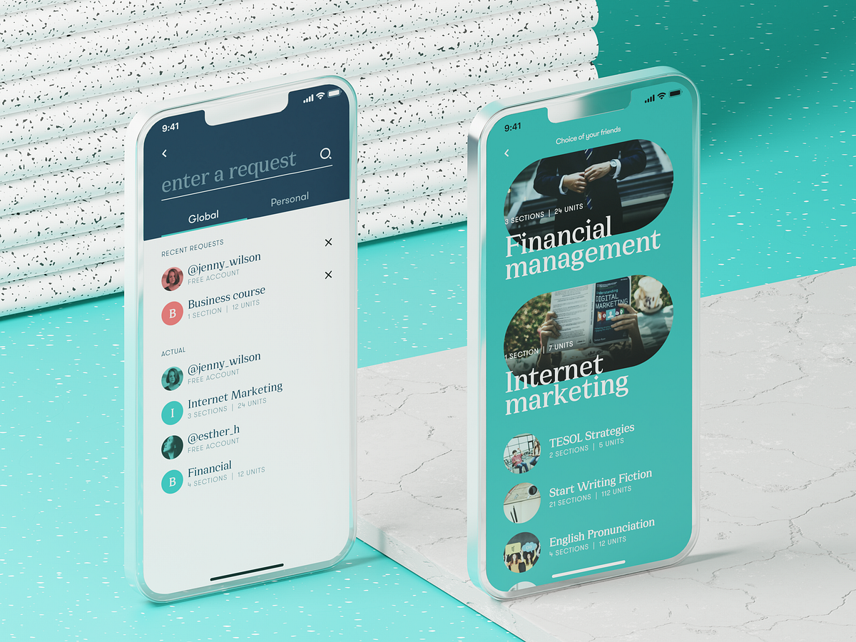
Effective Practices on Preventing Errors in User Interfaces
No doubt, the best mistake is the one that wasn’t made. However, life isn’t like that, and user experience as well: mistakes are an integral part of both. In our previous article, we shared some handy tips on dealing with error screens and messages, but is there a way to prevent users from making at least some of those errors? Yes, and today’s article is all about them. Here’s a set of design practices to consider, with various examples from UI designs by Tubik or from well-known digital products we often use.Directional CuesDirectional cue is an element of the user interface that gives a visual hint on specific interaction or content to let the user see it faster and easier. As well as road signs and signposts do in the physical world. They guide a visitor or user to the key elements, text lines, and call-to-action elements, this way making the conversion reachable and users’ problems solved quicker. Arrows, pointers, and other visual prompts help to navigate users through the interface and make it easier to avoid unnecessary clicks and interactions.The Nonconventional Show website on mobile plays out with slight and elegant arrows directing users’ eyes to the buttonsThe landing page for the service of hiring digital artists uses pointers as a directional cue focusing users’ attention on the CTA button and tagline.https://medium.com/media/d048b7a92440a05ac16278e3f7be2f78/hrefOnboarding Tutorials and TooltipsOnboarding is a set of techniques and interactions whose objective is to comfort the user and give a concise introduction to the product. One of the ways to quickly introduce the app to the user is in the onboarding tutorial, which is a set of several screens that are shown to the first-time users and explain the benefits and functionality. Here you may show some vital things that differ the interface from the others, and this way prevent the errors which could arise later.https://medium.com/media/bc5f60e4967310444d6a97e25ae85b0b/hrefAnother onboarding technique that has a significant influence on error prevention is tooltips. These are prompting messages tied to particular layout elements or user actions. They usually appear in modal windows rather than separate screens. Tooltips present a proactive way to guide the user to the right option and avoid misunderstandings.Visualized LimitationsOne more way to prevent the user from wasting their time and effort is by showing the visual limitations, if they exist, right in the process. One of the classical examples is Twitter. There is a limitation of 140 characters per tweet, and the platform shows you clearly if you exceed that number: the extra part is highlighted with color, the number of extra characters is shown, and the button of the tweet becomes inactive. Such an approach saves users time and effort and prevents unnecessary clicks.Text PromptsUX designers know much more about user interfaces and interactions than an average user, but that knowledge can sometimes play a dirty trick on them. Why? Because what’s obvious for designers may appear confusing to users. The function behind the particular field or button may seem super clear to you but not for users of an app or a website. Keep that in mind and support them with short and clear text prompts. Usability testing will help you to find the pain points where it’s needed most of all. One of the popular examples is a text prompt in the search field or simple clues in the fields of a contact form.Education app features a text prompt integrated into the search field.However, keep in mind that text prompts and fillers should be obvious as examples. Try using lower contrast for them compared to the real input text, or integrate the words indicating that like “e.g.” or “example.” In case the text filler looks too realistic, it may create the wrong impression that the field is already filled with information.https://medium.com/media/40a9c92e33b36bc7df68c91146a9fabb/hrefPreviewsPreview functionality lets a user review the results before the feature is activated. For example, if you offer the user to choose between several color themes or different font sizes, show the preview in the process of choice so that the user can be sure he or she really wants that change. That may also touch on more complex things: CMS platforms, emailing services, and showcase platforms usually allow users to preview a piece of content before they publish or send it to make sure that everything is just right.WordPress CMS enables a writer to preview all the changes in the post before publishing or updating it.SuggestionsAutocomplete and other suggestions present another popular feature that helps users quickly find what they want and avoid unnecessary interactions or extra clicks. Here’s how it looks in the process of search in Tubik Blog. When the user starts typing the search query, the website offers some relevant options immediately, and the full list is shown after the request is completed.Clear ExplanationOne of the vital points behind UX writing is guiding a user through interactions with simple instructions and updates. Use this checklist to review the texts you write to support interactions. It should be:clear (users understand what you talk about, the core message isn’t blurred or complicated)concise (the piece of text is meaningful, laconic, and concentrated on the goal, no empty talk is included)useful (the copy gives users necessary information or helps with interactions)consistent (the copy within the interface of one digital product keeps the same style, tone, voice, and terminology).Focus on informing users and explaining what’s going on and how to deal with it instead of diving into technological details or explaining that it isn’t your fault. Make your explanations slang-free and cut off everything secondary. This way, you will lead the users to what they need and help them avoid mistakes.The screen of a camera in the Pazi app features a clear text instructionInline ValidationIn basic terms, inline validation is a way to inform the user about the error or successful completion of the needed action right in the process of interaction. Most often, users deal with it in the process of filling in different forms (registration, login/signup, contact form, subscription form, etc.) Such an approach is really effective, especially for long forms with many fields: you update the user at every step instead of making them fill all the numerous fields and then telling them that “something went wrong.”However, there are some important points to remember:don’t integrate premature validation: it happens when the user just puts the cursor into the empty field, and it immediately gets marked as “wrong” before the user even has a chance to type something in. It will have a bad effect as you create an additional distraction and evoke negative emotional feedback on users being blamed for something they didn’t even start doing.don’t just mark the error; explain it: it’s not enough to show there is an error and leave the user confused about what is going on. Don’t just say “error” or “something went wrong,” but give a short and clear explanation letting users understand how to make it right.use color and visual markers known to most users: whatever your personal association with red color as a marker of an error, it seems there is a way or pattern better recognized globally to instantly let users understand that error is made. As well as the sign of a tick or a thumbs up marking the successful action. Think about markers that won’t require much cognitive load and won’t distract users much.Inline validation of filling a subscription form on Tubik BlogOne more way to prevent the user from an error is to make controls inactive until the error is solved. Sure, it should be done by giving the user a clear understanding of how to solve the problem.Here’s how the Buffer app, the tool for automation of social media posting, does it:When you open the window for a Twitter post to plan for publishing, the text prompt informs you that there’s nothing to publish. The button for scheduling the post is inactive.When you start adding the content, the button gets active. You can add up to four images to the post, so if you haven’t reached that number, you can see a free slot for media.If you added all four possible images, there is no more slot for another one. In case you exceed the number of possible characters, the button gets inactive again, and the extra part is marked by both color and filling the lines — this way, the error will be more accessible for people with color blindness.Just this simple case shows how many different details and scenarios should be considered to prevent a user from making mistakes.Here’s another interesting example of inline validation for the user flow of item customization: that’s the e-commerce service where users can customize their hot dogs before buying them. Tick symbols in the checklist show what stages are already done, keeping the user updated and confident. This way, it prevents the errors connected to missing something before making an order.Color AccentsColor is one of the most powerful factors of visual communication with users and visitors, so it seems to be quite logical to employ it and help users avoid mistakes. Think over applying color accents as a part of navigation, guiding a user, and drawing attention to the core interactive details or zones. This way, you increase the chances of correct clicks and taps instead of getting lost between a bunch of homogenous layout elements.https://medium.com/media/0554a763bc03d3ffe8e1dc36c3433ace/hrefOtozen app for safer driving uses color marking as a part of user experience design, helping users quickly scan and understand different categories of datahttps://medium.com/media/b7c56abbb1ff5c68243da40b55f73e08/hrefThe website for a food delivery service uses the color accent to inform the user about the current number of items in the cart, this way preventing unnecessary interactions and getting back to the shopping cart page to check if the item is in it.https://medium.com/media/c845201849695c96c68d305e0ac2cf64/hrefFamiliar IconsChoosing icons, especially for very basic interaction elements, always think twice before diving into a sort of creative experiment. Although icons are small, their impact on usability is huge: they give users quick visual clues, especially in the case of users with poor reading skills or disabilities, environments inconvenient for reading text, or not-that-perfect knowledge of a particular language. What’s more, icons are processed by the brain much faster than words, so they can make interactions faster and reduce cognitive load. Yet one of the reasons for that is the integration of icons that are instantly associated with particular functions or actions.For example, make no mistake that needing to search through the content of your website, users will be looking for an icon of a magnifying glass. If you start experimenting with it, the risk of errors, mistaps, and misclicks gets higher. Familiar icons make the product feel like home for users and give them more confidence.Bauhaus Event page uses well-recognized icons to mark the core information (date, time, and location) and make it easily found on the page.Gallery App features a set of easily recognized icons such as search, user profile, and shopping bag in the tab bar. As well, the icons for followers, comments, adding to favorites, and sending a message are integrated into artists’ profiles.Recognizable PatternsThis point continues the previous: not only icons but also other interaction patterns sticking to typical mental models may prevent app or website users from errors. For example, consider the following points:study typical scanning patterns and use them to make the core navigation intuitive and instantly visibleput contact information into the website footer where users tend to look for itapply breadcrumbs on a website to let users trace their journey and get back when neededconsider lazy registration via social network accountsmake the logo in the header clickable and returning the user to the home pagemake the text links underlined to show that they are clickableput a cart button into the header on the ecommerce websitesuse plus icons for controls aimed at adding itemsThese and many more options for patterns that are well-known to users and make interactions easier and error-proof. Thoughtfully done user research and usability testing will help you to pick the ones that will provide the most user-friendly solutions.https://medium.com/media/d3ee2e6cef1af4861412e9813cf89fd1/hrefThe control for creating a new storyboard in the Designer AI tool features a plus button supported with a text instructionIcon LabelsEven though icons are a powerful element of usability and are perceived faster than words, there is another side of the coin: the aspect of meaning. People can perceive icons super fast, but if the message they transfer is not clear and can have double-reading, this speed will not bring a positive user experience. Fast capturing of the icon bringing wrong understanding cannot be defined as recognition, it’s just fast noticing. Recognition means not only speed but also the right action or information that this icon should bring to the user. Only in this case will it work as a factor preventing users from errors.There are tons of easily recognized icons such as a telephone receiver for a phone call, an envelope for mail, a magnifier for a search, and so on. Sure, using these icons, you create a much faster perception of the UI functionality than using copy instead of them. Nevertheless, in cases when the image of an icon is not so obvious, its usage should be thoughtfully contemplated. If the icon doesn’t correspond with the goal and meaning it is assigned to, the speed of recognition doesn’t matter. That’s why there are cases when text transfers the idea or data more clearly, and sometimes it is more effective to use the double scheme when the icon is supported by the text label.Mindfulness App uses icons supported with text labels in the tab bar to avoid misunderstanding as the meaning of the graphics may not be obvious to all users.The Watering Tracker application uses icons with text labels in the tab bar to make sure that double meanings are excluded and avoid mistaps.https://medium.com/media/f211b9186784d65c945688e27341ac02/hrefThe field for creating a new post on the LinkedIn feed features the icon supported with a clear text label for a core interaction. The icons of adding media like images or videos are secondary and aren’t supported by the text. Anyway, the icons chosen for them are easily recognizable without a copy for most users.Progress AnimationWhen users interact with a digital product, they want to know what is going on at every single step. Making users wait in uncertainty is the risk of losing those users. Still, when users are informed, waiting can be not so annoying and stressful, and users don’t make extra actions and mistakes. So, this aspect should always be taken into account, and there are many ways to support it via interface animation and text explanations.Grammarly Plagiarism Checker tool supports the process of search with loading animation and text explanation of what is going on.https://medium.com/media/e6956d46b4742c07845bf1b2723c730d/hrefhttps://medium.com/media/1a45408653ce556321d84661d15d310c/hrefHere we’ve mentioned some of the popular error prevention practices; more ideas and examples on this and other UX design aspects will be shown in our upcoming articles, so keep up with the updates.Useful ArticlesHere’s the set of articles on more aspects and best practices of user experience design.Motion in UX Design: 6 Effective Types of Web AnimationUX Design: Types of Interactive Content Amplifying EngagementAesthetic Usability: Beauty on Duty for User Experience5 Basic Types of Images for Web ContentTypes of Contrast in User Interface Design5 Pillars of Effective Landing Page DesignThe Anatomy of a Web Page: Basic ElementsWeb Design: 16 Basic Types of Web PagesWeb Usability: Breadcrumbs Design Tips and PracticesBasic Types of Buttons in User InterfacesOriginally written by Marina Yalanska for Tubik BlogWelcome to check designs and art by Tubik via:WebsiteDribbbleBehanceTubik ArtsEffective Practices on Preventing Errors in User Interfaces was originally published in Muzli - Design Inspiration on Medium, where people are continuing the conversation by highlighting and responding to this story.

7 Popular Ways to Use Photo Content in User Interfaces for Web and Mobile
Photos are the classics of web and app design imagery. They catch attention, set the mood, show how things work, and cover many other essential objectives in cases when pictures work better than words or enhance the written message. Our today’s article is also devoted to photos used for websites and mobile applications: let’s look at the main goals that push UI/UX designers to search for the best shot and review plenty of UI design examples by tubik agency team of how photos work in user interfaces.Pottery website designProduct or Service DemonstrationObviously, photos present the major tool for the visual presentation of goods on e-commerce websites where the principle “you get what you see” is a vital part of success. As long as you sell something physical, the customer expects to see it by default; that’s really the case when the picture is worth a thousand words. For shopping online, the quality and style of photos are crucial as they often become the main trigger capturing the customer’s eye as well as one of the key elements in the decision-making process under conditions you cannot see and touch the real goods.Other vital aspects of using photos effectively as a part of the e-commerce experience and brand presentation are originality and consistency. To stand out from the crowd of competitors, online stores need their photos to look unique, memorable, and instantly transfer the brand image. That’s why regular photo shootings are an integral part of e-commerce reality. Depending on the target audience, different stores choose different approaches to photo presentation: some make it friendly, informal, and as close to real-life as possible, while others present their goods in original surroundings or model-posing; some resources prefer studio shots while others take photos in special environments.Whatever the approach, an essential aspect is staying consistent in it to make it recognizable so that website or app visitors could feel it like a pattern and didn’t handle too much cognitive load. As well, a consistent approach to the cross-platform photo presentation of the brand photo content in different marketing channels such as social networks, advertising banners, newsletters, etc., sets the strong visual connection and helps shoppers recognize the brand whenever they see it.A consistent approach to a visual photo presentation of the items on the e-commerce website for a fashion brandAnyway, the photos should demonstrate the stuff from different angles and perspectives, especially on product pages. Another thing to keep in mind is that items photographed on models or in the proper environments have more chances to draw customers’ attention and look more convincing. It doesn’t mean that object photography doesn’t work, yet in most cases, seeing an outfit on a model, a toy in the hands of a kid, or a set of dishes on the served table lets the buyer easily imagine it looks and see its benefits. So, quite often, e-commerce platforms combine both types of photo presentation: a clean object photo with no distractions as well as its photo on a model or in the surroundings of use.https://medium.com/media/fd4676a078a1140f6673a06e7dd3bd38/hrefhttps://medium.com/media/0dbae34320e0fdf1557cb3c1f0a819e6/hrefCertainly, it works the same way to demonstrate the services that can be visualized with photos.Website for a massage services companyhttps://medium.com/media/40c29c670cfb134c53f1c6557e0db3fe/hrefhttps://medium.com/media/bcea89ae8d7c2e1754f1cd94d556e376/hrefOne more popular case often demanding thorough attention to photo content is the situation when the person or company has to build an online portfolio website. The visitor’s attention span is very short, so works in the portfolio should be dressed to impress. In this case, photos often become the major visual attractor and help to build a consistent presentation.Fashion models portfolio websiteSetting AtmosphereOne more point photos are highly effective at is the ability to instantly transfer the visitor to the needed atmosphere. Properly chosen quality photo creates the mood, and this way engages the users to not only see the content but also somehow feel it, connected to their own experience and imagination.Home page for the ballet company website conceptDue to that, in particular, atmospheric theme photos are quite popular to be used in hero sections of websites and landing pages. This way, designers activate the factor of emotion and delightfulness from the very start of interaction with the interface.https://medium.com/media/81b7f34eab74c170967d908d1cf7e54d/hrefWebsite design concept inspired by Moesgaard MuseumOne more popular UI design trend of a recent couple of years is using photos as a background image. Not only does this approach make the screens visually and emotionally appealing, but it also supports the feeling of the integrity of all the layout elements. On the other hand, it demands deep attention to contrast and legibility of all the elements, which may be harder to achieve than in the case of monochrome background.https://medium.com/media/0c0cc124f5366b94da456c656075521d/hrefThe impressive 404 error page for the website devoted to saving the oceans features the impressive full-screen background photo, instantly communicating the problem to the visitor.Lumen Museum website pagesMountain Resorts websiteHumanized ConnectionConsciously or unconsciously, people tend to be curious about other people. What’s even more important, in many cases, human photos look more convincing and trustworthy to us. No wonder one of the key goals behind the photos on websites or apps is making communication more human-like. Photos of teams working on a product, pictures of people to connect to, from founders and top managers to support personnel, photos of clients providing testimonials or reviews, authors of articles in the blog or media, and many other cases — all of them aim at making the user experience more human and trustworthy.Nonconventional Show website uses photos to set the direct visual connection to the podcast host and set the needed atmospherehttps://medium.com/media/192312c3599757fd60777b55df52bc35/hrefhttps://medium.com/media/3f14892aadcf957cf477b50b55838227/hrefWebsite of a fashion designer brandDesign concept for a website of a photography contesthttps://medium.com/media/57045d57161bffd807f8380c846a9d22/hrefEducation app designDirectional CuesA directional cue is an element of the user interface giving a visual hint on a certain interaction or content and helps the visitor see it quicker and easier, just like road signs and signposts do in the physical world. Directional cues are an essential factor in enhancing digital product usability, as they:enhance the page or screen scannabilitystrengthen the visual hierarchyimprove navigationincrease conversion rates.Photos integrated into the interface can also cover that role. They mostly function as pointers (a photo of a human, animal, or object pointing at the needed element and this way attracting users’ eye to it) or gaze direction (a photo of a human, animal, or character whose eyes are directed to the needed element this way stimulating a natural urge of users’ curiosity to check what it is).The hairdresser’s brand website uses a hero image on the home page that works as a directional cue: the model’s eyes attract your attention to the zone of CTA elements.https://medium.com/media/974c1a604f852ccdcc9f0fabc0e45e2d/hrefGuides and ManualsBeing highly effective and common in setting a natural visual connection with the physical world, photos often become the primary demonstration tool in diverse manuals and guides. Be it a recipe, a guide on how to use a device, to knit a scarf, to tie a neckerchief in 20 trendy ways, or even how to take a photo — whatever kind of instructions is given to a visitor, supported with good photos it will work much more user-friendly and will be far handier than just a text.Dessert recipes blogIllustrative Article ImagesOne more goal efficiently covered with photos is illustrating articles and online editorials. Photos can add visual support to the topic of the article and strengthen the text.The rule of thumb here is not to use photos as visual fillers. Both title images and photos included in the article have to work as visual helpers, not distractors, so make them meaningful, informative, or at least add the necessary mood if the article is a piece of the emotional story. If you are telling a historical or retrospective story, find proper archive photos; if that’s the article about a specific place, don’t use stock photos to show something similar but get the ones from that particular location. Relevance is a key to successful photo usage in this case.Online editorial about different generationsBartending encyclopedia websitehttps://medium.com/media/76063b0239f8b5797226dc6413b78070/hrefCreating Emotional AppealAnother big reason to integrate photo content is the emotional appeal added to user experience. Whatever logical and thought-out we try to make our actions, the emotional background of the situation plays a crucial role in engagement and decision-making. And that is the aspect where images in general and photos, in particular, are super helpful. They set strong associations and build up the necessary atmosphere, often even before a visitor starts reading, as images are perceived faster than words. With the properly chosen photo integrated into the web or mobile layout, designers are able to not only capture the user’s eye but also transfer the needed mood.Confectionery website design setting strong emotional appealhttps://medium.com/media/a4189dd917a425cd0d1b29a0dcaf0b91/hrefBook festival websitehttps://medium.com/media/14a32fef2a8ab4f50e67f24f1fb4b644/hrefAdvantages of Photos in Interface DesignThe significant advantage of photos is their ability to connect what users see on the web page with a real world of physical things and live people. Photos have been a part of human reality for many decades, much before the Internet advent, so this kind of visuals is fairly native, close, and clear for us. What’s more, with all those devices that let any of us capture something in a second, photography is really a part of everyday life for many people — so, being used on a website, it sets strong connections and associations.What’s more, photography is also a kind of art. With them, you can set the balance of realism and aesthetics in your web user interface. You can keep the necessary style appealing to your target audience and creating the required emotional background. That is one of the reasons for choosing photos to support articles on blogs and media websites.Website design for a horse-riding clubPoints to ConsiderUsing photos in web design, consider the following tips:download high-resolution photosoptimize them for the web/mobile so that too big images don’t overload the page or screen — loading speed is a crucial factor of positive user experiencegive the images enough air to breathe — keep the balance of negative spaceremember about responsiveness and test how the images look on different screens and devicesdon’t use photos as just decor — let them speak to users, transfer a message and support all the other layouts.Furniture company websiteWhere Designers Get PhotosThere are three several ways:original photo production for the particular project: this is the most expensive option, but the photos will have the highest level of exclusiveness;paid stock photos: you buy a photo you need from a photo stock that offers a variety of shots. This may be cheaper than custom photo shooting, but you may spend a lot of time searching for the photos corresponding to your tasks;free stock photos: you take the photos from the communities or teams that share them for free. It is the cheapest option, but you have to be ready that other people may do the same, so you’ll have to think well about how to make your design original under these conditions.So, it’s easy to see that the way you choose depends on a specific project, its budget and goals.Anyway, even if you are the one who runs a blog or charity with no budget on visuals or if you are creating a design concept for your portfolio, free photo stock websites offer a lot of high-quality content now. As well, some stock photo banks offer a mixed scheme, with some content or formats available for free and more on subscription; as well, from some of them, you can also order unique photos for your goals or buy already available photos to be sure they belong only to you.Among them, the following resources are often used for good photo content:Unsplash: it’s a community of photographers from all over the world sharing their photos for free. Photos are featured under thorough curation, so you won’t find trash therePexels: big bank of free stock photos on a variety of topicsMoose Photos: professional production of stock photos that effectively work together and are very flexible for a broad content strategy; is especially interesting due to the diversity of people working as modelsPixabay: a huge stock of free images, not only photos but also illustrations and vector graphics.Shutterstock: a huge bank of stock images on different topics, most content is available with a paid subscriptionDepositphotos: another massive library of stock images, especially for business and marketing goals, mostly available with a paid subscriptionKnow more resources of photo content to recommend to designers? Tell us in the comments!Useful ArticlesHere’s the set of articles on more aspects and best practices of user experience design.Motion in UX Design: 6 Effective Types of Web AnimationUX Design: Types of Interactive Content Amplifying EngagementAesthetic Usability: Beauty on Duty for User Experience5 Basic Types of Images for Web ContentTypes of Contrast in User Interface Design5 Pillars of Effective Landing Page DesignThe Anatomy of a Web Page: Basic ElementsWeb Design: 16 Basic Types of Web PagesWeb Usability: Breadcrumbs Design Tips and PracticesBasic Types of Buttons in User InterfacesOriginally written by Marina Yalanska for Tubik BlogWelcome to check designs and art by Tubik via:WebsiteDribbbleBehanceTubik Arts7 Popular Ways to Use Photo Content in User Interfaces for Web and Mobile was originally published in Muzli - Design Inspiration on Medium, where people are continuing the conversation by highlighting and responding to this story.
Designers’ Pick: Top Color Trends to Inspire You in 2022
Pinpointing, let alone predicting the design trends has become notoriously hard in this day and age when things move, shift and transform at warp speed. What’s in today might be totally out as soon as next month, and color trends can be particularly tricky as they tend to move with seasons and to follow current events which are, by their nature, unpredictable. Still, some things tend to stick more than others and to mark the defining trends.We already wrote extensively about the top web design trends for the year, focusing perhaps more on the UX side of things, on animation and interactivity, on website architecture as a whole. This time around we want to welcome the warmer weather with an exploration of some of the color trends that we noticed not just in web design but also in fashion, furniture and home decor, and perhaps give our readers a few chromatic hints for the rest of the year.Our very own Marijana Obradovic, the author of the stunning Solene and Konsept themes, is a keen observer and researcher of the design comings and goings, and she came up with these color trends for 2022:It’s All About the NeutralsFor the Love of GreenOrange CrushWhen Orange Meets GreenBurgundy, the KingIt’s All About the NeutralsCream, warm beige, cold beige, cream gray, gray cream, macchiato, pampas, marble, powder, ivory, nude, taupe, hazel…You name it — you’ll find it in 2022, in the streets, in the shop windows, in furniture and home decor and, yes, in web design, too. The spectrum between the lightest cream and the deep, brownish hues, with tints of red, pink, blue and even green, is marking this year’s trends and we can see it paired with other neutrals or with more saturated, louder colors.Julia Derevianko for Gotoinc proposes an eCommerce layout for a jewelry store that uses an off-white, creamy background to create an elegant backdrop for the featured photographs and jewelry pieces. Julia combines several complementary hues, from Carrara to Pampas, in a color scheme that provides breathability but at the same time adds depth and even some degree of quiet intensity.Alexandra Holodnaya made excellent use of a soft, warm beige with a hint of pink in her project for a magic and esotery shop and online learning platform Golden Venum. She skillfully alternates backgrounds in this gorgeous layout between light tones and black ones, creating an exciting tension of elements held together by the lovely old gold typography.We spot a similar chromatic inspiration in the Modern Font Bundle by New Tropical Design, where the warm cream tone is paired with burgundy (which we’re going to touch upon later on in this article), as well as a deep, atmospheric orange and a dark mossy green.While the colors from the beige and cream part of the spectrum work wonderfully when paired with more intense, vivid colors, it’s also worth mentioning they can look amazing in beige-on-beige sets or combinations of beige with colors just a hue away. A terrific example of this combination, which is definitely a 2022 trend we’re seeing a lot, is the creative visualization project that Notoo Studio did for 41zero42, specifically for their Superclassica series of floor and wall tiles.Another color that looks and works amazingly well when paired with, well, basically itself, is the warm gray. Alina Gaan explored this concept in her jewelry website project Juff, proposing a look that basically sports no contrast at all, and yet manages to work just fine for a website layout.But enough with the neutrals, let’s move on to louder trends for this year.For the Love of GreenGreen is another definitive trend for this year and it comes in all possible variants — from earthy and muddy deep greens to vibrant grass tones and, of course, neons.Marlow, the minimalist branding mockup scene creator by Moyo Studio, is heavily based on grays in various tones, mostly on the colder side of the range. The project includes several adjacent colors that complement the grays and give them depth and character, most notably the wonderful, elegant dark olive green, as well as browns with a significant portion of green component to them.Semi Permanent Hotel by Highsnobriety was a short-term takeover of the Paramount House Hotel in Sydney, featuring a range of artists, musicians, designers and other creators. The website for the project is based on the monochromatic layout with colorful, intense imagery and interface details in a lovely shade of bright green with a touch of cyan. The green is used for the favicon, the pagination bullets, select typography as well as for selected (or hovered) areas of the 3D model representing the hotel. This quite moderate addition of color breaks up the monochromatic interface without hampering its character, and the choice of green adds vitality and energy to the mood.Ogeh Ezeonu opted for a green on green combination for her website, using a very, very dark forest green as the background color (in some parts of the page it comes in form of gradient, too) and a lighter, brighter leaf green for select interface details, such as the boxed sections with links and button outlines. This way, she created a gorgeously balanced atmosphere that packs a lot of character without being too loud or bold.The Dutch brand development and design studio Maibru did a similar thing with incorporating a refreshing green shade to its website in form of various interface details — for instance, the menu items (indicating the current location, as well as color change on hover), language and mode switcher, cursor and navigation, and so on. The same green color is used for both the light and the dark mode, and it looks great in both instances, bringing vibrance and joy to a muted layout.A brand we already wrote about in our piece on innovative footer design, the furniture manufacturer Sol’ace opted for an interesting brownish green (or greenish brown?) as the background for some of the page sections, combined with a lovely warm gray. A fitting choice for a brand with a strong focus on natural materials and sustainable manufacturing practices.But muted, pastel and earthy greens are not the only ones marking this year’s color trends — in fact, we’re seeing a lot (and really, a lot) of super-vibrant greens, electric greens and neons.For instance, the Chinese Reesaw Studio incorporated a lot of bold, vibrant colors in their branding project for GLZ Super Park, with the neon lime green as the main color featured in the logos, packaging, even the accompanying materials such as masks, duct tapes and so on.The designer and art director Stas Bondar chose an interesting and vibrant shade of green (with a lot of yellow to it) for his online portfolio, available in two modes: “casual” (black background with green details) and “fancy,” in which the said color is used for the background and combined with black interface elements. It’s interesting that the same color assumes different characters depending on the mode — in the “casual” mode, the dark background makes it appear more yellow, while in the light “fancy” mode it is definitely more green.Finally, let’s not forget one of the loveliest green shades — the mint green. The digital production studio 9P featured this color in various interface details (the oversized cursor, the buttons, the logo and menu items, to name a few) on their website, coupled with the black background for a striking and modern contrast, and they also used it for one end of the gradient for the hero text.Orange CrushAs a color that communicates joy, optimism, warmth and fun, it’s no wonder that orange is going to be a massive trend in 2022, a year when the world finally seems to take a break (hopefully permanent!) from the pandemic. From couture to streetwear, web design and even product design, various hues of this fantastic color can be seen everywhere.Tiare Payano incorporated a neon carrot orange into the palette for the brand identity project for Silkaen, a natural skincare brand. Payano paired it with different shades of red, burnt sienna, deep pink and other warm colors, creating a balanced, feminine and elegant palette.Design for the Gesture issue of the Sociotype Journal also features a lot of orange, albeit in a more toned-down variant. This particular brick orange works great on paper, as it complements the paper texture and gives the overall design a warm, deep character.Moving on to louder, bolder tones, the design for the Bravo Musique music and artist label features a stunning, somewhat vintage range of oranges, from the classic safety orange to hibiscus and royal orange.The visual identity for the Still Young interior design company by Low Key Design pairs an intense orange, almost a cinnabar, with a grayscale palette in an exciting, elaborate design concept based around the “law of three.” The entire visual system revolves around the numbers 3, 6 and 9, and the orange serves as the third chromatic element in the palette (in addition to the white and black that basically constitute the grayscale), sustaining the concept but also bringing a welcome contrast and dynamics to the design.The website and redesign concept for the restaurant Máirtain by Daria Shakula features an elegant, mostly monochromatic palette skilfully broken up by a vivid pumpkin orange used for a few select interface details, the footer and the fullscreen menu. Paired with the orange in some of the featured imagery, this particular use of color reinforces the brand identity and gives it a strong, well-built character, freshens up the concept and brings vitality without appearing vulgar or loud.Finally, here’s a layout that celebrates the power of orange in all its glory: the web design for the packaging-free grocery store in Los Angeles, re_grocery, uses an orangish red, or a reddish orange, for basically all interface elements, from title and paragraph typography to buttons, from navigation elements to the footer, which is entirely orange. It was a risky choice but one definitely worth making, as the result is a flattering, modern and engaging design that we can only assume does wonders for the company’s business bottom line.When Orange Meets GreenIf this combination reminds you of a clown suit, think again. Depending on the particular hues used in the palette, the orange and green combo can actually be quite sophisticated and convey a sense of opulent elegance. Let’s take a look.The UI Kit for Figma by Alexsander Barhon proposes modules for building web pages, with imagery that features small yet striking details in a lovely muted orange, combined with deep moss green, olive and mud, creating a wonderful sense of warmth and depth.Tiare Payano did a similar thing combining deep oranges and greens on a dark background for Nancy, a family-owned cafe in the Dominican Republic. The palette is based around deep, warm, earthy hues such as orange, terracotta and brick, combined with a dark green that seems to have a touch of warmth to itself, too — or perhaps it’s the oranges and pinks that bring that quality in the otherwise cold color.The green and orange combination works well in brighter tones with a bit of a pastel character, too, as evident from the Vestre Inspiration Book 2022. In this project, we get to feast our eyes on wonderful pairings, such as true orange and grass green, but also yellow and purple. These combinations are based on the principle of complementary colors, and as such they aim to create an intense and dynamic effect, but thanks to the careful selection of particular tones and textures, they also appear quite soothing and pleasant.Green smoke, apricot orange and a range of light pinks and warm grays dominate the palette of the Absolution Cosmetics website, where the orange and green work as particular accents and can even be considered chromatic leitmotifs of the layout, even though they appear very sporadically on the pages. The dynamics between these two add much needed intensity to the light, airy layouts.The brand identity project for Lande Architects includes a wonderful palette of muted greens, warm earthy tones and siennas, combined with a vibrant yellow with plenty of orange hints to it. The stationery and the calling cards are printed on a heavily textured paper with relief typography, which, combined with the colors, gives the project a distinct organic character.Finally, while not exactly focused on the interplay between green and orange in particular, the website of the oil and salsa manufacturer Frantoio Cavalli does play around with the two, by juxtaposing the delicate greens of oils with warm orange, yellow and red hues from salsas, both in featured imagery and in product packaging.Burgundy, the KingTimeless and sophisticated, burgundy appears to finally be making a comeback — and long overdue, if we dare say. This elegant color, traditionally associated with wealth, opulence and royalty, is actually an extremely versatile pairing color for palettes and combinations that require contrast, depth and warmth.Being a dark, intense color, in web design burgundy is best if used for details or select sections, like Sloane Street did on their homepage. This choice of color adds a touch of class to the design, pairs wonderfully with the rest of the palette and the page’s white space, and even communicates with the imagery on the page.La Maison Plisson, on the other hand, opted for a very subtle use of burgundy, applying it to the button outlines, underlines, some of the typography and the wine glass icon, completing the brand narrative that revolves around exquisite gastronomy, the finest ingredients and the best wines. It may be an obvious choice, but it is done with such good measure and taste it actually works perfectly.Burgundy can also be a fitting choice for various technology and industry niches, as well as for finance, which are often plagued by quite pedestrian blues, grays and plain reds. The brand strategy and visual identity for Refactor Capital by the Play Studio features a striking rusty red which, in combination with a deep grayish blue and plain white, creates a firm, stable palette that communicates professionalism and expertise.The gorgeous branding project that supports female entrepreneurship, Wo’men Entrepreneurs by Ben&Jo bases the palette around a dark green, with color accents in yellow, teal and pink. This combination is supported by a lovely warm burgundy in a slightly lighter variant, used as the backdrop in the project imagery, giving it depth and warmth.Something similar was done in the visual identity project for Périples, where a stunning deep teal was used as the main background color, combined with a range of muted warm tones, including burgundy, which adds contrast and warmth, as well as a hint of vintage character.Wrapping It UpSoothing cream, beige and gray, exciting orange and optimistic green, topped by the royal burgundy — it’s clear that this year’s color trends do not follow a strict, cohesive narrative but rather aim to expand the reach of chromatic potential through contextualisation. We hope that the wonderful examples featured in this article will inspire you and give you some fresh ideas for your future projects. If you have a color you feel might mark the current year, don’t hesitate to share it with us in the comments section.Designers’ Pick: Top Color Trends to Inspire You in 2022 was originally published in Muzli - Design Inspiration on Medium, where people are continuing the conversation by highlighting and responding to this story.

How to Make a Superb Multilingual Website
To answer the question “What is a multilingual website?” — it’s a website with content in different languages. Multiregional websites cater to more than one country or geographic region. It’s challenging to make your website multilingual, especially if you have little to no experience in the area.We’ve collected best practices for developing multilingual and multiregional website development to make it simpler.Multilingual user experienceStart with translationIs expanding to new countries and regions the next step for your business? It’s likely that your website content was originally written in one or maximum two languages. This chapter answers the “How to translate a website into another language?” question.Source: public domainYou could hire a professional to translate your website content. But depending on the target language and the amount of content, this can be a rather expensive endeavor. Still, a professional translator will be able to adapt your website not only in terms of language but also in terms of culture, catering it more to the needs of your new target audience.Although creating multilingual websites using Google Translate is considered faux pas, opting for machine translation, does prove to be cheaper and faster than the other alternatives.Many multiple language websites turn to software-as-a-service translation solutions that offer a variety of web and mobile localization services. Let’s look at the specific examples of companies that apply best practices for website localization.LocalizeSource: Localizejs.comLocalize offers a variety of translation tools for translating websites and web applications, backend elements (emails, SMS messages, notifications, etc.), and iOS, Android, and hybrid mobile applications in more than 80 language pairs. They also offer technology for translating uploaded files in CSV, YAML, XML, and other formats.Localize features include:a translation dashboard with intuitive reporting, custom HTML and CSS, and file and content hosting;tools for automation, including automatic content and language detection, plug-and-play integrations, and search engine optimization;translation tools such as an in-context editor, a glossary, and a style guide;tools for team collaboration with support for different user roles and permissions;on-demand human translation from the platform’s partners;client support and consultation;privacy and security, including network security, input control, two-factor authentication, and an activity stream;BablicCapSource: Bablic.comBablic is an online service for website translation. It offers comprehensive translations via a simple process, which you can test within the 14-day free trial:log into the platform;type in your website’s URL;select the source and target languages;сhoose the language selector. You can go with labels (English, Deutsch), short code (EN, DE), or flags (which we don’t advise, but more on that later);сhoose the translation type. There are options for selecting manually editable machine translation, manually editable professional translation, and pure manual translation.Your website is then converted in Bablic’s visual editor where you can view the interface as it would be seen on desktop computers, tablets, and smartphones and manually edit each website element as necessary.CrowdinSource: Crowdin.comCrowdin is a web-based SaaS tool for localizing desktop software, mobile apps, websites, web applications, documents, video games, and video content. The three main services that Crowdin provides are management and organization, localization for developers, and translation and proofreading.management and organization constitutes a set of features for taking care of translation files and teams. It also offers analytical reports and automated budget calculations;localization for developers is a set of features for integrating translation into the development process. Crowdin offers a free open-source command line interface, a RESTful API, and a number of supporting plugins and integrations;translation and proofreading is a service that automates and simplifies the translation process. Crowdin’s online editor offers collaboration features, translation integrity, machine translation engines, translation memory, glossaries, and many other tools;TransifexSource: Transifex.comTransifex offers a collection of tools and features for comfortable and high-quality content and software localization. They offer:file and content hosting. Supporting over 25 different file formats, Transifex allows you to prioritize content for translation and track changes within files;team management and collaboration. This feature allows you to comfortably manage teams, including organizing people into teams and controlling their roles and permissions;translation tools. Transifex’s comprehensive translation editor allows you to comfortably search through files, perform translation checks, and keep count of translated characters. Transifex also offers a translation memory feature, the ability to upload visual content and translate video subtitles, HTML and variable placeholders, a glossary, and a style guide;translation workflow management. A feature for setting up advanced translation workflows lets you control and fine-tune translation workflows of any complexity. It also offers an ability to set up translation crowdsourcing;detailed insights and analytical reporting. The translation dashboard offers insights on the overall progress of translation projects. You can view a list of languages for which translation has been completed, languages waiting for translation, and issues waiting to be resolved.SmartlingSource: Smartling.comSmartling is a translation management platform for localizing websites, digital content, mobile applications, documents, customer support content, marketing content, audio, video, and so on. Their solutions include a translation management system, a global delivery network, and a number of collectors and translation services.the Smartling translation management system allows you to capture, organize, and spread translated content across an entire organization. Users can see a visual representation of translated content in real-time, manage translation tasks and processes, and create fully customized workflows. Translation memory allows you to centralize, reuse, and share translations. Vendor management allows you to control and organize translation agencies, freelancers, and other people involved in the process. Cloud-based computer-assisted translation offers a comprehensive set of tools for quick and comfortable translation. A system of reports and analytics allows you to analyze each translation process step-by-step to increase quality and productivity;a translation proxy helps with automating the process of translating websites, web apps, and web services. It offers simple content extraction through scheduled content crawls, context visualisation, efficient translation processes, content control and delivery, and information security;translation connectors allow for integrating Smartling’s services with a variety of content management, marketing automation, eCommerce, code repository, and customer support platforms.POEditorSource: Poeditor.comPOEditor is a comfortable localization management platform for software translation. Currently it supports 15 file formats, but POEditor is constantly working on widening their horizons. Among the features offered by POEditor are:a REST API for automating localization workflowsintegration with version control systems including GitHub, Bitbucket, GitLab, and VSTS for file management optimizationintegration with HipChat and Slack for live communication and reporting on translation processescrowdsourced translation for community-based translationsdetailed statistics for detailed reports on translation activitytranslation memory for the ability to reuse translated textsreal-time translation updates to increase the overall efficiency of translation collaborationthe ability to access human translation services directly within the platformmachine translation services based on translation engines from Google and MicrosoftThink about navigationThe most important part of multilingual design is comfortable language navigation. And although it’s likely that your website will detect the user’s language automatically, translating content based on geographic location, there should still be an option to manually change website language.Drop-down or a separate page?We suggest the usual types of language navigation as most users are already comfortable with them.A drop-down menu is the most common option. It’s a button that, when clicked, reveals a list of languages that users can scroll through and select from. Here’s an example from Airbnb.com:Source: Airbnb.comThe language drop-down is accessed by clicking on the Language and currencybutton in the bottom right corner. Once opened, it reveals two drop-downs: one for language and one for currency. Offering a choice of both language and currency is common for marketplaces.International websites also often use drop-down menus without scrolling, like on Booking.com:Source: Booking.comThe language selector is, again, next to the currency selector, and is marked with a flag. It first displays a list of the languages most common in the user’s geographic area, then lists all available languages.A similar option is to start with a list of regions as opposed to languages. Here’s an example from the Fujitsu Global website:Source: Fujitsu.comThis is an option for businesses whose services vary from market to market, since it redirects users to country-specific pages with unique experiences that are relevant to particular countries.A similar approach could also be implemented with a separate page for country selection. This is how Nintendo does it:Source: Nintendo.comNintendo’s region page offers an extensive list of countries and regions, helping users comfortably find relevant content.Next, we discuss how to represent languages and countries for website language navigation.Flags or words?It’s considered bad taste when multilingual websites use flags for language navigation. Since flags represent countries, not languages, they can complicate language selection especially in cases where the website is targeted at a country with two or more official languages. If you still want to use flags though, avoid something like this:Source: British-airways.esky.comAnd opt for a variant with languages or country names written out:Source: Nike.comBeware of Left-to-Right and Right-to-Left differencesSome languages are written and read from left to right (LTR) and some from right to left (RTL). A multilingual site that deals with markets that use RTL languages should be adapted to the peculiarities of RTL languages.Source: Facebook.comHere’s a summary of our article about RTL design specifics. If you’d like to read the whole piece, you can find it here: Right-to-Left (RTL) Website Development: Tips & Tricks.Typography. Be careful with the fonts you choose for ornamental scripts. We recommend Noto fonts, as this is what Google recommends. If you want to use a different font, make sure you resize it to preserve legibility since traditional Latin typefaces tend not to fit RTL properly. Also, avoid italicized and bold fonts as they decrease the readability of RTL scripts.Numerals. The majority of Arab countries use Western Arabic numerals. However, Iran, Afghanistan, parts of Egypt and Sudan, and some other countries use Eastern Arabic numerals. In order to make your website comfortable for a variety of people, make sure that users see numbers they’re comfortable with.Icons. When choosing icons for Arabic interfaces:mirror icons with explicit directions and icons depicting movement or text direction.don’t mirror symmetrical icons, icons with an explicit purpose, and icons depicting English characters, but do localize them.pay attention to the cultural implications of icons (consider not using piggy banks to represent thriftiness, etc.)Read also: SteelKiwi’s article on Smashing Magazine about Right-to-Left Development in Mobile DesignApart from icons, you should also mirror the interface, logos and navigation buttons, form fields, breadcrumbs, media players, dates, calendars, and tables to fit RTL design.Make adaptive UI elementsThe size of words can shrink and expand depending on the language. For a multilingual website, it’s important that no matter the language, there’s enough space for the words. Take a look at this example from Adidas:Source: Adidas.comIf it wasn’t for designers’ careful planning, the search box would be all over the place, moving to the right and to the left depending on the word size.Remember about encoding and fontsUse UTF-8 encoding to make sure that special characters are displayed properly regardless of the language. This is achieved by placingin the page header. This will not only make sure languages are displayed properly but will also support several languages on a page at once.When it comes to fonts, there are ones that support Latin scripts but don’t support Cyrillic scripts just as there are ones that work perfectly for Latin and Cyrillic scripts yet don’t support RTL or Asian languages. You can refer to Google Fonts in order to choose appropriate free typefaces for your website.Source: Fonts.google.comChoose appropriate URLsA website URL contains important information about the site’s content. Not only does it clue users to what sort of information they might find there, it can also show which country the website is targeted to (for instance, by indicating a German website with the .de top-level domain). Apart from being informative, URLs help search engines improve search results by displaying pages relevant to a particular region first.For the purposes of multilingual websites, it’s better to go with a country-code top-level domain name (ccTLD), as they’re a strong indication that the website is designed for a specific country. This way the version of your website for the Japanese market won’t show up in the US. However, ccTLDs are often unavailable and tend to be more expensive than other domain types.There are two options you can go for instead, combining a generic top-level domain name (gTLD) with either a subdomain or a subdirectory.gTLD + subdomain: uk.website-name.netThis will make it clear to search engines that the website is targeted at the UK, but users might have a hard time understanding that the URL goes to a version of the website in English.gTLD + subdirectory: website-name.org/jpUsually subdirectories help structure content, but if you include a country indicator, they can also show search engines that the website is targeted at a specific country (in this case, Japan). This is a great option as you can set not only the country but also the language, which is convenient for countries with two or more official tongues:- website-name.com/ca-en/ for the English version of a Canadian website- website-name.com/ca-fr/ for the French version of a Canadian websiteDon’t duplicate contentIt’s often the case that websites in the same language are targeted at different countries, and hence need to have separate pages. So a company working with the US, Australia, and New Zealand can have three separate pages for these countries but they would all be in English, as it’s the primary language spoken in all three. Search engines would treat this as content duplication unless you specify that each page is for a specific country. This is how that looks in code:Search engines would treat this as content duplication unless you specify that each page is for a specific country. This is how that looks in code:The first link indicates content in German for Germany, the second for Austria, and the third for Switzerland. Once search engines see these indications, they no longer consider your website to be duplicating content and won’t penalize it.Offer multilingual customer serviceIf your website’s users run into issues, they’ll likely want to talk to customer service. And it’s only natural that they expect customer service representatives to understand them given that they can view your website in their native language.Source: public domainIt could be a nuisance, however, to hire employees who speak several languages. This might not be so much of an issue for large companies, but it’s a real issue for startups.What you could go for instead is a functional intelligent chatbot. They’ve proven useful in a variety of industries and can do a great deal when it comes to solving your customers’ issues. If you would like to learn more, read our article about the benefits of chatbot technology.Finally, don’t forgetThere are a couple of smaller yet very important things to keep in mind when creating a website for more than one language.Dates, time zones and orthographyDate and time formats aren’t the same everywhere. While the US and Commonwealth of Nations countries use 12-hour time, the rest of the world uses 24-hour time. And although most people understand both formats, you should use the country-appropriate time format to create a more personalized experience.When it comes to dates, it’s better to have them formatted according to each country’s official standards. If a date is written 2/5/2018, a US user will understand it as the 5th of April, while for a European it would be the 2nd of May. You can find the full list of day/month/year formats by country here.Keep in mind that your website’s users might need to communicate not only across borders, but also across different time zones. Consider this during both design and development.As for orthography, you’ll have to look into the specifics of each country and language. One example is how decimal places are separated: with a dot in the US (28.3) and a comma in Europe (28,3).CaptchasGo for numeric captchas as they can be understood universally, regardless of the website language.Source: public domainPhone numbersAdding country codes to phone numbers makes for a more pleasant experience. You can find a list of all country codes here.Develop a multilingual website with SteelKiwiMultilingual website development is complex and involves following many rules. And the more languages, the more rules there are to follow. We have a lot of experience developing multilingual and multiregional products — everything from websites to mobile applications, including:Automated employment and payment platform JobMatchItSnaapy, a promotional mobile application with ERP features SnaapyRadonmeters — CRM and ERP for an online service that provides full-cycle indoor radon measurementPossio, a GPS-enabled solution for ensuring vehicle safety in Europe and the United StatesIf you’re looking for a top-quality service provider to develop a functional and beautiful multilingual product, contact one of our sales representatives and we’ll start working on your project today.How to Make a Superb Multilingual Website was originally published in Muzli - Design Inspiration on Medium, where people are continuing the conversation by highlighting and responding to this story.
How to Make a Superb Multilingual Website