
Design Inspiration
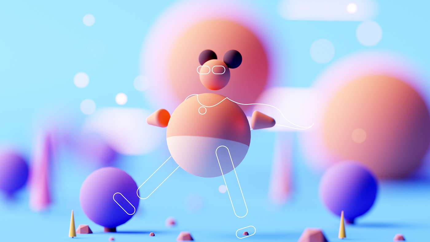
Profile page design examples
Hundreds of creative, innovative, well designed user profile pages ideas & examples.
We curate topical collections around design to inspire you in the design process.
This constantly-updated list featuring what we find on the always-fresh Muzli inventory.
Last update:

MatDash User Profile Page Design

User Profile - UX exploration

User Profile Account settings

MatDash User Profile Followers Page Design

User Profile

User Profile Screen

Multifunctional user profile page

Profile page / User management · Koala UI

User Profile Menu 👤
User Profile Interface Design

User Profile

User Profile concept

User Profile Page | Light mode
User Profile Page Light mode
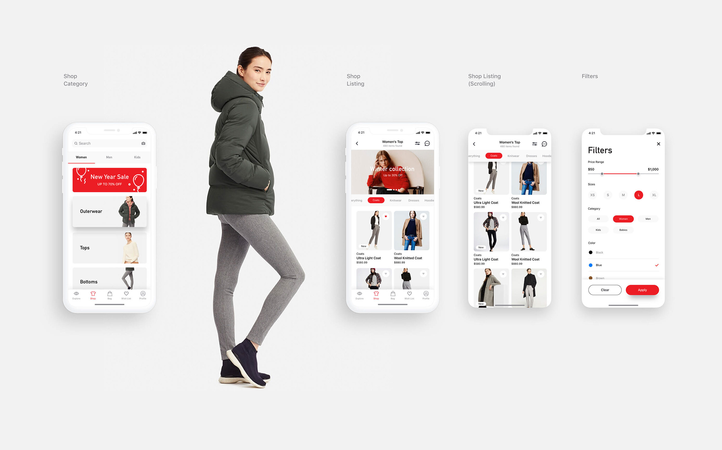
Redesigning the UI & Shopping Experience for Uniqlo HK app
Redesigning the UI & Shopping Experience for Uniqlo HK app AoiroStudioJul 08, 2019 Zion W is a brand & UI/UX designer based in Sydney, Australia. He shared a great redesign of UI and the shopping experience for one of my favorite clothing brand out there: Uniqlo HK app. I am currently using its North American version and it's a disaster in terms of its entire experience (💡). There are several things from Zion's concept that I dearly appreciate. First and foremost, its user interface is simplified and there is a consistency in the patterns for an e-commerce shopping experience. Another great feature is the 'lookbook', having a visual sneak of what you are buying especially a 'new' collection truly helps create conversions into sales. Give it a look! The all-new UNIQLO Australia app, with coupons, visual search, store locators, Look Book and other shopping features. More Links Personal Site Behance User Interface Design Work by Zion W More Links Behance
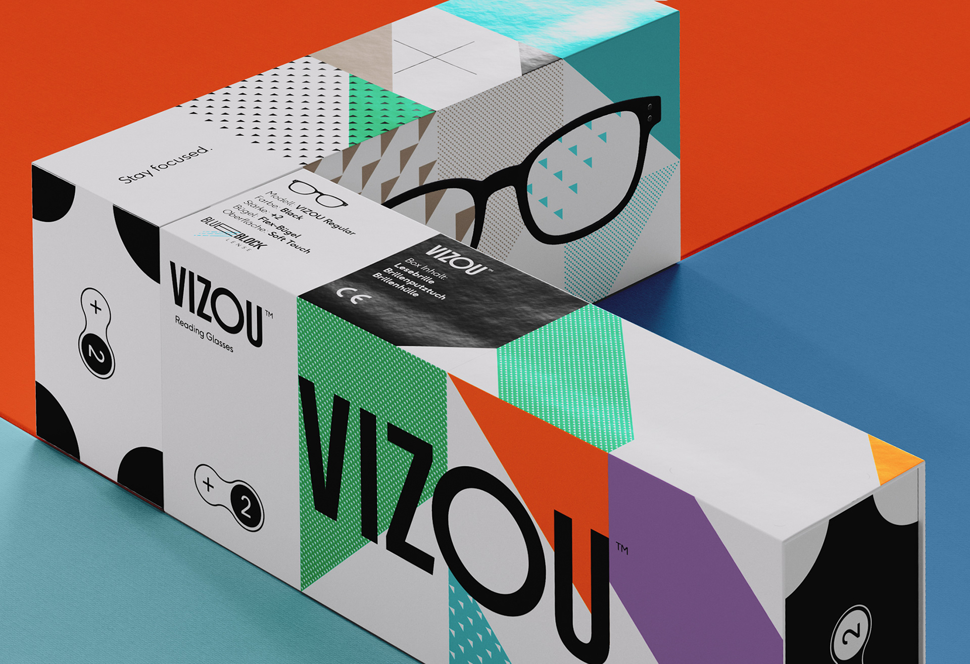
Packaging & Logo Design for Vizou's reading glasses collection
Packaging & Logo Design for Vizou's reading glasses collection AoiroStudioSep 30, 2019 I am starting to be attracted to showcasing work and projects that aren't related to 'user interface' and user experience. It's probably because I work into this field but having the opportunity to share whatever inspires us what makes me keep going with ABDZ. With this momentum, I would like to share the work of Studio Chapeaux and what they have done for Vizou's reading glasses collection in terms of graphic & packaging design. I personally love its subtle and touchy detail on the packaging that defines if your eyewear evolves in dioptric strength and how the graphical elements evolve accordingly as well. The comprehensive graphical identity evolves according to the dioptric strength, form and tonality of the respective eyewear model. A reading glasses packaging that grows with the needs. Graphic & Packaging Design By Studio Chapeaux About Studio Chapeaux They are a boutique of ideas and design bureau based in Hamburg, Germany. The majority of their work is focused on graphic, packaging design and branding. Make sure to follow their work! Studio Site Behance Instagram
Stylish Use of Textutre in Illustration: Wizje Magazine
Stylish Use of Textutre in Illustration: Wizje Magazine abduzeedoJan 18, 2019 Tomasz Woźniakowski shared a beautiful project on his Behance profile. It’s a set of illustrations he recently created for the newest Wizje magazine publication which is a polish collective of young people promoting poems of various writers. The illustration style is top notch, I especially like the usage of texture and depth. I feel that is a much better alternative to the ultra flat and vector look. Adding noise to shadows adds a lot of style to the illustration Another awesome thing to mention about this project is that Tomasz is a design student. We love supporting and helping students to get their work out there. So if you want to ge feature on ABDZ let us know. Meanwhile make sure to check out Tomasz Behance Profile Illustration
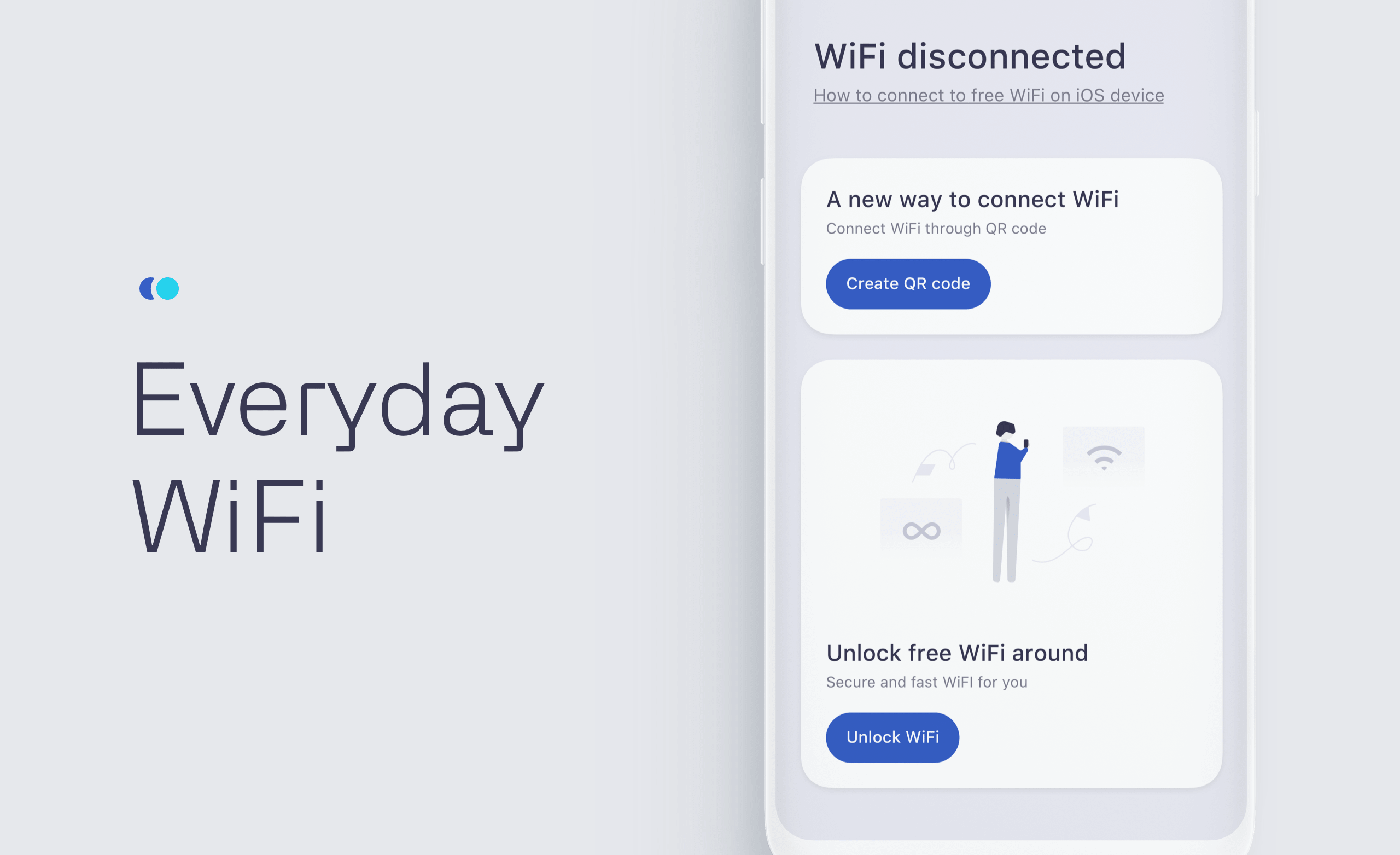
An Insight at the User Interface for Everyday Wifi
An Insight at the User Interface for Everyday Wifi AoiroStudioMar 21, 2019 Let's take an insight at the user interface for Everyday Wifi, a design by Linwu Wang. A designer based in Hangzhou, China. Unlike any Wifi helper application, the Everyday Wifi has been revamping the entire experience to facilitate the connection to a secure network without any effort. Especially knowingly when you are living in a country like China where there are billions of people, having a connection tool for the Wifi must a be plus. The visual design is much more quite simple and inspired by cards; that makes everything more readable and following a path that wouldn't derail the entire user experience. What do you think? Everyday WiFi is just like any other WiFi connection tools that help you connect to secure network without effort. Links Huaban Behance
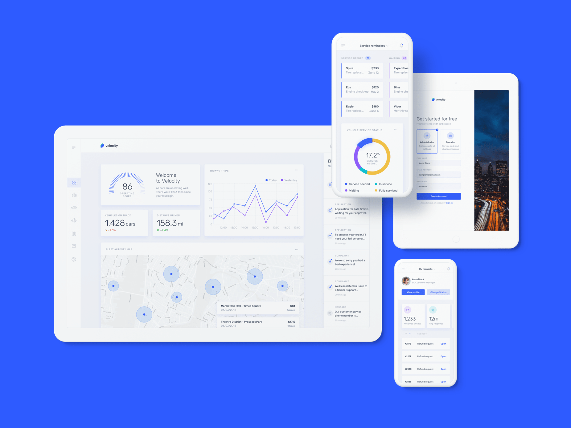
Meet Velocity: a UI kit and complete design system by InVision
Meet Velocity: a UI kit and complete design system by InVision AoiroStudioJan 10, 2019 Our friends from InVision is introducing Velocity, a UI kit and complete design system. With more than 300 UI elements, 70+ components and 30 screens; a complete designed kit perfect for building Saas apps or/and for your next design system (Such a trendy term lately!). Available for InVision Studio, Sketch and Photoshop. Again, it's free! Get it now. In their words Designers working on a responsive web experience need to design across small, medium, and large screen sizes to understand how each component should behave in different scenarios. But not all UI kits support that. The best results in design come when you think about the form and function components have across an app ecosystem. Velocity will take care of that for you—and set you up for a scalable source of design truth. This dashboard UI kit is a best-in-class example of how to set up a design system. Take your time, dig deep, and learn how you can apply these ideas to your next project. Understanding how shared components make up a design system will speed up your next project. We know Velocity isn’t a real company, but it could be. This kit includes 10 core layouts with the following templates: Dashboard Home Analytics Vehicles Dashboard Service Reminders Map Chat User Profile Settings Sign In Sign up Beep beep. Meet Velocity, a UI kit and complete design system for an imaginary self-driving car company. Borrow, remix, and remake for your own app. Meet Velocity More Links Get Velocity now Get Velocity now
Gustavo Perg 2019 Illustration Work
Gustavo Perg 2019 Illustration Work abduzeedoAug 27, 2019 Gustavo Perg shared a beautiful set of illustrations that he has created in 2019 so far. If you scroll down to the end of the page you will be able to agree with me that 2019 has been an incredible year for Gustavo because the quality and style of his illustration work is off the charts. For those interested to know about Gustavo, he is an art director, graphic designer and illustrator from Sao Paulo Brazil, we definitely recommend that you check out his portfolio at https://www.behance.net/gustavopergoli
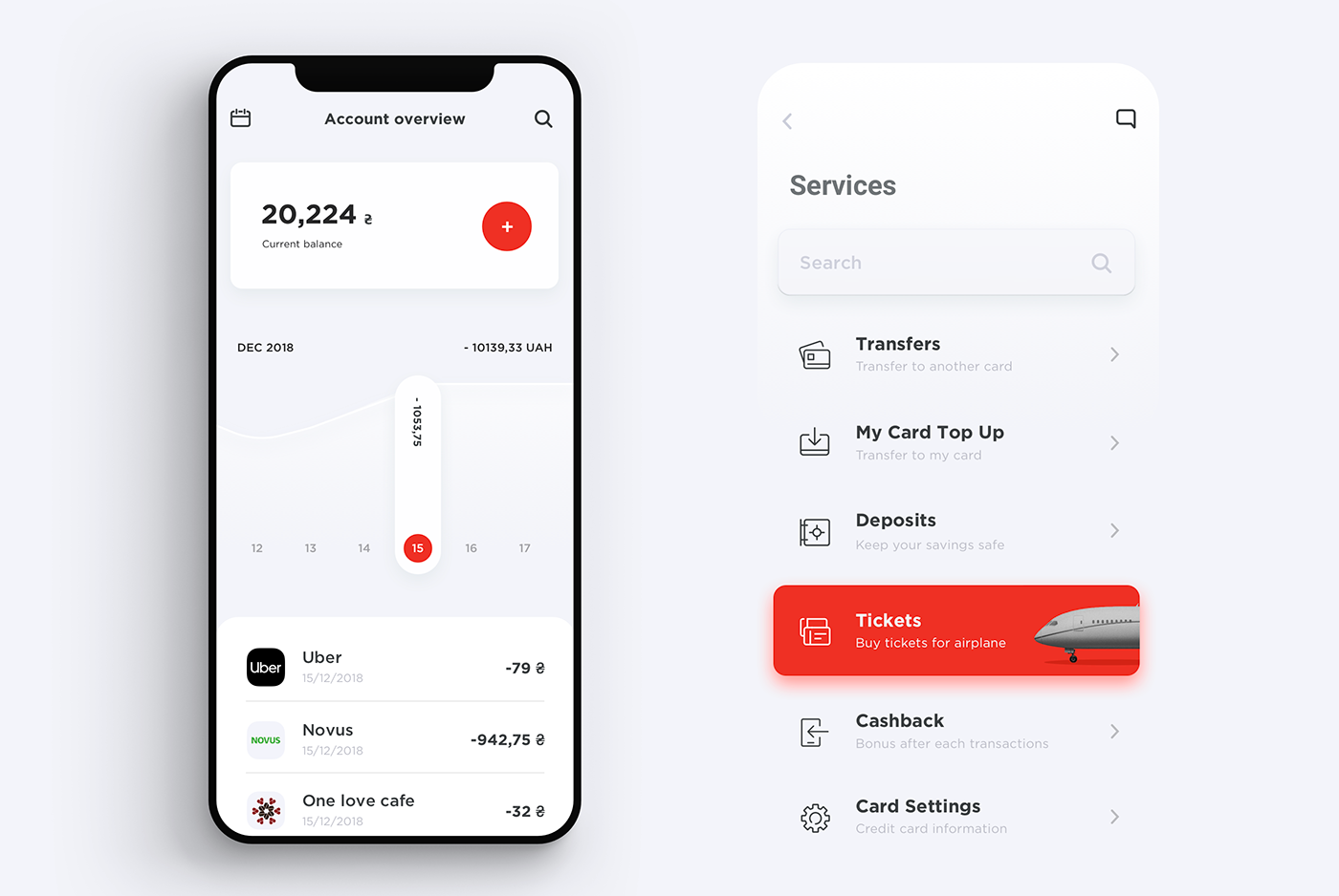
Redesigning the Alfa Bank mobile app
Redesigning the Alfa Bank mobile app AoiroStudioMar 19, 2019 Designers Stas Aristov, Alya Prigotska and Thanh Do decided to redesign the Alfa Bank mobile app. Let's take a closer look! I like the transition of the account overview, it's expressed through two different views with what we would call the "dashboard" and another view where you can select a specific account, send money to someone and your transaction history. The overall UI is clean and the right play with the primary colours, I would have added a second set of colours for secondary actions or additional features. Check it out, props to everyone involved in this redesign. Alfa-Bank is particularly active in Russia and Ukraine, ranking among top 10 largest banks in terms of capital in both countries. Our goal was to create simple and user friendly banking mobile app. Links Behance Credits Stas Aristov Alya Prigotska Thanh Do
Stylish Poster Design by Jose Berrio
Stylish Poster Design by Jose Berrio abduzeedoAug 15, 2019 Jose Berrio shared a really cool project of personal poster design on his Behance profile. They have all this dirty look, with some very stylish typography and textures. They bring back some old school movie posters, almost punk look. I liked the idea of creating personal projects to not only promote your skills but as away to let people know you are available for new projects. It's a way to differentiate yourself from the crowd. Jose is a a Colombian graphic designer currently based in Brooklyn. He received a degree in Graphic Design from LCI Bogotá and worked in advertising companies for seven years. I'm currently working as a freelance graphic designer and illustrator. For more information make sure to check out. www.joseberrio.com Poster design
Beautiful Character Design by Gustavo Henrique
Beautiful Character Design by Gustavo Henrique abduzeedoMar 29, 2019 Gustavo Henrique shared a beautiful character design project on his Behance profile. He created simple shapes in 3D and added some simple 2D draw on them. Gustavo mentioned that he wanted to give some personalities to these shapes using very simple lines. As he said: "I tried to use less shapes and lines as possible to give them some personality. Although they are very simple I really liked how everything looks good together." In addition, I quite love the way Gustavo played with depth of field, really exaggerating the blur of the background. That created a nice separation between foreground and background. I tried to use less shapes and lines as possible to give them some personality Character Design Illustration

CD Cover Designs to Bring Back that 90s Feeling
CD Cover Designs to Bring Back that 90s Feeling abduzeedoApr 09, 2019 If you had to describe the 90s I am pretty sure compact disks would be part of that short description. Also known as CDs, they were part of that decade and they were also an important medium for designers to showcase their skills on the covers. I dare say that being able to design a CD cover was probably the main goal of any graphic designer. So there’s nothing better than a collection of super awesome CD Cover Designs by HERO INK, a designer based in France, to bring back the nostalgic feelings of that long gone grunge era. CD Cover Designs
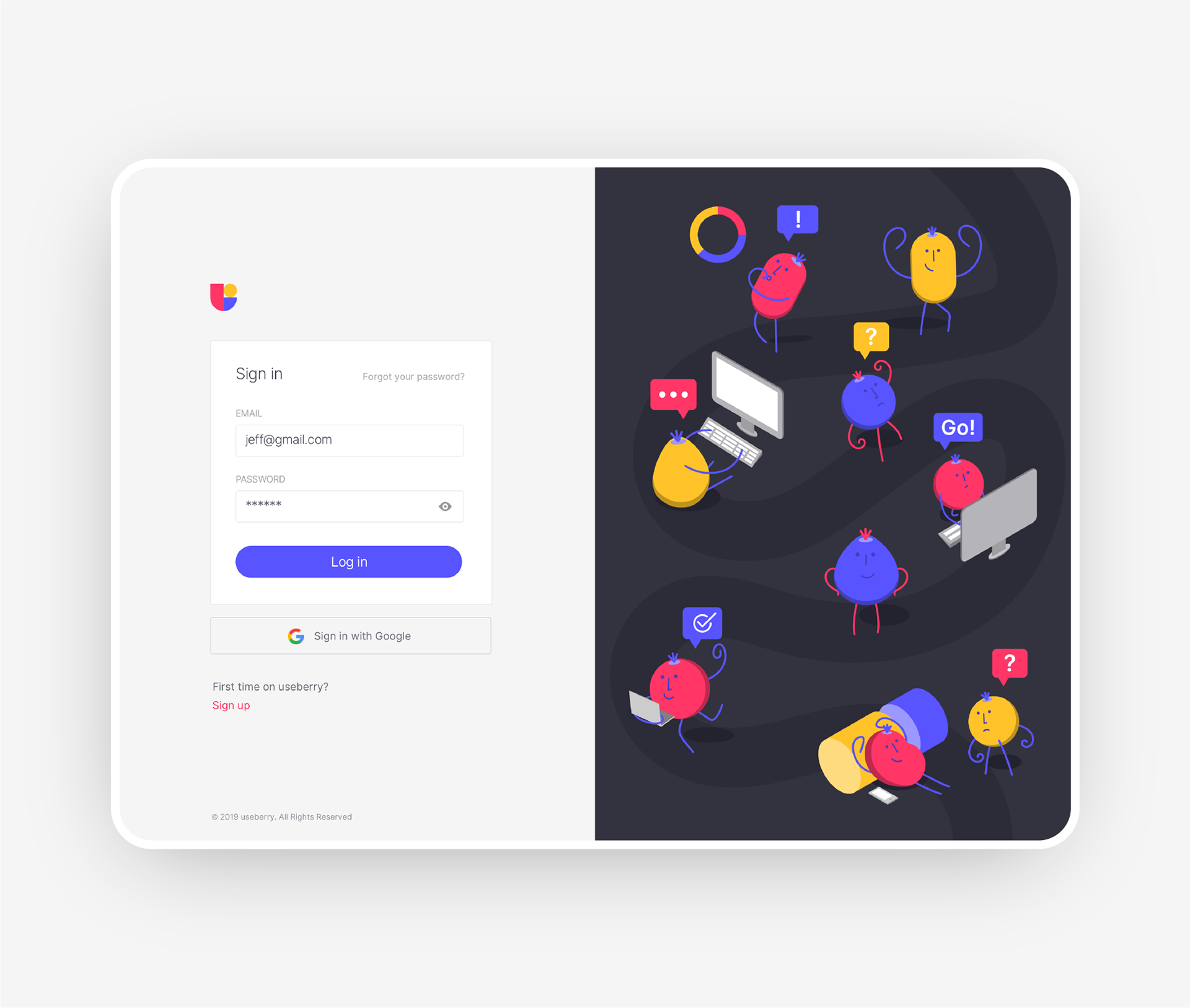
Undivided Rebranding & UI/UX for Useberry
Undivided Rebranding & UI/UX for Useberry AoiroStudioMay 20, 2019 holy ™ is an agency of all sorts of services, from branding all the way to the user interface design. Based in Athens, Greece, they shared on their Behance, a major rebranding & UI/UX for Useberry. They have revamped their entire look from visual identity, UI/UX, iconography, illustrations, animations and even copywriting. Useberry is an intuitive user-testing tool, which provides codeless prototype analytics. Props to the entire team at holy ™ for this amazing work, I love the fact they used the Inter UI font by Rasmus Andersson. I also appreciate the fact they shared UI design for the results page for example. Something we dearly get to see on published projects, usually we rarely get passed the "sign-up onboarding". A great challenge though was useberry platform’s UI/UX design, which not only needed to be light, clean and intuitive, but also able to address design community’s claims for functional and good design. More Links Studio Site Behance Visual Identity User Onboarding Dashboard Test Sharing Prototype Creation Results Follow holy™ on Behance
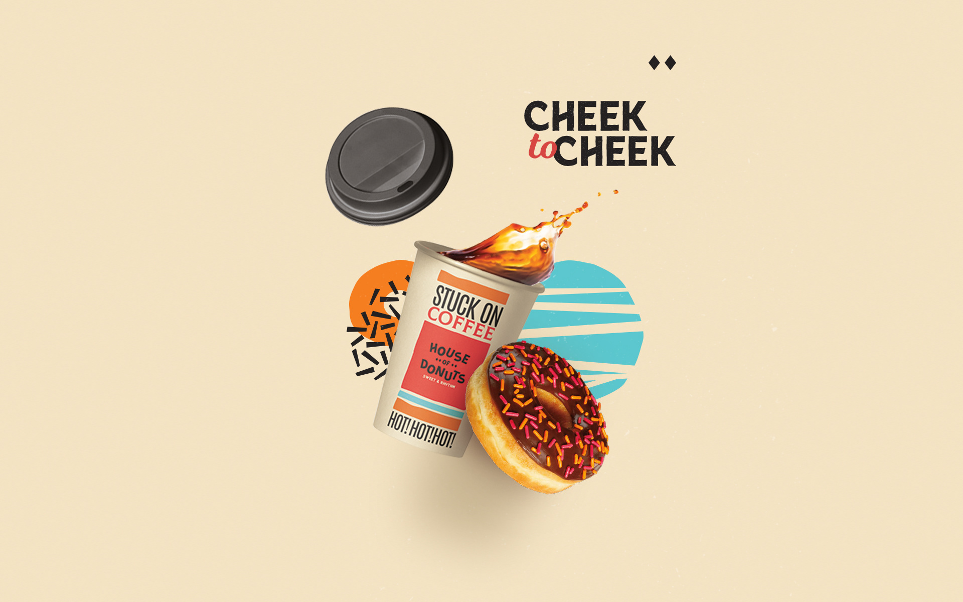
House of Donuts Playful Visual Identity System
House of Donuts Playful Visual Identity System abduzeedoOct 15, 2019 Donuts, oh donuts! It’s hard to resist the temptation of those little fried pieces of dough. To make things even harder Mariana Font and César Romero created a colorful and fun visual identity for House of Donuts. By playing with typography, colors and pattern they created a beautiful system that is playful but super modern and elegant. I personally love the packaging and printed materials. The website is awesome great, especially the hamburger menu. Visual Identity Marina is a graphic designer from Venezuela, currently based in Buenos Aires, Argentina. Cesar Romero is a graphic designer based in Santiago, Chile. For more information make sure to follow them Marina on Instagram
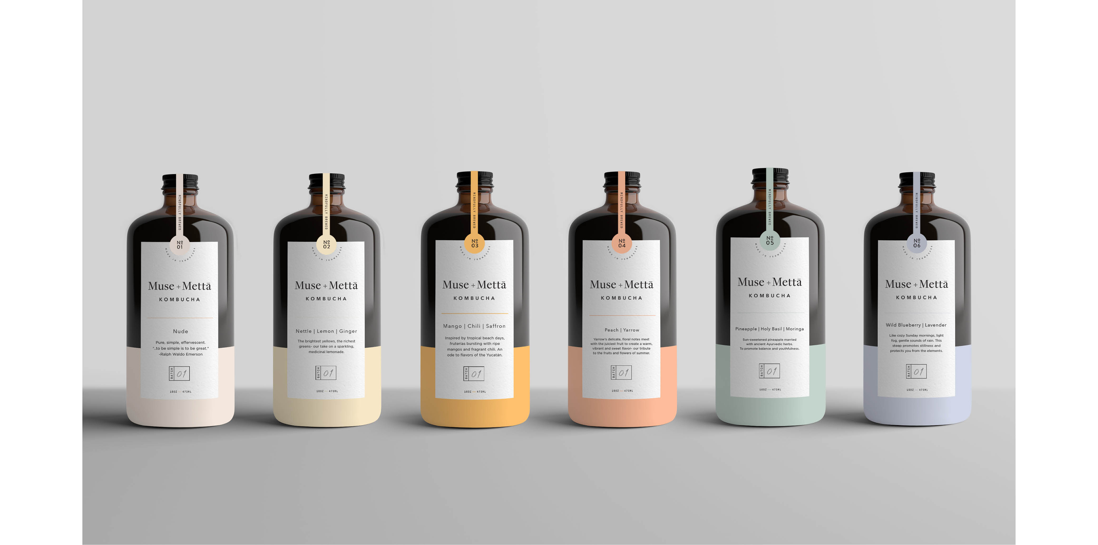
Muse + Mettā Kombucha Brand Identity by Kati Forner
Muse + Mettā Kombucha Brand Identity by Kati Forner ibbyJun 10, 2019 It's no secret we're big fans of the work coming from Kati Forner Design having showcased some past work of hers here on Abduzeedo. Of late we're swooning over the most recent work for Kombucha brand Muse + Mettā founded by Trent Brokie . Most definitely the most beautiful Kombucha bottle we ever did see, I can picture myself enjoying the Wild Blueberry and Lavender steep and then repurposing this gorgeous bottle as a home decor piece. The concept behind the work goes something like this: The color of each flavor complements the ingredient profile highlighting Muse + Mettā Kombucha's identity as more than just a beverage but a culture of health, art, and possibility. While you're here, be sure to check Muse + Mettā's Instagram page for a visual schooling on how to launch a product on this social platform in the most beautiful way. We believe food can feed us both physically and creatively. Brewed with fruits, flowers and herbs from around the world coupled with a passion for modern design and wellness to create a truly sensory experience
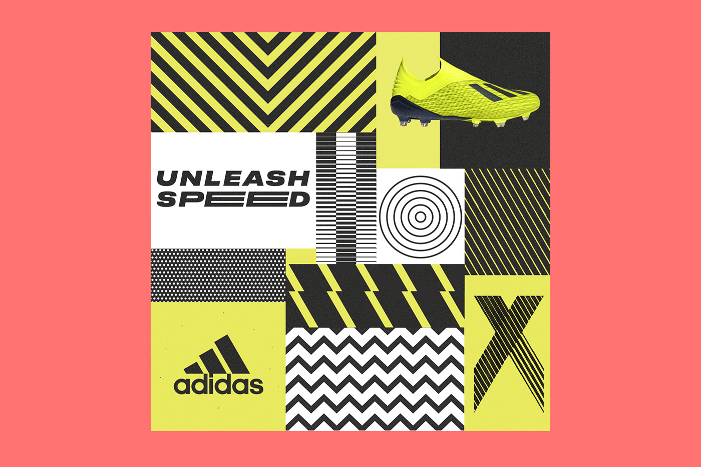
Graphic Design for Adidas Predator by Gordon Reid
Graphic Design for Adidas Predator by Gordon Reid abduzeedoMar 25, 2019 Gordon Reid shared a beautiful graphic design project for Adidas and one of their most iconic soccer (football) boots in history, The Predator. Adidas London wanted to create a range of new print, digital and social ads to mark the relaunch of this historic boot along with the launch of two new boots, the X and Nemeziz. Gordon worked with the strapline for each boot to create illustrated assets for each boot. Each created to compliment the culture, history and design of each of the boots. For Instance, the Predator played on more of a retro, bold and graphic feel, whereas the X artwork played on the enhanced speed element and Nemeziz was all about being agile. Each artwork was brought to life using a bold color palette and strong graphical elements that could be used throughout the advertising. Graphic Design
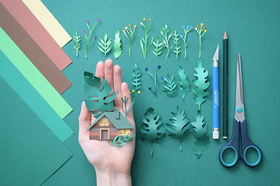
Beautiful Paper Art Work by Margaret Scrinkl
Beautiful Paper Art Work by Margaret Scrinkl ibbyJun 09, 2019 Margaret Scrinkl has been posting some very intricate paper art projects. I am a fan of 3D and photo manipulation, but you cannot beat the look and feel of a real handcrafted product. The textures, the light and most importantly how organic it feels. Computer generated images tend to be too perfect, they lack the subtle flaws that something made with real materials will show, like the different way the border of the paper looks after bing cut with scissors, or simple the fact that the curves are not perfectly uniform. There are many details that make Margaret's work special. Below you see the one titled House Jungle. You can also purchase this and many others. Printable art is available in her Etsy shop Paper Art
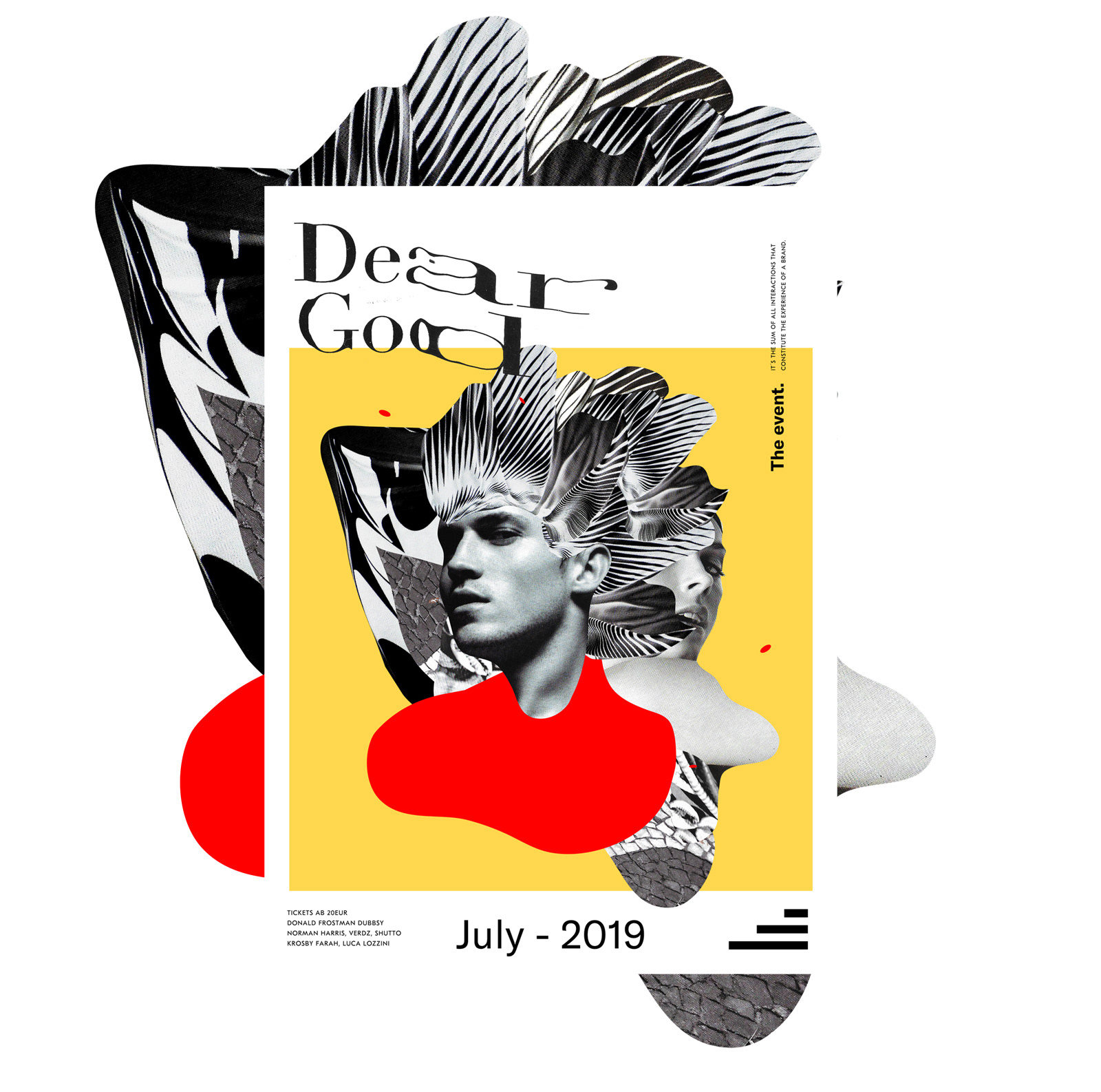
That 90s Look is Coming Back: Dear God Brand Identity
That 90s Look is Coming Back: Dear God Brand Identity abduzeedoJan 16, 2019 Yesterday I posted about the work of Dylan Levionnoi and the many 90s references for his work had. Today, we will keep on with the same topic, perhaps because now I am aware, but It seems to be that there are more projects with a similar style. For this post, I would love to share the brand identity project that Elvis Benício and Lostctrl published on their Behance profiles titled Dear God. It does indeed have that 90s graphic design look. Dear God is a brand identity project for a music event. It has that grunge look created by distorting the typography and the mix of primitive shapes with weirdly masked black and white photography. It seems to me that all ingredients are there. For more information about Elvis and Lostctrl make sure to check out their website at http://www.elvisbenicio.com/ http://www.lostctrl.net/ Brand Identity

Monday Motion Design Inspiration - Symbiose
Monday Motion Design Inspiration - Symbiose abduzeedoJul 15, 2019 Bring back another edition of our sometimes forgotten series, Monday Motion Design Inspiration, we are excited to feature the project that Benjamin CROCHET shared on his Behance profile. Titled Symbiose, this project is a fictive AI device, creating and transmitting sounds by bone conduction to help user feel better. Shapes and colors graphically represent the current state/mental health of the user, and its evolution after using the device. Motion Design Stills More information Benjamin Crochet. is a creative designer, based in Paris, France. He is specialized in motion, art direction, graphic design and his portfolio is simply awesome. Make sure to check it out. Web: benjamincrochet.com Instagram: @ben.crochet
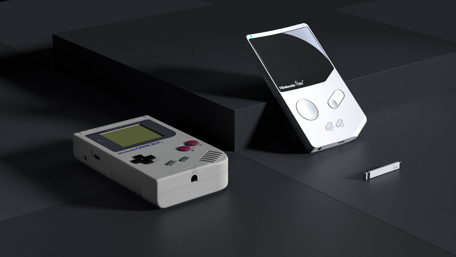
What if 1989 Game Boy was redesigned, introducing the Nintendo Flex
What if 1989 Game Boy was redesigned, introducing the Nintendo Flex AoiroStudioMar 04, 2019 The 1989 Nintendo Game Boy, a piece of our nostalgia. As a fun fact, the Game Boy and its successors have sold over 118 million units worldwide as of 2016. What if it was redesigned for today, what could it look like? Well YJ Yoon, an industrial designer based in San Francisco, California has shared on his Behance a delightful concept. Let's take a closer look! Based on its original user experience, YJ took a stab at its hardware by paying a tribute to the original classic design element instead of going completely in an unknown. One thing I love tough, there is a headphone jack! Including a screen on the controller is the essential idea behind GAME BOY, initially electrifying players due to its new-found portability. The vertical layout of the console reflects how a human’s body is designed. Through technology developing, the new curved display allows for a more immersive experience, as the curve makes to fill more of the field of view. Links Personal Site Behance
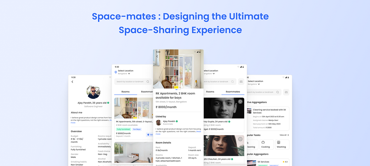
Space-mates : Designing the Ultimate Space-Sharing Experience
Space-mates : Designing the Ultimate Space-Sharing ExperienceThis was a Design Assignment given by Porter as part of their screening process.Figma File for your referenceAssignment link: https://porter-logistics.notion.site/Roommate-Finder-90f605d222d8421f921e2461e7953420Problem Statement💬Finding and keeping a good roommate gets harder as more people crowd into cities. Most city dwellers tend to spend most of their twenties (Ages 20 to 30) living with roommates.Design the experience from the perspective of a person who is looking for a roommate as well as the one who is looking for the apartment. After finding the ideal roommate, what else can this product do to make the roommate experience better? We are looking for you to discover multiple solutions and ways to solve those pain points.Now we are also coming up with a facility to onboard an aggregator who will provide local househelps on our platform for different societies. This feature will involve payment cycles, monitor regular check-ins, and temporary replacement service.My SolutionTo address the issues faced by people in finding roommates and rooms, I designed an app that caters to everything from finding roommates to managing them. The platform suggests compatible roommates to the users based on their preferences and interests. After finding an ideal room and roommates the next big problem that users face is finding househelps to get help in their day-to-day activities.Expected Timeline:4 daysScope of the Assignment:The current scope of the assignment was to design the entire journey for both cases along with any associated states. Keeping in mind the time constraints I had to decide what things I had to work on to get better solutions.Discovery of the problem, User ResearchIdeatingWireframingDesigning high-fidelity screensWhy finding good roommates/ rooms is a problem:Finding a good roommate is a problem because of the changing lifestyles, preferences, and ways of living.Due to the high prices of apartments users generally look for roommates to reduce financial stress.The process of finding good apartments and roommates can be time-consuming.Living with a roommate requires a certain degree of trust, and it can be difficult to trust someone who is a stranger or who has a different background or personality.User Research:I started my user research by doing some secondary research available online and talking with friends who are already looking for roommates or rooms and who are staying with roommates to find the pain points so that I can design the product more effectively. The research helped me to identify the following key problems:It is difficult to find a compatible roommate based on preferences and interests.Everyone has their own way to live.Trust issues and safety factors are major pain points users face.Affordable apartments.Cleanliness and hygiene issues.Food habits.Scarcity of appropriate platforms to look for roommates.People moving into new cities tend to live in shared accommodation to reduce financial stress.Scams and fraud.For the second problem statement, few insights that I gained are:People find it difficult to find house help for various daily chores.Difficult in managing time in keeping up with regular house chores.Users sometimes face language barrier issues.Sometimes there is a lack of expertise and inconsistency in work.Target Audience:Age group: 20 to 30People move to other cities for jobs, to start their careers, and to study.Looking for a roommate to move in.Current User Pattern:Currently, whenever users look for an apartment or roommates they generally have these mediums to get any leads:Facebook groupsTwitter groupsWhatsapp groupsContacts from family, friends, and colleaguesPain Points in current pattern:Trust issues.Scam and Frauds.No moderation on social media platforms.Bad experience.Can become spammy sometimes.Many times people contact and then don’t follow up or respond.Privacy concerns.User Persona:Based on the research and insights gained I created two major user personas to get a proper idea of the pain pointsUser PersonaFeature Ideation:Chat feature.Feed for roommates and rooms and for househelp service aggregators.KYC verification for authentication.Potential roommates/ rooms are shown based on their interests and preferences.Search and filter options.Ratings and feedback.Photos, rent, and other information should be mentioned.Payment cycles for ease of payment to the users.Monitoring facility and regular check-ins to help resolve any issues.Temporary replacement service in case of an emergency.Information Architecture:After doing the necessary research and laying down the features it was time to see what all information needed to be put on the screens for the efficient experience of finding roommates and househelps. It was designed by keeping in mind the user requirements.Information ArchitectureUser Flow:The typical first-time user flow would look like thisUser FlowDesign:WireframingAfter finalizing the idea, I started wireframing the app. I created wireframes for the entire journey of finding a roommate, managing the roommate experience, and finding reliable househelps. I started with rough sketches of the screens to get an overall idea and to have a basic structure.WireframesVisualsOnce the wireframes were finalized, I started designing high-fidelity screens for the app. The screens were a result of multiple iterationsHomescreen- Rooms FeedRooms Feed IterationsFinal Homescreen- Rooms FeedI designed the home screen keeping in mind the user requirements.The feed for rooms and roommates would be shown based on the preference they put during sign up and the app would give some suggestions.The verified tag will help create trust and authenticity among users that the rooms shown are legit.Suppose while listing the user doesn’t has a particular document then their room will be listed but the verified tag will not be shown.Users can search for rooms by locality also.Final Rooms Feed ScreenHomescreen- Roommates FeedRoommates Feed IterationsFinal Homescreen- Roommates FeedThe Roommates card shows the age and the type of room they are looking for along with their budget.The verified tag creates trust among users that the profile is not fake thus providing a better user experience.Final Roommates Feed ScreenRoom Details ScreenRoom Details IterationsFinal Room Details ScreenThis screen has multiple images to view so that users can have a proper look at the room’s images.Users can chat with the room lister for any additional information regarding the room.I tried to design the screen keeping in mind the user’s need and at the same time providing all the basic information that is required for the user to make an effective decision for a smooth experience.Users can quickly decide if their preferences and interests match with the room lister or not. The check mark and cross mark will help the user make a quick decision thus providing a better experience.Final Room Details ScreenRoommate Profile ScreenRoommate Profile IterationsFinal Roommate Profile ScreenI designed the roommate profile section keeping in mind all the necessary information that one will look for while looking for a roommate.If the preferences match with the roommate the user can chat and can finalize whether to stay with the roommate.Final Roommate Profile ScreenHousehelp Aggregator ScreenHousehelp Aggregator IterationsFinal Househelp Aggregator ScreenSo generally after finding a room and a roommate now, the task comes to manage the househelp chores. So aggregators will provide the required service and users can select from the range of aggregators available to them and choose whichever fits their interests.After a user books an aggregator then at the aggregator screen it will be shown at the top with information such as service timing, upcoming payment date, assigned service person for the said task, and total amount. It will help users to know all the information at all times.The ratings will help the user to decide which service provider to opt for.Final Househelp Aggregator ScreenAggregator Profile ScreenAggregator Profile IterationsFinal Aggregator Profile ScreenThis screen has the aggregator’s information and the service they offer. Ratings will help the users to decide how their previous service was and will create trust in the user about their service.If all the requirements meet the user’s needs then they can select the service they want to book and can proceed with the further booking process.Final Aggregator Profile ScreenAggregator Booking ScreenAggregator booking IterationsFinal Aggregator Booking ScreenOn this screen, the user can see the service they booked with the aggregator and can edit if they want to add any more services.Initially, upcoming recent dates will be shown and if the user wants to book for future dates then they can select from the calendar.Users can set up regular check-ins at the time of booking only and how frequently they want the check-ins to be done.Letting users set the check-ins would give them more freedom to customize their requirements.I added a copy about check-ins which will be helpful for users to know about the feature.By default, the billing period will be monthly as the services will be on a monthly rental basis, if users want to change the billing period they can do so using the arrow icon.Final Aggregator Booking ScreenTemporary Replacement Service ScreenTemporary Replacement Service IterationsFinal Temporary Replacement Service Screen:There might be situations where the assigned service person cannot come for the service, so at that time prompt will be shown to let the users know and they can view the details for the newly assigned person.Adding emoji with text would make it visually better and help in improving the experience.I assumed that users might have a question if there would be extra charges added for the newly appointed person, so I decided to add a copy to let users know.Users can confirm or cancel the replacement.In addition to that for replacement notification would be sent.Final Temporary Replacement Service ScreenHow the experience could be done better:Features such as an In-App house setting service could be implemented.With the help of expense tracking the roommates can track their regular expenses which in turn will improve the user experience.The app could provide resources for conflict resolution, such as mediation services or a chatbot that can help guide roommates through difficult conversations.PrototypePrototypeSome brainstorming scenesBrainstormingFuture Scope of Work:The feature could be added to split bills, and rents for a smooth experience.Users could take virtual tours of apartments before scheduling an in-person visit, saving time and effort.After the check-ins have been done users would be prompted to provide feedback to the aggregator. If the user provides negative feedback or reports an issue, the app would prompt the user to provide additional details so that the issue can be addressed. The app would also provide a way for the user to request a temporary replacement if the issue cannot be resolved.The app could provide a platform for roommates to give feedback on their experiences with each other. This could help identify areas for improvement and promote accountability.Customer Live support could be added to solve any issues that arise.Learning and Takeaways:I took feedback from a few of my friends and it helped in getting a better perspective on solving the problem.There is always room for improvement and with iterations, better solutions come up.Focusing on the pain points of the user helped in getting a better solution.And we’re done…🎉Thank you for reading the case study, feel free to give your suggestions and feedback.Let’s ConnectLinkedIn | Dribbble | TwitterSpace-mates : Designing the Ultimate Space-Sharing Experience was originally published in Muzli - Design Inspiration on Medium, where people are continuing the conversation by highlighting and responding to this story.
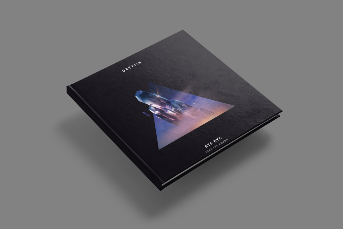
Graphic Design Inspiration: GRYFFIN's album
Graphic Design Inspiration: GRYFFIN's album abduzeedoDec 19, 2018 Anxo Vizcaíno has been commissioned by Red Yellow Blue to create this collection of cover artworks for the first GRYFFIN's album (Interscope Records). Under the concepts and creative direction of Jordan Miles Rosenheck, they designed a series of portals that "are metaphors for having access to anywhere and anything we want, because we're made of everything". Each piece is related to a track that has been released separately, previous to the main album 'Gravity Pt. 1' containing 6 songs and of which cover is the door to this GRYFFIN's universe. They also went above and beyond, making a loopable animation for that one. Personally, I am a fan of Anxo's work. They have that space theme combined with a sort of surreal touch that you will find familiar to some of my early tutorials if you followed the blog since the first years. I highly recommend that you check out Anxo's full portfolio at http://www.anxovizcaino.com/ Graphic Design Credits Client: GRYFFIN Label: Interscope Records Agency: Red Yellow Blue Art direction: Jordan Miles Rosenheck Design and animation: Anxo Vizcaíno
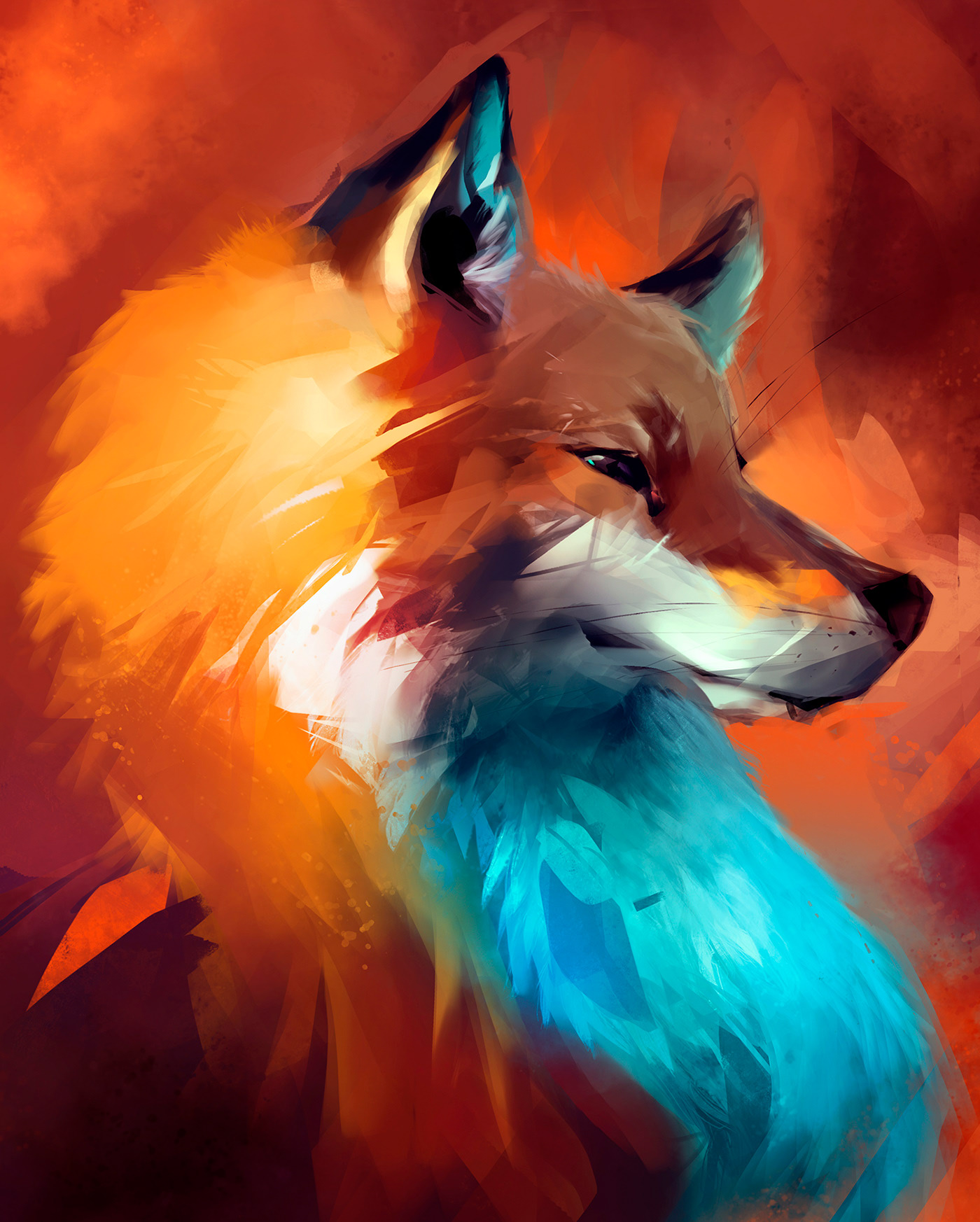
Animal Painting Studies by Guilherme Asthma
Animal Painting Studies by Guilherme Asthma AoiroStudioJul 29, 2019 Guilherme Asthma is a freelance visual artist from São Paulo, Brazil, he shared a stunning and impressive animal painting studies using Photoshop (for one) and a photograph as a reference. These are righteously fascinating! I took the liberty to share its entire project, my favorite one is actually the 'fox'. I mean just take a look at the different spots of lighting and colors. It's a true master and his craft and it's going to keep on making greater art. Make sure to follow Guilherme' work. Paintings & Digital Art Work by Guilherme Asthma More on Guilherme Asthma Personal Site Behance ArtStation
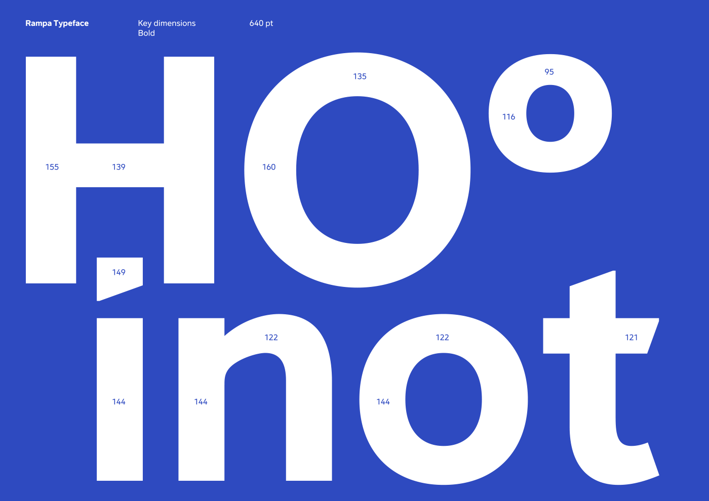
Rampa Neither Grotesque nor Humanist Typeface
Rampa Neither Grotesque nor Humanist Typeface abduzeedoSep 10, 2019 Pedro Matos shared a beautiful typography project on his Behance profile titled RAMPA. Built from scratch, for v10. Rampa is a bespoke typeface developed for Primavera BSS, born with the release of Primavera v10. Neither a grotesque nor a humanist font, Rampa is a contemporary yet friendly looking sans serif typeface—with moderate contrast and modern proportions—that plays on both sides of these styles. The key concept behind v10 branding and communication is a 20 degree acute angle, symbolizing growth and evolution. Rampa was crafted to include this 20º angle throughout almost every glyph geometry, present sometimes on a shoulder, on an apex, a leg or even a terminal, to bring out a higher sense of relationship between all parts. Typaface Credits Client: Primavera BSS Studio: Pi Creative Studio Creative direction and design: Pedro Matos
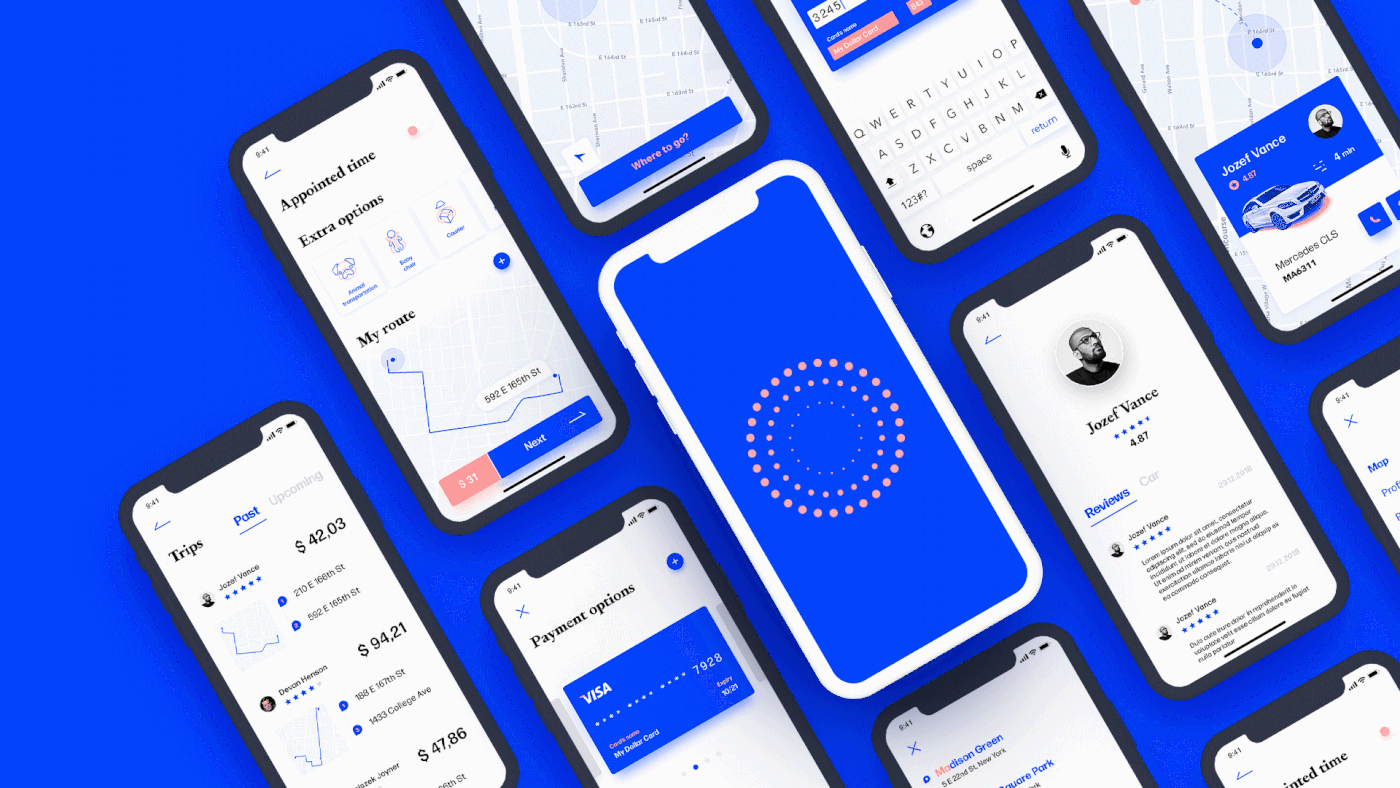
NYC Taxi App
Hi mates! Some time ago I worked on a taxi application and was inspired to make my own one. I made some research and interviewed a target audience to be able to create a useful and comfortable product that corresponds to all user's needs. Advice and opinions are welcome :) Tags: taxi map ui ux app application design wireframe mockup minimal clean light white blue flat mobile ios iPhone android optimization user interface experience interactive layout navigation search profile icon illustration animation
Is this really coming back? UI Design Trends
Is this really coming back? UI Design Trends abduzeedoFeb 05, 2020 We posted about this new trend a month or so ago, however it seems that it’s really picking up steam on sites like Dribbble. With more and more people sharing snippets of working exploring this style it makes me wonder, is the skeuomorphism or as we call it now, the neo-skeuomorphism coming back? Below I select some entries to illustrate the trend but the biggest question for me is not only if it’s coming back but how easy it’s to translate the designs to the adaptive reality we have today. The original skeuomorphism exploded with the iPhone and it was a fairly fixed screen size. Most of the effects were done using bitmaps with tools like Photoshop and Fireworks. Now it’s a bit different as we design for different devices. I know that CSS is a fairly simple process to translate that, however is it for Android and iOS the same? Neo-skeuomorphism UI Design

Reimagining Data Structures - Digital Art
Reimagining Data Structures - Digital Art AoiroStudioMay 27, 2019 Dimitris Ladopoulos is a visual artist and art director based in Athens, Greece. He shared on his , a series of digital art entitled: Data Structures. There isn't that much description but I imagine in his take on reimagining data structures. It totally makes sense how the modern World is built on data and how it is golden for companies to maintain control of our descriptive forms for future usage. What do you think? 0x0000000100300268 0x00007fffd8132201 0x0000000000000000 0x000000000000000a... More Links Personal Site Behance Digital Art Follow Lorenzo on Behance
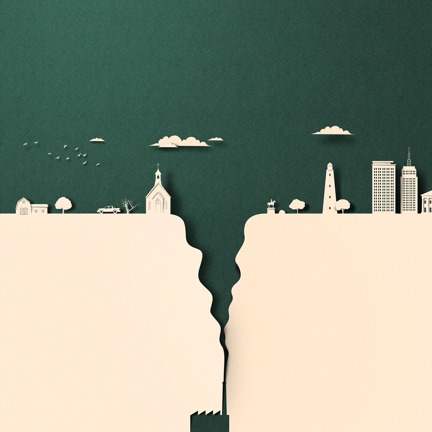
Amazing Paper Cut Illustration Focused on Climate Change
Amazing Paper Cut Illustration Focused on Climate Change abduzeedoJul 04, 2019 Eiko Ojala is a designer from Tallinn, Estonia with an incredible portfolio of papercut artworks. For this post I would love to share one of his latest projects, this one titled “Climate Changed". The Guardian reached out to Eiko with the task of illustrate how the climate change affects people in the American South. Some of the illustrations ask questions like “Why people in the US south stay put in the face of climate change.” or “Florida is drowning. Condos are still being built. Can't humans see the writing on the wall?” - Our goal here is not political but 100% focus on design, and the paper cut work is simply fantastic and totally deserved to be promoted. Not all environmentalists eat tofu: the hunters fighting climate change. Paper Cut Illustration
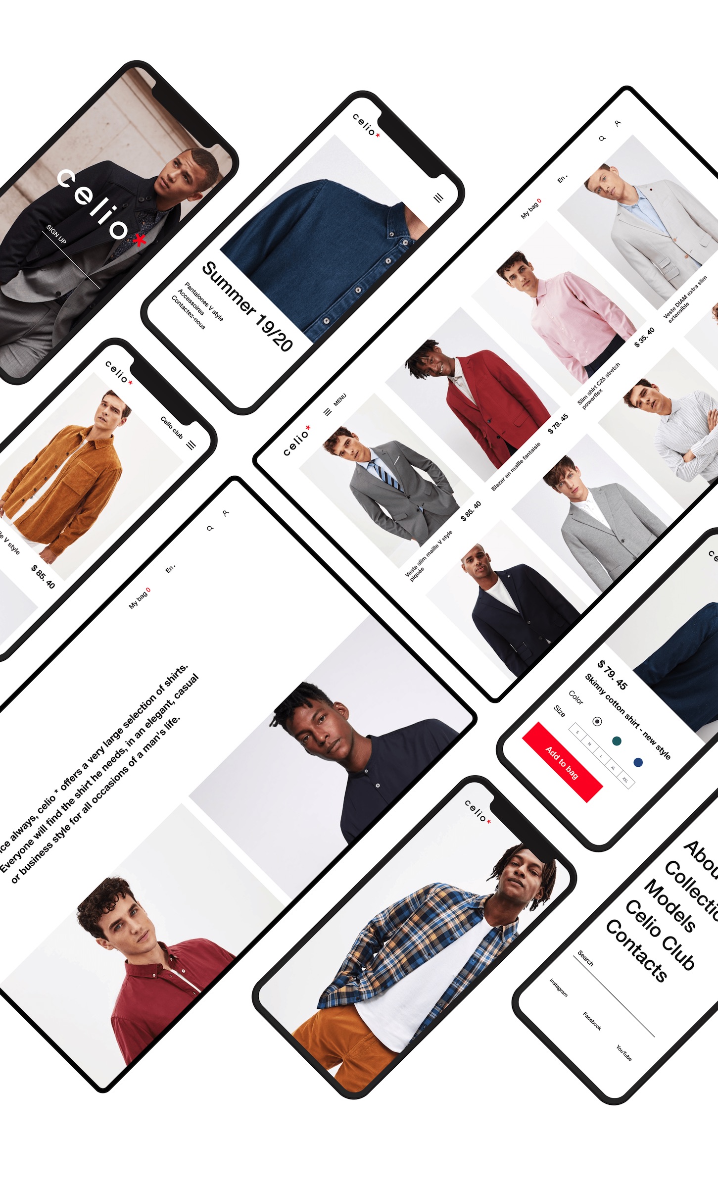
UI/UX Website Redesign Concept for Celio*
UI/UX Website Redesign Concept for Celio* abduzeedoSep 18, 2019 Set Sargsyan shared the UI/UX website redesign concept for the fashion brand. The main goal is to show that the existing structure and interface can be more friendly and fresh for the users. In constant expansion, Celio* is present in more than 50 countries with more than 1100 stores. The brand offers an elegant and cool urban fashion through a wide choice of clothes and accessories for men created by its integrated style office, responding to every desire and every moment of life. So the main task is to provide maximal friendly structure for the e-commerce part and combine the grammar structure with the new fresh UI concept. “I am a Celio* user and I wish to interact with the brand’s web production like this” says Set Sargsyan Web Design
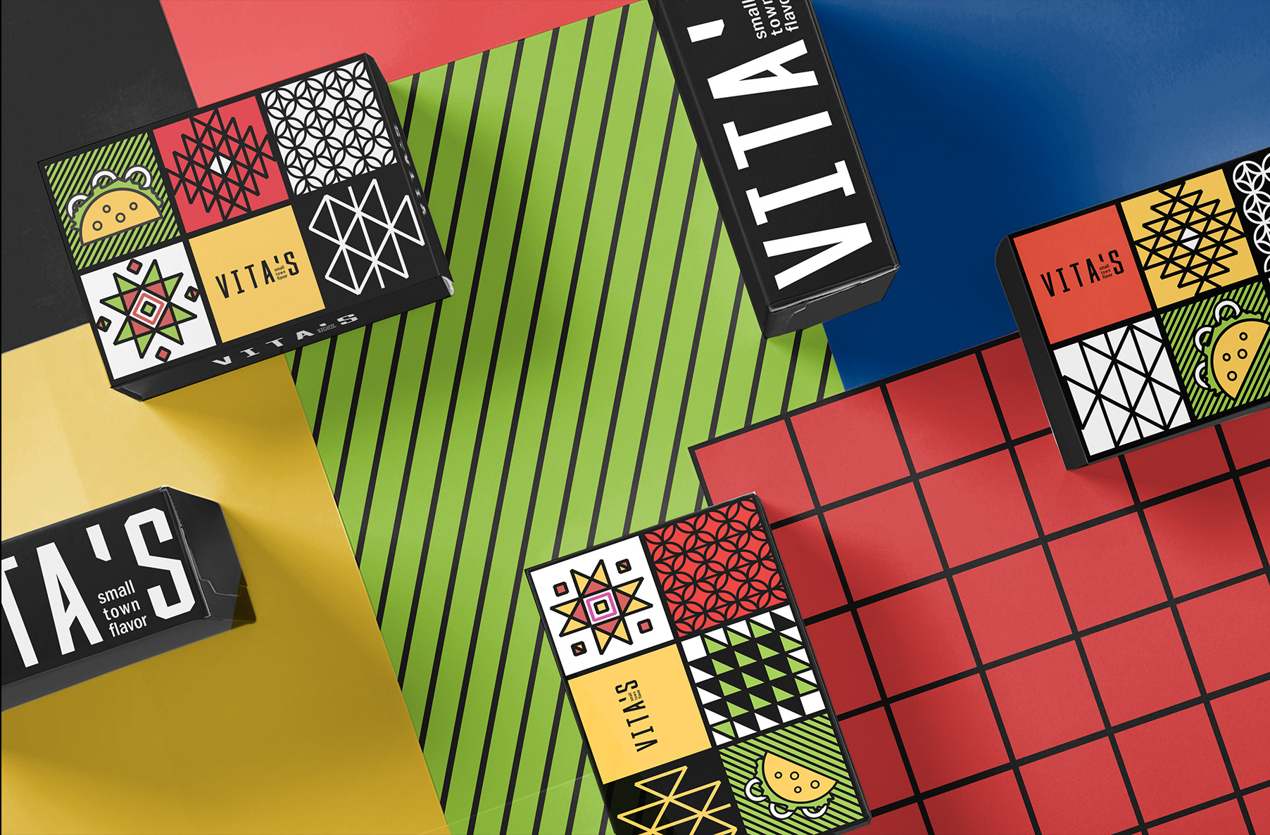
Visually Delicious Identity and Branding for Mexican Restaurant
Visually Delicious Identity and Branding for Mexican Restaurant abduzeedoSep 17, 2019 Anta Petrenco shared a beautiful visual identity, branding and packaging design project on their Behance profile. The project was for a small restaurant of Mexican cuisine who want to make not only delicious food, but also be visually attractive to their customers. Anta combines clean vector lines with vibrant colors to create modern look patterns. The result is quite modern but very friendly because of the color palette. I am a big fan of the style and that’s why it totally deserved the feature. Visual Identity and Branding If you have a design project that you want to share with us, feel free to send us the link via social media or email.
Space Escape Illustration Series
Space Escape Illustration Series AoiroStudio Oct 30, 2018 Prateek Vatash is a graphic artist based in Bangalore, India. He shared on his Behance, an illustration series entitled: Space Escape. It's a beautiful series with a true inspiration from the 80s but added with a flair of a broad range of vibrant colors. I published the entire collection since every single piece has something special and unique of its kind. Make sure to check out more of his work, enjoy! More Links Personal Site Behance Illustration illustration digital art
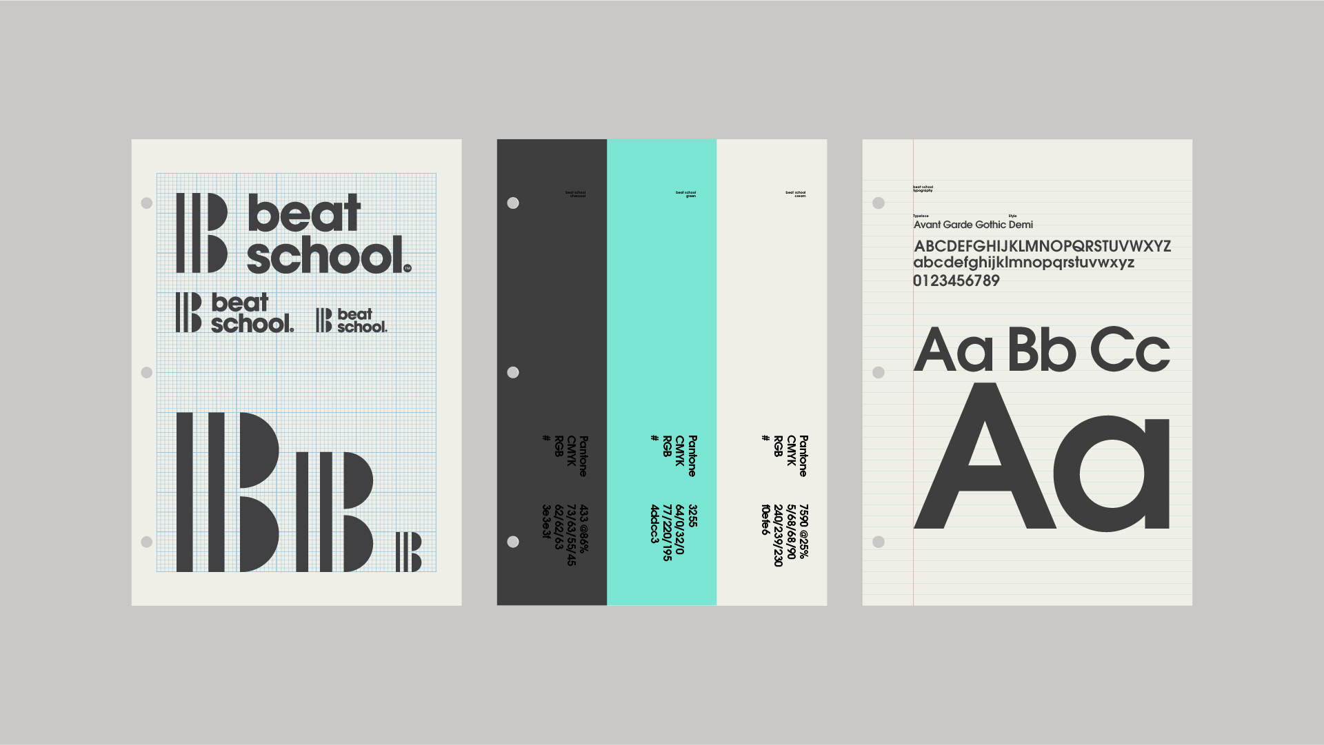
Modernist Brand Identity for Beat School
Modernist Brand Identity for Beat School abduzeedo Oct 26, 2018 Alex Townsend shared a brand identity project create for Beat School, a Houston based music publishing company comprised of music producers from around the US. The identity needed to be music related, simple and slightly urban. The result is a modernist mark with bold typography and a contrasting color palette. To inject a bit of personality into the brand, I couldn't help using a school materials aesthetic for the presentation. Alex is a New Zealand based Independent Designer. Working independently, providing hands-on design solutions and brand experiences for emerging technologies and platforms for the likes of Sony, Nike, Channel 4(UK), YouView, Microsoft and more. For more information about Alex Townsend make sure to check out: http://www.farnorthstudio.com/ Brand identity branding
Amazing Abstract Wallpapers by Dante Metaphor
Amazing Abstract Wallpapers by Dante Metaphor abduzeedoApr 24, 2019 Dante Metaphor shared an awesome set of beautiful wallpapers. They have all the elements of great wallpaper: abstract art, 3D, light effects. That’s the reason to deserve the feature here on ABDZ. The cool thing about this project is not just the outcome, but the reason behind it. He took the time to learn Houdini and Redshift 3D. A bunch of 4k wallpapers i did while experimenting with houdini, enjoy Wallpapers
Studio Emme Furniture Design - Branding
Studio Emme Furniture Design - Branding abduzeedoNov 19, 2019 Hana Neuman shared a branding project for a furniture design agency based in Cairo, Egypt called Studio Emme. The brand’s logo is designed based on an isometric grid in order to highlight the three-dimensionality of the product offered - mentioned Hana. She also adds that the logo represents a fusion between the chair icon and the name of the brand. Branding
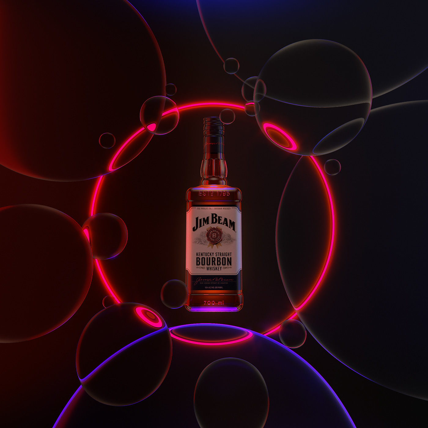
CGI Compositions & Light Effects Bottoms Up
CGI Compositions & Light Effects Bottoms Up abduzeedoFeb 18, 2020 Mike Campau shared some incredible CGI explorations for beverage campaigns featuring famous brands like Jim Beam, Courvoisier and others. There are tons of different compositions but the ones that caught my attention were the ones that had some flashy and classy neon light effects, not a surprise you might say. Below you can see my favorites, but make sure to click on the link to check out the full collection CGI Compositions & Light Effects
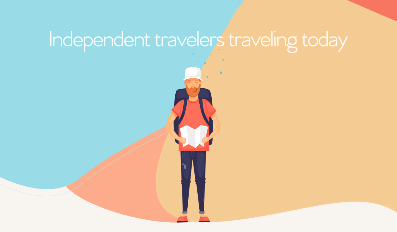
Playful App Design for Bonarego Tourist Guide
Playful App Design for Bonarego Tourist Guide abduzeedo Jul 31, 2018 Cuneyt Sen shared a really cool project on Behance for an app design presentation as well as brand identity for Bonarego, a tourist guide application with video & audio targeting today's independent travelers. The reason I like this project is of course interface design but also the way it is shows the features. From the UI point of view there are a few nice touches. I love the organic element it was created and how it is used on certain elements of the UI, like the avatar for example. I also know that there are several issues with this design, one being accessibility with the very low color contrast. For more information make sure to check out http://www.cuneytsen.com/ App design UI/UX app design
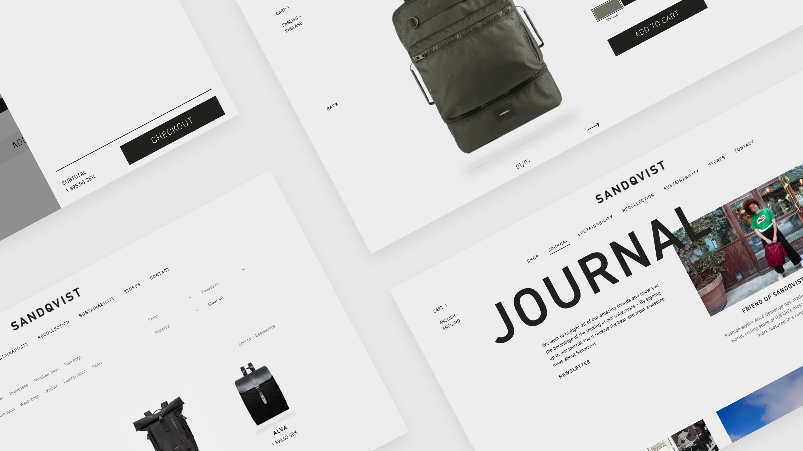
Web Design Concept and Prototype for Sandqvist
Web Design Concept and Prototype for Sandqvist abduzeedo Sep 10, 2018 Lucas Olsson shared a really cool web design concept for the Swedish brand Sandqvist. There are a lot of things to love about this project, I would highlight the minimalist look with excellent typography and of course the black and white theme. As you probably already know, I am a fan of that look and have been trying to explore it here for Abduzeedo. Another awesome thing about this project is that Lucas went beyond mocks and created a fully working and responsive prototype using Webflow. Everything is built in webflow and can be seen at http://sandqvist-redesign.webflow.io/ Web design Visit other social media sites or follow him on: Dribbble Instagram web design
Motion Design for Ordinary Folk
Motion Design for Ordinary Folk abduzeedoOct 31, 2019 Gabriel Silveira was invited by the very cool people at Ordinary Folk to help them design their video for SAP along with Stephen Kelleher, Nuria Boj and Haewon Shin. In this kind of project it's always interesting to see what animators come up with using your designs, and in this case he was BLOWN AWAY by what those incredible designers and motion designers did. Below you can see some of the style frames and the final video. You will definitely understand why we love this so much! Illustration and Motion Design Video SAP - Innovations from Ordinary Folk on Vimeo.
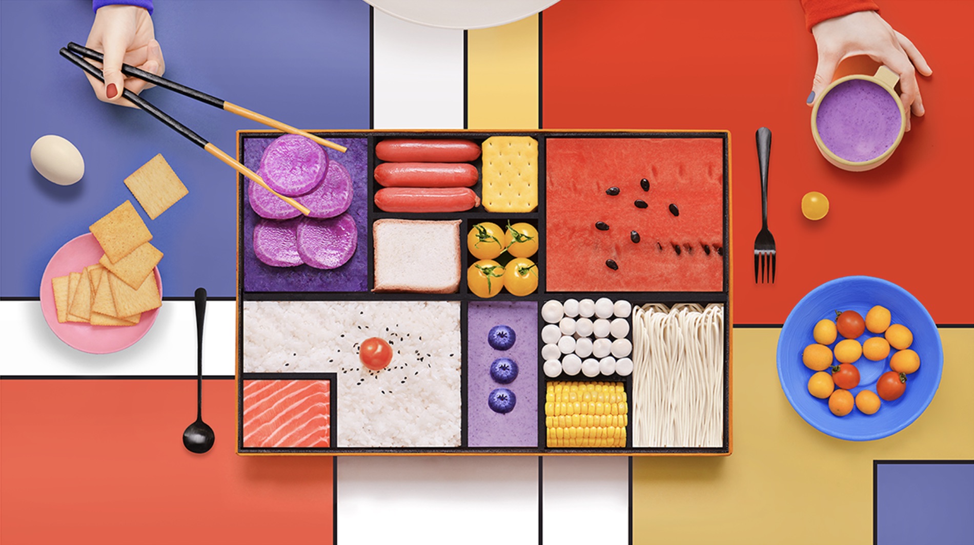
Amazing Mondrian Inspired Bento Box Industrial Design
Amazing Mondrian Inspired Bento Box Industrial Design abduzeedoJan 21, 2019 One of my favorite artists of all time is Piet Mondrian. He is known for being one of the pioneers of 20th-century abstract art, as he changed his artistic direction from figurative painting to an increasingly abstract style until he reached a point where his artistic vocabulary was reduced to simple geometric elements. That is exactly the phase I am the biggest fan. I painted a few pieces recreating some of his iconic pieces like the Composition II in Red, Blue, and Yellow from 1930 for example. So it’s not a surprise if every time I see something that resembles the master Mondrian it will inevitably catch my attention. That’s exactly the case of the industrial design for a bento box, yes you read it right, created by Yum tang inspired by Mondrian. Yum experiment with the idea of using Mondrian’s abstract geometry mixed with food colors to recreate the inspired Bento Box. It’s quite creative and definitely beautiful, especially the examples that she listed on her Behance profile. Mondrian’s abstract geometry mixed with food colors to recreate the inspired Bento Box In addition to that, apparently there was a partnership with Thinkpad, I couldn’t understand quite well because the post was Chinese and the translation was a bit all over the place. Industrial Design Inspiration Bento Box Design For more information make sure to check out Yum Tang's work at https://www.behance.net/yumyang
That 90s Look is coming back - Poster Design by Roman Post
That 90s Look is coming back - Poster Design by Roman Post abduzeedoMay 20, 2019 It’s time for another entry to our, not so, wildly popular series “That 90s Look is Coming Back”. This time we bring a beautiful set of poster design created by Roman Post on his Behance profile. The post he shared is actually the 9th installment of a series of posters Roman has been posting. For these, Roman brought all of that 90s look at full force, you can see that dirty look with textures, broken elements, especially typography making it hard to read. Everything that defined graphic design in the 90s is explored in these posters, that’s why we had to share with you. Poster design
That 90s Look is Coming Back: Work of Dylan Levionnois
That 90s Look is Coming Back: Work of Dylan Levionnois abduzeedoJan 15, 2019 For the past few years, or I dare to say decade, we saw a resurgence of the 80s in fashion, movies/TV and design in a way. Look at the work of amazing people like James White for example. However, I have noticed a slow shift to a new trend. We are moving ahead and beginning to see an influx of 90s inspiration. There are a ton of references already in plain site. There’s an amazing movie called the Mid 90s, the blockbuster Captain Marvel is supposed to take place in the 90s and of course, I started to see more projects on Behance, especially from students, capturing the style of that incredible decade. That’s the case of the projects that Dylan Levionnois have been sharing on his profile. Dylan Levionnois is a graphic designer from Vire, France and his projects definitely have a lot of 90s references. From the dirty/grunge look using some patterns or texture, to probably the most classic reference, the typography. Dark looking images and simple color palettes, white on black, perhaps with a pop of red. The 90s had a lot of the David Carson, End of Print look and Dylan brings that back on projects like Print - NIKE x BSMNT x ALCH. One of biggest criticisms of some of the 90s look in terms of graphic design was how difficult things were to read. There was definitely an accessibility issue there. I hope the new designers that take that style and are capable to solve this problem and create a totally inclusive design, yet with that awesome 90s look. Graphic Design Examples
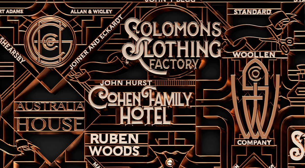
Art Deco 3D Typography for Shell House
Art Deco 3D Typography for Shell House abduzeedoMar 26, 2020 Like Minded Studio has shared are really cool project on their Behance page. Titled Shell House, the project rocks a composition using 3D Typography and a beautiful Art Deco style. It reminds me of the Great Gatsby artwork and also the Photoshop tutorial we wrote about it years ago. 3D typography
Super Stylish Illustration and Animation: Wonderlust Ident / Racing
Super Stylish Illustration and Animation: Wonderlust Ident / Racing abduzeedoJul 31, 2019 Wonderlust Ident / Racing is an illustration and animation project shared on Behance by a few super talented people. Their goal was to show that when you approach life with a childlike sense of wonder, life will always be fun and never boring. That is what the project is all about, and it's a series of beautiful illustration combined with smooth animation. It definitely makes you wonder why things got much boring as we grew older. When you approach life with a childlike sense of Wonder, it's never boring. For this series of personal idents, we are exploring just that. Credits Studio: Wonderlust Producer: Christian Rankin Creative Direction / Concept: Ryan Rumbolt Art Direction / Illustrations: Loris F. Alessandria Character Animation: Juan Ponta Compositing / Animation: ARM Sattavorn Original Music / Sound Design: Facundo Capece Animation Illustration process
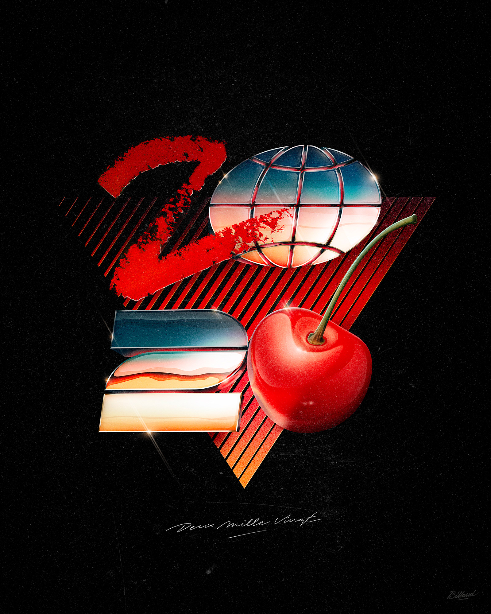
Graphic Design: Happy New Year 2020 with an 80s Look
Graphic Design: Happy New Year 2020 with an 80s Look abduzeedoJan 06, 2020 Romain Billaud shared an awesome graphic design and personal project on his Behance page. As we start a new decade it’s amazing to see all the different ways to interpret the 2020 year. Romain has jumped to my top 3, if not the top 1 because of the stylish 80s look and feel. Make sure to follow him on Instagram & Facebook Graphic Design
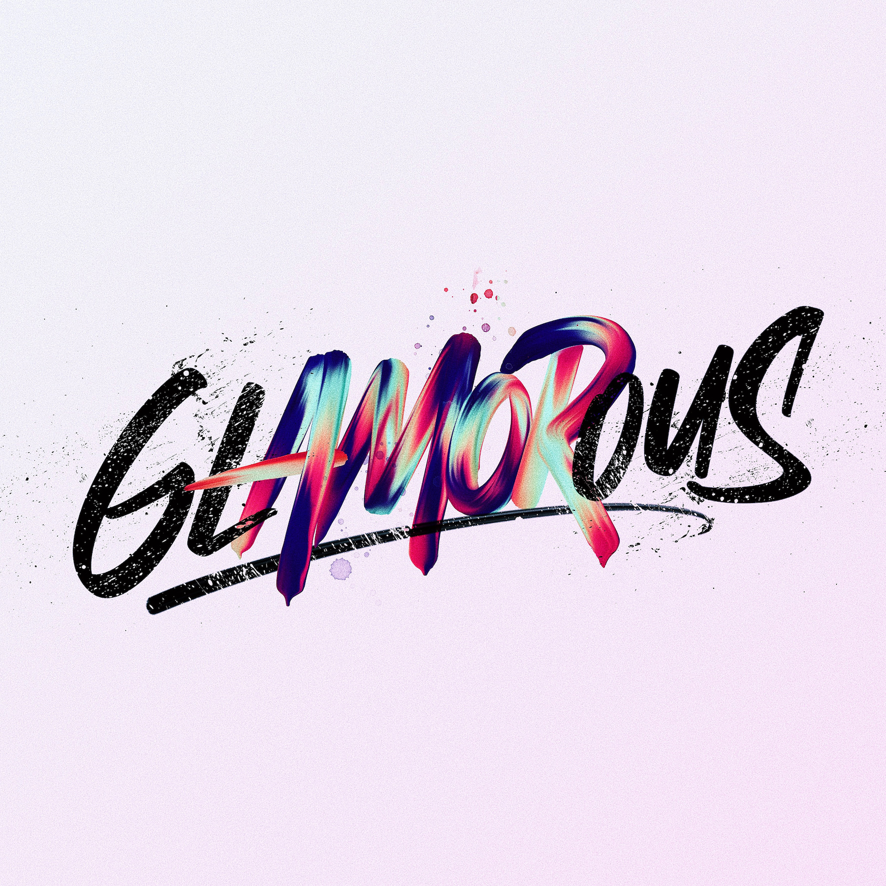
Typography Experiment Collection: EXPERIMENTYPE
Typography Experiment Collection: EXPERIMENTYPE abduzeedo Sep 17, 2018 David Milan shared an awesome typography post on his Behance profile. It's a collection of experiments playing with calligraphy and lettering. I particularly love this type of work. I used to spend so much time practicing Photoshop and Illustrator to be able to do similar artwork. It's awesome to see how David pushes the limit of analog and digital. First experiment collection I made using different techniques with my own calligraphy and lettering works. I like to explore, get inspired by other artists and see what comes out. As you can see I love to use colors, shapes, gradients, high contrast, paint and real textures. Typography Typography
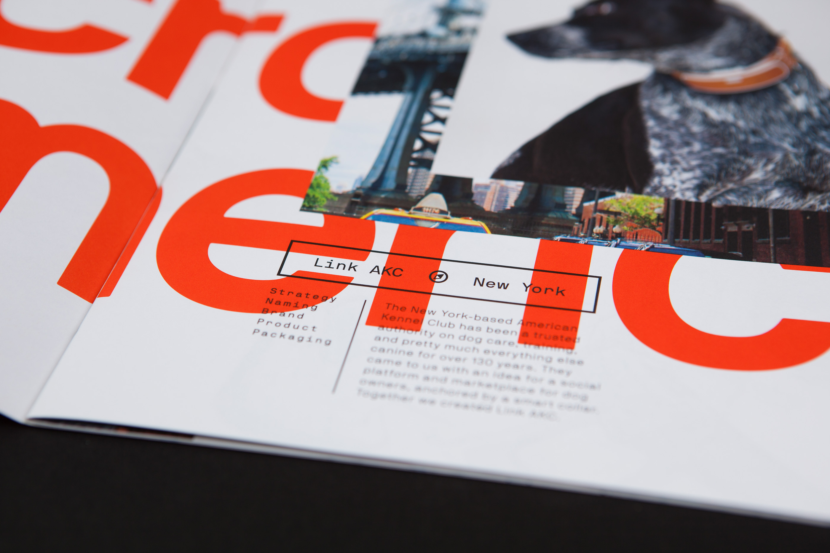
That 90s Look is Coming Back - Design Across America Brochure
That 90s Look is Coming Back - Design Across America Brochure abduzeedoApr 08, 2019 Melody Yung and Brett Lovelady shared a really awesome graphic design/editorial design project on Behance titled Design Across America. It’s a collection of product design created across America from the folks over at Astro. Melody and Brett say: “At the heart of all of Astro’s design is an American ethos. We recently put together a brochure to highlight projects with stakes all over the US, from Seattle to Detroit to NYC.” - personally I am not very familiar with the product, however, I would love to talk about the design of the brochure and how it could be part of our “That 90s Look is Coming Back” series. It seems to have all the ingredients, I will let you decide. At the heart of all of Astro’s design is an American ethos Our collaborations with NYC-based American Kennel Club resulted in a smart-dog collar, brand and packaging that’s equally dog and people friendly. With our Seattle-based friends at Prolitec, we created the product, identity, and packaging for Aera, a unique fragrance station for the home. Our work with Detroit’s prolific Shinola led to a suite of power cords, a wall clock based on their bestselling watch, and a turntable (their first foray into the audio space). 90's Look in Editorial Design
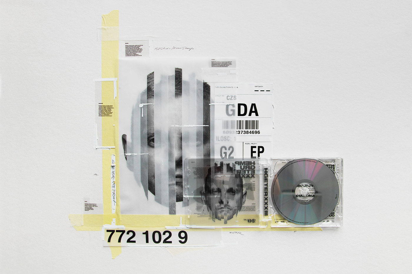
That 90s Look is Coming Back - Eter CD Album
That 90s Look is Coming Back - Eter CD Album abduzeedoFeb 08, 2019 It’s time for our eagerly anticipated entry in the series about that 90s graphic design look coming back. I am sorry if you are not a fan but the idea is just to try to spot a new trend and if that is really coming back or it is just a few 90s warriors keeping that flame alive. For this entry I would love to share the awesome work that 247 Studio did for a CD record cover design. The work was done for the album Eter by Hemp Gru. I am not familiar with the music but I spot some of the grunge look with collages and the classic tape holding a photo, super tight leading for text and black and white photography. I am a fan! ...collages with the classic tape holding a photo, super tight leading for text... Credits https://www.behance.net/imialkowski https://www.behance.net/krystianty2042 https://www.behance.net/oesu https://www.behance.net/bartosze5c3 https://www.behance.net/Fabjanski 90’s Graphic Design
That 90s Look is Coming Back - Eter CD Album
Get access to thousands of freshly updated design inspiration pieces by adding Muzli to your browser.
Loved by 800k designers worldwide, Muzli is the leading go-to browser extension for creative professionals.
The Power of a Well-Designed Profile Page: More than Just Aesthetics
In today's digital age, our online presence has taken on a level of importance that few could have predicted a couple of decades ago. A crucial component of this online persona is the profile page, which acts as a window into who we are and what we represent. This might be on social media, a professional networking site, a personal website, or even a forum. So, what makes a well-designed profile page so essential?
1. First Impressions Matter
The saying, "Don't judge a book by its cover," although wise, is often overlooked in the online realm. Most viewers will make snap judgments based on what they see. A well-designed profile page that's clean, organized, and aesthetically pleasing can create a strong and positive first impression.
2. A Reflection of Your Brand
For professionals and businesses, a profile page often serves as a brand touchpoint. It tells visitors what you're about, what you value, and the kind of work or service you offer. A cluttered or inconsistent profile can convey a lack of professionalism, while a sleek, consistent design can bolster brand trust.
3. Improved Usability
A well-designed profile doesn't just look good; it functions efficiently. Users should be able to quickly access the information they're seeking, whether it's your contact details, portfolio, or any other relevant information. Good design facilitates this ease of navigation.
4. Showcasing Personality
While conveying professionalism is essential, so is showcasing personality. A unique and well-thought-out profile page can give visitors a sense of who you are, not just what you do. It allows for personal expression and can make your profile memorable.
5. Building Trust
Especially in professional networking or e-commerce settings, trust is paramount. A well-designed profile page, complete with authentic photos, comprehensive details about skills or services, and genuine testimonials or recommendations, can build this trust.
6. Optimized for Engagement
Good design often considers the user's journey. By strategically placing call-to-action buttons or interactive elements on your profile page, you can guide visitors towards desired actions, be it connecting, following, buying, or simply learning more about you.
7. Adaptability Across Devices
In our increasingly mobile world, a well-designed profile is adaptable across devices. This means it looks and functions seamlessly, whether viewed on a desktop, tablet, or smartphone. This adaptability ensures you put your best foot forward, regardless of how someone accesses your profile.
In Conclusion
A profile page is often the starting point of online interactions, both personal and professional. Its design, thus, holds more power than one might initially realize. It's not just about aesthetic appeal; it's about communication, brand-building, trust, and engagement. Investing time and thought into crafting a standout profile page can yield dividends in the long run, enhancing connections and opportunities in our interconnected digital landscape.