Design Inspiration
Best web design examples
A curated collection of web design inspiration. This is a list featuring what we think are the best, most inspirational, well-crafted, elegant and stylish web pages in the wild.
We curate topical collections around design to inspire you in the design process.
This constantly-updated list featuring what we find on the always-fresh Muzli inventory.
Last update:
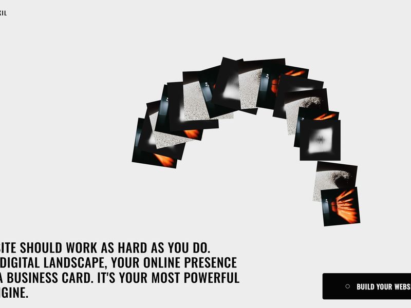
Jalal Eddine Maoukil | Software Engineer & Web Designer | Rabat, Morocco
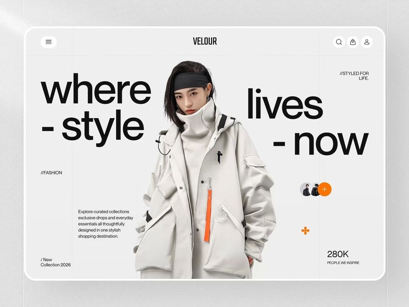
Velour - Fashion E-commerce Web Design

Vantara Web Design & Development | Clay
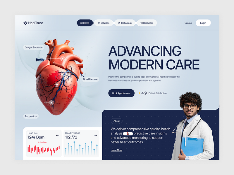
Healthcare Web Design
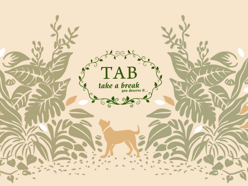
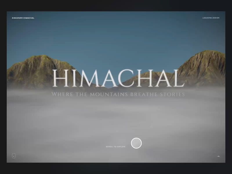
Take a Break - Web Experience | Liquidink Design
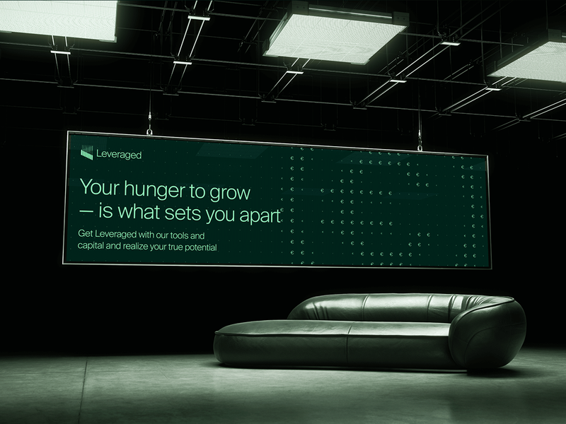
Leveraged: Branding & Web design
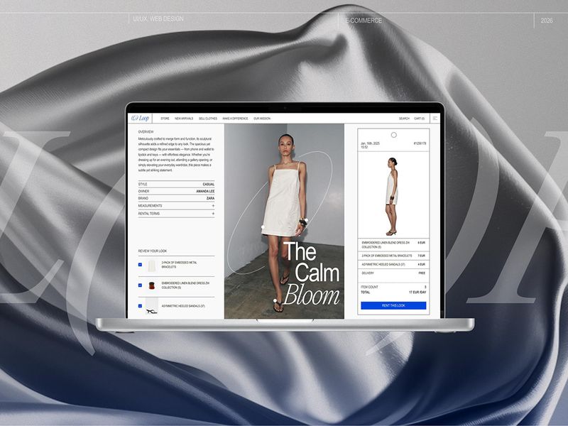
LOOP — Sustainable Fashion E-commerce, Branding & Web Design
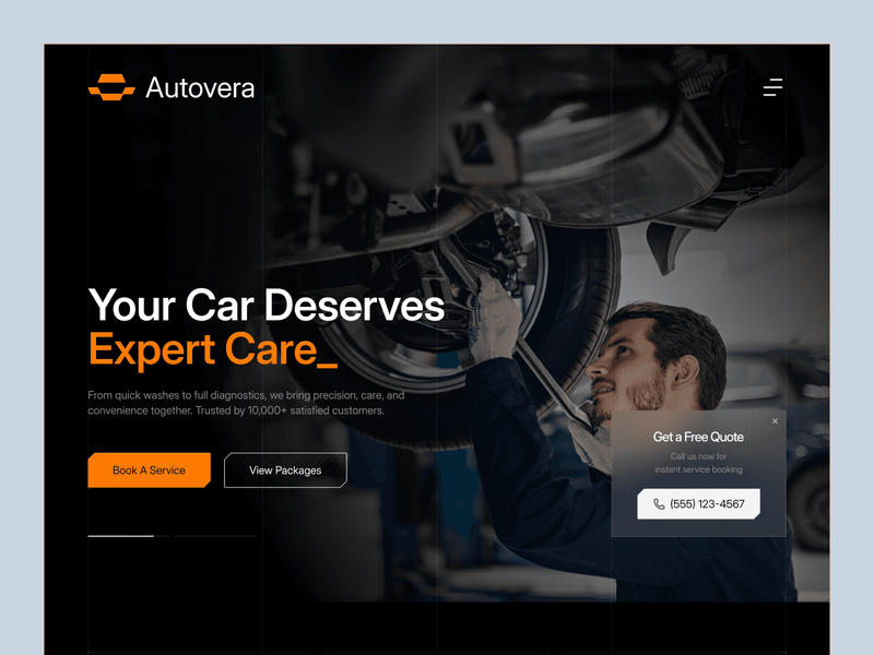
Autovera - Premium Automotive Web Experience
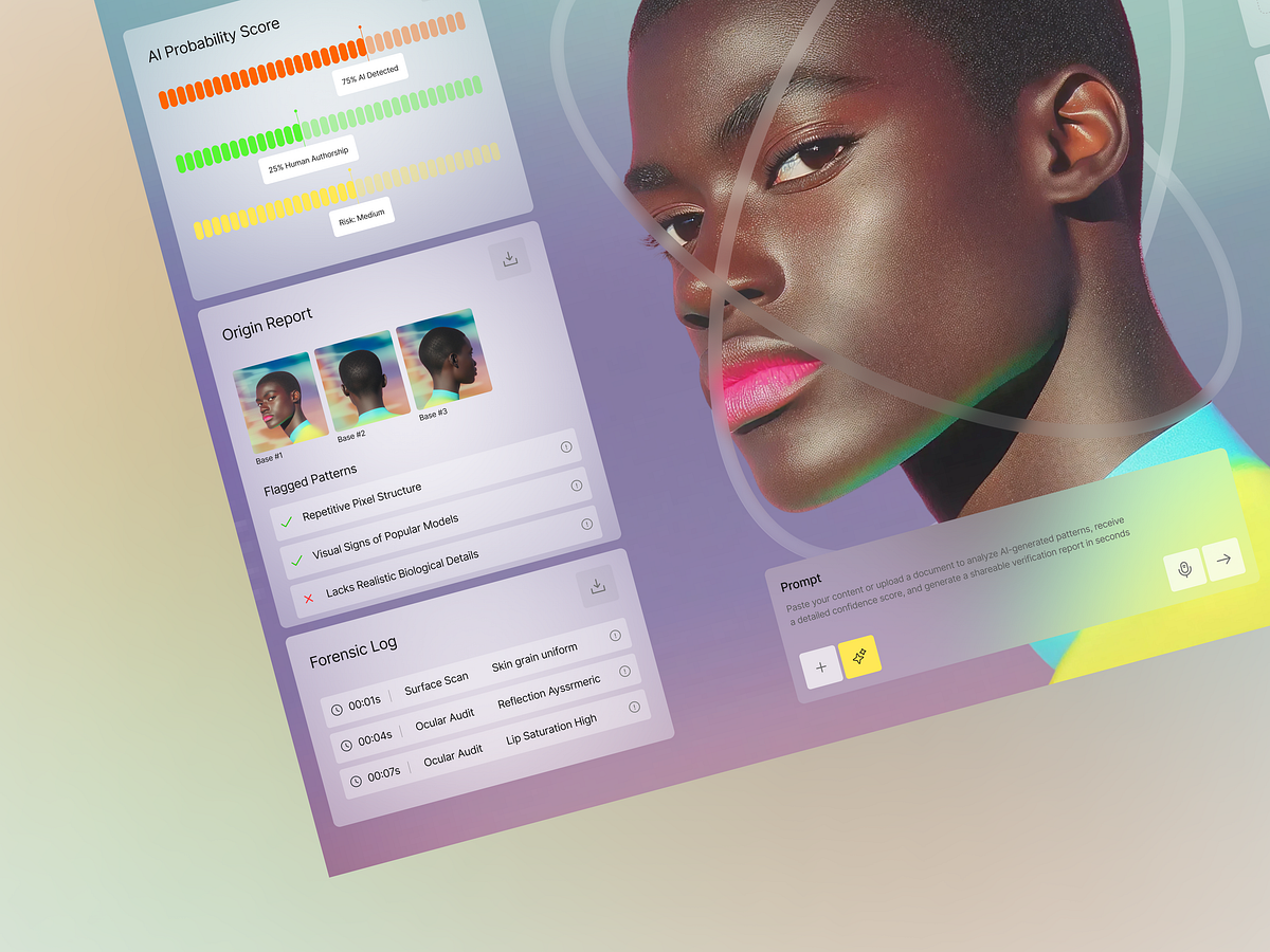
AI Detection Web App UI Design for Content Verification
SaaS Web Design
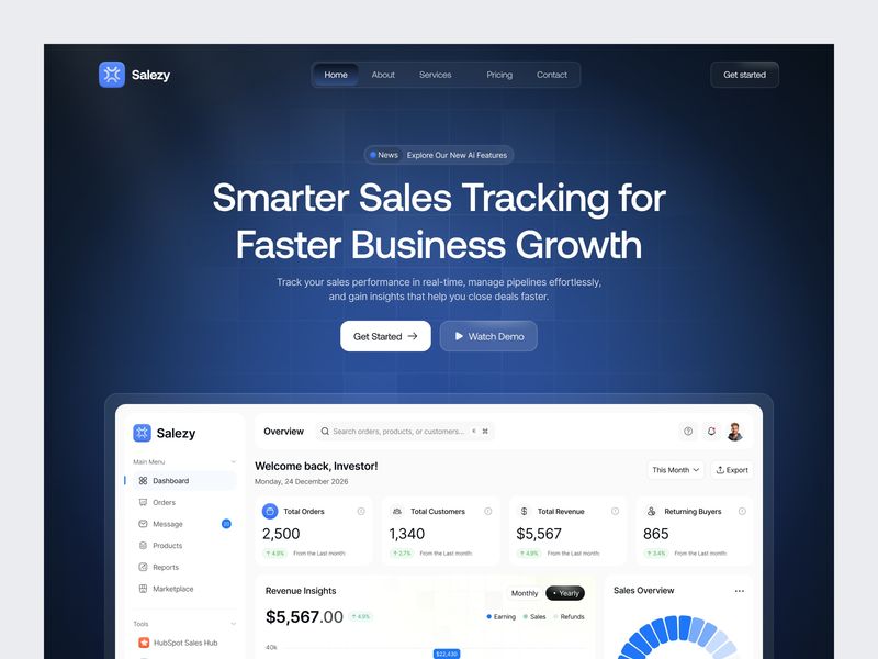
Web/Landing Page for Growth Insights & Analytics
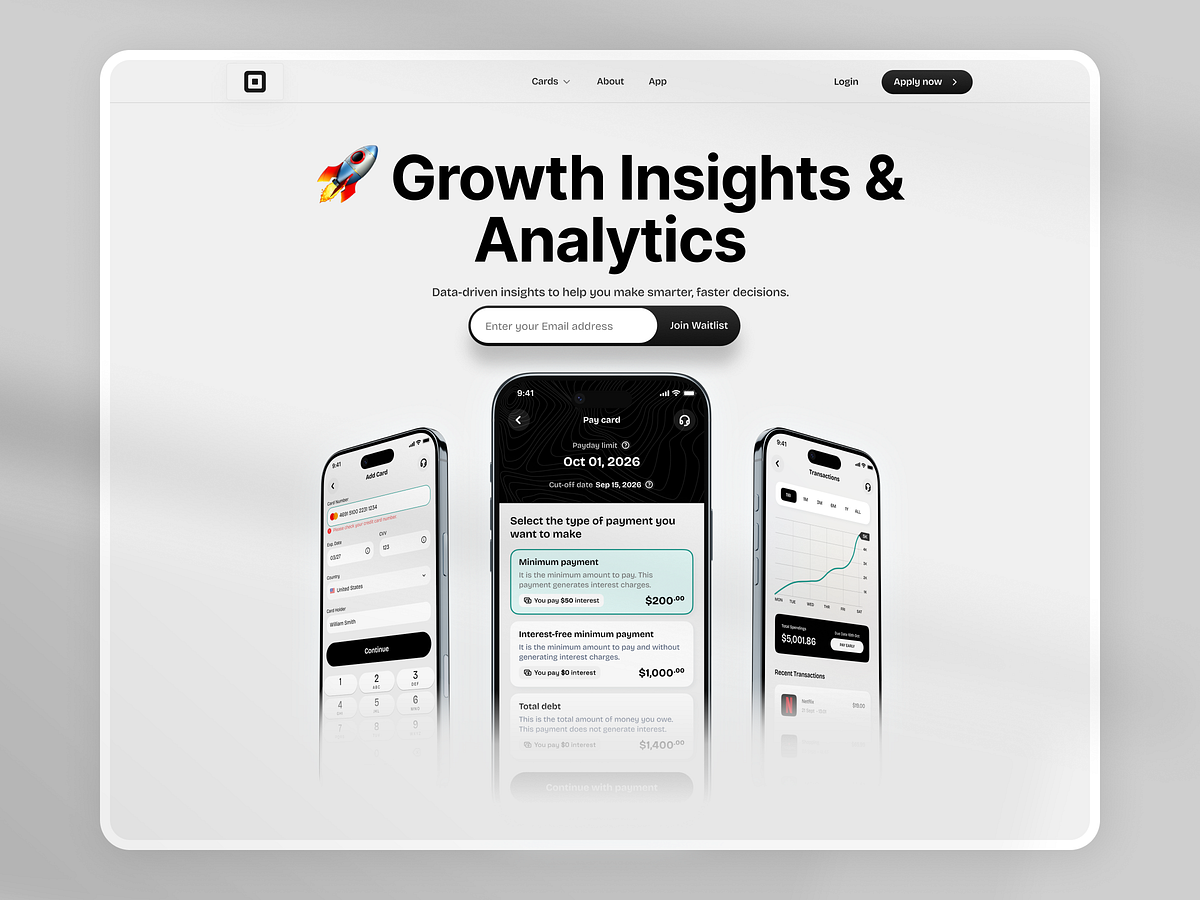
Fintech Landing Page Exploration / Web Design
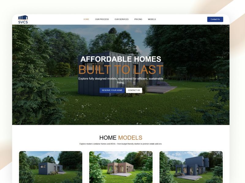
Industrial Minimalism: High-End Modular Housing UI Concept
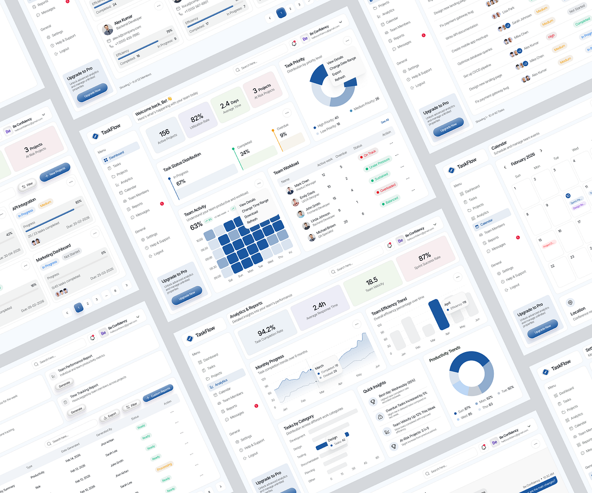
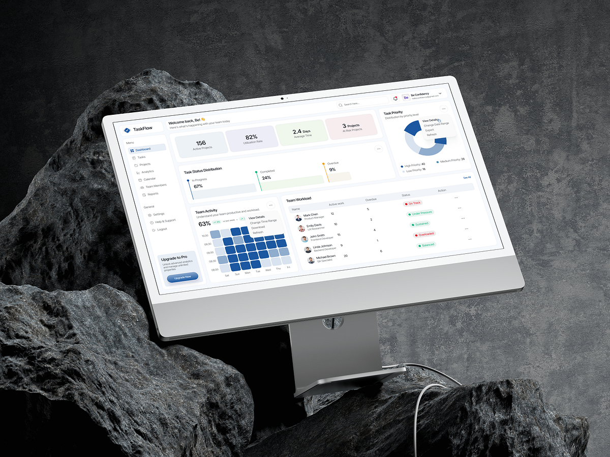
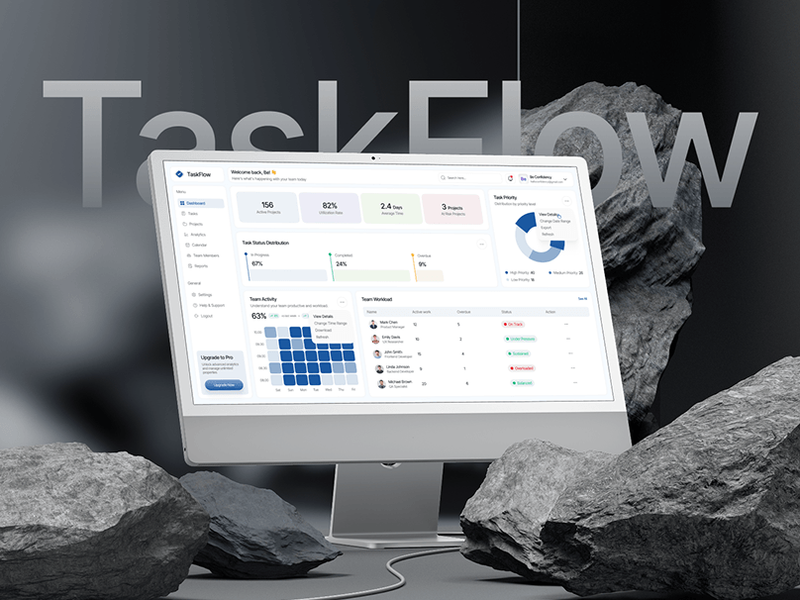
TaskFlow → Complete Task Management | SaaS | Web App
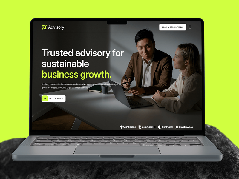
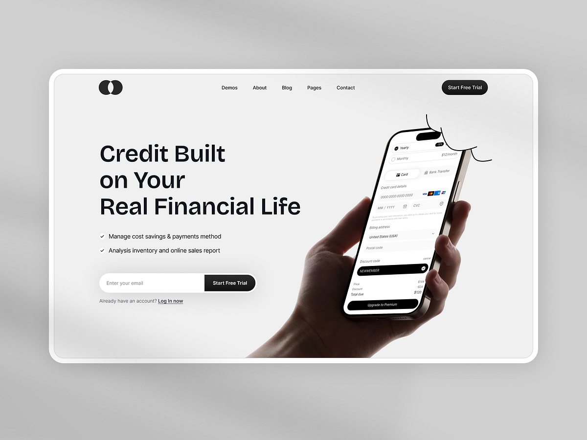
Advisory - Financial & Consulting Web Design
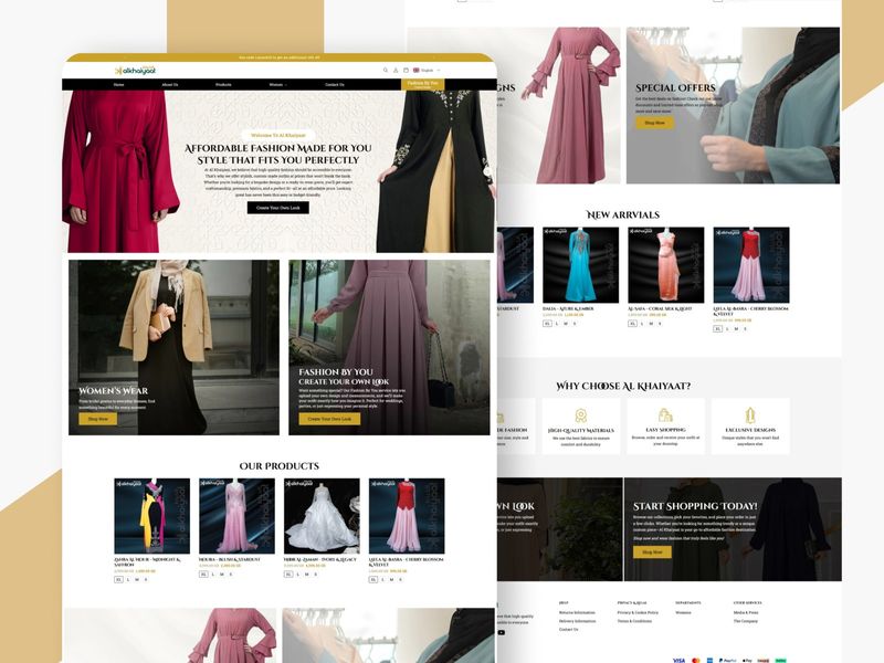
Al Khaiyaat | Luxury Fashion UI
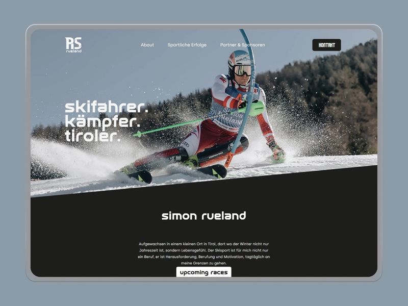
Simon Rueland | Pro Athlete Portfolio
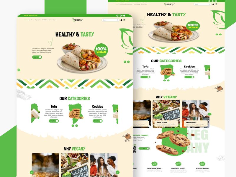
Organic Motion: A Vibrant Approach to Vegan eCommerce
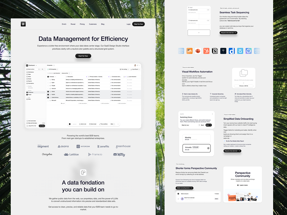
Data Management Web/Landing Page Design
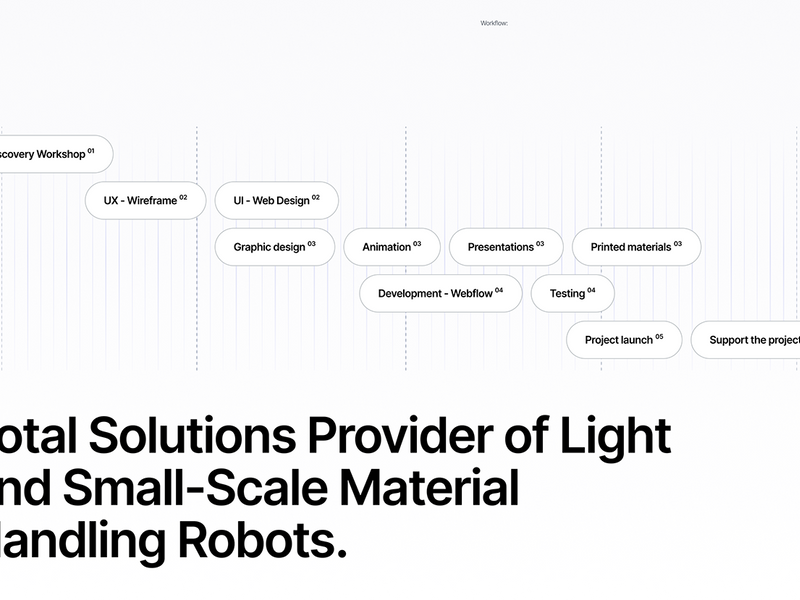
Webflow Web Design & Development - Robots Manufacturer
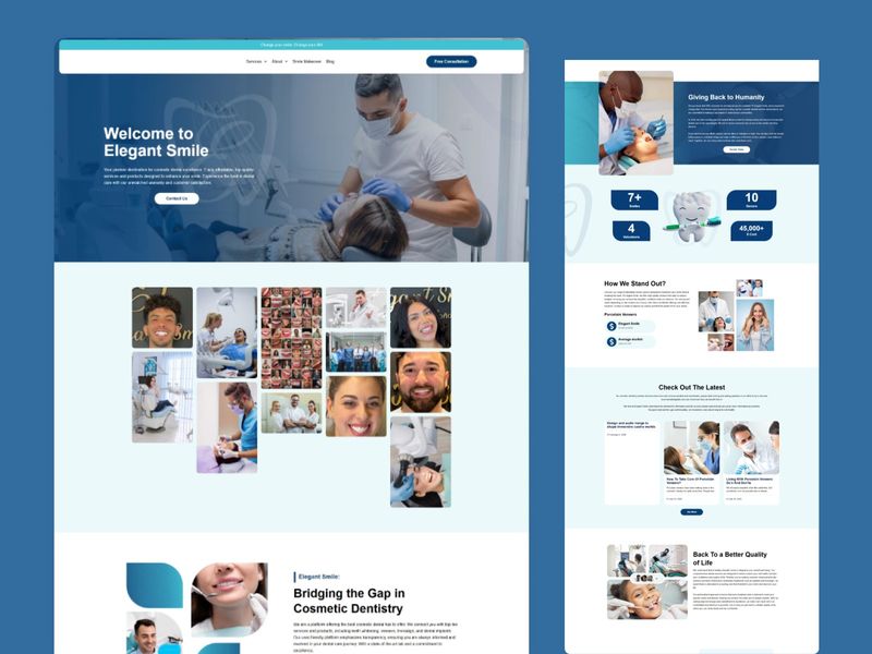
Elegant Smile — Dental Excellence UI
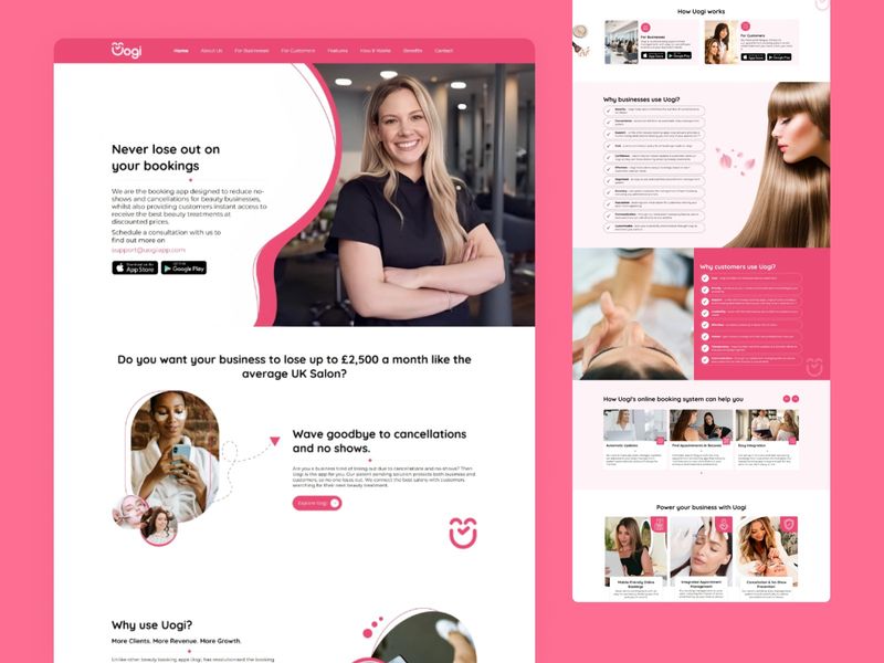
SaaS Authority: Professional Booking UI for the Beauty Industry
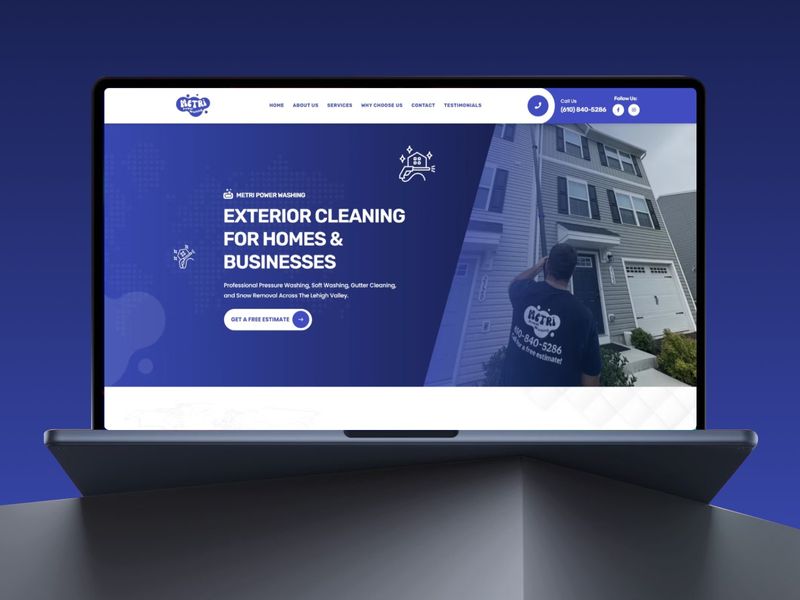
Metri — Professional Power Washing UI
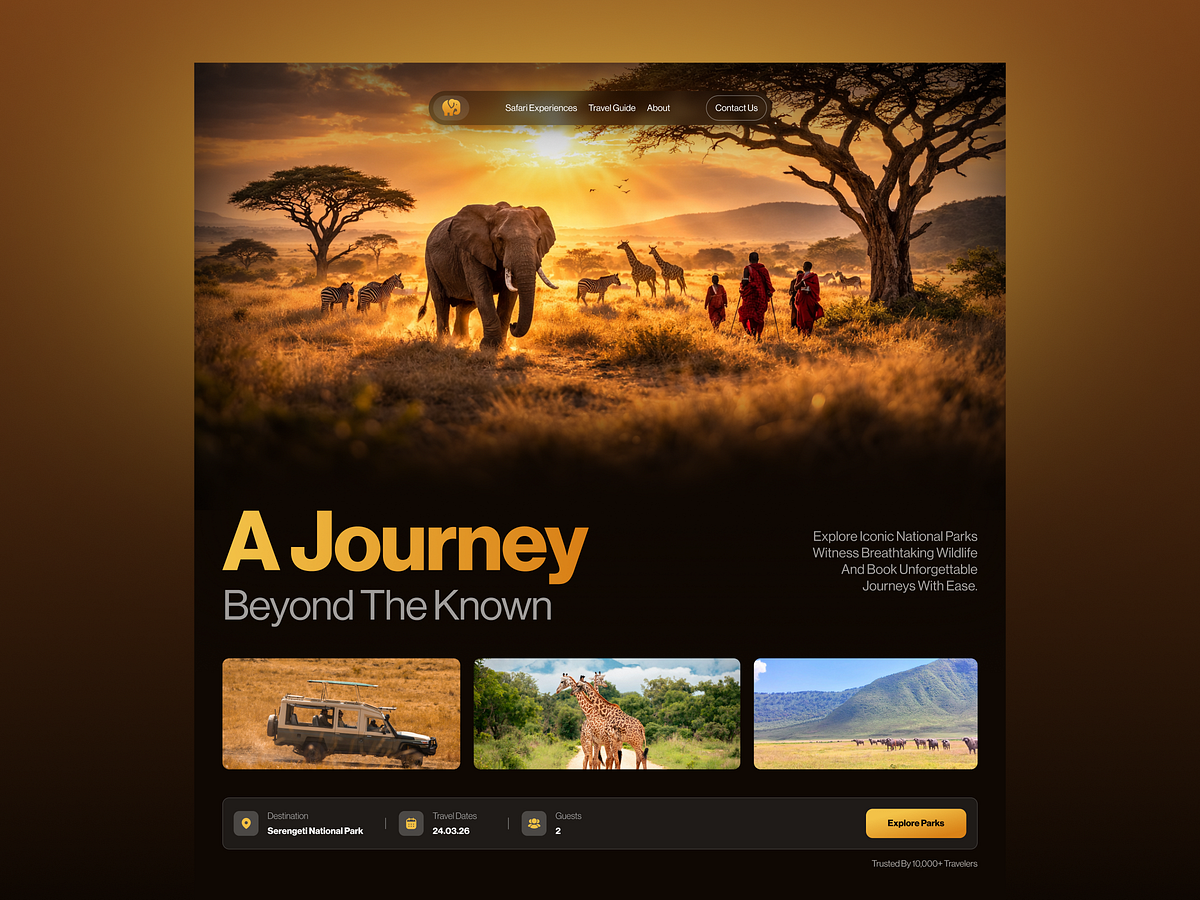
Premium Safari & Park Discovery Web Design
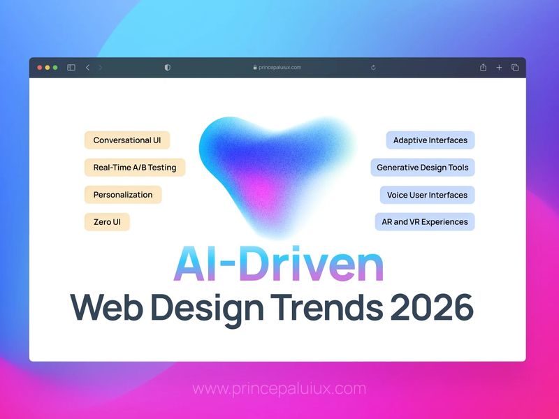
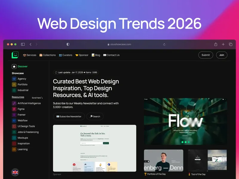
AI-Driven Web Design Trends in 2026
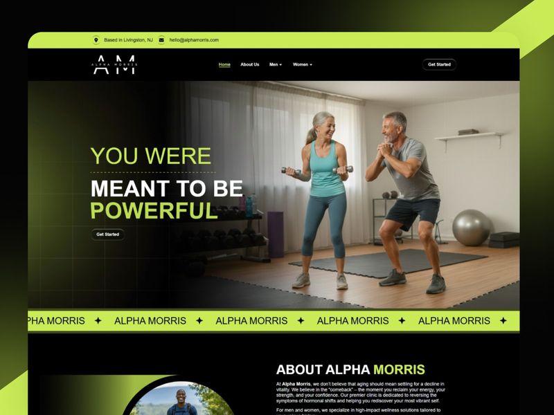
Alpha Morris | Performance Wellness UI
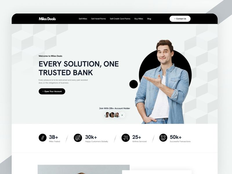
Miles Deals — Fintech & Credit Points Website Design
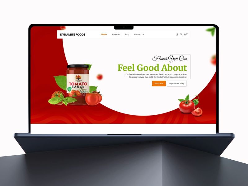
Dynamite — Bold Sauce eCommerce
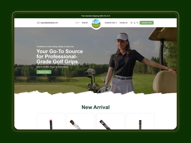
Precision & Performance: High-Authority Golf Retail Store
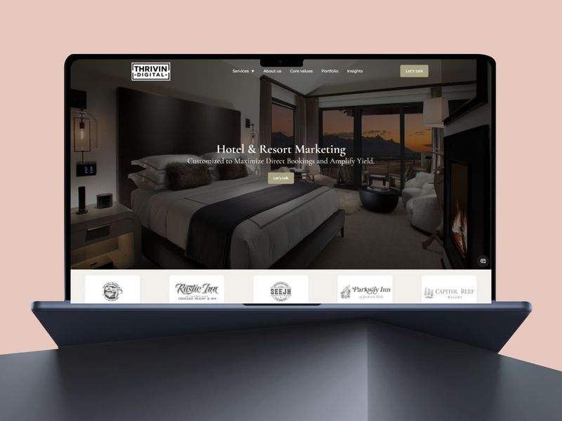
Thrivin Digital — Hotel & Resort Marketing Website Design
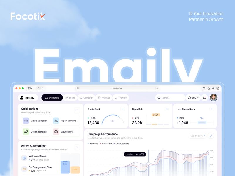
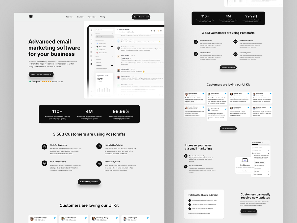
Email Marketing Automation SaaS | Web App UI UX
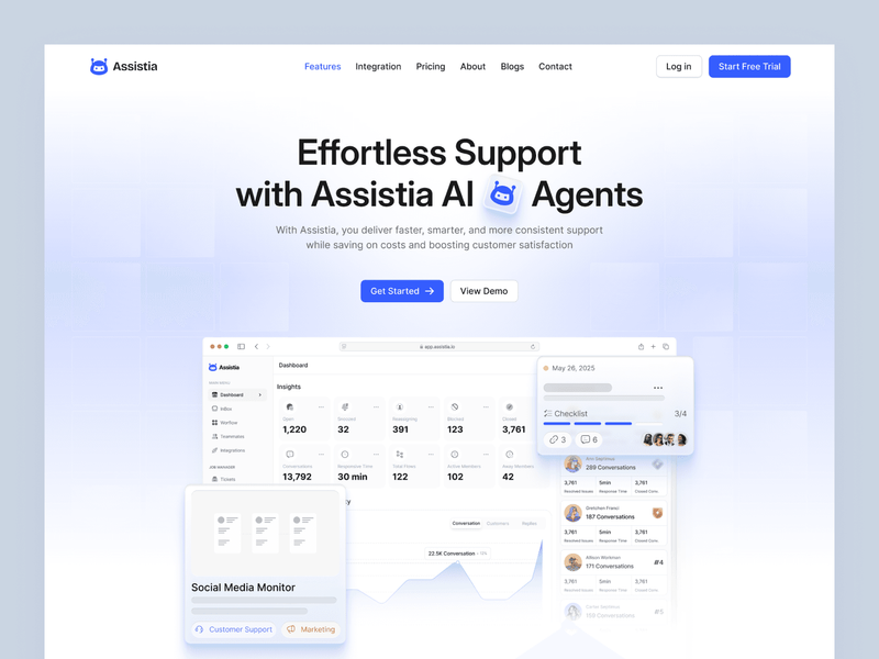
Assistia — AI Startup & SaaS Web Interface Design

LOOP — Fashion E-commerce, Branding & Web Design
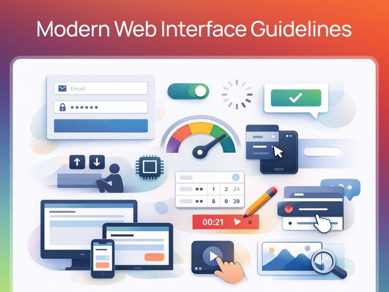
Web Interface Guidelines

FinStream — Fintech Web/Landing Page UI/UX
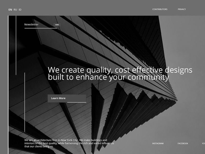
Arch | Minimalist Web Design for Contemporary
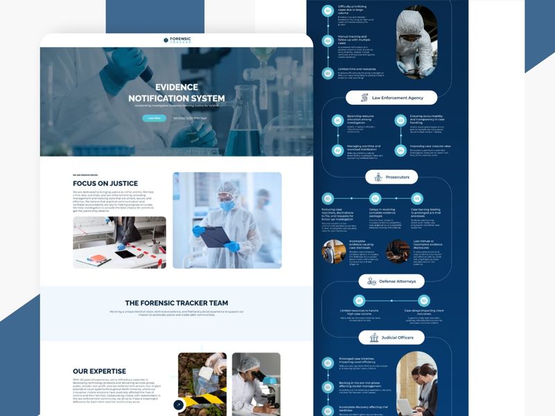
Forensic Tracker — SaaS Evidence Website Design
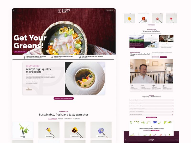
Chef's Farm — Microgreens & Fresh Garnish Website Design
21 Web Design Trends 2026: Design for Humans in an AI-First Web
Portafolio Web
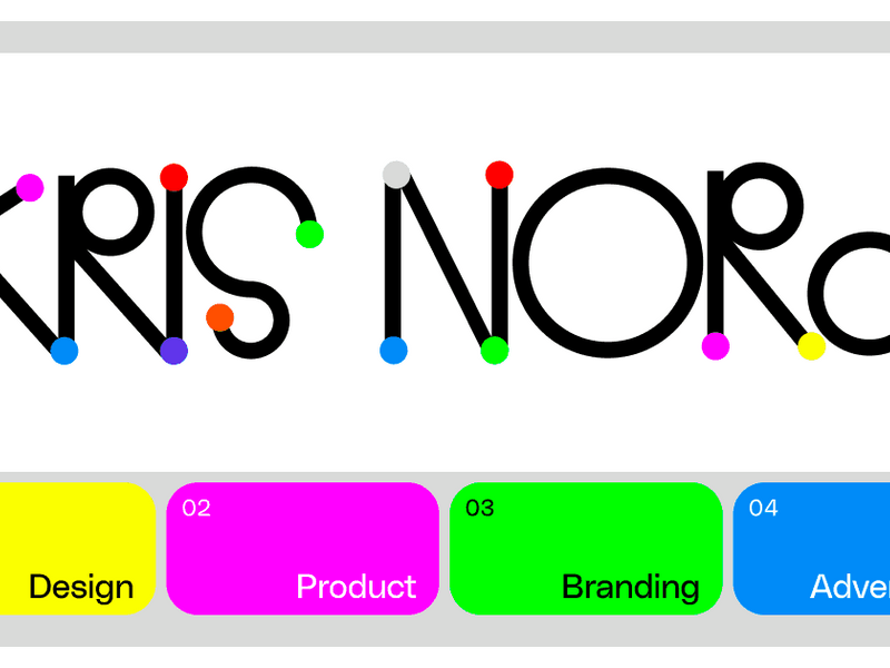
Fun Web Design | Brand & Product Design For Startups | By Kris Nord
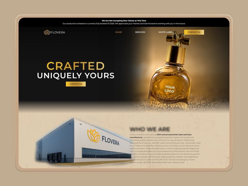
Flovera | Luxury Fragrance & Manufacturing Website Design
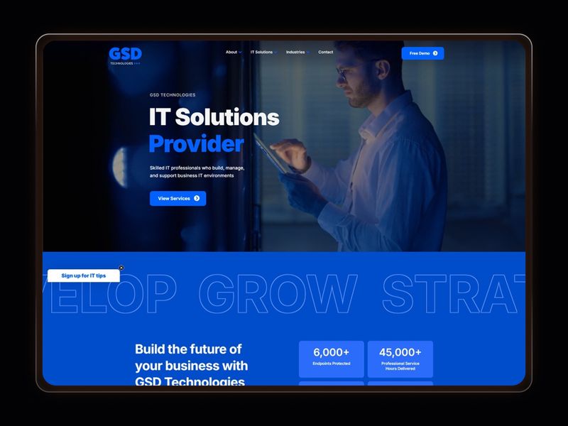
GSD Technologies — IT & Managed Services Website Design
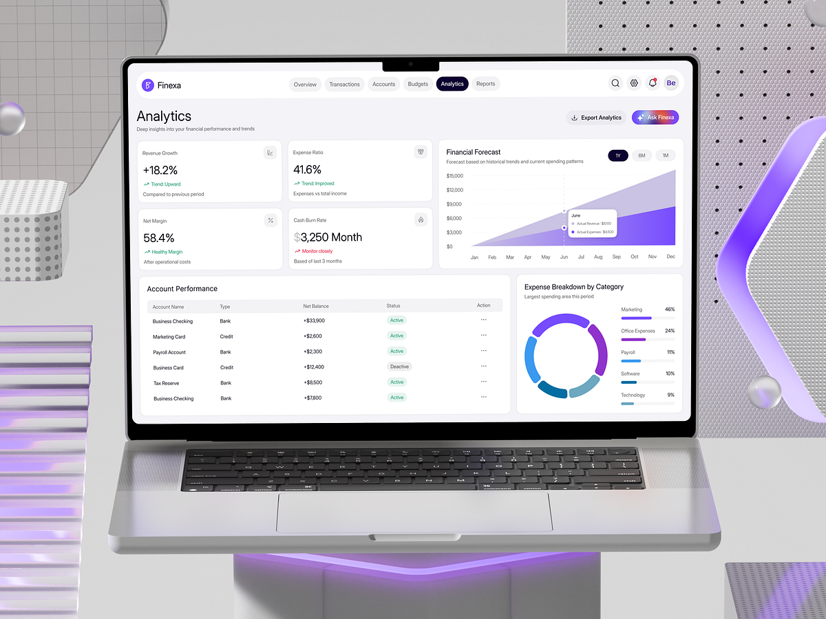
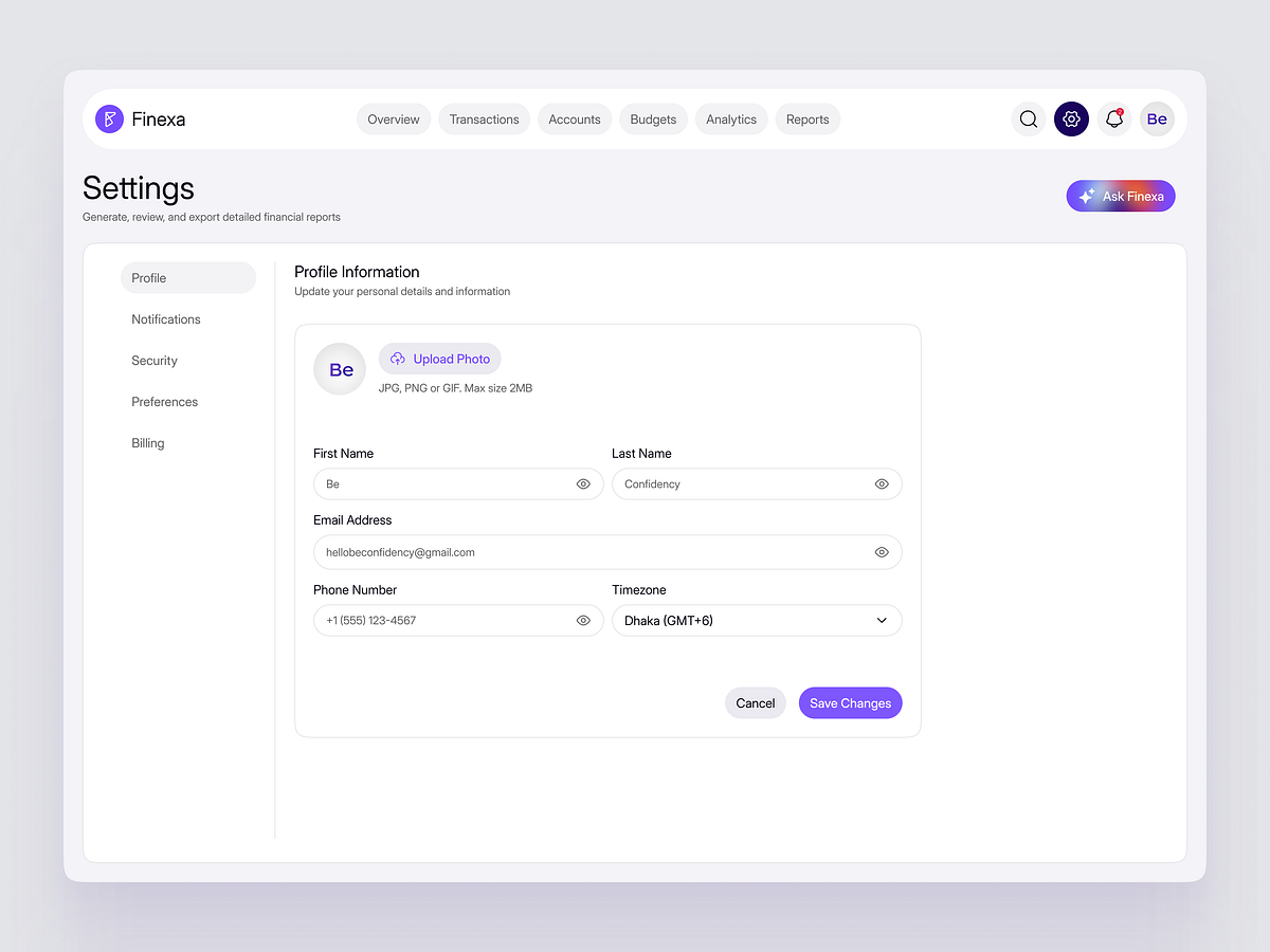
Finexa – Analytics Dashboard | SaaS | Web App
Web/Landing Page - UI/UX Design
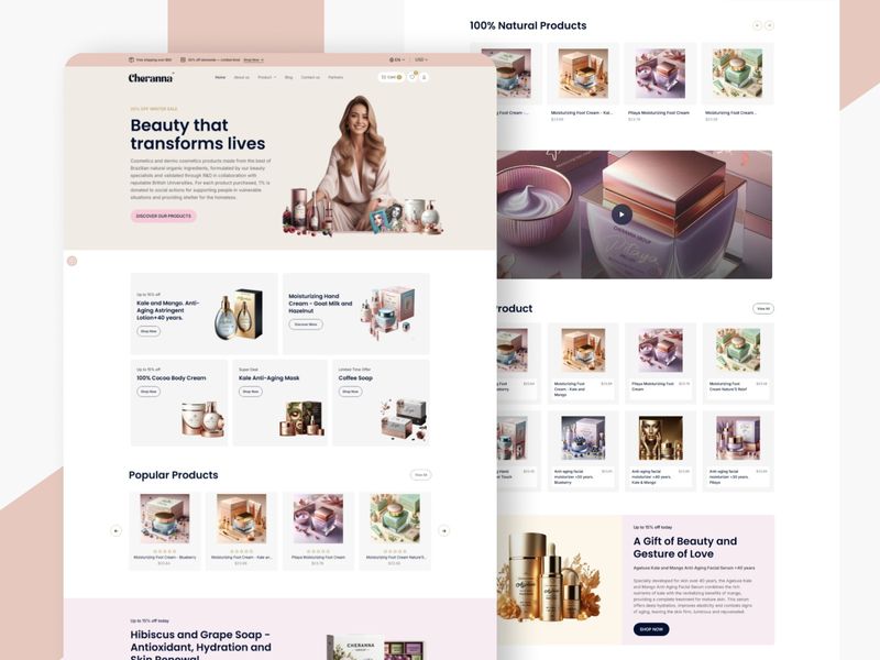
Cheranna — Premium Natural Skincare Website Design
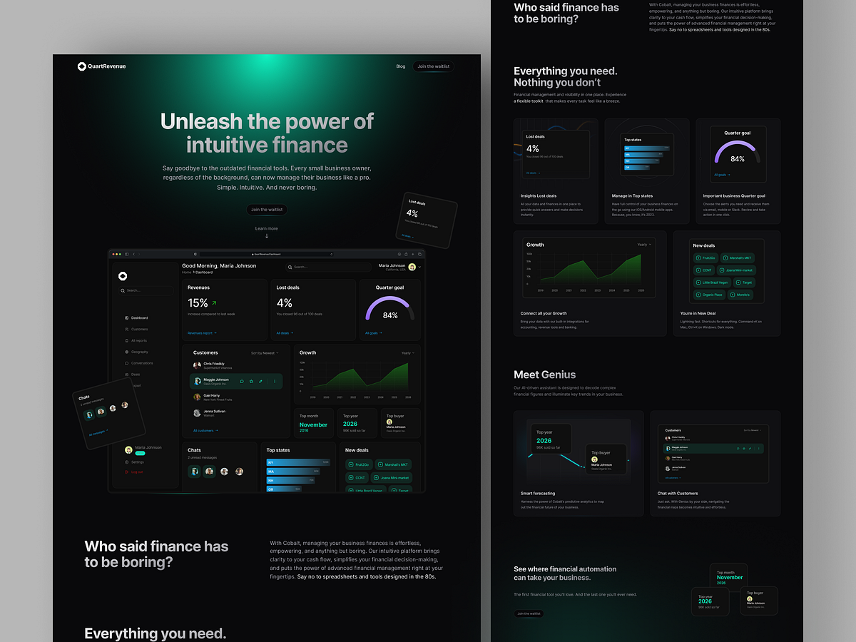
QuartRevenue - Web Design & SaaS
TaskFlow – Task Management Dashboard | SaaS | Web App
Admin Dashboard Web App UI Design
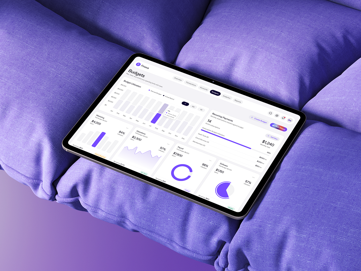
Finexa – Budgets Dashboard | SaaS | Web App
Task Management Dashboard| SaaS | Web App
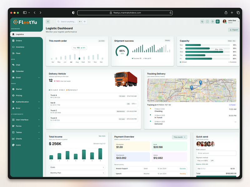
Logistics Admin Dashboard Web App UI Design
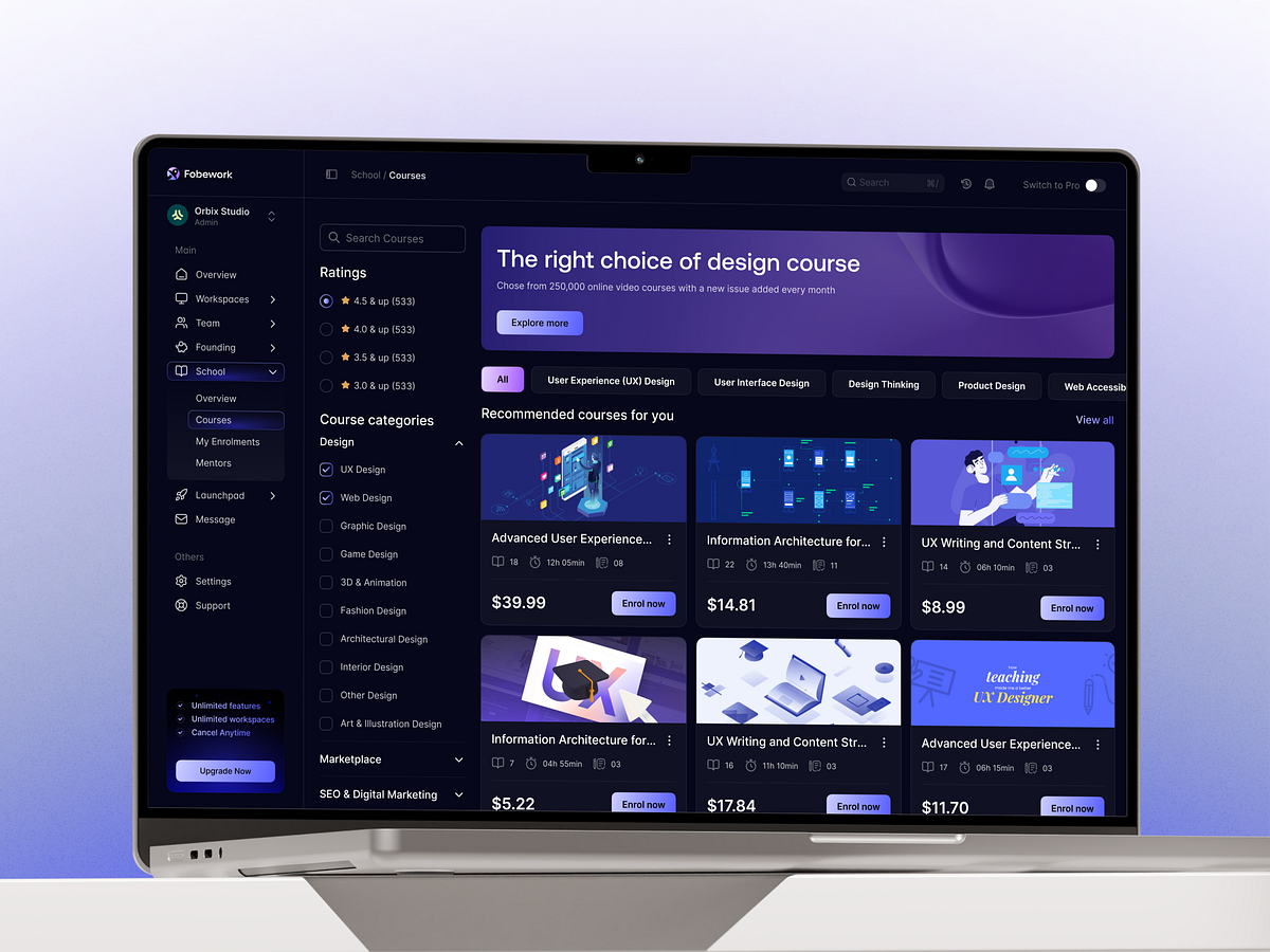
Design Course Marketplace Dashboard | SaaS Web UI Design
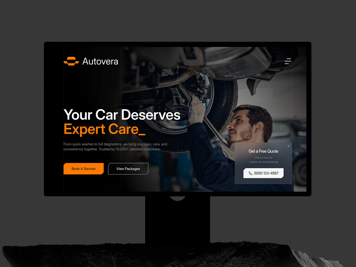
Autovera - Premium Automotive Web Experience

Cloud Web — Smart Expense Tracking Experience 💸📊
Finexa – Security Settings | Dashboard | SaaS | Web App
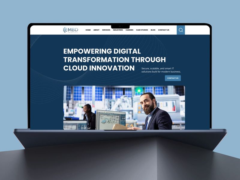
MBD Techworks | Cloud & IT Solutions Website Design
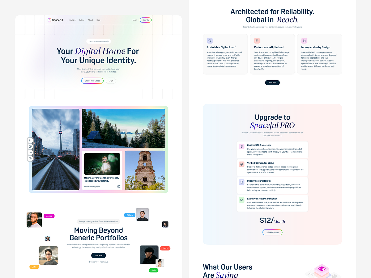
Personal Web Space Platform – Modern, Clean & Landing Page UIUX
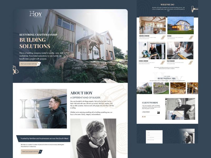
HOY Building Solutions | High-End Restoration Portfolio
HOY Building Solutions | High-End Restoration Portfolio
Get access to thousands of freshly updated design inspiration pieces by adding Muzli to your browser.
Loved by 800k designers worldwide, Muzli is the leading go-to browser extension for creative professionals.
Tips & tricks for a good Web Page Design
In today's digital age, a well-designed web page is a crucial element for businesses, organizations, and individuals looking to make a strong online presence. A thoughtfully crafted web page not only enhances user experience but also plays a pivotal role in conveying information, building credibility, and driving conversions. Here are some essential considerations to keep in mind when designing a web page:
User-Centric Design: The user should be at the heart of your design process. Understanding your target audience and their needs is essential. Create a layout that is intuitive, easy to navigate, and visually pleasing. Prioritize the placement of important information, such as contact details, calls-to-action, and key messages.
Mobile Responsiveness: With the majority of internet users accessing websites through mobile devices, it's crucial to ensure your web page is responsive. A mobile-friendly design adapts seamlessly to various screen sizes, providing a consistent and enjoyable experience across devices.
Clear Visual Hierarchy: Establish a clear hierarchy of elements on your web page. Use typography, color, and spacing to guide users' attention to the most important content. A well-defined hierarchy improves readability and user engagement.
Loading Speed: In a fast-paced online environment, users have little patience for slow-loading pages. Optimize images, minimize unnecessary scripts, and choose a reliable hosting service to ensure your web page loads quickly. Faster loading times enhance user satisfaction and SEO rankings.
Consistent Branding: Your web page should reflect your brand's identity consistently. Use your brand's color palette, logo, and typography to create a cohesive and recognizable look. Consistent branding fosters trust and recognition among your audience.
Engaging Content: Compelling content keeps users engaged and encourages them to explore your web page further. Use concise and impactful copy, complemented by relevant images, videos, or infographics. High-quality content builds credibility and encourages visitors to stay longer.
Intuitive Navigation: Easy navigation is essential for helping users find the information they need quickly. Implement a logical menu structure and include a search bar if applicable. Users should be able to access different sections of your website without confusion.
Effective Calls-to-Action (CTAs): Clear and persuasive CTAs guide users toward desired actions, such as signing up, making a purchase, or contacting you. Use contrasting colors and action-oriented language to make CTAs stand out.
Accessibility: Ensure your web page is accessible to all users, including those with disabilities. Use alt text for images, maintain proper color contrast, and follow web accessibility guidelines to provide an inclusive experience for everyone.
Testing and Iteration: Designing a web page is an ongoing process. Regularly test your design across different devices and browsers to identify and address any issues. Gather feedback from users to make informed improvements and refine your design over time.