World Cup Art
A curated collection of World Cup art to inspire you. This professionally-curated, constantly-updated list featuring what we think are the best, most inspirational, well-crafted, elegant and stylish designs.
We curate topical collections around design to inspire you in the design process.
This constantly-updated list featuring what we find on the always-fresh Muzli inventory.
Last update:

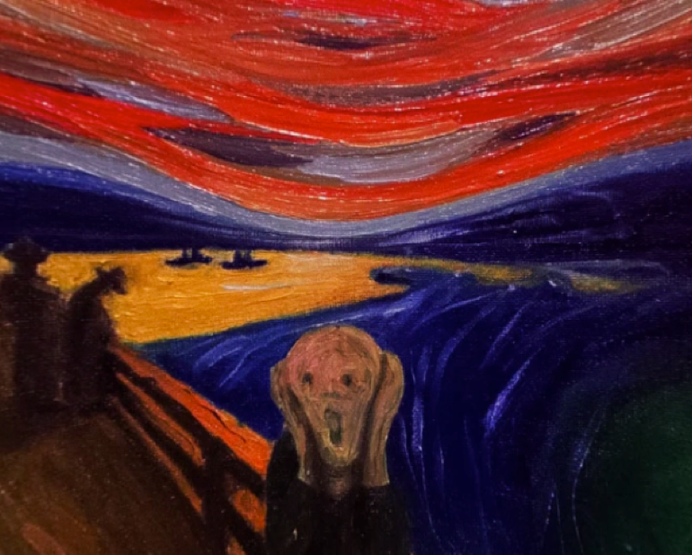
Fear And Loathing In Oslo
U.S Air Force - Into The Storm
Transformers: The Last Knight | Trailer & Movie Site | June 21, 2017
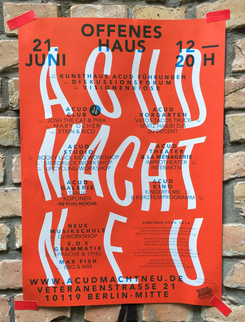
graphicporn
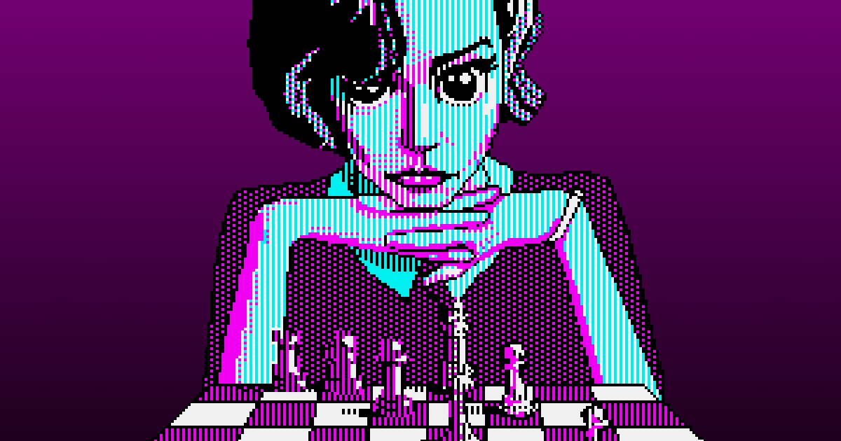
The Kilobyte’s Gambit

BBC-Earth , Life Story Ep05 - Courtship - Puffer Fish (From Netflix)

Masks Work. Really. We’ll Show You How

Women‘s Foundation 25th Anniversary Campaign
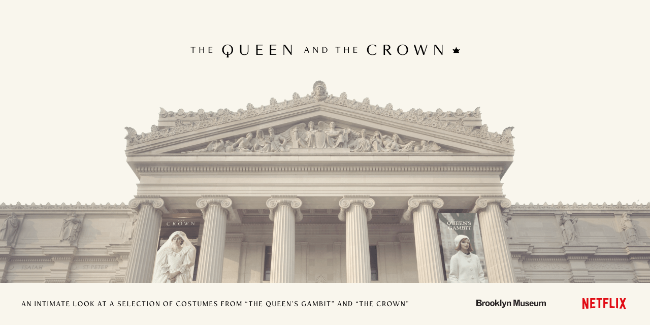
The Queen and The Crown
![[Invalid Project]](https://a5.behance.net/06ee2e76e6992375409393e3fb42106fec723907/img/search/homepage-seo-image.webp)
[Invalid Project]

New Split-View Trash Sculptures by Bordalo II Combine Wood and Colorful Plastics Into Gigantic Animals
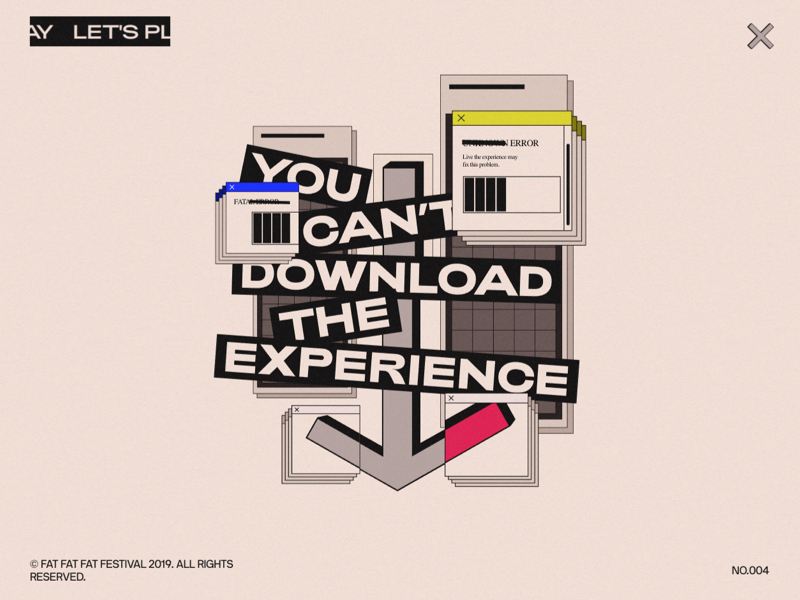
FAT FAT FAT Festival

Discover Ray-Ban® Stories Features

Artworks for GWENT © Card Game
A new artwork for the upcoming card game GWENT by our good old friends CD Projekt RED. We've been happy to work with amazing artists. For more details please follow the links: https://www.playgwent.com/en https://www.facebook.com/PlayGwent/ https://www.youtube.com/c/playgwent/videos © 2016 CD PROJEKT S.A. ALL RIGHTS RESERVED
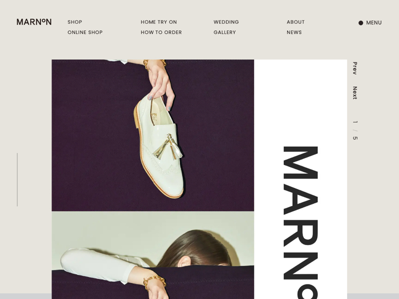
MARNON
VIITA Watches

Pitchfork Music Festival

Bats and the origin of outbreaks

TAO TAJIMA | Filmmaker
Superlist

Discarded Objects are Beautified with Colorful Coral-Like Growths by Stephanie Kilgast

Otherworldly Paintings Trap Skeletons in Perpetually Bizarre and Eerie Situations
In his ongoing Fragments series, San Antonio-based artist Jason Limon (previously) uses muted jewel and earth tones to paint uncanny scenarios for his recurring skeleton figure. The bony subject finds itself in a variety of bizarre situations, whether bursting from a tube of paint, orchestrating a puppet show with a pair of ornate paper hands, or nervously awaiting an encroaching fire. Often set against backdrops filled with multi-colored dabs of paint, his small pieces are imbued with a sense of creative problem-solving as he traps figures in scenes with boxes of pencils, scuffed erasers, and other craft supplies. More
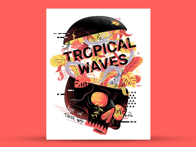
Spidey Vs Venom, Tropical Waves, Russia 2077 and more… Weekly inspiration roundup!
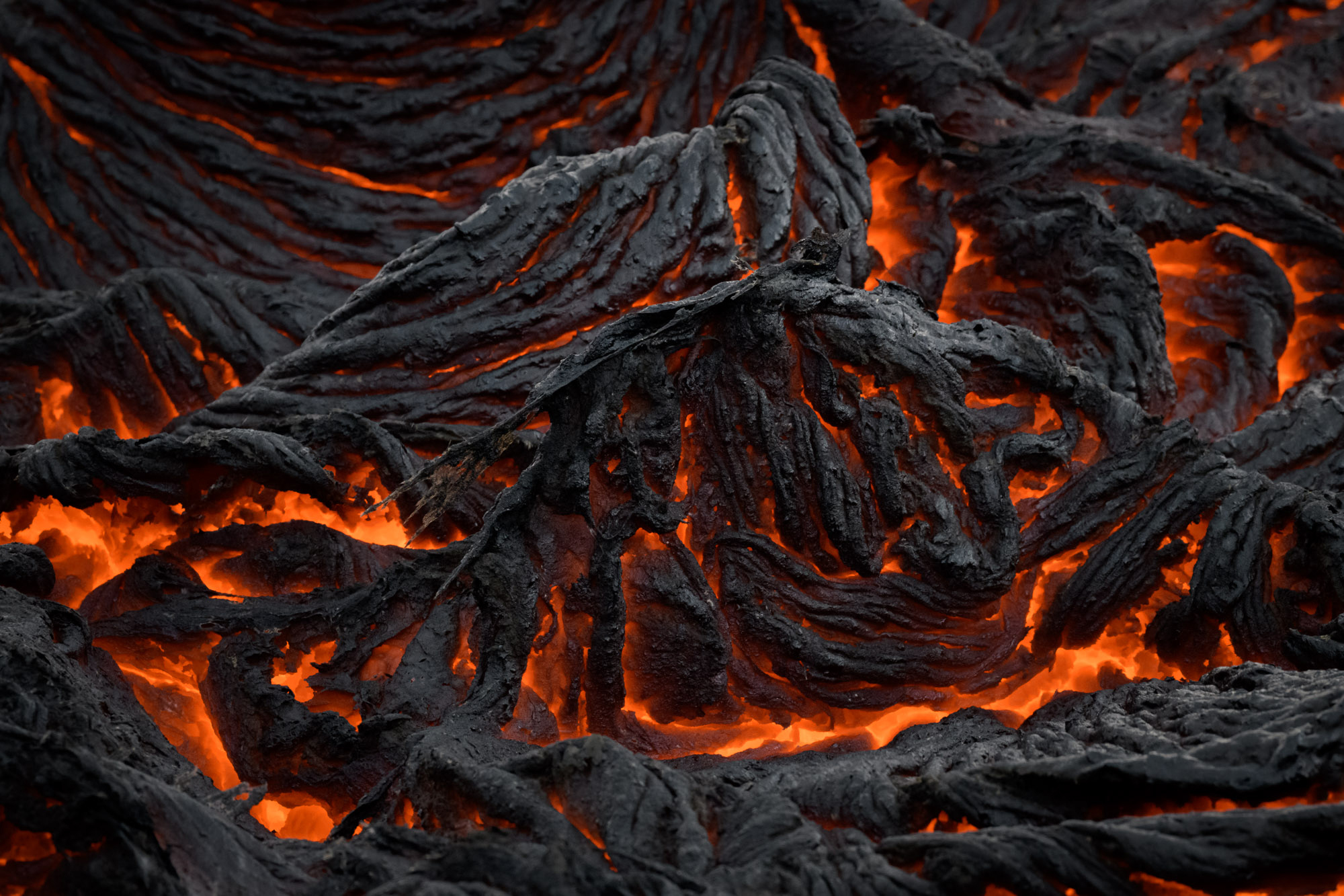
Icelandic Volcano

Weekly Design Inspiration #213
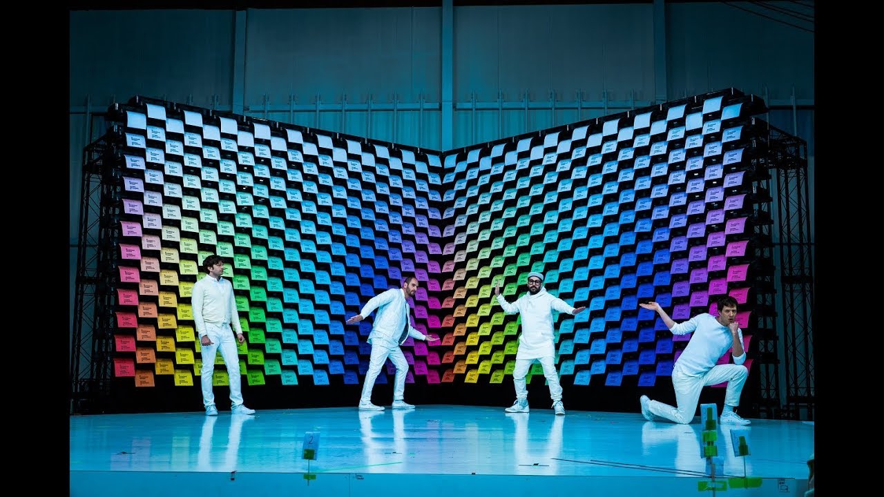
OK Go - Obsession
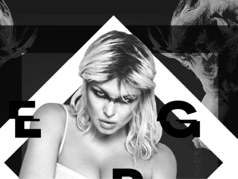
Fergie
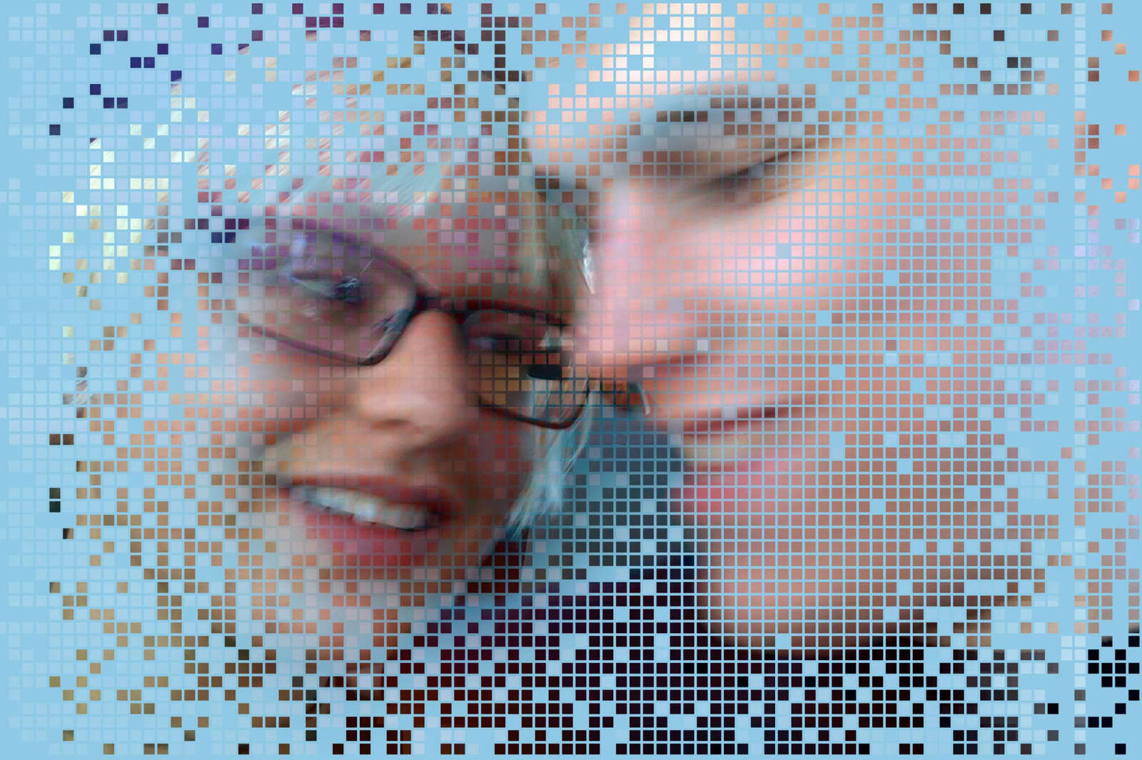
The Jessica Simulation: Love and loss in the age of A.I.
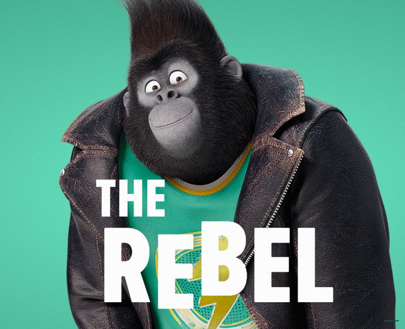
Sing | Trailer & Movie Site
Jigsaw
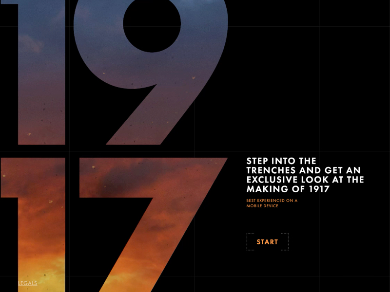
1917 | 360 Trench Experience | In Theaters Now
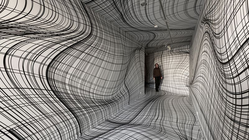
Vertigo-Inducing Room Illusions by Peter Kogler
Metaсonf

Margot Lévêque Studio
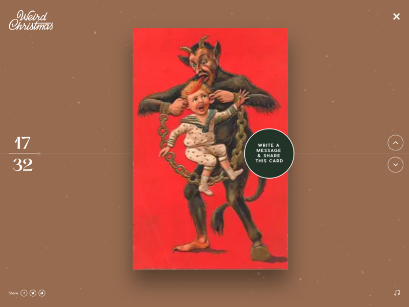
Weird Christmas ~ Create your card!

The New York Times – #ThisIs18
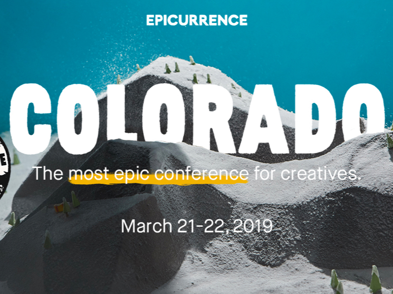
Epicurrence – Breckenridge, Colorado
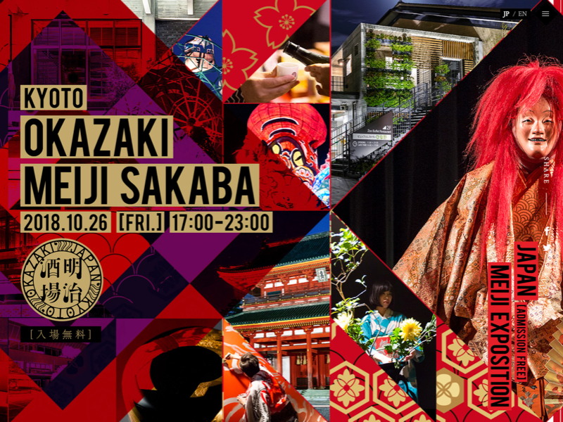
KYOTO-OKAZAKI MEIJI SAKABA

Lost & Found: An Endearing Animated Film About the Selflessness of True Love
Lost & Found is an endearing stop motion film that chronicles a dramatic turning point in the sweet relationship between two crocheted animal toys. A foxy fox and smitten dinosaur have enjoyed many loving memories over the years, but when the fox topples into a fountain, the dinosaur must give his all to save her. The short film, directed by Andrew Goldsmith and Bradley Slabe and produced by Lucy J. Hayes, convincingly imagines the inner lives of its stuffed animal protagonists and uses the fragile nature of crochet as the crux of the storyline. More
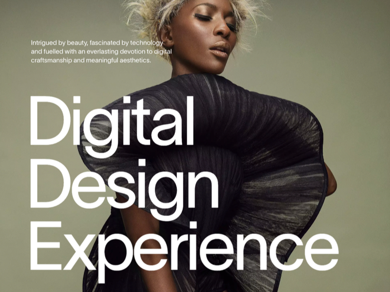
Exo Ape - Digital Design Studio

A Forgotten Pinhole Camera Made from a Beer Can Captures the Longest Exposure Photograph Ever
Eight years one month. That’s how long a beer can pinhole camera spent capturing this solargraph at the University of Hertfordshire’s Bayfordbury Observatory. Featuring 2,953 light trails of the sun’s movement, the image is thought to be the longest exposure photograph in existence, surpassing Michael Wesely’s record of four years eight months. Then an MFA student at the university, Regina Valkenborgh set up the camera in 2012 and subsequently forgot about it. More

Meticulously Painted Portraits by Miho Hirano Fuse Introspective Women with Plants and Animals
Solitary female figures command the canvas in oil paintings by artist Miho Hirano. The Japanese artist creates detailed portraits of her human protagonists, who avoid direct eye contact with the viewer, staring off into the distance as fish and butterflies swarm and flower blossoms and vines seem to grow from the figures’ hair. In a statement on Gallery Sumire’s website, the artist describes the mission of her work as “to express the changing situation of life’s ugliness and maturity.” Hirano draws inspiration from her upbringing, noting that her mother cared for plants and animals, and those motifs have continued in her work even though she does not currently reside in a nature-filled place. More
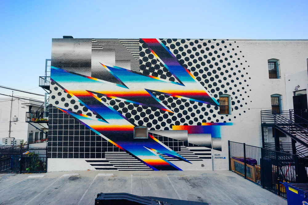
Expansive Black and White Patterns Mixed With Chrome Color Spectrums in Murals by Felipe Pantone

Flatland II: A New Series of Dramatically Skewed Photographic Landscapes by Aydin Büyüktas

Rael San Fratello’s Pink Teeter-Totters at the U.S.-Mexico Border Win Beazley Design of the Year
The three neon pink seesaws that slotted through the U.S.-Mexico border were just named the 2020 Beazley Design of the Year. Conceived by Oakland-based artists Ronald Rael and Virginia San Fratello (previously), the playful, subversive project was installed in July 2019 between El Paso, Texas, and Ciudad Juárez and physically connected the two communities despite the 20-foot barrier. The prestigious, annual award comes from London’s Design Museum. More

Judge a book by its cover?

Fashion Illustration series
kasiq street fashion illustration series
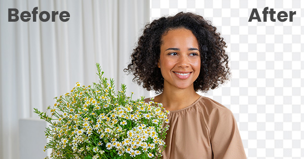
Remove.bg

Nuanced Portraits of Women Merged With Abstract Environments by Sofia Bonati
Self-taught artist Sofia Bonati captures nuanced expressions and personalities of a variety of female characters while also integrating them into abstracted environments and patterns. Her illustrations most often feature solo subjects melded with thunderclouds, dizzying mazes, and floral patterns. Bonita renders the women’s features in graphite and she uses gesso, paint, and markers to add colorful accents and build their surroundings. The strong, distinctive expressions on each woman’s face suggests that the characters are in control of their environments, rather than being subsumed by them. More

Expressive Text Loops, Folds, and Ties Itself in Knots in New Murals by Pref
British graffiti artist Pref (previously) transforms words and sayings into visual interpretations of their meanings or messages—forming the word “undo” into a knot, or layering the phrase “all over the place” on top of itself to take up as much surface area as possible. With added shading and perspective the words appear as if they are 3D, like his piece “It Is,” which forms a a narrow grey cube when the letters are stacked. More
Hall of Zero Limits
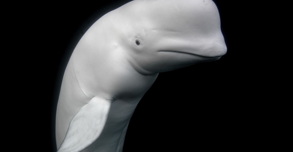
Winners of the 2021 Sony World Photography Awards

Beaded Images of Disease Explore the Impact of Colonial Trade
In her series Trading, Saskatchewan-based artist Ruth Cuthand creates a visual metaphor that outlines how early settler/Native relationships influenced First Nation people’s living conditions and wellbeing in Canada. The colorful works are created from beads which were traded by European settlers for furs in the Americas. Although dazzling aesthetically, the works content reveals images of deadly viruses passed on by settlers as a result of this trade, such as influenza, bubonic plague, measles, smallpox, typhus, cholera, and scarlet fever. More
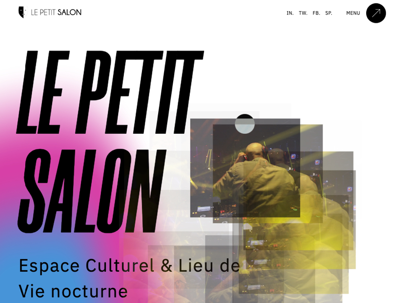
Le Petit Salon

Textiles and Board Games Inspire Large-Scale Murals that Span Sidewalks, Streets, and Staircases
Baltimore-based artists Jessie Unterhalter and Katey Truhn, known as Jessie and Katey, started creating murals because of the sheer accessibility of public art. The pair have always created work with a big visual impact, but as their designs grew they began to consider the possibility of working on the ground in addition to large-scale walls. Their site-specific floor works combine inspirations from both textiles and board games to create interactive walkways that encourage play and exploration. More

Ari Weinkle – Artist & Designer
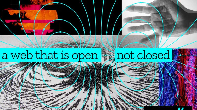
Mozilla launches new brand identity

Nigerian Hair Culture Documented in Rainbow-Hued Portraits by Medina Dugger
Lagos-based photographer Medina Dugger documents colorful hair culture in the coastal Nigerian city with her ongoing series Chroma. The collection of portraits pays homage to J.D. ‘Okhai Ojeikere, a renowned African photographer who documented women’s hairstyles in Nigeria for over 50 years, starting in the mid-20th century. Prior to decolinization, Dugger explains, wigs and straightening had replaced much of the indigenous hair culture, and ‘Okhai Ojeikere’s documentations sought to celebrate traditional hairdos. More
The Virtual Economy | L'Atelier

The Virtual Economy | L'Atelier
Get access to thousands of freshly updated design inspiration pieces by adding Muzli to your browser.
Loved by 800k designers worldwide, Muzli is the leading go-to browser extension for creative professionals.
What can designers learn from World Cup visual design and sports art?
Major sporting events like the FIFA World Cup are among the richest sources of commissioned graphic design, producing thousands of original works across posters, identity systems, mascots, and fan art. The consistency required for a global event — one identity system adapted across dozens of languages, cultures, and formats — makes World Cup design a masterclass in scalable visual systems.
What design techniques dominate sports illustration and World Cup posters?
Bold color blocking, dynamic diagonal compositions, and stylized figure illustration are the dominant approaches. The best sports poster work uses gestural line quality and exaggerated proportions to communicate energy and movement — techniques borrowed from constructivist and mid-century sports poster traditions. Typography in sports design tends toward bold, condensed sans-serifs that hold their weight against large illustrative elements.
How do sports events shape wider graphic design trends?
World Cup campaigns have consistently introduced design aesthetics that spread beyond sports into mainstream branding. Brazil 2014 popularized warm gradient palettes in digital design. Russia 2018 brought constructivist geometric patterns back into contemporary brand identity work. For designers, tracking major sports event design reveals what cultural moments are shaping visual taste — often 12–18 months before the trends reach consumer products.