The Designer’s Guide to Basic UX Writing & Microcopy: Focus on the Power of Words in UI
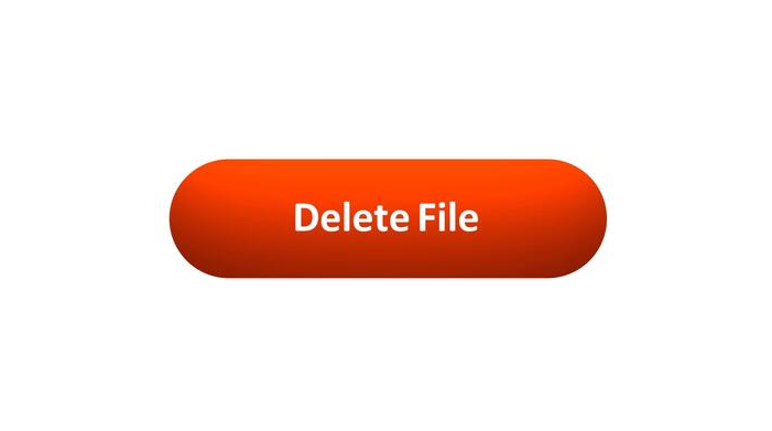
As designers, we obsess over pixels, grids, and color palettes. But there’s an invisible material in our interfaces that is just as crucial: language. The words we choose can be the difference between a user who feels guided and empowered, and one who is confused and frustrated. This is the domain of UX writing and microcopy—the small but mighty bits of text that guide users through your product. It’s the button label, the error message, the placeholder text. It’s not just “copy”; it’s a core component of the user interface. When done well, microcopy is invisible. It quietly does its job, building user confidence and paving the way for a seamless experience. Let’s break down the principles for writing clear, concise, and helpful text for the most critical UI elements. Why Microcopy Matters: More Than Just Words Before we dive in, let’s reframe what these words are: Button Text: Not just a label, but a commitment. It tells the user what will happen when they click. Error Messages: Not just an alert, but a solution. They should help the user fix the problem, not just announce it. Labels & Instructions: Not just a description, but a guide. They prevent errors before they happen. With that in mind, here are the fundamental principles. Principle 1: Write Button Text that Builds Confidence Buttons are the primary call-to-action (CTA) points in your interface. Their text needs to be specific, action-oriented, and predictable. ❌ What to Avoid: Vague commands: “Submit,” “Go,” “Ok” Technical jargon: “Configure,” “Execute,” “Transmit” The classic, unhelpful: “Click Here” ✅ Principles & Examples: Be Specific and Action-Oriented: Use a strong verb that describes the exact result of the action. Instead of: Submit Write: Sign Up for Free or Publish Post or Send Invoice Use the Active Voice: Focus on what the user is doing. Instead of: Your profile can be edited here. Write: Edit Profile Create a Sense of Value: When possible, hint at the benefit. Instead of: Download Write: Get My Ebook or Save Preferences Real-World Example: Notice how the button doesn’t just say “Ok” or “Confirm.” It explicitly repeats the destructive action, Delete Document, leaving no room for misunderstanding. Principle 2: Write Error Messages that Solve Problems Nothing halts user momentum like an error. A bad error message adds insult to injury; a good one turns a moment of failure into a moment of guidance. ❌ What to Avoid: Technical gibberish: “Error 500: Internal Server Fault.” Vague blame: “Invalid Input.” Condescending tone: “You did it wrong.” ✅ Principles & Examples: Explain the Problem in Plain Language: Clearly state what went wrong. Instead of: Form Submission Error. Write: We couldn't save your profile. Provide the Solution (Most Importantly!): Tell the user exactly how to fix it. Instead of: Invalid Email. Write: Please enter a valid email address (e.g., name@example.com). Be Humane and Respectful: The tone should be helpful, not accusatory. Use “we” to take responsibility where possible. Instead of: You forgot to fill out the required fields. Write: We need a few more details to complete your registration. Principle 3: Write Labels & Instructions that Prevent Errors The best error message is the one you never have to show. Clear labels and instructions set user expectations correctly from the start. ❌ What to Avoid: Inconsistent terminology (e.g., “Client Name” in one place, “Customer Name” in another). Ambiguous language. Instructions that are paragraphs long. ✅ Principles & Examples: Be Clear and Consistent: Use the same word for the same concept everywhere. Instead of: Handle (What does that mean? Username? Nickname?) Write: Username Put the Key Information First: In placeholder text or hints, lead with the most important detail. Instead of: Enter your phone number, including the area code first. Write: Phone Number (including area code) Use Sentence Case: Capitalize only the first word for labels and buttons (e.g., “Email address”). It’s easier and faster to read than Title Case. Show Examples: When format matters, show, don’t just tell. Instead of: Enter your date of birth. Write: Label: Date of Birth Placeholder: MM/DD/YYYY Real-World Example: The labels are simple and standard. The placeholders provide a clear formatting template, preventing user guesswork and ensuring the data is collected correctly. The Golden Thread: Tone & Voice Underpinning all these principles is a consistent Tone of Voice. Is your product a trusted professional? A friendly guide? A witty companion? Your microcopy should reflect this consistently. Be Concise: Omit needless words. Be Useful: Your primary job is to help the user complete a task. Be Human: Write like you speak (to a colleague, not a stranger). Your Words are Part of the Design The next time you’re designing a form, a modal, or an empty state, don’t treat the text as a last-minute filler. Wireframe with real, purposeful copy. Prototype with the exact messages. Ask yourself: Is this button text a clear promise? Does this error message help the user move forward? Do these labels prevent confusion? When you wield words with the same intention as you wield color and layout, you elevate your design from a mere visual arrangement to a coherent, helpful, and human-centered conversation. The post The Designer’s Guide to Basic UX Writing & Microcopy: Focus on the Power of Words in UI appeared first on Designer Daily: graphic and web design blog.